I decided to sketch out my image. Who was I kidding, I was very much concerned about the painting needing to look "perfect". I was willing to sacrifice a certain degree of spontaneity in exchange for the comfort of knowing that my brush wouldn't stray too far away from the intended targets. I could recall when I first started with Chinese brush I was dead set against sketching. I always thought that sketching was reserved for novices. I've came to realize that I needed to do what was right for me, and not for anybody else. So what if I was a novice.

I shied away from using too much ink as my shading base layer, especially on the face. Too much ink imparted a grimness to the feel of the painting. I also cheated by purchasing some cheap off the shelf flesh color acrylic. I used that to lay down my base coat, and used vermilion as my main shading color and vermilion plus tea if I wanted a darker shade.

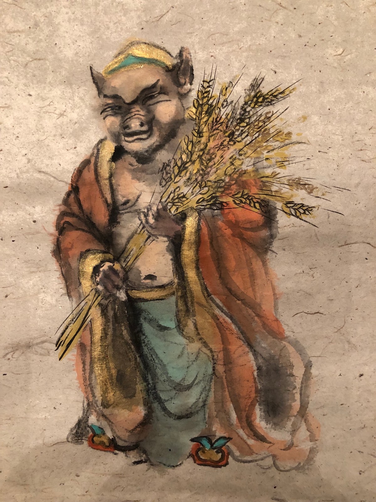
Again I resorted to the unbleached Xuan with fibers that looked like the butt wiper paper of the yesteryears. The base color plus the exposed fiber added the "organic" nuance that I so endeared. It happened that one of the fiber particles in the paper popped up in the area of the forehead, just above the eyebrow. This was such a serendipitous delight for me, because now my pig archetype had a huge mole on his forehead, adding to the persona of my protagonist. I couldn't have planned it any better.

I had mentioned in my mountain lobes blogs that the side-tipped contour lines denote more than the contour, but also the thickness of the slab we were describing. I've applied the same technique and understanding to the strokes used to describe my shadows. Here an example of a side-tipped brush stroke of uneven width gave the illusion of the lapel not lying flat against the chest wall. The neck was farther away than the rest of the body, therefore a wider area of black void.

The side-tipped brush also worked well on describing the undulations on the robe. The vertical brush strokes of vermilion on the right were simply a lightly loaded brush of very diluted vermilion with its tip dipped in undiluted vermilion. The Xuan paper allowed the color to form its own gradient, demonstrating dark and bright areas along the robe.

I was not happy with the heavy drape lines on the front of the robe, especially after seeing how nicely the two vertical side-tips turned out.

So I reapplied the drape lines using a vermilion brush with ink tip for the color gradation. Since the paper already had a layer of color on it, it became a sized paper effectively. Thus the mixing of the color was not as dramatic as the vertical ones. I believe that is one of the reasons that in traditional Chinese Brush we discourage going over a painted area repeatedly. Doing so destroyed the fine details of the brush stroke.

I applied the same technique to the blue over coat. I prepared a blue/ink dish and a blue/white dish to help me further differentiate thedifferent areas of the blue robe.


The upper arm area was done with the blue/ink side-tip and the forearm was done with blue/white

For the navel I judiciously darkened circular areas around the navel leaving a ring of the base color to denote the rim, and a much darker center and just below the navel to suggest the depression.

By writing a half arc as a shadow, a nipple was formed without much fanfare.

I bought some metallic gold acrylic to paint the lapel and the waist belt and the inner sleeves. I used gold strictly for its dramatic effect and it worked well for my purpose. The acrylic formed a thicker and harder surface than the rest of the painting not done with acrylic. The buckled paper convinced me that these areas were more like collage art than a two dimensional painting. Interesting. Whether it would retain this look after mounting remained to be seen. Perhaps I would deliberately not smooth out those areas during mounting so that I could preserve this illusion.

I was able to appreciate the difference between acrylic and watercolor, especially when they appear in the same painting. I definitely know my brush and the paper reacted quite differently to the two.
All the experimenting was invigorating, perhaps I was breaking all rules, by my own accord at least. I sketched with pencil, I dared to use different media, and went over painted areas repeatedly. I used metallic paint. I dared to shade. Nothing esoteric, but just experimented what I felt like. I could now tell what a pure Chinese Brush artist deemed as dirty or muddy, versus the simple, single and transparent strokes of the traditional Chinese Brush.
I also added a faint shadow by using what was in my brush wash basin. I was being mindful that the shadow did not diminish the ethereal quality of my archetype. I wanted Mr. Pig to cast a subtle, non-distracting presence, as one would on a overcast day.

That was my photography alter ego speaking to me!