Wednesday, November 23, 2022

Duck pond

Having finished my dragonfly painting when the pond is stagnant, I couldn't help but remanence the days when the pond was full and beautiful.  I am talking about late spring, when flowers are in bloom and the geese welcome their new family and the pond is filled with runoffs from the spring rain.  


So instead of ruminating whether the glass is half full or half empty as I alluded with my dragonfly painting, why don't I attempt at something that is definitely a full glass.

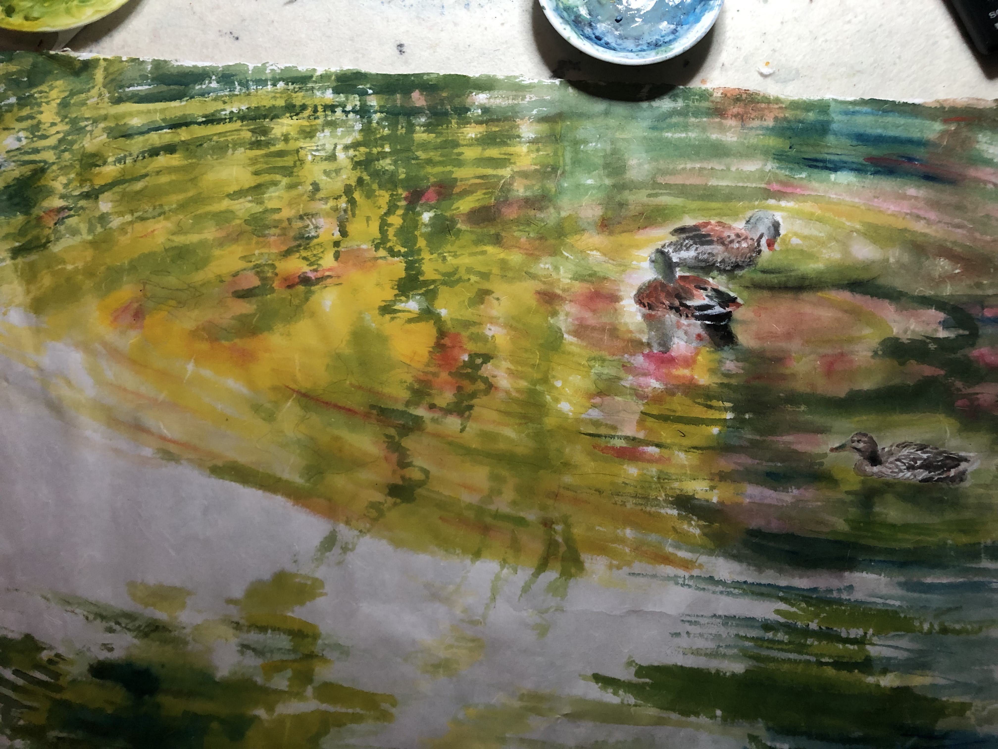
The reflections of the yellow water iris and red rhododendron in the pond, interrupted by ducks lazily peddling is what I am going to attempt to paint.

For me, the challenge is to bring about the motion of the water; to bring about the transitory and ever evolving reflections.  They seem to be dancing around all the time, yet being stationary, in the sense that their position in the water never change.  So how does one portray a dancer who dances in place?

I definitely do not possess the expertise to answer that question, nor do I own the skills to depict that.  To me that's almost like asking me what is love, what is happiness.  All I know is that I just want to pick up my brush and strike while the iron is hot.  While I am still feeling it.

I want the ripples in the water to be the stage and ducks as prop.  I have an idea of how and where I want my ducks so I just pencil in their cutouts and wrote in the feathers.


The water immediately next to the fowls is relatively flat, showing only a semblance of ripples, so it is  easy to insert the palette denoting the sky, the water and the vegetation along the banks of the pond.


As I continue to build the stage with brushstrokes of concentric circles the brownish duck at the bottom gets drown out by all the vibrant colors.  A touch up with titanium white on the feathers gives that duck a little more presence.


I am not too concerned about my brushstrokes.  You can say that I am out of control; allowing my
feelings to guide me and pray that I've developed an adequate brushstroke over the years; even while I am not paying attention.  At the same time I am well aware that my Xuan paper reveals a very saturated look while wet, so I've learned to ignore that seemingly awkward appearance. 


The painting is making more sense now that the sky is painted in.


Finally the painting has dried, my duck painting!  The good old days!


Friday, November 11, 2022

Presenting my dragonflies (Summer Pond)

Perhaps it's due to the complexity of my coloring scheme, or my child-like mischief, I want to do something unconventional to my mounted painting on Xuan before I frame it.  

I want to varnish it.

I remember reading somewhere that oil paintings get their vividness by virtue of light being refracted through the oil in which the pigments are suspended.  I figure my displays of blue and green and yellow could benefit from a coating of oil or varnish.  I suppose the traditionalists would protest vehemently of my sabotaging paintings done on Xuan paper.  Well, no pains, no gains is my answer.

The mounted painting is now dry and taut and is ready for harvest at this point, normally, that is.


I am using Liquitex gloss medium as my varnish.  To demonstrate the effect of my experiment, I am varnishing half of my painting to begin with.


Needless to say, the effect is dramatic.  There is an immediate reveal of depth and details are made more vivid.  I get the wet look back!  Obviously it would be ludicrous to varnish only half the painting.  I did it to prove a point.

I choose to lap on the varnish while the painting is still taut and fixed to the hard board.  This is to prevent any warping of the paper due to the uneven coating of the varnish.

The following photo shows the before and after the application of the gloss medium on my painting.


After the gloss medium varnish is dried the painting is now harvested from the hard board.
The shine on the lower left corner is the light reflection off the dry surface of the now varnished painting.  This is where the argument is valid from the traditionalists; that the quaint and understated feel/taste of the Xuan paper is totally annihilated.  My painting now reminds me of a printed poster with the sheen and all that.  I suppose I am lucky that this is not a traditional Chinese painting on Xuan.

Or, better yet, maybe I can try using a matte medium next time.  Food for thought.


I am quite happy with how this experiment turns out.  There is now a richness in the color that wasn't there before and the dragonflies look so vivid they are ready to fly off the paper.  It definitely delivers the effect I am looking for.  I am also happy about my use of sprayed alum solution.  I can see the clear margins around the multitudes of slight voids amongst the colors.  They look almost like divots on a golf course.  They help to portray the shimmering surface of the pond.  I am using them as subtle clues to augment our visual processing of the picture.  

I anguish over the matting of the painting.  Just a little bit.  My dilemma is that I have unequal heights in my upper and lower borders.  Typically a Chinese painting would have a wider upper margin because we designate that margin as the "Heaven", which trumps everything.  The example is most obvious in all the vertically hung scrolls.  But I am not dealing with a typical Chinese painting here, so I am not bound by that tradition.  I am going to cut my mat with unequal top and bottom margins and designate the bottom end as the one with the wider border. 

I am using a white mat with a black underside, thus the beveled edge shows up in black.  I really love the look of the thin black line between the painting and the white mat.  It bestows a bespoke feel to the whole setup.  

At last, my Summer Pond painting.


Friday, November 4, 2022

The Art of Rejection

Having my works adjudicated for exhibitions is one way to find out if my works fit in or not.  There are only two possible outcomes; being accepted or being denied.  I am sharing one such thumbs-down experience here.  Isn't it fascinating that rejection is also an art form.  283 words were used to describe the two letter word "no".


Thank you so much for applying for inclusion in the upcoming exhibition.  I appreciate the time, thought, and energy you put into your work and your entry.

Unfortunately the above mentioned work was not selected at this time. Please be aware that the jury process is blind, meaning that images are reviewed and artist's names are not revealed until the process is complete (this method works best).

This years' call (after 8 tough rounds) is punctuated with an ethereal quality shrouded with elements of nature and the static interruptions of technology! Additionally, elements from all verum themes seem to have shown up and their arrival strikes a haunting reflective sense of the 'in-between'. Notes of the past and future collide through abstract expressions that balance the entirety with biomorphic interpretations that speak of worlds (known and unknown)!

As I am sure you are aware, in the jury process a grouping becomes relevant and works are selected for their intrinsic aesthetic value and appeal, but also (as importantly) for their relationship to the other chosen works (and the theme as a whole). It is a truly strange phenomenon, but I reject so many works that I admire (this happens because of my creative curatorial process where I elect to focus on a collective voice that emerges around the theme).

This jury process was particularly challenging (with so many visionary and skilled works submitted) and this rejection does not reflect the high quality, time, energy, and care of the work you submitted.

I am so appreciative that you gave me the chance to spend time considering your work for this exhibition. It was truly an honor (perhaps more so than ever before)!

with profound gratitude,


Hence the rhetorical question is: would you rather receive a simple one word "no" or a 283 words embellished "no"?  I must admit that I have problem understanding some of the terminologies and phrases used in this short essay. They pose a striking resemblance to wine tasting notes, which I also fail to understand by the way.  Allow me to indulge you in this exercise by substituting a couple of words from the original text:

This years' vintage is punctuated with an ethereal quality shrouded with elements of nature and the static interruptions of technology! Additionally, elements from all vines seem to have shown up. and their arrival strikes a haunting reflective sense of the 'in-between'. Notes of the past and future collide through abstract expressions that balance the entirety with biomorphic interpretations that speak of the palate!

Obviously I am out of my elements here.