Tuesday, April 20, 2021

Finishing up my Gorge painting

I looked at my dried painting in day light and it certainly looked quite different from the dim incandescent light, and the color wasn't as exaggerated as when the painting was still wet.


 I thought I could tone the color luminescence down further.  This would be a good time to make the bluff side of the painting darker, since it was situated with the light behind it.  I know in the classical sense, Chinese landscape paintings seldom pay homage to lighting effects, but my current work was too "contemporary".  So what the heck.


 The darkened right lower half the painting contrasted with the brighter left side of the painting.  The darker sky also made the distant horizon more visible, showcasing the the distance perspective.  I used a cold color, blue, to describe mountain ranges far away; as our atmosphere absorbed most of the other color wavelength.

Titanium white was used to bring out the Vista House, otherwise it would had been swallowed up by the red wash of the sky.

At a glance, the painting assumed a diagonal composition.  I could see a play between the upper left hand corner and the lower right hand corner.  I suppose my interest in photography encouraged me to pay attention to light values.  Conversely I believe my painting hobby made my photography better, making me more aware of composition.

The one contrast I did not intend to make was the washed out contour lines from the landscape on the right.  The repeated staining to adjust the tonal quality had buried my original lines.  The visible shorelines on the left did not bode well with the vague shorelines on the right.  This was definitely not a ying versus yang contrast. 

What I did intend to contrast was the way I painted the lobes of the mountains.  Normally the ridge of the lobes is the lightest and the darkest value is assigned to the area just beyond the contour line, where the gully between the lobes lie.  This is the part where streams form and vegetations grow.  The left side of the painting exemplified this practice.  On the right side of the painting however, the ridge had the darkest value.  I did that to suggest the presence of mist seeping through the mountain range from the right.  The voids on the cliff face hopefully set the stage for the visualization.  Hence the landscape on opposite sides of the river had opposite treatments to the ridges.  Granted, this was a rather obscure and perhaps insignificant observation.  Is this a case when some wine snob tells you that there is a hint of black currant, strawberry, chocolate and apricot in the wine and your response is forget the hype, just drink the damn wine?

Anyways this was what I arrived at.


The shorelines on the right side were re-established.  The exposed rocky surface of the bluff was given more texture.

Somehow the painting looked quite desolate, reclusive.  I was so tempted to paint in a few sail boats on the river,  or some transiting geese.  But then given the context that this was during the Covid-19 pandemic, perhaps it was appropriate to feel sort of detached and isolated?

Eventually I couldn't stop the itching, I had to do something to the painting, to make it a little more personable.  I vividly recalled that white caps are a frequent occurrence in the gorge, hence the city of Hood River is a favorite wind surfing destination.  It would be difficult to paint the waves and the white caps to scale, given the vastness of scenery.  My excuse was that the painting was a little bit impressionistic anyways, so what the heck.  If you want true realistic images, then get your own camera out.  


Traditionally I would not have used titanium white to accent the white breakers, but since precedent was set by applying that to the Vista House, I felt justified.


Wow, that was different!  My painting had just assumed a different persona.  It now had drama.
The waves not only provided additional scenic texture, but also provided a foreground to the painting.  Up until this point, I didn't even know the foreground was missing. 

This might have been an example of the tail wagging the dog.  Painting the water was never in the construct when I planned the painting; yet I couldn't take my eyes off of it now.  In painting, as in life, sometimes a tiny insignificant afterthought could morph into a primary impetus and  change your status quo totally.  

After the novelty wore off, I decided to darken the foot of the bluff further more to create more of a contrast with the lit side of the painting.  


The darkening was done by more ink staining from the back of the paper.  I didn't want the ink to obscure too much of what was on the top layer of the paper already, I had already deposited too many layers of color, very unbecoming of what I was taught in traditional Chinese painting.  The translucent nature of the paper allowed me the freedom to color from the back.

The paper was not mounted yet so it was creating its own shadows from all the localized dimples but the darkened bluff face at least looked credible, as it was in the shadow.

Friday, April 16, 2021

River Gorge Landscape


With the furor of Covid-19 still raging, the outdoors is perhaps a relatively safe place for a respite  The Pacific Northwest certainly has its claim of fame, as far as picturesque vistas are concerned, but even the famous Multnomah Falls was off limits for a lengthy period, to curb crowding.  The Falls is located in the Columbia River Gorge National Scenic area, some 40 miles east of the city of Portland, and driving there is a wonderful way to spend an hour motoring.   Once you are outside of the city limits, the freeway opens up to relaxed cruising.  Or you can take the Old Columbia River Highway for a even more scenic and leisurely drive.  The Vista House perching on a bluff overlooking the river is your introduction to the Columbia River Gorge and many small falls dotting the Old Highway.

One has seen images of the Gorge and the Vista House countless times, but it never gets old.  I'll add my footprint to that collection.

I started out by laying down the bluff and the surrounding landscape.


The exposed rock cliffs were colored with a mixture of burnt sienna and vermillion, colors that were left in my dish and I rehydrated them.  Waste not, want not.  


I decided to use an opaque color for the trees on the bluff and in-between the rocky slabs. I mixed Blue Hue with Yellow, toned down with ink to make it less vivid.


For the rest of the grounds I used a transparent green color, mixing my own yellow and indigo
I used the two different kinds of green, in both hue and opacity, to help me differentiate the different terrains.  

As it turned out, my palette hues were a little too vibrant.  I blamed it on my choice of using left over vermillion, which made the color too bright.  That had a rippling effect and affected the way I perceived my colors as I was continuing to paint.  I am sure my dim incandescent lamp with a beige shade had something to do with it too.  More on this later.


I ran a freeway at the bottom of the bluff, along the river's edge.  I tried to impart a smidgen of  truthfulness to the overall feel of the scenery, although I had taken some liberty to the details of the landscape.  I gathered that the silhouette of the relatively contemporary Vista House plus the bright color palette of the painting so far, definitely did not lend itself to the strict classical depiction of landscape.  I might as well insert the modern infrastructures.  I actually considered painting in power transmission towers and wind turbines.  


Since I was already on the road to some bright coloration applications, I might as well make the sky dramatic by using a bright red color, as a backdrop to the Vista House.  Go with the flow, right?


I needed to take a break and give myself a chance to evaluate what I had done so far.  

I alluded to the fact that I was painting under a dim light with a bad lamp shade.  For some reason I seem to function better in cramped quarters with less than ideal surroundings.  Most of my painter friends would create an atelier in a bright room with picture windows and a huge desk.  I am the exact opposite.  I suspect it had something to do with my upbringing.  I had never had a room that I could call my own, and had always slept on a sofa while growing up.  Living in the city there was never a moment of silence.  I had gotten used to that and adapted well.  In fact, I could never study in the library.  It was too quiet.  I needed to have the TV set or radio on, as background noise.  The noisier is the environment, the better I could concentrate.

I feel naked and helpless in a bright, nicely furnished room.  I often pick a corner desk with no windows in cramped quarters to paint,  I get an adrenaline rush when I paint or study in the wee hours of the day, when I know I should be in bed.   I'm more inspired for some reason under those circumstances. 


Monday, April 5, 2021

Revisiting an old landscape sketch

 As I was trying to repair my vintage record player I got to experience the joy of accomplishment, for having been able to make my turntable work for a little while.  I also suffered the disappointment from defeat, having screwed around with something that was clearly beyond my expertise; rendering my turntable into a bipolar machine,  inexplicably vacillating between 33 and 45 rpm while playing a record.  I reflected on that experience and saw similarities in how some Chinese brush painting students failed.  Often times knowing a little bit about a subject is more dangerous than being totally ignorant.  Just because one could make a mark with a wet brush doesn't necessarily mean one knows  to write or paint with a Chinese brush.  The fact that I could solder and know which end of a capacitor is negative doesn't make me a electronics repairman. 

I tried to nurse my nerves and took my mind off the anxiety in fixing the turntable by motivating myself to practice the fundamentals in Chinese brush painting.  I picked orchid painting because of the close similarity between painting orchid and calligraphy.  There shall be a day when I could be proud of my orchids, I consoled myself with platitude.

I was working on a parallel project in the mean time.  I also had my eyes on an old landscape sketch that I had pinned to the plaster wall.

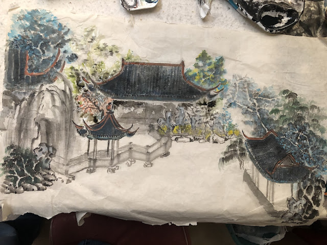
I was trying to depict a classical Chinese garden; a place that is rigidly structured, yet offers ample room for free contemplation and so much beauty.  The sketch was done sometime ago and I had it pinned up so I could cast a wandering gaze at it from time to time, to see what needed to be worked on further.  I do this religiously with almost all my works.  I find such casual scrutiny beneficial and serendipitous.  

Unfortunately the child in me led me to launch a drone in the room where I paint.  The drone rose from the floor with the ushering of the joystick on the control tablet, but veered by itself sideways ( obviously some phantom force was involved, I couldn't be the person doing that !) into my pinned sketch.  Well the exposed blades of the drone chopped up part of my sketch and tore it off the wall.  I picked the carcass up from the floor and pinned it back on and it stayed there until now.  I thought this would be an excellent opportunity to see if I could mend the painting, along with my turntable.

I was dividing my time between the orchid exercise and the garden restoration.  Ink was the only color used for my orchid practice and the garden required an assortment of colors.  I didn't want cross contamination of my ink dish with my color dishes.  

I started by coloring my roofing and trees, to establish a mood.  Well that wasn't exactly true.  I was rehydrating the left over pigments in my color dishes, and they happened to be hues of green and indigo and vermillion.  I was picking from left overs.  


For some of the trees I used a blue hue for leaves, just to add a little variety.


I used a yellow underlayer of color on yet other trees, and on the willow.


When green was painted over the yellow undercoat, it presented a different hue, and the occasional yellow that came through added to the nuance of the palette. 


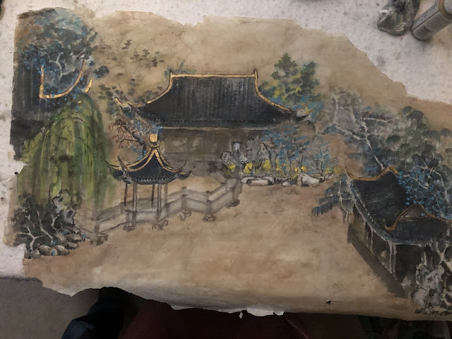
I decided to jazz the painting up a little by giving it an aged and weathered look, with the help of burnt sienna.


The color wash and the travel of the brush tore off parts of the paper, since the propellers from my drone initiated the shredding some time ago.  

I decided I was too timid with the burnt sienna, so I summoned tea stain mixed with ink, and more burnt sienna.


My weathered look scheme was coming alive.

After the wash had dried sufficiently, I decided the painting needed more adornment.  I reached for the metallic gold acrylic from my tool chest and painted the hip roofs and the flying eaves golden.  


The new attire bestowed a different personality to the painting.  The metallic gold actually looked good over the vermillion undercoat.  It had a persona of old relics or artifacts from temples

After I had a few days to ponder and ruminate on what I had done so far, I decided to accost more details to the painting.  I decided some of the leaves on the trees could use a better definition.  I also decided to make the plants behind the rocks in the middle of the painting more lucid, the juxtaposing of the Taihu stones rendered them obscure.   I painted some bamboo leaves and gave them an ink outline, as I did selectively with some leaves at strategic positions in the painting. 


Some will accuse me of succumbing to pedantry, indiscriminately bombarding the painting with fluffy details to conceal my less than perfect brushstrokes.  My answer would be that until I was ready to be starkly naked, I would always dress up with something that complements my personality.  


I reminded myself often, I do this for fun.  In this particular case, I was trying to revive a sketch, executing parallel exercises between fixing my record player, practicing painting orchid and this.
In the end, I enjoyed all three events, a complete failure in electronics repair notwithstanding.
As the saying goes, it's all about the journey and not the destination.

Enough said.