It is no secret that I am not happy with my Multnomah Fall painting and have attempted some remodeling to the painting. Yet I am still bitten by the bug.
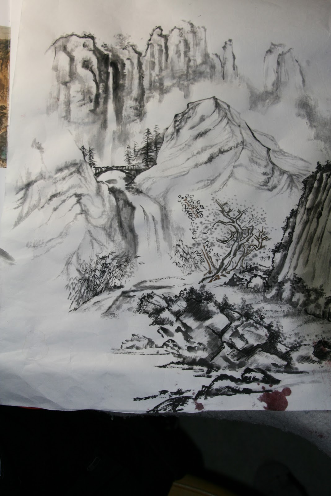
I've decided to try to depict the fall more as a presence than as a specimen. I employed simple lines.
I created 3 stages, the near, the middle and the far. The learn by rote training came into play. It wasn't too difficult to snatch different scenes from repeated practices.
The near scene enjoys the darkest lines and is shacked with the most details. Trees are done in the outlined style, sort of. The middle stage cradles the bridge and the lower fall, which then empties into the creek. The far scene is staged by the upper fall, flanked by sentinels of straight cliffs. The fog and mists at the bottom of these cliffs are used to push them way back, further away from the rest of the masses. I should note that in the original draft, I felt the width of the lower fall was too wide. I cleverly turned the right edge of the lower fall into a steep embankment, effectively narrowing the spillway.
I kept the color scheme simple. The indigo blue was used mainly for effect. The cold color helped to foster distance, yet adding punch to the painting.
I did the frame a little different from the traditional way. Instead of an assembly of 4 sides, I skillsawed an opening into a plank of pine to accommodate the canvas. The pine is finished in gold to render an "antique" look.
This piece was submitted to a Calligraphy and Painting competition hosted by the Confucius Institute.
Whereas I have not received any notices from the Institute, I am very happy to see my work poted as the promotional piece on their main page under the C and P category.
http://promotion2011.chinese.cn/index.php