Thursday, December 24, 2020

Wetlands

 I am blessed with a couple of wetlands within an hour's drive from home.  These wetlands are managed marshlands that municipalities use for water treatment and filtration, along with providing a preserve for migratory birds and other fauna and vegetations.  Ducks and Canada geese are common visitors and I am especially fond of the geese because of the contrast provided by the black neck and the white band on their tail feathers, hence I model them often.  My last blogs of Explorers and Reflection are examples of geese and wetlands being the source for my inspiration.

I've deemed these destinations as one of the few places that I could still go visit without violating Covid protocol.  They are outdoor venues and I could easily avoid nexus with other humans by maintaining a 2 meter bubble.  So I went to this 600 acre wetland that started out as a site for water waste disposal until enough complaints were registered to convince the city to mitigate the offense.  Now it is home for a well managed eco-system punctuated with vast lakes and sloughs oozing from culverts and providing respite for domesticated and wild souls alike.  I snapped a few photos for reference, and planned my next painting.


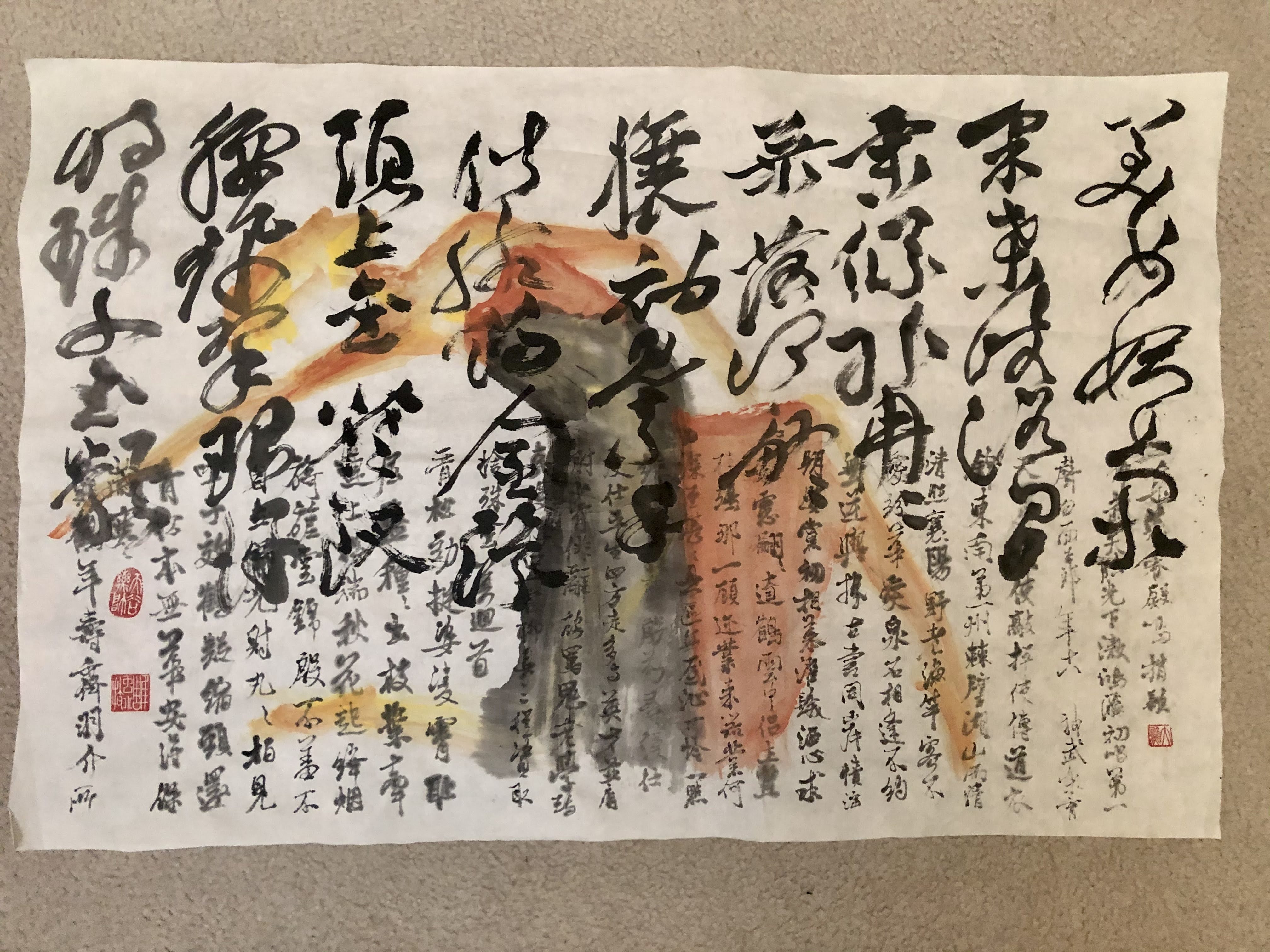
For this exercise I chose a Xuan paper that I bought for practicing brush calligraphy.  This is not the maobian paper that I alluded to before but is yellow all the same.  Unlike the more fibrous maobian this one is crisp and smooth.  This paper is good for calligraphy because it is quite absorbent and the ink does not bleed easily.  It can also withstand repeated rubbing from the brush without roughing up the surface into felt.  The drawback for this paper is that it is not good at rendering ink tones and the lack of differentiation could make the painting sort of insipid.  Nonetheless I picked this paper mostly because it has been a while since I last used it and I wanted to reacquaint myself with it.

The yellow Xuan paper reminded me of the aged scroll paintings in museums, so I wanted to do this painting in a decidedly Chinese fashion.

I started out with the trees in the foreground.  As far as I was concerned classical Chinese paintings had a very distinct way of depicting mixed shrubs and trees.  Whenever one sees a grouping of trees being painted a certain way, one knows immediately that the painter had left a calling card to say that this was a Chinese painting.


Typically the trees would be of mixed species, often times conifers and deciduous together and assuming various pleasing poses.


I placed the trees on an incline to aid the composition and solved the problem of not having to fill in as much the center portion of the painting.  I didn't want to give too much detail about the ground, so a few side-tipped brushstrokes delineated the topography.

The curved furrows left by tractors and the observation shed were points of interest when I visited the preserve, so I was determined to work them into my painting.  Those were the landmarks that I associated with this particular wetlands preserve.  I tried to adhere to the scheme of using just two colors and employed the classic dotting method of describing shrubs, stones or grass; and in some cases just for decoration and adding interest to the contour lines of the hill.


Modeling after the pair of Canada geese in my photo, I decided to use the middle void in the painting as the flight path for my geese.  I loved the simple silhouettes of these birds.  Their simple lines were conducive to treating them as Chinese fonts rather than birds.  One could literally write them out instead of filling them in with ink.


I would be seriously remiss if I didn't set the stage for the hundreds of birds that swamp the preserve.  They come and go in brigades of flopping dots in the distance and it was quite a sight to behold and to ponder if there was a vast body of water yonder obscured from my line of sight.  Their cacophonic chattering broke the stillness of the area, without being annoying.

Almost all of these could be written with two or three strokes using the very tip of the round brush.  It was fun to try to mix up the positions of the wings so they didn't look too unison.  After all the fowls were not marching.

Was there any symbolism in painting paired geese flying towards the flock in the yonder?  Could the grass be greener on the other side?

I had hoped for the formless brushstrokes in the distance, especially the strip on the upper right hand side to assume a much lighter value.  I painted them with my brush wash, thinking that would be light enough. As it turned it, it wasn't.  The culprit was the paper.  This kind of Xuan paper is good at registering brushstrokes but not in showcasing ink tones. 


The painting was wet mounted on a piece of regular white Xuan and then framed.


It provided me with something new to look at for a while.  


Thursday, December 3, 2020

Doodling, Calligraphy

I was not feeling particularly motivated to paint but I felt that I should not be keeping a distance from my brush and Xuan.  I had not practiced any calligraphy for a long time so this was a most opportune time to brush up ( pun intended ).  After all Chinese brush calligraphy is the foundation of Chinese brush painting.  The quality of the brushstroke is a major determining factor in the intrinsic virtue of a Chinese brush painting.

I rolled out the Xuan on my desk and decided to practice the running style of Chinese calligraphy.  As the name connotes, the running style is a calligraphy done in haste.  The brushstrokes are more than cursive however.  They are actually greatly reduced from the regular block fonts.  To illustrate my point, try to imagine a cottage with a gable roof and two dormers and a detached garage.  So these are the identifying features of this property.  The cottage might have red shutters and green doors and triple pane windows but these are not features that one could pick out readily.  Thus in the dim starlight, one can still pick out the gable roof and the two dormers and the detached garage.  If one was asked to do a quick rendering of this cottage, one would just draw a gable roof roof with two dormers and a detached garage.  

So are the brushstrokes in the running style of Chinese calligraphy.  A lot of the details are missing, and only the most distinct "roots" of the font is written.  Thus the running style fonts often require an educated guess to disambiguate, as they are not readily decipherable, especially when context is missing.

The fact that the calligraphy is done in haste, doesn't mean that I could write in haste, especially when I lack complete control of the brush.  Imagine trying to do a triple Salchow double toe-double loop combo in ice skating.  It looks graceful and fluid but it takes expert skills to determine speed, rotation and which side of the blade to exert force.  Now imagine the brush as your skates and you are the skater.  You can't rush it!  The running style calligraphy is so deceptive. 

My inadequacy became readily apparent after I filled the page, emulating  a Ming calligrapher Zhu Yunming.


My hesitation and non-decision caused my brush to stay on the paper far too long resulting in a loss of definition of the brushstroke.  Instead of seeing a serpent wriggling I saw dead earthworms striking poses on paper.  The thin connecting brushstrokes should have happened naturally as a result of the brush lifting most of the way and then landing to form a new stroke.  I however was forcing an abrupt lift and landing of the brush.  I always compared this akwardness to people doing static poses to emulate runway models.  What we see in a glamorous photo from fashion models is a single frame derived from results of thousands of continuous shutter clicking trying to capture the fluid translation of a flood of arrangements of the body and limbs.  Thus trying to strike a static pose always seemed contrived and pretentious because it was not eased into.  There was no hint of  transition.   So was my calligraphy.

I knew I was using the wrong kind of paper for my calligraphy.  I read with tantalizing interest on the tidbits of stories of how these great masters of Chinese brush painting had their own custom papers and brushes made.  I was only practicing so it really didn't matter, besides I am nowhere near that level of competence or excellence to demand custom paper.  Suffice to know that different papers and different brushes do make a difference.  This is not hearsay or folklore.  My favorite paper to use was actually the one that is considered unrefined.  It is made with unbleached bamboo fiber and has a rough and yellowish tint.  I call it glorified toilet paper because it is super absorbent but doesn't bleed easily and is ideal for butt wiping.  It is Maobian paper that I am referring to.

So I tried the same writing on the Maobian paper


I do believe this paper was more honest, in that it did not amplify my shortcomings.  The brushstrokes seemed a lot more natural and mindful,  failure to lift my brush notwithstanding.  Perhaps they can make a little blue pill for my brush or my wrist.  But honestly, I believe that once I learned the lines and start treating the calligraphy as one continuous line of thought instead of individual characters I should see a better result.  The way I was doing my calligraphy practice was like posing hundreds of static poses.

Since I had room left at the bottom of my Xuan, I decided to do more calligraphy exercise.  This time with a the walking style calligraphy.  This style of calligraphy means it is done with less haste than the running style, thus almost all of the original structures of the word is retained.  It is definitely not as formal and rigid as the block characters and allows ample latitude for form and personality.  I believe the word cursive describes this style best.


Again it was painfully apparent that the ink bled like crazy and any reference to the tip and edge of the brush is all but gone.  I wonder how much of that was me and if a master calligrapher could make this work all the same.  

Just as I was ready to banish this piece of  calligraphy exercise to my pile of etudes, as I call them, I was suddenly imbued with a notion.  I caught a glimpse of my Pie Jesu piece in the corner of the floor.  I  attempted to visually dub the ballet dancer silhouettes with music score from Pie Jesu, perhaps I could add a dancer here to emulate Chinese calligraphy?

The limbs of a dancer seem perfect analogs for the individual strokes in a Chinese character, bending at the joints to give meaning or functionality to the dancer's pose, or to a Chinese character.  The continued movements of the limbs and the body and the head of the dancer are no different from the twists and turns in the brushstrokes of the running style calligraphy.  How far back does the dancer's head tilt and which shoulder is the gaze directed at is no different from the where the brush presses and lifts and where a vestigial dot ends up at.

Enough soliloquy, I picked up my brush and impulsively wrote my dancer, using whatever color was left in my dish.  I was afraid that even the scant time spent on squeezing out the color tube could render my thoughts less lucid.


After my " id " phase was satisfied, my "ego" phase plunged in and began to analyze what I  had done.  I was made aware of the two different styles of calligraphy occupying two halves of the paper.  Perhaps I could make my dancer along the same vein.

I decided to don my dancer in a two toned skirt to emulate the two font styles and I happened to have left over vermilion that I could rehydrate in the dish.  Vermilion should go well with ink.


My doodling got out of hand.