Sunday, June 2, 2013

Beaverton Creek Classic (Coloring)

I felt a little better now that I know how to handle the foreground.

Parallel to the creek runs a trail, partly dirt and gravel, and partly constructed of wooden planks.  This trail starts at the little lookout area and then follows the bank.  I am having great difficulty with painting this trail because I really don't have a clear image as to how this trail should look like on paper.  I just haphazardly plotted the footprint and will deal with it later.


The leaves would assume different colors.  It would be boring if all of them were green. I decided to have green, yellow, red, crimson, and blue leaves.  It is not uncommon for Blue Hue Three (176) to be  used as a leaf color; it is like a punctuation mark!  That and Green Label Hue Three(173).
For these leaves I would use yellow as the base coat.  It is important to write the color in using brushstrokes.  Forsake the temptation to just block in the entire area.  In this particular example, the leaves are little rectangles.  So using the brush tip, start at the point, press and lift at the opposite side.  As we pile on layers of color, the tone becomes more saturated.


The different colors tend to carve out a tiny margin around themselves (perhaps due to brushstrokes not exactly the same as I repeat the process) and give the leaves a thickness.  I would pile cinnabar on yellow, then carmine on top of that, for example.  After the entire painting is done, I would then re-outline the leaves and trunks for a better definition.


I now need to put in the grounds.  What I had was a faint green smudge with  dark outlines.  I would go over the entire ground with brown (684) mixed with ink, taking care to leave the highlighted areas uncovered.  By selectively using different tones of brown, and subsequent highlighting with Green Label Three again,  I can map out the contour and the topography of this landscape and render a three dimensional feel to it.

Stepping back and look at the painting.  On the lower right hand corner I have a tree in the middle of the trail.  Looks bad!    So I decided to paint in some foliage around the base to make it less obvious.  I also embellished the trail with blades of grass or vegetation here and there.  I would probably write in some moss dots too, but I'll wait until the painting is almost done.


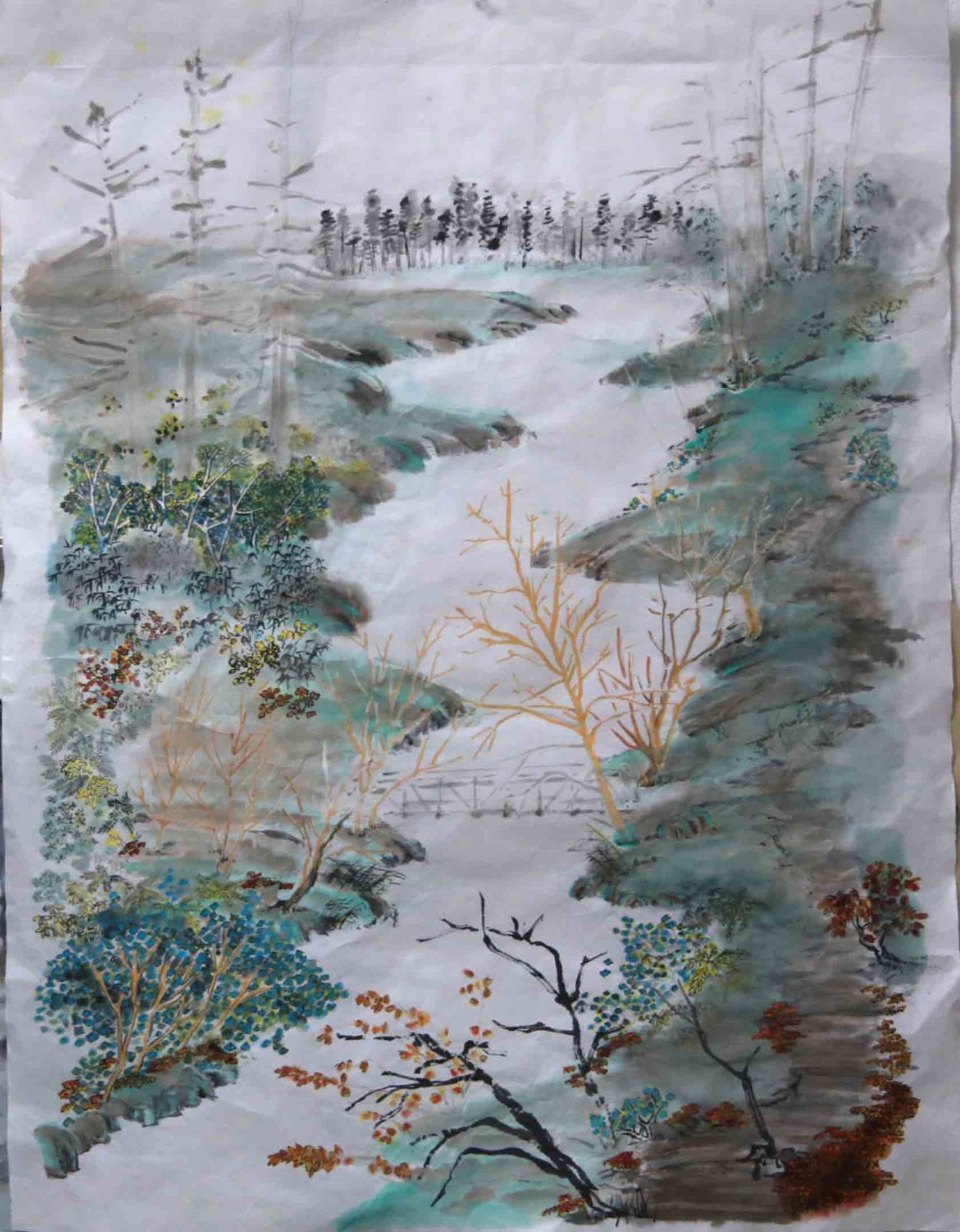
Once that problem is fixed, the left side of the bridge looks naked.  I had the small trees there to conceal the entrance, but there was no hint of a path leading to the bridge and thus the bridge seem detached and was not connected to the painting emotionally.  My faithful foliage came to the rescue again.  These leaves could be shrubs, or they could be from the trees;  a little added intrigue for the audience!


I also darkened the sky somewhat, such that it is now connected to the rest of the painting.
A margin of green around the shores to frame the landscape.  I use that as a minimalistic representation of reflections, certainly in accordance with classical Chinese Brush painting doctrine.


to be continued.

Thursday, May 30, 2013

Flamingo Tango

One of my teacher accused me of unable to Let Go !  Thus my brushstrokes are not deliberate and feel inhibited.  I was told many times to let it all hang out, because I had to go so much overboard just to reach par!

I was cutting up some paper for calligraphy, which I was in no mood to do.  Why don't I doodle, or just horse around with the brush?  Perfect excuse for not doing calligraphy!

Images of a pair of Flamingo dancing came to mind.


Not bad, I thought.  Then I decided to add in a few black areas to signal the trailing edge feathers.
Us Chinese have a saying:  Painting legs on a snake.........................................  messing up a good thing by being redundant and overbearing.  The black lines were clearly an afterthought, and not syncing with the rest of the brushstrokes.

In my disgust, I grabbed a whole sheet of 4 ft Xuan and repeated the process, except this time I figured a way to incorporate the black areas a little better.


I don't dislike it.  I thought it looks interesting.  I could do a better job on the body!  I thought the body on the smaller piece looks better.


I decided to anchor the birds a little better by writing in some darker ink brushstrokes, being careful to display calligraphic characteristics, especially with turns and lifts.

Sunday, May 26, 2013

Heron Taking Off

I was cleaning out the attic when I came across a model glider that my son and I had built years ago.
This baby has a 6 feet wingspan and is covered with blue and white mylar at the wings and white on the fuselage.  Somehow it reminded me of a heron.

I wanted to paint a heron taking off, with its dropped nose and neck.  Now I'm thinking about the supersonic Concorde.  These images are good; hopefully they can help lend some emotional content to the painting.
 front of Xuan                     


Heron taking flight would assume a lower view angle, thus framed by grassy weeds.
I first wrote the lines for the stalks, then I turned the Xuan over and retraced some of these lines with alum solution.  As we recall, alum works as a resist.  The reason to do this on the back side is because it is more effective this way.
tracing with alum on the back


Now I painted in the heron itself.  The grassy weeds now have a narrow white margin provided by the alum, thus making a better separation from the heron; creating a perception of distance.


Painted in the shore line and trees to add a perception of distance.  I tried to highlight the heron by darkening the surrounding with a wash.   The best concoction for this wash is the brush bath.  This bath water is the sum of all the colors used for this painting, and is guaranteed to provide the right tone.
   darkening the surrounding
 
       brush bath used as wash


This is what the painting looks when dried.


This is an exploratory piece.  I would like to apply what I've learned from this to a few more?