Monday, July 18, 2016

Destruction, Reconstruction

I painted this version of Beaverton Creek in a more traditional manner, trying to incorporate classical techniques of showing mixed flora and landscape.

It is now looking more awkward to me everyday.  Perhaps it is my color scheme; too vibrant.
The tree at the bottom is too ostentatious.  I remembered intentionally picking that color, sort of like a punctuation mark.  Perhaps it was mod when I did that, but now it looked really out of place.  Like going out dressed in a Victorian outfit.

Perhaps I was too busy sorting out the different techniques and I forgot about the cohesiveness of the painting as a whole.


I've been itching to do something about it.

Once a painting on Xuan is mounted, in this case on canvas, there's virtually no way to make any corrections. Then the idea came to me that I must be willing to sustain some casualties for any corrections to happen.  The question is how much am I willing to gamble or sacrafice.

Go for broke, I finally decided.  It would be a fun exercise and experience for me.

My weapon was sanding paper.  Yes sanding paper.

I decided that I needed to destroy some of the things I had built into this painting before the phoenix could arise from the ashes.

Gingerly I sanded away with my 100 grit paper.  The image was getting lighter, ever so slightly.  The lines were becoming less well defined and the painting assumed a more relaxed attitude.

OOps, I sanded too harshly.  There was a hole.

Pull back, breathe easy.  Easy does it.

I stopped before I totally mutilated my painting.  I mixed a dilute paste of gesso and ink and scraped that on with a putty knife.  


I started to re-paint on the dried gesso, changing color, shape and what not.  Everything was fair game.  I held no prisoners.


After the repainting had dried, I proceeded to sanding again.


As I discovered, the process of sanding and re-gesso and re-painting actually formed intricate overlapping layers of paint and gesso and the combined effect was almost like something done with air brush and displayed depth that wasnt there before.

I love this amalgamation process.


The lines and brushstrokes dissolved into mere suggestions with easy transition from one area to the other.
Notice the hole I created from sanding too vigorously.


The heavy lines of the bridge was sanded off and now wore a weathered look.


I retained the clear lines and saturation at the lower left corner


The right side of the bridge was obscured further by repeated sanding and re-staining


The patch where the lookout was located became just a suggestion, with mottled rails


In this rebuilding process I changed the perception of the water by introducing haze.  It could be mist, it could be the reflection of the sky.  I changed the color and shape of the foliage at the bottom.  I lightened the bridge quite a bit and concealed the ends more fully such that the structure is less harsh.  I also retained the clear brushstrokes at the lower left corner for contrast with the rest of the painting.  I expanded the color field around the trees, i.e. the barren tree in the middle had a color cast way beyond its branches. The entire left half of the painting had clusters of yellow hues.  I found myself drawn in by the scent of these baits and wanted to explore more.  The painting might look hazy but as one looked through the fog, there was still a lot of detail for the audience to travel through.  That satisfies the depth perception, in the Chinese painting canon anyways.

The painting looks western, and yet the way the mixed foliage is portrayed is classical Chinese brush, choice of color notwithstanding.

This painting now reminds me of a place that is dreary and misty and grey.   A place I call home.  A place where the disease called SAD exists.  The acronym stands for Seasonal Affect Disorder.  That's when a person suffers from mood disorder because of insufficient exposure to daylight.  The remedy is phototherapy, where artificial light is used to fill in the gap. 

I think the transformation was quite dramatic.

Thursday, July 7, 2016

Face, Second Phase, Third Phase

For my second face on that huge piece of paper, I wanted to expand on the theme of eyes closed.

No, not eyes wide shut as in that steamy movie, but something more cerebral.

For some reason, Buddhism came into mind.  I wanted to paint the attainment of Arhat.  Such state encompasses ridding of all thoughts, worries,pain, matters of life and death, and removed from all worldly  burdens.

For this face, I chose to do something a little different.  I wanted to paint it with reversed values.  I needed it to resemble a photo film negative.

I began by sketching the basic construct with very light ink.


I then worked on building up the values, black is white, white is black


Finally all the values are in


The original sketch showed slits for the eyes, where eyeballs would reside.  In this negative rendition, I intentionally left out the eyeballs.

The interesting thing is, to me anyways, that after I looked at the picture for a while, my brain seemed to work overtime and started to fill in the blanks and the image no longer resembled a film negative anymore.  It started a life of its own.  The fact that it had no eyeballs was not relevant anymore, nor was it evident. In fact it seemed like Arhat had his eyes closed also.  The eyeballs were just surreptitiously missing.

I did the face in this fashion because I had a statement to make, which I will delve into more deeply in the future.  The gist was I wanted the negative image to be a contrast with the rest of the faces.  I imagined that the audience would  sense the disharmony  but they probably couldn't tell right away.  In fact I was hoping this divergence would create a certain level of discomfort or apprehension but one was not able to attribute to the source.

For the third face I chose a figure from the Buddhist theme again


here is the painting with all the faces


At this point I really am not sure what my next step should be.  My intention is to call this quits; before I do something stupid.

Sunday, June 26, 2016

Saving Face

I was having fun painting the face of the Dream State piece.

Make hay while the sun shines, strike it while it's hot....... enough of dorky cliches!

I decided to do more faces.


Well, that's one face.  It's a start.

My intention is to paint a few faces on this piece of Xuan, perhaps carrying the same mood or theme.   I'll let that thought brew for a while.

Wednesday, June 22, 2016

Oil and Water expanded

Knowing that my oil and water method leads to results, I am itching for new experiments.

I recall the picture I took of people doing Tai Chi in a courtyard dotted with sculptures.  In this picture I had the face of a sculpture in focus and the rest of the scene was out of focus.  I decided to paint this scene.

My premise is to create a conflict, or contrast by utilizing focal points and ink tones.

My first task is to paint a face, a face of a statue.  This face is consciously distorted; not only to remove any references or semblance to photography, but also to format it to fit the dimensions of my Xuan.  Bulging eye, fat lips, short chin.  Really complex emotions.  Somehow it seems to work.


I now tidied the shadows of the face a bit, and begin my painting of the Tai Chi gestures.  I am using oil to depict my gestures.  This is set on a red matte board so I can more easily see the figures.


The wet areas around the oil laden figures is a diluted ink solution, ready to reveal the oil slicks as voids when dried.


I took this picture in dim light to better show off my gestures painted with oil, revealed by ink.


I am at a point now where I don't know what my next move should be.  I don't know what else to add to or modify.

At this point, I'm also concerned about whether the oil would go rancid or not in the future and how is it going to affect my mounting.  Oh well, too late to worry about that now.

Good time for a break.

I am calling this piece Dream State, or Der Traum; for now.

Sunday, June 19, 2016

Getting down to the nitty-gritty of Suliao Xuan Ban

I See The Light is ready for mounting and framing.

To say that I'm a little apprehensive is an understatement. I' really don't want to ruin my piece in this delicate process, especially now that the piece has been adjudicated into an exhibition.  I need to have it done.

I'm employing my Suliao Xuan Ban method to make the painting appear like a float; to highlight the fragile Xuan and the starkness of my light show. This process involves the dry mounting process, when the tissue paper like Xuan is affixed onto a sheet of clear plastic.  The adhesion is provided by fusing the paper to the substrate with heat transfer fusion paper.

In the wet mount method the starch glued piece can be soaked to rid it of adhesion and begin the mounting from ground zero if a boo boo was made.  This luxury, if one can call that as such, is not afforded by the dry mount. The bonding cannot be reversed easily.


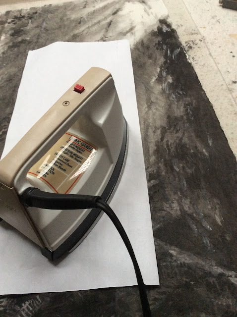
First the fusion  paper is tacked onto the clear plastic. My favorite tool for this purpose is a heating iron left over from my model airplane building days. I used this to iron on the skin to the spars of  the models.

After the backing on the transfer paper is peeled off, my attention turns to the air bubbles.  I burst them with a pin and press them flat using a rubber eraser, avoiding body oil from using my fingers.  I don't know if such precaution is necessary, but I rather be safe than sorry.


The Xuan with the painting is now laid on the bonding surface, and is ironed on through a cover sheet to avoid marring the painting.   The procedure of tacking  in place with the small iron is repeated, followed by using a regular iron for a uniform surface.  The trick in tacking now is to use sufficient heat for some fusion to take place, yet not too hot to allow wiggle room for the Xuan to shed its creases and wrinkles.  This is where tender loving care comes in. The big iron is used only after I am satisfied with the quality of the painting's surface.


A blank piece of Xuan is then bonded onto the opposite side of the plastic for white balance.


Here is the finished product in the custom frame I made,


The white border around the painting is not matte board, but rather the wall behind the frame.

Thursday, June 2, 2016

It's Like Oil & Water

I've been struggling with my lines.  The quality of lines.

I seemed to be sketching and tracing, rather than laying down decisive, strength laced calligraphic brush strokes.

I know I must practise on my calligraphy, there's no two ways about it.  Somehow I resent such exercises.  I feel restrained, contrived,  trying to copy all the nuances in each brush stroke precariously, all the time wishing that I could just write like that.    My frustration is that I never seem to be able to lift any benefit from this arduous task.  Whatever I learnt from  brush calligraphy somehow defies to be translated into painting.

No I'm not having the blues, I just happen to find my old Tai Chi painting from the pile in the corner of my room.  I have the urge to revisit that subject matter, with a twist this time. I'll side step the lines. Find an easy way out.


I shall do the gestures in forms and not line figures.

Since I've been doing black and whites lately, I shall continue my pursuit in this vein.

Instead of using alum to block off my forms, I decided to experiment with using oil.  My theory is since oil and water don't mix, perhaps the space occupied by oil will prevent water or ink from seeping in.  So goes the experiment.

The following is one of the gestures done with just plain cooking oil.  I let the oil dry overnight before I attempted to do anything more to the experiment.


I found out that the oil patches could be overcome if I used concentrated ink.  So I throttled back and started out with a more diluted solution, subsequently building up to the desired degree of blackness.  The oil laced gestures actually helped me tremendously in deciding which part should be filled in with ink or not, and also allowed me some freedom as to modify the boundary between oil and water.  I found myself morphing the figures as I went along and it was quite exhilarating.  Almost like chiseling out a marble  figurine.


Then this idea suddenly crept into my consciousness.  I've been leafing over pages on acupuncture books and I was in the process of trying to understand the 12 main meridians and the organs they are associated with.  Why don't I illustrate my gestures with these meridians.  Who knows, they might be educational, for me at least.  My plan is to gather them into groups of Hand Ying, Hand Yang, Foot Ying and Foot Yang, plus the Du and Ren (Governor Vessel and Conception Vessel).  This should account for the twelve regular meridians, plus two of the eight Vessels.  That's a plan anyways.

Here I painted in the three Foot Yang meridians (Stomach, Bladder, Gall Bladder) in red


I also experimented with depicting the meridian (Foot Bladder)  from a second sheet on the bottom, since the figure part is quite translucent


Foot Kidney meridian (Ying, in blue)


I've been ruminating.  Had my command of brushstrokes been better, I would never have thought of all these "tricks" to experiment with.  I suppose if everyone was naturally beautiful and perfect, the hair dye, mascara, lip stick industry would not have existed.  Necessity is the mother of invention.  Just saying!

Before I segue too far from the topic, I just wanted to say that I'm not too happy with the portrayal of the meridians.  I shall look for a more artistic way to depict them.  I am hoping for a way to combine science and art into one.  

In this particular instance anyways.

Thursday, May 19, 2016

For What It's Worth

There was a painting competition for high school students.  The subject matter was flowers. This happened in Hong Kong.

This was probably a project sponsored by the likes of urban parks council or parks and recreation, etc.  A noble effort to promote art and participation and drew attention to the merits of a city park.

The result of the competition, along with the works was posted outside the administration office, where the public can view during operation hours.

The  First Place winner of the group is


The Second Place winner is


I remembered the unsettling emotion I felt when I saw the results.  I was confused, perplexed.  I felt the judges were wrong.

It really was none of my business.  I was just someone who loves and appreciates painting, certainly not a juror by any stretch of the imagination.  Art is a very subjective thing.  Beauty is in the eye of the beholder.  How do you agree or argue with a urinal being accepted as modern art, or breaking a Ming vase as a program of arts had any redeeming values.  I am venting again with these off the cuff remarks.  My apologies.

Anyways I was prepared to do a rather informal, unscientific survey of my own; I asked my painting cohorts to rate these 2 paintings.

I did not tell them what this was about or who did them.   I just presented them with the 2 images and asked them to rank them.  They did not even have to tell me why they ranked them that way.  I was not looking for a reason, just a ranking.  I believe this way people feel a little more secure in the sense that they need not expose their thoughts or feelings or biases.

To my delight, only one person agreed with the judges.  The rest of us thought it should be the other way around; that the Second Place winner should be awarded the First Place.

I don't know if this has anything to do with our social indoctrination or our immediate cultural environment.  I am sure that it does.  I have my own theory.

The top painting seemed more exuberant, full bodied and vibrant.  A value more often associated with prosperity, happiness and abundance.  It closely animated the Chinese saying of A Hundred Flowers Blooming Together.   Auspicious is the word that comes to mind.  A more traditional value in the Asian culture.

Whereas the second painting seemed more abstract and airy.  Ostensibly a merit in the Xieyi style of painting, nonetheless succumbed to the relative frugality of floral arrangements. There was a distinct feeling of the subject matter and the background, the host and the guest.   Whereas my cohorts and myself are Asians but we are now immersed in western culture and perhaps are more receptive to the  less representational presentation.

Or, my cohorts and I instinctively shared the same affinities.  The fact that we agreed on something just says we have the same taste, not that we are right or wrong.

Our tastes have changed.

Just a thought, for what it"s worth.