Thursday, February 8, 2018

Rehearsal


The demo event at the cultural festival is fast approaching and I would be less than honest if I admit to not having any anxiety.  I know I have a plan, but unlike working at home, out there anything can happen, including boo boos. For all to see, nonetheless.

Just received word today that a local TV station will be filming a little segment on me as part of the festival promotion.  If that doesn't stoke my fire, I don't know what will.

To assuage my trepidation I decided to run through my steps in painting my dog again.  I call this a step by step rehearsal, to have some discrete and concrete ideas on what each step would be.  I am doing this for my own benefit.  I can't be mumbling and be taking too much liberty in which part I would be painting next, as if I was at home.  I need to be able to parlez my scheme and the group audience need to be able to follow me in an orderly fashion.

For my TV appearance, I decided to use a Xuan that I use for calligraphy mostly.  It is quite absorbent and does not bleed too easily.

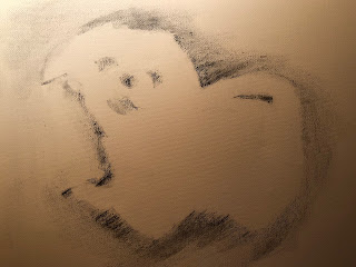
First step is do record my template on the Xuan, rubbing out the silhouette with charcoal.

Then write in the eyes, nostrils and the mouth using dark ink.  The voids in these small areas are important.  They represent the glint in the eyes, the nostril openings and the tongue.  So try not to fill everything up.


Keeping the brush which is drier by now, and employing side-tip, block in the dark areas between the front legs, below the belly and in front of the hind legs and the junction at the butt and the upturned tail.


Wash out the ink somewhat from the brush to achieve a lighter shade, write in a big mustache beneath the eyes.   Join the nose to the lips Write in the chin. This helps to define the snout of the dog.


Write in a lone ranger's mask around the eyes.  Now the dog has a face.


Write in the right leg ( left on paper )


Write in the left leg ( right on paper ), leaving a big "S" void, hinting a highlighted contour of the left leg.  Write in the chest area with a darker shade to bring out the chin.


Try to leave a gap at the bottom of the eyes.  This void describes the highlighted profile of the snout, and gives separation between the muzzle and the eye sockets.


Using a light shade with a side-tip, lay the brush down and execute big bold strokes to round off the hind quarter.... and accentuate the "S" void to suggest the front left leg.


Write in the tail, leaving the top margin blank, to suggest the back lit areas of the tail.
I forgot to round off the lower lip of the dog by writing in a lighter margin beneath the lower lip.
So I'm doing that now ( red circled area )


Using a light wash, go over the edges of the animal where the charcoal was.  This helps to set the powder and one can use a darker wash at the bottom to cast a shadow from the animal.


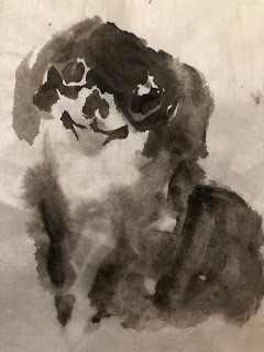
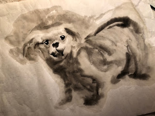
I've also tried the same painting using different kinds of Xuan;  not only as a chance for further practice but I wanted to see the different results

my calligraphy Xuan


my regular Xuan


my semi-sized Xuan

on canvas


I used the calligraphy Xuan because it is more forgiving with regards to water content of the brush.
I thought the semi-sized would be the easiest but the result was disappointing for me.  The painting looked harsh.  I liked both the regular Xuan and the calligraphy Xuan in this exercise.  The one on canvas turned out really nice.  That was a complete surprise.

So is this dog going to be the harbinger of an auspicious year to come?

Wish me luck.

Sunday, January 28, 2018

A Dog Day Afternoon, the next day

My reason for creating a template is two fold.

The most critical one is that the image must be duplicated without too much fanfare by just about anybody. Since my demo activity is going to be in cultural fairs and I could not pick and choose my participants, I need something that anybody can follow.  I've had kids as young as toddlers ( and most often than not, their parents ended up doing the painting ) and as old as senior citizens.  When each session has 20 or more people, it is not likely that I will be able to help draw a proper outline for each and every participant.  The importance of properly locating the eyes and the nose necessitates a stencil that dictates such locations.  It is my belief that if I can help to place the windows to the soul properly, then the painting is 70 percent complete.  I trust this is the reason why Chinese placed such an importance into painting in the eyes on their dragon boats.

As it turned out, there was a third reason that was not readily apparent to me, and it was a rather serendipitous observation, which I will explain later.

I forged ahead with my stencil design


printed the design on my printer and cut out the location for the eyes, nose and mouth.


With this stencil on my Xuan, I used a charcoal stick broadside to create a silhouette on the paper


I am happy with my progress so far.  Armed with this gadget and methodology I can assure myself that this process is repeatable, and no prerequisite in brush painting is required.

Next on my agenda is to explore how to transform this sketch with the least amount of brushstrokes and shades of ink into a painting.


Notice the void areas in the last example.  The fact that I did not completely filled the template space with ink wash resulted in a back lit effect.  The void space above the head and behind the rear quarter not only suggests back lighting, but also lifted the animal away from the paper and giving the painting a 3 dimensional touch.  By painting in with charcoal around the border of the template, I am effectively defining the contour of the dog without a harsh ink line.  As the ink wash is allowed to dry on Xuan, it bleeds into the surrounding fiber, giving the outline a furry feel.  This is the third reason that the template is a good idea in this endeavor.  I now need to remind my audience to leave those areas blank!

Now that I know what I'm dealing with, I am able to settle down and concentrate on creating a proper painting using my scheme.


The stencil has pupated into a lovely puppy, suggesting an auspicious new year.
I'm looking forward to the demos now.  Let us play!

Saturday, January 27, 2018

A Dog Day Afterenoon

I am finally back home.

All the travelling was fun, but like everything in my life I was rather passive about it.  I worry about expenditures, scheduling and travel companions.  Well it  just happened this time.  I wasn't planning on these trips.   Something that didn't "just happen" for a while was my painting.  I was not motivated.  Obviously doing brush painting on the road is not like rendering a pencil sketch.  To be honest, my heart really wasn't in it.  Strangely enough I don't feel too guilty about the hiatus.  Perhaps the stars had planned the absence for me, knowing how passive I am to seek it.

Well someone did nudge me a little lately.  Chinese New Year is approaching and I was asked to do demo again, as a program in a couple of the Lunar New Year celebration activities.  This will definitely help me get back onto the saddle.  The stars will not abandon me!

It is time I fill my brush wash basins with water and cut my Xuan into smaller pieces for my prep works.

This is going to be the year of the dog.  I've tried to paint dogs before I embarked on my journeys.  I was goofing around and tried painting on photo paper.  I quite enjoyed the process and the result wasn't too offending;  I was gratified by how vivid the paintings looked.  Yet I wanted to attempt a more traditional approach, and most of all, something simple.

In order to do a demo in front of a group, chances are 99 percent of the audience are novices.  This is not the time nor place to talk about techniques or aesthetics.  The process needs to be result oriented.
It needs to be fun, simple and guarantees a result; a presentable finished product.  In this case, the painting of a dog.

I thus gathered my thoughts and turned on my TV.  I am one of those lucky people who is not perturbed by noise.  The noisier the environment, the better I am able to concentrate.  I don't know if this is what happens when one lived in an urban jungle, or the fact the I grew up inhabiting a 500 sq.ft. flat with 6 other family members.  I often found myself studying not in the library, but a noisy restaurant; a bowling alley; a mall.  Silence scars me.  My mind wanders in the absence of stimuli.    I hate to admit it, but I sleep with my radio or TV on quite often.

I started to doodle with the TV chattering in the background;  trying to reacquaint myself with my brush and my Xuan.  The result was disastrous.


I had no control of the brushstrokes.  I had no control of the water content of my brush.

I was reminded, and humbled, by the fact that good calligraphic strokes are the basis of Chinese brush painting.  If I am still fighting this nightmare how am I going to sail through my demo and how do I expect the general public to do that?

Then I thought I would do something that employs more of a wash than just lines.  Everybody can splash, right?


That wasn't too bad.  It had spunk.


How about this one?

I was really trying to stay away from painting anything that came close to being a Shih Tzu or a Pekingese because I was trying to get out of the stereotype.  I was trying to not paint something banal.

I picked up a couple of New Year's greeting cards from a bookstore while I was travelling.


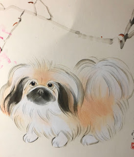
I am in no position to comment on the technical meritsof these cards, but I must admit that I was a little turned off by the dogs on them.  They seemed vapid and without a soul.  The same reason I am tepid about my dog paintings in the past blogs.  I know this is purely a very subjective opinion from me, but the question I asked myself would be: do I want this animal to be a representation of the auspicious year to come?

Puppies are so cute and I recall this little poodle mutt that I could relate to.  Perhaps I should paint something with a emotional content.  That is my motivation.  Now I have a beacon to guide me.


Well nobody said it was going to be easy.  But look at those big eyes and the tongue hanging out!
I might be onto something.

But seriously, I began to work on this feeling that I had.

It's going to the the year of the Dog.  Man's Best Friend!  A dog is loyal, trustworthy, always of service.  I need to be able to sell this as the harbinger of good fortune for the year to come.


I know the sketches looked rather haphazardly done, and they were, but I was really anxious to put down what I felt about the personality of the dog.  I could clean up my brushstrokes as I became more comfortable with myself.

Of course the motivation for my painting all these are always on my mind.  I have a job to do, and that is to allow an average person to successfully paint a dog.  I am challenging myself to paint something that can easily be converted to sort of "painting by numbers" and yet possesses a suggestion of artistic merit.  I am sending my hippocampus into overdrive.

What I need is a stencil.  A template.  Something that is repeatable.

I proceeded to work on this premise.  I drew an outline around my animal.


I wanted to explore the feasibility of such a template.


Saturday, November 11, 2017

Putting On Make-up

I was desperately trying to find something to do; to get myself back on the routine, as a way of dealing with jet lag.  I was  even more determined to not do what I needed to do, for the fear of opening up a Pandora's box.

I needed to get organized for an upcoming show.

As I was sifting through my pile of unframed pieces, I came upon this black and white rendition of
Lan Su Chinese Garden, a classical Chinese garden built with the corroboration from the city of Suzhou.

It wasn't a bad painting at all.  It was done with a black and white theme, adhering to the classical ink and water wash theme.  That was my intention at the time the painting was conceived anyways.

There are several flaws that I need to mitigate now that I have re-examined the work.  The painting needs an area of focus, an area of interest.


The red circled area (the Taihu rock) could use a more three dimensional feel.  The yellow circled area lacks definition and seemed incidental.  The blue circled area screams for a better association with the rest of the painting.

Instead of amelioration with ink alone, I am asking for help from the color department.  I am constantly reminded that this is a painting about a classical Chinese garden and I don't want to make it audacious.  So Less Is More, that's my mantra.

I judiciously used Prussian blue ( toned down with ink) and tea ( yes tea ) to reveal the bright and dark areas of the Taihu rock ( red circled area), leaving sufficient void space to illustrate the highlighted areas.   The presence of color helped to bring out the structure.


I selectively filled in the yellow circled area with Prussian blue, tying it together with the Taihu rock, setting the stage for the immediate foreground.  The vignette corner was kept untouched, to further bring contrast and focus to the courtyard.


In the blue circled area, I darkened the the top and right areas of the painting to increase the contrast.
I also darkened the white board below the soffit overhang, just above the lattice work.  The original white bar was too glaring and did not fit in with the overall value of the pavilion.  In fact I found that a distraction.  The negative space suggesting a small tree was further accentuated by darkening the surrounding area.  The same treatment was applied to the mottled leaves above the ridges, making the flying roof ridge more dramatic.  The void area to the left of the pavilion was kept to create depth and separation from the background.

Finally tea (darkened with ink) was applied to the bottom of the rhododendron plant to the right of the Taihu rock. giving weight and a presence to the plant.  The same color treatment was applied to the plant at the lower left hand corner, making the foreground of plants and rocks a lot more cohesive.


In the end, I do like the new look of my painting.  It's like putting on a very light make-up and eye shadows to a beautiful lady.  She retains her calm and elegance and ever so slightly catches you with her glimpses.


Friday, October 20, 2017

Xuan vs Presentation Paper

I happened to have some presentation paper (Epson) laying around so I decided to try to paint on it.

In a sense the presentation paper is more akin to normal paper, especially the way it curls when wet.


Then I wanted to paint the same dog on regular Xuan.  Anticipating that it would be difficult, for me anyways, to have good control of the void space, I decided to not incorporate the negative spaces into the animal.  Except, perhaps, by the trailing tail, hinting at the presence of a body.


I think the Xuan version is more fluid, allowing a more intricate transition of tones.

Thursday, October 12, 2017

Another Try At Glossy Photo Paper

Adhering to the dictum "strike it while it's hot" I attempted another dog painting on the HP paper.

I chose to do just a headshot this time.


Painting on photopaper is almost like doing watercolor on glass.  The surface provides no traction at all, so the tactile feel of the brush is sorely missing.  Water coalesces at its own will, yet the track is revealing as it pertains to how the hair in the brush is lined up.  In fact, when I find any traction at all, that's an indication that the coating on the paper is getting gel like and is ready to peel if I'm not careful.  It makes the task of rendering a tonal difference from a single stroke almost impossible.  It forces me to pay attention to my brushstrokes.


so the trick is to add each layer laboriously, all the time being mindful that the previous layer could be peeled off because the surface coating is weakened by the wet brush.


Thursday, September 28, 2017

Painting on photo paper

I was toying with painting on photo paper in my last post.  I really don't have a good reason for why I chose to do that, perhaps subliminally I knew I was doing a portrait.

Anyways I was a little astonished at the result.  The finished painting seemed to have the pop that I've not seen from using Xuan.  Perhaps the photo paper was designed to reflect more intensely from the ink or pigments?   Same reason they make projection screens with different gains for a variety of venues.   The paper I used was HP premium plus photo and proofing gloss.  I'm not trying to endorse or advertise for HP, but I should let people know in case they want to play with it too.  I suppose any photo paper would do the trick;  I'll experiment with matte photo paper when I have a chance!

I thought I would paint something cute and cuddly; like Pekingese, or is it Shih Tsu.   I certainly am pretty naive about the different breeds; as a kid I would generically grouped them as lion dogs, because they look like lions with manes.  In fact I think the word Shih Tsu sounds very close to the phonetic sound of  the word lion in mandarin.  Perhaps it was a mis-communicated lost in translation. Oh for heavens sake, a mutt then.

I started out by claiming the rough shape and features of the animals.


I was using tea color and a dirty brush that was not totally devoid of ink.  My sloppy trait!

Working to define the snout and the eyes a little better, and adding facial hair to help define a 3 dimensional topography


I tried to use plain water to wash off the ink a little around the snout and the eyes to create the pupils etc.   It appeared that I needed to reinforce the highlights more by using titanium white.  I also inadvertently let some water dripped onto the front leg of the dog on the left.  As I was trying to remove that water, the surface peeled off like a face mask, resulting in a blank spot.  Obviously how much water I allowed on the surface affected the final result.  Too much water resulted in a peel off.

I then dressed up the dog on the right with titanium white mixed with tea color and vermilion, and improved the pupils and the nose


extending the work to the left


This is when I decided to get cute.  I thought I would add just the slightest hint of shadow to the duo.
The slightest!

So I diluted my brush wash, dipped my big brush in the container, gave it a good whirl, allow the brush hair to soak up an ample amount of liquid, hoisted it from the container and flung the brush onto the photo paper.  Just the slightest hint of a shadow!

I was so pedantic.

I thought I was doing a wash on Xuan.

I had forgotten that too much water on photo paper actually peeled off the surface if I laid a brush on it again.  I was amnesic about the hole I created to the dog on the left.

When I tried to dab up the excess water, I created 2 peeled streaks on the photo paper; on top and under the 2 dogs.  A hasty attempt to dry the area further actually ruined it more.  A track of what seemed like eraser debris is formed.  Whatever was the coating on the photo paper was now like soap scum on a bathtub.   The only difference is I didn't know what kind of detergent to use to rid of it.   I should have quit when I could.


In disgust I threw the piece onto the floor.  I wanted to stomp on it.

After sulking for a couple of weeks I decided to hide my mistake.

I remembered the masterpieces of paintings or calligraphy of ancient times had all these seal chops on them, as they were passed from emperors to emperors, connoisseurs to connoisseurs.  Those were stamps of approval.  So why can't I do the same?!

I took out my chop collection and unabashedly sealed my own fate. [ pun intended ]


I should work in a junkyard as a salvager.