Wednesday, August 18, 2010

Wanderlust


Songs and Hymns
soar to the Heavens

This moment fills me
intoxicates me

I surrender myself to wanderlust


The above is a rough translation of the Chinese writing in the painting.   This style is called  the "grass style" or "sloppy style"  of the Chinese cursive writing.

This flowing style of calligraphy matches quite nicely with the very raw and bold form of interpretation of a bird.  No attempt was made to hide or ameliorate the brush strokes.  This really is the essence of the Xieyi style of Chinese brush painting......concrete thoughts, but free brushes.  

Good or bad, let it all hang out

Tuesday, August 17, 2010

Calligraphy

translation:

If
LIFE  is not witnessed by the present moment
then
when does

Living
is
to be able to
Do As You Wish

Tuesday, August 10, 2010

Isn't Being Cute Enough?


In the routine of preparing materials for tutoring, I have to answer a fundamental question about Chinese Brush painting, and that is "Isn't being cute enough?"

The word "cute" can embody a broad interpretation, but I shall use it in the context that it attracts an audience. Case in point is some of the so called Chinese Brush paintings one sees on the net or fair vendors are often crowned with the verbage "Isn't that cute?". I shall use paintings of bamboo to illustrate my point.

Bamboo is one of the 4 required proficiencies for people studying the floral theme in Chinese Brush painting (the others are plum flower, orchid and chrysanthemum). Bamboo is a study of many virtues in the Chinese philosophy. It is stiff, yet flexible. It bends but does not break. It is strong, yet hollow. It symbolizes an ideal personality, being forthright, without being conceited. Being flexible without being manipulated. Appears to be hard and cold, and yet has the room inside and the capacity to accept.

Thus the proper way to paint a bamboo is always straight up, stern and yet not overbearing. It must show the virtues, then one goes about the business of composition, where to park the leaves and the branches. Bamboo is a plant of the grass family, and yet the branches and the main stalks are always straight or bow like, ready to bounce back, and never bend and twist like noodles. The segments are usually painted using the bone method, usually using straight tip. The rings around the segments are very specific in the sense that it shows the remnant of the sheaths of the shoot. It also tells you whether you are look up or down the bamboo by whether is arch is an upward bow or a downward bow.

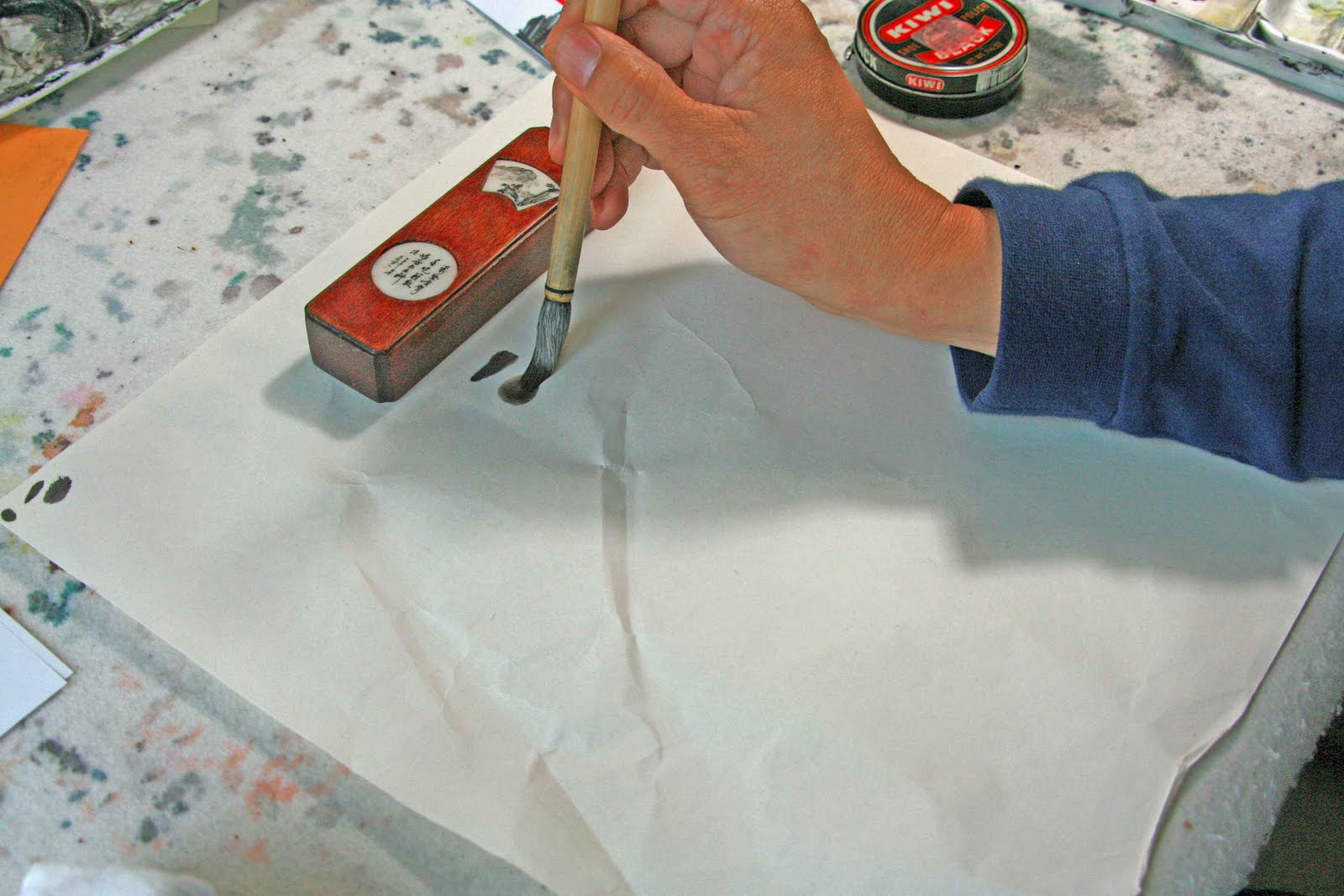
My experience with painting bamboo is very limited. I've only done my obligatory homework pieces when I was taking lessons. I used bamboo as a teaching subject because it truly is the most fundamental way to learn Chinese Brush strokes. It teaches one how to hide or show the points, straight tip, twisted tip, press and lift and all that jazz. In essence, one does not "paint" a bamboo, but "writes" a bamboo, because it requires the application of all the basic methods of the brush. Every segment of a bamboo painting can be broken down and reassembled in some Chinese calligraphy. It is like a basic Kata in martial arts. One has to learn a few basic moves to execute the Kata.

The left picture is the "cute" visualization of the bamboo, but is very unbecoming of the brush art because it answers to all the bad qualities of a bamboo painting. The branches and leaves are twisted, looking more like true grass than bamboo. The segments are not done right and the rings are feeble attempts to point, press, draw and lift. Yet these types of bamboo drawings are quite prevalent in greeting card stores, book markers. Yes they are cute, albeit not done correctly with the Chinese Brush strokes.

The picture on the right is the more accurate way of painting a bamboo using the Chinese brush. It showed the bone structure, the correct brush stokes and a gradient in ink tone. However it also has a lot of boo boos, i.e. the thin branches failed to separate and the nodes fused together, looking like a rope with knots on it. The leaves on the left hand side should be pointing downward instead of up.

So the six million dollar question is..... can "cute" and "proper" co-exist? I suppose this is not necessary an ideological debate. In our vernacular, does the word cute mean more than being pretty and fetching? More importantly I suppose, is "cuteness" what an artist seeks?

I suppose this is my fervent attempt to bring to light what Chinese Brush painting is about and ask all of us to be a more educated audience, so that we can all truly appreciate the art form, without the facade of being "cute".

Tuesday, August 3, 2010

Artist Trading Card


Part of the upcoming Portland Open Studios experience involves the creation of artist trading cards. I have done those before but I stopped short of affixing the image onto the card itself. Duh!! Trading cards without the cards, rather innovative!

Anyways now that I've been set straight, I applied gesso onto the back of the cards and all of a sudden they have a life of their own. They curled up like cooked shrimps.

For ease of application, I used rubber cement for paper instead of my starch concoction. This procedure did not correct the shoehorning of the playing card.
Fortunately a rolling pin did. I used a wooden rolling pin on both surfaces of the cards and this was done when the cards were almost dry. I then slapped on a thin coat of satin varnish to protect Xuan paper surface.

Sunday, August 1, 2010

Classical Landscape


This landscape painting is portrayed in a rather minimalistic fashion. The lack of color forces one to devote all their attentions to the composition and the line structure.

The painting is inspired by the Columbia River Gorge. The work was first done last year but I needed to change a few things. The opposing walls of the gorge is characterised by the 2 rows of serpenting land masses, obviously an exaggerated vision; nonetheless sets the stage pretty well in this application.

The trees in the foreground are painted in the classical sense of tree representation. Thus the leaves are circles, horizontal lines, and slashes of various shapes. This is very common practice in describing a mixed species woods.

The little skirts at the bottom of the hills is decorated with dots. These are there to represent shrubs, structures like posts, boulders, but the main function is to break up the lines so that they are not continuous ropes....... a no no in Chinese Brush painting. The "churn" method is the hemp line style. Churn lines are used to describe the texture and the topography of the hills.

Perspective is achieved by the obvious fading out of the land structures, with no discrete brush marks of whether it is water or fog or whatever. This is the all important "blank" space in the painting. Perspective is further achieved by the relative saturation of the ink. One can tell very easily that the near subjects are much darker than the distant destinations.

The one big failure in the painting is the bottom boulder, which assumed a different persona from the rest of the painting. The lines are too entangled, rendering it much more jagged than the others. The dark lines also give it a dirty/solid look, which is very uncharacteristic of this painting.

A painting like this is quite easy to consume, I think. Right off the bat you know that it is Asian. The downfall is that it pigeonholes what Chinese Brush painting should look like. This is due to the fact that all these "classical" rules or methods of painting is followed and it is easy to give the impression that all works have the same look and feel to it. This style of endowment have been around for at least a thousand years. Whereas it is important for us to study the techniques and basics of the Chinese brush, it is not necessary to keep on repeating or try to reproduce the styles that was popular way back when.

Tuesday, July 13, 2010

Evolution of a Heron


Months ago a giant array of feathers visited my backyard. As it descended it momentarily interrupted the rays filtering through my window; that was how it caught my attention.
So I wanted to paint a heron.
The photos tell the story of my attempt. I started to draw out what I recalled as a heron (top photo).
Obviously it looked rather awkward, in fact I had problems deciding what length of its legs should be; hence the two different lengths. As we go down the line, I was trying out the brush stroke styles and the ensuing image takes on a better resemblance of a heron. I have a little bit of practice now. I must point out at this point that my failure in depicting a heron not only lies in the fact that I knew very little about the bird, but I really did no know what I wanted to paint. I was more like a field biologist, wanting desperately to record its features. What grabbed my attention were those seemingly long legs and that gaze.
As the bird frequented my place more often, I realized what made it a heron was not its features, but its poise. The heron's neck seemed to tell all the stories.
With this new understanding I arrived at the third photo attachment.
The outlined drawings (4Th and 5Th photo)are perhaps more "classical"; in the sense that it is how most herons are painted. A smattering of colors, correct proportions to say that this is a heron and not a goose.
Last week the heron stayed for over an hour and was almost oblivious to my presence.
I decided to try my hands again in painting, this time using the brush to paint the forms, rather than relying on lines to define the boundaries. My emphasis now is totally on the neck, which narrates the heron so eloquently. The bottom picture is a record of that encounter. I like the motion and the energy this painting emits.
It seemed raw, but is so honest!

Monday, June 21, 2010

Bi-Fa (pronounced B-Fa)

A reader was a little taken aback by my comments in "What Brush Stroke". The quibble was about my tone of the language. I seemed to suggest that only Chinese Brush Painting pays attention to brush strokes. Whereas I know very little about other brush works, i.e. watercolor, oil, acrylic etc, I do know that Chinese Brush Painting places foremost emphasis on Bi-Fa, the method (discipline) of the writing instrument. Calligraphy and painting is about the same foci, Form and Bi-Fa (brush strokes). In fact, many teachers in Chinese Brush Painting would insist that students "write", and not "paint" the lines.

The Chinese Brush owes its characteristics to a round body with a pointed tip. I am told that there are 8 basic techniques in applying the brush on paper, utilizing not only the tip, but also the belly of the brush. Couple this with various speed, angle, degree of dampness, and whether the point is split or solid, the permutation on the possible ways to reveal with a Chinese Brush is endless.

The picture insert shows the start of a line with a point at the top line. The second line started with a rounded stroke, which is accomplished by travelling the brush in the opposite direction to begin with.


The importance of understanding the basic premise of the brush, is to understand how to take advantage of the brush. In this example I am trying to paint a "line" of various thickness. As I traverse the brush across the Xuan paper, different pressure is exerted, and the brush responded by spreading( or condensing ) its coverage.


Now we shall see how this "line" applies to painting. In the example, I am painting a dragonfly.

The picture on the right shows the result done with this proper technique. The "wing" is a line written with various thickness. It is all about the control of the brush. The wings look natural, and possess "Chi" (energy) and have "Li" (strength)

The picture on the left is done with the wrong technique. I blocked in the color. You might say that I "painted" the wings instead of "writing" the wings. Upon close examination, one can observe the border that I had painted around the outline of the wings, and then filled in with color. Obviously they look like wings, but they are devoid of the "Li" and the "Chi" shown on the other dragonfly. Perhaps it is the small imperceptible irregularities in the brushed shape, versus the static intentionally painted outlines that bestows the energy. I suppose this is the argument about hand tailored suits and hand stamped Ferrari bodies.


One might argue that to the casual patron of the Chinese Brush Painting, what is the big deal. The big deal is whether it matters to you or not. If you accept the premise that Chinese Brush Painting is about Bi-Fa, then you must learn to appreciate that.

You can play a G arpeggio on a violin using all 4 strings, but you can also play the G arpeggio using only the G string. To the untrained ear, they are the same notes. However a violin patron could tell the difference in the timbre of the notes and appreciates the skill level of the performer, lest not forget the composer's expressive intent in having all the notes played on the one string. Same dictum can be applied to the understanding and appreciation of Chinese Brush painting. It is not necessarily a matter of whether my art form is better than yours , but where the emphasis lies.