Monday, June 30, 2014

An old friend re-visited

My formal training in Chinese brush was in landscapes, but I found myself doing a lot of geese, insects etc.  I just paint whatever captured my imagination and more often than not, these critters caught my fancy.

I had done a few  insect paintings in the style of Master Qi Baishi over the years.  The two that I am most fond of was one with a cicada and one with a grasshopper.  I decided to re-visit the grasshopper again.  I want to see if I can show an improvement in my brush.

I found a piece of  triple Xuan measuring 15 x 18.  I wanted a thick paper because I wanted to do it a la Xuan-boo style;  a thicker paper would stand up to the abuse I put it through.   I will be preparing my own canvas and making my own frames etc.    I use the commercial painters drop cloth as my canvas.  I enjoy the more pronounced texture from the drop cloth, over the anemic feel of the canvas frames sold in stores.

The problem ( and the advantage ) of using commercial drop cloth is that the fibers are not always uniformly wound.  Sometimes a few loops go astray and swell inordinately with the application of Gesso.  This apparent irregularity actually adds to the uneven feel and the character of the canvas.

I started out by laying down the stalk with a  coarse brush.  The stiff bristle makes a bone brushstroke that much easier, and the white streaks left at the end of the stroke is very enticing and enigmatic.


I did the upper leaves a different hue from the bottom ones to add dimension and interest.


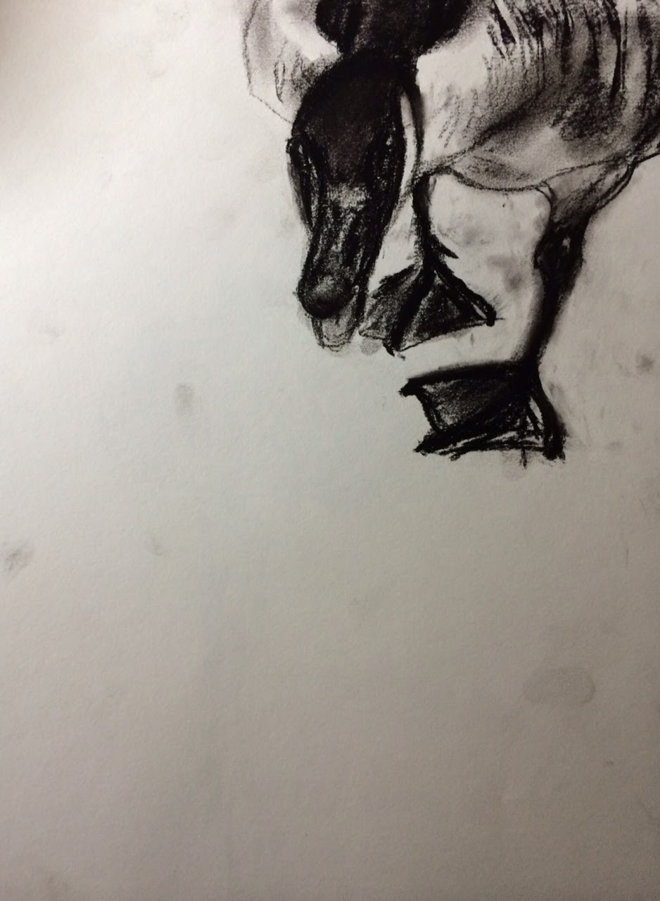
Using very faint indigo and ink and pencil, I blocked in the shape of the grasshopper.


The insect is coming into life with a fine brush.  This part of the painting is more Gongbi than Xieyi.


A close-up reveals  the interaction between the fabric and the brushstroke.  At this point, no one would have believed that the painting was done on Xuan.  The paper assumed a feel of the fabric underneath.


Made a frame and colored it with dark mahogany.  That dark sultry red tint was a perfect match for this painting.


I do think this work is better than the previous attempt!  My brushstrokes are more convincing now.

Sunday, June 29, 2014

Coffee, Ink and semi-sized Xuan

I was just finishing my 2 days old coffee.  I admit to leaving unfinished coffee on my desk and drinking it days later.  No belly aches, no vomiting, no problems.  McDonald's had raised their coffee price from 30 cents to a dollar and 30 cents.  I was baited, and got reeled in.  I blame my parents for not making me smarter.  So, I am not about to waste any coffee.

I don't often work with semi-sized paper, but the few times that I had tried it, I fell in love with it.
For me, the paper is more forgiving.  It won't bite me back when I misjudged my water load in my brush.  Yes the brushstroke loses some acuity and the stroke floats a little bit before sinking in, sort of like a delayed reaction,  but I feel emboldened to be a little reckless. 

I found a nice piece of classical work to study.  The artist's name escaped me, but I really liked his way of addressing each stroke and defining each line.  I thought the semi-sized paper would be particularly useful for this study.  I could take a little more time in putting together this jigsaw puzzle and not worry about if my brush was too wet or too dry.


The semi-sized paper was able to faithfully record different ink tones


Each brushstroke, no matter how faint or delicate, showed a presence.  The audience is encouraged to read the painting, as more clues are revealed upon each cast of the eye.


The painting was finally finished with my days old coffee as color, filling in shades and  shapes.  Literally an exercise of good taste.

Monday, May 26, 2014

Good-bye

Good-bye Mrs. C
You're finally freed
free to soar the beach that you loved


I miss you

Sunday, May 25, 2014

Pavilion

Having to do a themed exhibition right after a trip overseas while I was in the stupor of jet lag is definitely not fun.  It's amazing what adrenalin does to a person.

After the anti-climax, I needed to get back into the swing of things again.

The brush felt so foreign.  I have not touched it for a while.  Could the heart grow fonder after the short absence?  I shall find out.

I decided to reacquaint myself to the brush by doing some doodling.  Well, sort of. 

I did some grass style calligraphy; just to get the blood flowing.


I talked about appreciating the brush stroke during my spiel at the exhibition, so I decided to pay extra attention to  my brushstrokes.  I want to work on my center tips.

I deem the lines of a Chinese pavilion interesting.  I want to portray the high sweeping ridge line.
I want to capture the emotions emanating from the dancing soffits.

I started out with a brush saturated with ink to write the arching ridge line.  I wanted a moist, wholesome look to the lines to reflect on the massiveness and the energy that these lines give off.
This is going to be a pavilion in a lake, a la classical gardens for the rich bureaucrats in the old days.


Using light ink, the surrounding covered breezeway was put in place.


Writing in the tree, paying attention to leave a little space between the branches and the pavilion, to establish  perspective.


Using Green Label 3, I dressed the branches and the waters edge.


I know it's a cliche but I just couldn't resist painting the reflections on the water.  I tried to be scant in the details.  I restrained myself from using more color to the painting.  I wanted to keep the airy, impressionistic feel of the paining.  I surmise that my cinnabar colored chop will add that speck of punctuation that I was look for.  It had to be strategically placed.


My dots seemed too evenly spaced.  They were restrained and not interesting.  This is something I need to work on.


Monday, April 21, 2014

Relationship, no, not that kind

Since I had quite a few pages left on my drawing pad, I thought I would fill some pages with quick charcoal sketches.


Armed with this sample drawing, I went on to painting with brush on bamboo paper.  I really like the texture and warm color of this paper.  There is something very organic about this piece of fancy butt wiper.


I don't know why I truncated the bodies into halves.  Perhaps I thought it was a more interesting composition?  Perhaps I thought the relationship of the two geese were intriguing.  Were they chatting, greeting or quarreling?  Who knows!  In my mind their necks seemed to be the story teller.  Their  body language  was  translated into neck language.  This is a plausible explanation for painting just half a goose.

I wanted to explore this relationship by humanizing the geese.  What if one goose tries to playfully sneak up on a dozing partner?


I thought the leaves were too big for this composition.  I don't know if this was a painting about leaves or geese.  I can't sense any goose/goose or geese/leaves relationship in this work.

What if I moved the geese closer to each other.  That will form a relationship for sure.


Well the leaves still stole the thunder.  They were too overpowering. One goose seemed  to be giving the other one a cold shoulder. There was too much size disparity between the 2 geese.  Was the sleeping one much farther back to have appeared  smaller?   If so, I need to perhaps paint it in a much lighter tone?  Or separate the two with blades of grass?  I really have not established the relationship of the 3 items in this painting at all.  Something to remember in my future trials.

Monday, April 14, 2014

Am I sick of it?

We had an unusual winter.  We saw some snow, enough to cause traffic problem and closed schools.

During one of those off days, my friend snapped a picture of the highway.   Just a random picture.  Something to do with the index finger on the iphone.


That picture was about ready to be deleted.  It was not intereting.  But what do you do with your day when you try to stay off the road as much as possible?  Play with all your pictures, my friend said.  Cropping is easy to do.


"I want to paint that."  That was my impulse after I saw the cropped photo.

My first attempt at the photo was too "faithful".  I think I was too busy recounting all the details, down to the little bush in the foreground.  The bush looked out of place in the painting.   For one it was too small to really establish a perspective.  Besides, it really took away the  abstract patch type ambiance.  I also thought the horizon lines very too strong. They were too rigid and confining.  This painting attempt had all the undesirable misgivings of painting from a picture.


On my second attempt I thought I would just recall from the photo.  I think I was playing a little more with the elliptical shapes of the landscape, rather than the landscape itself.  The lines definitely livened up and were not as forbidding.  Gone was the redundant bush in the foreground.


I wanted to play with the shape partitions more,  i.e. the sky, the bend in the highway on the left, and the filed in the foreground.  In my mind, this had turned into an exercise of painting patterns and lines.  I was reluctant to do this a third time.  I seemed to me that I had spent my soul in the first attempt already, and anything subsequent to that is boring and repetitious.  Perhaps I just want to prove to myself that I have discipline and I can work at something until I am satisfied.


I looked at my third attempt and I saw haste and desertion.  What have I done!  I was a mad man.  I really couldn't make anything out of it.  The painting looked disjointed.   I should have stopped at two.  Perhaps I was tired of toying with the same time over and over again.

Could I just be sick of it?