Thursday, June 25, 2015

Something Different, Woods

I've done a few pieces using Beaverton Creek as reference.  Perhaps I have grown accustomed to this terrain since I come here often for my walks, or is it something else?  Why do I like this place?

I have a strange notion about our affinity for a particular place, a particular scene, a particular subject matter. 

What motivates one to sketch or take pictures of a particular frame, person or subject matter?  Most of us do not wantonly record anything and everything.   Something has to emotionally appeal to our psyche before our finger is lifted.

I submit that when we take in something, or when something interests us, it is because that something fills our void.  Not just any void.  In other words we have hidden somewhere in our basal ganglia trophy cases destined for various specific collectibles and we might not even know about their existence.  It's like a grand scheme of jig-saw puzzle.  The moment one of these pieces shows up, our brain fires and commands us to capture it.   I believe we sketch or snap pictures to fill our pre-wired circuit board with desired components so we can get that board running.  We in fact already have a picture or painting laying dormant in our head.  We are constantly searching for those pieces of information to complete our grand jig-saw puzzle.  It is as we were given an extensive order list and it is our job to conquer that list. Obviously the reverse can be said.  We are inspired by such events, thus nurturing new ideas and perspectives.   By documenting these tidbits of new information, we expand our repertoire.  I suppose this is like debating whether the chicken comes first or the egg comes first.

So one particular spot in this nature reserve fits in my trophy case labeled "Geometric Lines".
This jig-saw piece has multitude of vertical lines, trees, intercepting the horizontal lines of the path that criss-crosses the woods.  Normally intersecting lines are difficult to handle, especially in Chinese painting, but I find this particular piece exacting.  My challenge is to establish a spatial relationship of these lines so they only appear to intersect on paper but not in space.

That brings up another dilemma.  What I pictured in my mind does not jive with the common notion of Chinese painting.  Contrary to old teachings, shading and lighting will play a vital role in my concoction.  I shall however, stick with the fundamentals of Chinese Brush painting.   My brush, ink, Xuan and calligraphic brush strokes.  I am not going to worry about which pigeon hole I got put in based on the style.  The shackle is off.

I used charcoal to rough in my basic composition.  Blasphemy, some might say.  To which I retorted: Why Not ?   If it helps you, use it !   Some of us have a perfect draft in our head but I'm not one of them.   One strong stand on the left contrasting with weaker ones on the right,  garnished by horizontal lines, depicting the boarded path.  I'll be using an exaggerated perspective to glorify this space, to help one realize the ambience of the woods.


I stepped off the wrong foot from the very beginning.  Instead of mapping the underlying features, I was drawn in by my OCD and started to grow my bush in the foreground.

I extricated myself from that and started afresh.


This time I mixed in some alum with my ink.  My intent was to have any excess alum to leak out as a barrier to subsequent coloring, thus forming a border along each brushstroke.  This renders a boneless style of painting into a boned one, although the outline now is a clear line  instead of a solid ink line.

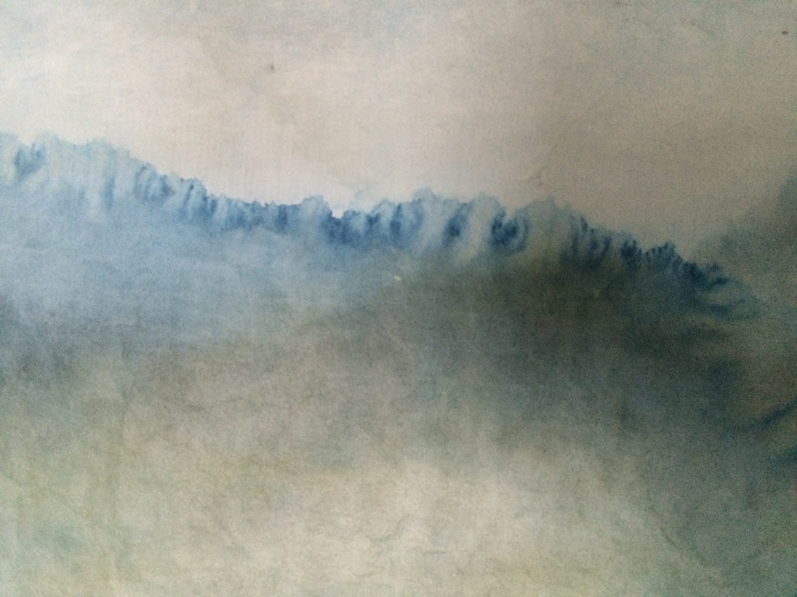
Using the splash ink technique, I established the features in the background before filling them in with details.


Mixing a little tea with my ink imparts a warmer tone.  I used that to manipulate the different parts of the
painting.


My goal was to create a feeling of being in the woods, where it is cool and sheltered, yet there was sufficient clearing for light to filter through to highlight the paths.  It is these highlighted paths that creates the illusion of depth and draw us into the painting. Again the alum did its job by imparting an aura around some of the branches, as if viewing a back lit photography.

Tuesday, May 26, 2015

Peony

I was all giddy when I left my friend's house.  I left with a few stalks of peony from my friend's garden. 

I didn't do it surreptitiously; I snipped the specimen with my friends knowledge of course.  I was giddy because I finally had the courage to teach people how to paint from a real object.  Modeling unfortunately is not emphasized at all these days; at least I've only had one teacher that championed that need.  The rest of them was just do as I do.

I have griped about the rote learning practice of Chinese brush painting.   I believe it stifles creativity.  It trained many a craftsman, but few artists.   Many of our teachers were taught that way and saw nothing wrong with it.   If one does A and B, you will get C and D.  Our aspiration was to keep doing A and B until the results of C and D were guaranteed.   I bought into that theory too for quite a while because it is very reassuring.   Repetition brings a semblance of success.  It is difficult to eschew from that practice.

To showcase a deviation from such canned styles, I used an example of a peony painting from Qi Baishi.


Not surprisingly it brought on some rather strong comments.  Not everybody is a fan boy of Mr. Qi.
People in general usually don't have an appetite for his rendition of peony.  However he is so famous and all that I am pretty sure this painting would command an astronomical amount of mula these days.  That brings on another discussion.  Is success measured by how much one's painting is worth?  If not, what defines success?

So this is exactly the dialogue I wanted to strike up with my students.  Should we have enough faith to forge our own styles, like Mr. Qi did and not worry about acceptance, or should we play it safe and follow the rote learning tradition.

I gave myself that challenge with the newly acquired peony cuttings.  I decided to at least show the students how peony is traditionally painted, but challenge them to seek their own paths.  I thought it was a good compromise.  After all we do need to start with the basics.

The way I was taught was to load the brush with titanium white and apply color to the tip of the brush only.  As we roll the brush on paper, we apply copious pressure to the belly of the brush to form the flower petals.  The color part of the brush paints the bottom of the petal, while the white belly takes care of the upper part of the petal.  Layering is achieved by the next round of painting in the petals; the red from the brush tip forms a margin against the white area of the previous brushstrokes.  We are in fact constantly managing the negative space (the white part) by painting in the red margins.

My compromise was to teach students how to paint with the prescribed brushstrokes, but we paint not from memory or a fixed scheme, but from observing the real flower.  We touched the leaves, the stalks, the flower petals.  We tried to acquaint ourselves with the subject matter.

I am attaching a picture of the peony we used.


The resulting paintings look traditional and contemporary at the same time.  I definitely feel that these samples  speak with much energy and is a far cry from the run of the mill pieces one would normally see.  Obviously I am not biased.


The best part of it all was that knowledge had been transferred.  I participated in a small way in the saga of keeping Chinese brush painting alive.

Tuesday, April 28, 2015

The Last Leg Of My Journey

It didn't take me that long to sense something is not quite right with my last painting.


The left and right darkest patches at the bottom seemed stoic, to the point of non-participation, I mused.  I suppose the composition fit in the grand scheme of things; the left side being solid and dense, the right side vague and sparse, so it subscribed to the ying and yang notion of Chinese brush. I just wanted to accentuate the left side even more.  I suppose the vertical contrast set the stage for drama.
 
Since I was rather impatient with this observation, it was more the reason for me to approach this with a little discipline, more so than I normally would.
 
I trimmed a few pieces of the same semi-sized Xuan and painted a few alternatives to the left bottom.
This is too much fun; alternative endings!  Is there a Director' cut?  I must be watching too much Blue-rays.
 
Scene I:  Water Grass


Scene II:  Thorny Branches
 
Scene III: Exaggerated Gradient
 
I then pinned these cutlets to my original painting for evaluation.
 
 
The water grass seemed out of place.  Frivolous.  I didn't like this at all.


I was hoping the thorny branches would garnish the theme of pathos. I do like the effect a lot; much better than the water grass anyways, yet the assembly looked odd.  It was as though that part of the painting was speaking a different tongue.  When everything else was sort of soupy, the branches became real pricks.  It definitely brought out the contrast but the feeling was lost in the translation.


Needless to say the exaggerated gradient arrangement received my nod.  The darkened area collaborated much better with the bend and projected  a proper distance perception.
 
Armed with such analysis, I proceeded to my Director's cut!  The last leg of my journey!


Tuesday, April 21, 2015

Continuing My Journey

So I've been casting glances at my "Journey" painting, the one with the two riders in it.

To say that I didn't like it would be a lie.  I do like it.


 I don't want to label it as being soulful, but it does have that quality of beckoning to your other senses and to explore beyond what is on the paper.  Yet, something was amiss.  I couldn't put a finger on it but I feel the void.  It is like drinking a cup of hot rum cider with a stuffy nose.  You taste the rum alright, but missed the aroma of the hot cider and spice.   When I caught sight of the image on the tube my brain processed it as two travellers on a ride.  What registered was the swath of land and the hazy diffused light.  It could present itself as tranquil, or lost.  The travellers might be taking in the scenery, or just enduring.  Who knows.  

I have to zoom out my lens, and see if I could capture the rest of the vibes.

Why not change the orientation to portrait.

I positioned the river bend at the extreme bottom of the paper, and the sky opened up in a dramatic way.  Now I could immerse in the picture.


 The immense sky was featureless.  It could use some embellishing.  Cirrus clouds, anvil head clouds, flock of birds, high noon are possibilities.  I settled on a mountain peak.

With this format in mind, I embarked on my own journey again, this time to do the painting in a portrait orientation.

I tried to avoid harsh outlines since the overall mood is one of dust and haze.  I needed the distal end of the river to be blended in with the background.   I painted a rider with really loose definition and
rather diffused brushstrokes, trying hard to just evoke a perception, rather than describing  a discrete object.


Unfortunately I failed to eschew old habits and re-defined my riders with added brushstrokes and rendered them too "solid".  Ah, that is another story.

I decided to show 2 reflections in water this time, one for each rider..


Again these reflections were painted on the back of the paper, as the top layer of the paper fiber worked to add that haze filter effect.

For that sepia look I summoned the help of coffee.  Yes, plain old coffee.  No sugar, no cream.
This natural pigment (if  you want to call it as such) has no gum or binder in it, thus it would not fix to the paper fibers.  Any subsequent attempt to rework an area introduced a new wash basin and gradient for the coffee to migrate, and gathered along the edge of the wet area, drying to a interesting stain mark.  I happen to love this effect.  I thought this is coolest way to elucidate a feature with ambiguous contour, in this case , the reflection of river bank in the water.


This pooling and migrating and concentrating of the coffee helped to create cloud like features in the sky.  I left a cone-shaped void to hint the presence of a snow covered peak. 


That distant mountain top helped to seal the perspective of this unforgiving landscape, making the journey of the intrepid riders more daunting.

Friday, April 10, 2015

Embarking On A Journey

I was tired after power-washing my sidewalk.  My fingers were numb from clutching onto the spray gun trigger for hours. I spread myself out on the sofa, turned on the tube and somehow dozed off.  Drifting in and out of my dream state, I glimpsed at an image on the tube, just long enough to register that as a couple of horseback riders trotting by a river.

A river bank, two riders, landscape and sky merge into non-distinction.  I have my main characters and the setting.  What was my motivation?  How about interpreting 2 intrepid travellers enduring the relentless bleakness?

I proceeded to position the riders on a curving river bank, at least that was how I recalled the frame.
The void provided by the river contrasted with  the vast expanse of land right above it.  The curve provided a sense of movement, whereas the two riders assumed the more sedentary role.  No I was not confused,  that's just how I perceived the arrangement.  It was contrary to what one might think.


I wanted to add a little intrigue by painting in the reflection of a rider in the water. I used ink to tell this story.  I was really interested in seeing how everything evolved from my serendipitous glance, so I wanted to keep things simple for my framework.

The attention grabbing features were the rounding banks, which defined the main stage.  Horizontal lines gave notion of the vast expanse of real estate, dissolving into the sky.  The paper that I chose was the semi-sized Xuan.  I chose it for its translucent appearance, and that it is easier to push the brushstrokes, allowing excess water from the brush to do its thing; forming interesting edges.
In this case the margin of the reflection in the water resembles indistinguishable vegetation.

Having established this framework, one which looked interesting for me, I forged ahead to paint something with a little more detail in it.

I incorporated light burnt sienna into the color palette.  I thought it worked well within my scheme of events.  I thought it portrayed bleakness without being too cold.  I moved the right bank up from the bottom to allow a more distinct impression of the river rounding the bend, thereby creating more movement in my composition.  I tried to create a sense of the horses kicking up dust as the riders travelled, now adding movement to the originally sedentary figures.


I took advantage of the translucent property of the paper by painting the reflection of a rider on the back of the paper and allow the image to come through the front side.  The effect was visually stunning  when looking at the real painting.  The un-brushed surface worked like a semi-transparent veil.  The reflected silhouette seemed vague and real at the same time.    Perhaps I had trained myself to look for this manifestation, to the point that I became hyper-sensitive to it, thus making a big deal of this trick!  Simply delicious!

I added a little dash of blue-green to the sky and the water for the ominous effect, while leaving a patch of void in the center to expand the distance perspective.

It's time again to pin this up and do a more elaborate perusal.

Thursday, March 19, 2015

When Is It Too Much Information

The classical Chinese garden in town asked for permission to use my rams painting for promotional purpose.  Obviously that was a feather in my hat, a shot in my arm.

I had done Chinese Brush demonstration for them in the past, so I dug up some of the drafts I did then.  The pavilion always interests me, so I shall do another one.

I really went to town with this one.

I was painting in a lot of details  Defined boulders at the pond's edge, well dressed Taihu stone, trees, shrubs, you name it.


I gave the darkest ink tone to the my main character, the pavilion.  The leaves that grew over the pavilion tiles and the lighter ink tone tiles in the back helped to describe distance.  I even employed a photography trick by painting in dabs of diffused ink on the right, not only to frame the scene but the out-of-focus look pushed the painting further back.

I tried to circumvent the busy content by employing a very simple color scheme, and I was selective in which objects to color.  All the while looking for complement and contrast.

At this point the painting still had that raw appearance and was begging for a finishing touch.
I thus painted in the reflections and shaded in the covered corridors in the background.

It is interesting to compare this work with my previous attempts.

My first attempt turned out to be the most vivacious, I mused.   I was driven by a notion and I tried to bring it out with my brush.  It had that unadulterated innocence. Simple brushstrokes described the pavilion roof ribs, tiles, boulders, Taihu stone etc.  The audience was given a lot of freedom to conjure up whatever they wanted to see or feel.


My second trial had a lot more information.  The roof tiles were painted in. There were a lot more lines to depict the boulders, the Taihu stone and I was even trying to line the leak window in the covered breezeway!   Instead of nurturing a notion, I was trying to reinvent a painting.


My urge to give full accounting of the scene drowned me out.  I wandered further away from what inspired me in the first place and got caught up by the nitty-gritty.  I seem to recall reading somewhere that Chinese Brush is sparse in details, lines and outlines are used to shape images with little shading or reference to light values.

Whereas I am not necessary pedantic with regards to the "doctrines" of Chinese Brush; whereas I am totalling accepting the Western influence and believe in the evolution of the Chinese Brush art form in today's environment, I sometime wonder if I drank the kool aid.

 Perhaps I paid too much attention to the photograph that I took of this place.  Don't blame the kool aid.

Monday, March 2, 2015

Banal not; Unremarkable, yes.

I had a chance to submit my Banal Fail  piece for critique by an art professor.  I was surprised by the comments.

As I mentioned I was particularly fond of the way I was able to "stop" the bleeding of color in its track.  I allowed the bleeding to form streaks on this semi-sized Xuan and before the streaks could homogenize I used a hair blow-dryer to dry them.  To me it was like going back to the dark-room days when one pulls the print from the developer tray into the acetic acid stop bath.


I thought I was so resourceful.

I fretted over whether to paint birds into this landscape.  When I gave in and painted in the migrating geese I thought it was cliche.


It turned out that the professor did not like my treatment of the streaks at all.  "Contrived" was the comment.  I was feverishly defending myself.  I was trying to hint the presence of trees without making them too real. 


I  urged to express the presence without making it so mechanical.  The bleeding streaks intimated themselves as an afterthought, as evidenced by the layering, rather than as a natural occurrence.  The birds fit in fine and were not ostentatious in this particular case. That was the professor's adjudication.

I wanted to say one man's meat is another man's poison but then something else hit me.   I was too immersed in the technical trickery that I forgot about the overall ambiance of the painting..  What I deemed a monument became a boulder.

As a painting, it was unremarkable.  As an etude, why not.  I still like it.