Wednesday, February 20, 2019

Gearing up for painting demo at cultural fair

I was invited to do painting demo at the Cultural Fair again this year.   I was reluctant to give my nod this year, as the organizer was quite sloppy with the arrangements.  Giving notice a week prior is case in point.  But hey, this is not about me, right?  After all, this is a celebration of the Chinese New Year, so I don't want to be the scrooge.  I should feel wanted.

The last couple of years taught me to subscribe to the KISS axiom.  Keep It Simple, Stupid.  The participants could range from 4 years old toddlers to 80 years old seniors.  My presentation should be focused on fun, and result oriented.  My job is not to "teach" painting, but rather as a facilitator so that everybody will have fun and a sense of accomplishment after painting their own pieces.

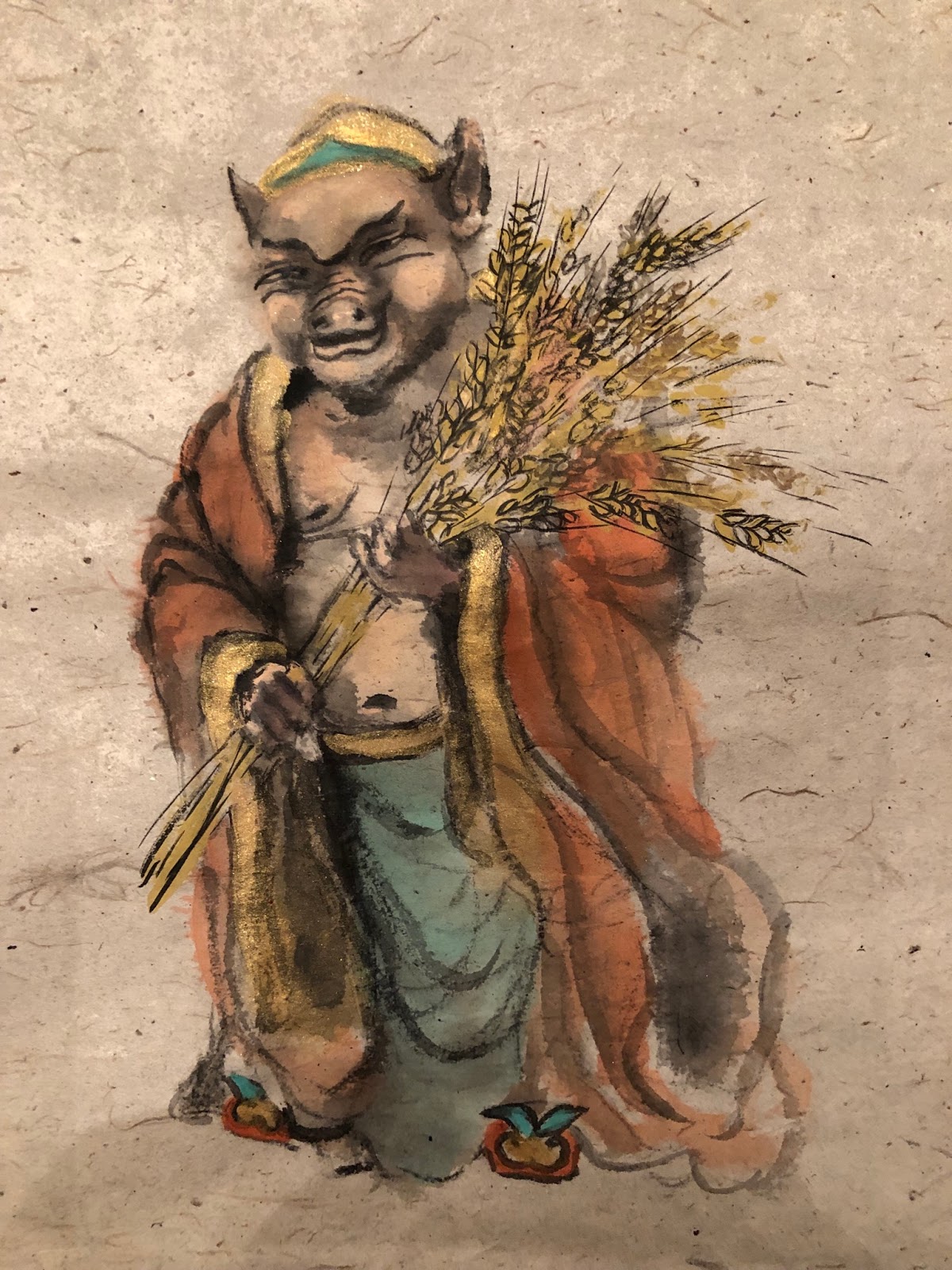
I'm sticking with the Zhu Bajie character.  Most Chinese would be familiar with him and identify him as the celebrity pig,  and for everyone else, it should be fun to be exposed to a little Chinese trivia.

Obviously I am going to simplify the image I posted on New Year's day.  My plan is to single out the 2 characteristics of the meme;  a snout and a pudgy face.  If a person can nail these two traits, then a pig is born.  The rest of the painting will just be along for the ride and should not significantly affect the outcome of the painting.

So that I can be consistent with my presentation and get guaranteed results, I've devised the following game plan;

I would have participants mark off the paper into roughly thirds.  At the top one-third line start by drawing a oblong circle, representing the snout of the pig.  Under the snout, write in a thick line for the mouth opening, followed by the lower lip.


Next comes eyes


Now we would assign the pudgy cheeks and the brows.  I want the presence of the cheeks to dictate the persona of the pig.  The open mouth and the round cheeks should give off a sense of where this painting is going.


A pair of floppy ears are now attached to the face.  A cap with an ornament (typically jade) tops off the upper contour of the head.


The snout is now associated with nostrils and the skin folds on the ridge.  The nose is no longer two-dimensional.


Eyeballs are now seated, following the notion that they bestow spirit to the being.


The pose is for Zhu to be holding a scroll or banner, bearing an auspicious writing; the Fai Chun.  The tradition of decorating with Fai Chun is quite popular with the Chinese culture, even today.  The calligraphy is typically done on red paper, the color of jubilation.  The words convey blessings and fortune.  The calligraphy is then used to decorate an entry way, such that one's ingress and egress is always blessed.


Now that we have the head finsihed, the rest of the body should just flow.  I shall start on the right shoulder, and a horizontally bent elbow.  Participants will be asked to paint 4 closed bracket signs to emulate fingers.  If I ask them to paint fingers, invariably a roadblock barges in.  People would claim no prior experience of painting digits.  Now closed brackets are a different story.  Everybody, except for the very young, knows what they look like.  Asking the audience to write brackets takes away the fear or hesitation.  The fingers are to be positioned somewhere around the bottom-third marking.


Collar is written in and a robe is draped over the arm, extending to the bottom of the paper.  I don't think the exact proportion matters that much.  For all practical purposes, we are painting a fictional figure to begin with.  Who's to say the arm or fingers are too long or short.  Zhu is however you imagined, as long as it is a pig.

We can now proceed to the left side of Zhu.  Here the fingers are represented as open brackets or a series of the letter C.  A waist belt is fitted and the bottom garment painted in.  Paint in a rectangle to fit between the upper fingers and the lower fingers and we have ourselves a banner.


I do not expect the participants to be able to write the Chinese characters.  I therefore wrote 3 different versions of the Fai Chun myself and took pictures

This is the cliche "Happy New Year"


"Safe Entry and Exit, safe journey"


"The wind suits well, and the rain is all right" ( Everything is going my way)


These calligraphy pieces were then printed on red construction paper.  They were cut up into individual pieces, which would go on the banner in the painting.


So these pieces of red strips are actually the hook for the painting project.  Once the person is finished with his/her painting, they can choose their Fai Chun and glue it in place.


Now all participants will have a finsihed piece to bring home.  A piece that looks polished, and a meaningful memorabilia for the Year of the Pig.  They themselves painted the piece; and that is the only thing that matters.


Wednesday, February 13, 2019

Presenting Mr. Pig

I decided to mount my Mr. Pig painting and frame it for a proper presentation.  This is the Year Of The Pig after all and due respect must be paid.

I went with my Suliao Xuen Ban method again.  After the Xuan  paper was tailored and mounted to the proper location of the clear plastic, the fun began.


This is going to be a celebratory painting so I need to jazz it up a little bit.  I wanted it to blink a little.  I had some gold glittered Christmas ribbon laying around so I drafted it for my project.  I harvested the glitter by scraping the ribbon with a knife.


I didn't want it to sparkle like a Swarovski  piece, but definitely enough to make it noticeable.  Since the painting depicted a bountiful harvest with the stalks of grain, I applied a heavy sprinkle onto that area to emphasize its presence.


After the application of glitter, I sprayed the the painting and the plastic with Urethane.  The aerosol helped to fix the glitter and rendered the clear border semi-opaque ( newspaper is blurry now in the background).  It also helped to provide additional shielding from the elements.


I built a frame with poplar for the piece and painted it gold to adorn my painting, befitting a regal and auspicious year.   I wanted quiet simplicity and  elegance.  Two holes were drilled on the vertical member of the frame for hanging.  A small hole on the inside for the transparent fishing lines to pass through and a larger one on the back side to hide the knots which secured the fishing line.


The fishing lines were threaded through a short piece of heat-shrink tubing.  This little tube would fit around the lines snugly once a heat source is applied, i.e. with a heat gun or a flame.  I chose to let it ride freely on the lines.  This was meant to be an added protection of the lines from abrasion.  Just an insurance policy against premature breakage from normal wear and tear.


My set up allows the frame to sit perfectly flat against the wall without any tilt.  Fishing line was used such that it is less obtrusive through the semi-opaque border of the plastic piece,  accentuating the float effect of the painting.  I hope to create the illusion that Mr. Pig just appeared in thin air.  He is a diety after all. 


Here is the framed piece.


Tuesday, January 22, 2019

The Pig as an archetype, experimenting as I go

Armed with all the notes and test sketches that I had accumulated on my pig, I decided to launch the painting project in earnest.

I decided to sketch out my image.  Who was I kidding, I was very much concerned about the painting needing to look  "perfect".  I was willing to sacrifice a certain degree of spontaneity in exchange for the comfort of knowing that my brush wouldn't stray too far away from the intended targets.  I could recall when I first started with Chinese brush I was dead set against sketching.  I always thought that sketching was reserved for novices.  I've came to realize that I needed to do what was right for me, and not for anybody else.  So what if I was a novice.


I shied away from using too much ink as my shading base layer, especially on the face.  Too much ink imparted a grimness to the feel of the painting.  I also cheated by purchasing some cheap off the shelf flesh color acrylic.  I used that to lay down my base coat, and used vermilion as my main shading color and vermilion plus tea if I wanted a darker shade.


Again I resorted to the unbleached Xuan with fibers that looked like the butt wiper paper of the yesteryears.  The base color plus the exposed fiber added the "organic" nuance that I so endeared.  It happened that one of the fiber particles in the paper popped up in the area of the forehead, just above the eyebrow.  This was such a serendipitous delight for me, because now my pig archetype had a huge mole on his forehead, adding to the persona of my protagonist.  I couldn't have planned it any better.


I had mentioned in my mountain lobes blogs that the side-tipped contour lines denote more than the contour, but also the thickness of the slab we were describing.  I've applied the same technique and understanding to the strokes used to describe my shadows.  Here an example of a side-tipped brush stroke of uneven width gave the illusion of the lapel not lying flat against the chest wall.  The neck was farther away than the rest of the body, therefore a wider area of black void.


The side-tipped brush also worked well on describing the undulations on the robe.  The vertical brush strokes of vermilion on the right were simply a lightly loaded brush of very diluted vermilion with its tip dipped in undiluted vermilion.  The Xuan paper allowed the color to form its own gradient, demonstrating dark and bright areas along the robe.


I was not happy with the heavy drape lines on the front of the robe, especially after seeing how nicely the two vertical side-tips turned out.


So I reapplied the drape lines using a vermilion brush with ink tip for the color gradation.  Since the paper already had a layer of color on it, it became a sized paper effectively.  Thus the mixing of the color was not as dramatic as the vertical ones.  I believe that is one of the reasons that in traditional Chinese Brush we discourage going over a painted area repeatedly.  Doing so destroyed the fine details of the brush stroke.


I applied the same technique to the blue over coat.  I prepared a blue/ink dish and a blue/white dish to help me further differentiate thedifferent areas of the blue robe.


The upper arm area was done with the blue/ink side-tip and the forearm was done with blue/white


For the navel I judiciously darkened circular areas around the navel leaving a ring of the base color to denote the rim, and a much darker center and just below the navel to suggest the depression.


By writing a half arc as a shadow, a nipple was formed without much fanfare.


I bought some metallic gold acrylic to paint the lapel and the waist belt and the inner sleeves.  I used gold strictly for its dramatic effect and it worked well for my purpose.  The acrylic formed a thicker and harder surface than the rest of the painting not done with acrylic.  The buckled paper convinced me that these areas were more like collage art than a two dimensional painting.  Interesting.  Whether it would retain this look after mounting remained to be seen.  Perhaps I would deliberately not smooth out those areas during mounting so that I could preserve this illusion.


I was able to appreciate the difference between acrylic and watercolor, especially when they appear in the same painting. I definitely know my brush and the paper reacted quite differently to the two.
All the experimenting was invigorating, perhaps I was breaking all rules, by my own accord at least.  I sketched with pencil, I dared to use different media, and went over painted areas repeatedly.  I used metallic paint.  I dared to shade.  Nothing esoteric, but just experimented what I felt like.  I could now tell what a pure Chinese Brush artist deemed as dirty or muddy, versus the simple, single and transparent strokes of the traditional Chinese Brush.

I also added a faint shadow by using what was in my brush wash basin.  I was being mindful that the shadow did not diminish the ethereal quality of my archetype.  I wanted Mr. Pig to cast a subtle, non-distracting presence, as one would on a overcast day.


That was my photography alter ego speaking to me!

Friday, January 4, 2019

The Pig as an archetype, learning as I go

Now that I am pretty comfortable with my concept, I need to execute it.

I am basically on uncharted territory.  This painting now has become an experiment, a game for me.  I'll research, apply, and make corrections as I go.  Quite stimulating I must say.

I reworked the face and tried different ways of shading

I did not gauge the position of the snout correctly in the above example.  I had put in too long and wide a shading on the left side of the snout, which seemed to end on the cheek now, instead of along the smile line.

again the same mistake as the first example; improper shading of the snout, forming a weird structure.

As I was doing my research and reading up on portrait photography, I found out there is such a thing called the Rembrandt triangle.  It is the illuminated triangle under the eye on the dark side of the subject.  This triangle is bordered by the shadow of the nose and the sunken eye socket and renders a pleasing geometric form of the face.  Such Rembrandt triangle was sorely missing from the 2 examples above.

I knew my pig had fat cheeks, but I still would like to test the theory, so came yet another attempt


 This one did look more natural and pleasing with the Rembrandt triangle in place except that I messed up on the lower lip and now the pig seemed to have forgotten to put in his lower false teeth.  His lower lip was caving in.

I must also tried to find out what is the best color for the Marshal's clothing.

                                                                        all blue

red robe with blue pants

blue robe with red pants


I also tried different hand positions.  The bottom example has a higher grasp by the left hand.
I thought it left too much exposed real estate on the belly and chest.  I'll probably go for the lower grasp.

I tried a more relaxed and spontaneous brushstroke rendition, one that was not mired in a lot of details


I also fell in love with the paper with the heavy fibers.  This is a unbleached, unsized paper that reminds me of the ass-wipers from way back.  I certainly remember it from my childhood.  It has such a un-pretentious, wholesome feel to it.  The fibers also complement well with the lines of the figure.  I know the term organic has been way overused these days, but this is a fine example of an "organic" paper.

I definitely shall gravitate towards that as my choice paper for this painting.

Oink Oink Oink