Wednesday, September 28, 2022

Algae in the pond

We've had a string of days that are warmer than usual.  It is the succession of days of 90 plus degrees that tires a person, especially when that person has to rely on natural convection cooling.  The fan does help to move the air and create some evaporative cooling from the moist skin, so it helps somewhat, psychologically at least.

When the rainy season stopped the pond behind my house ceased to enjoy the flow it normally gets from the creek that feeds it.  The water level has dropped a couple of feet behind the weir and the pond has become stagnant, overgrown with algae.  The homeowner's association has spent good money seeking supposedly professional advice, planting shrubs and tall grass next to the bank to ostensibly lower the water temperature and therefore slow down algae growth.  To no avail.... I could have told them that.  Then some homeowners do not like the raggedy look of the plants and trimmed them down, as if they are ornamental hedges.  One homeowner even resorted to putting algaecide into the water, which is a violation of environmental protection laws.  It is a contentious issue, to say the least.

For lack of better ways to spend a hot day, I've been looking at this body of pea soup through my blinds.  There are still ducks around, lazily paddling their feet in the summer heat, feeding occasionally under the water.   They carve out channels amongst the algae, like an icebreaker creating passages through the artic ice.  I suppose I am visualizing ice subconsciously to squelch this suffocating heat. 

Now these patches of algae are forming an interesting floating mosaic.  They look more yellowish than green.  The sun still glimmers off the water in dancing flashes despite the lack of any perceptible wind. The thickness of the day is breached only by the ducks quacking.  This looks like painting material.  

I am looking at this as a challenge to myself, like every painting that I've attempted.   I am going to attempt to put that suffocating feeling onto paper and I am going to try something new in the process.

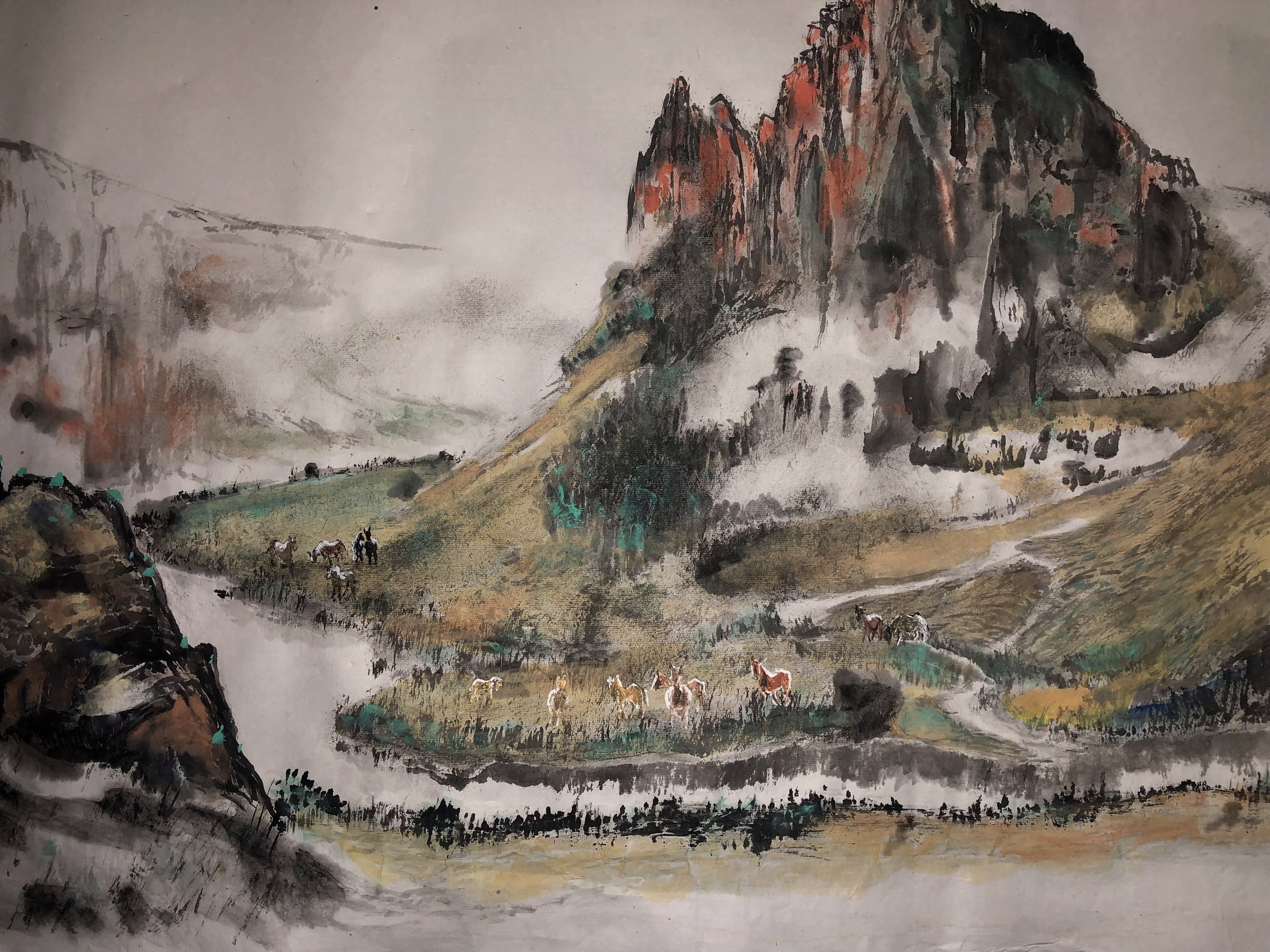
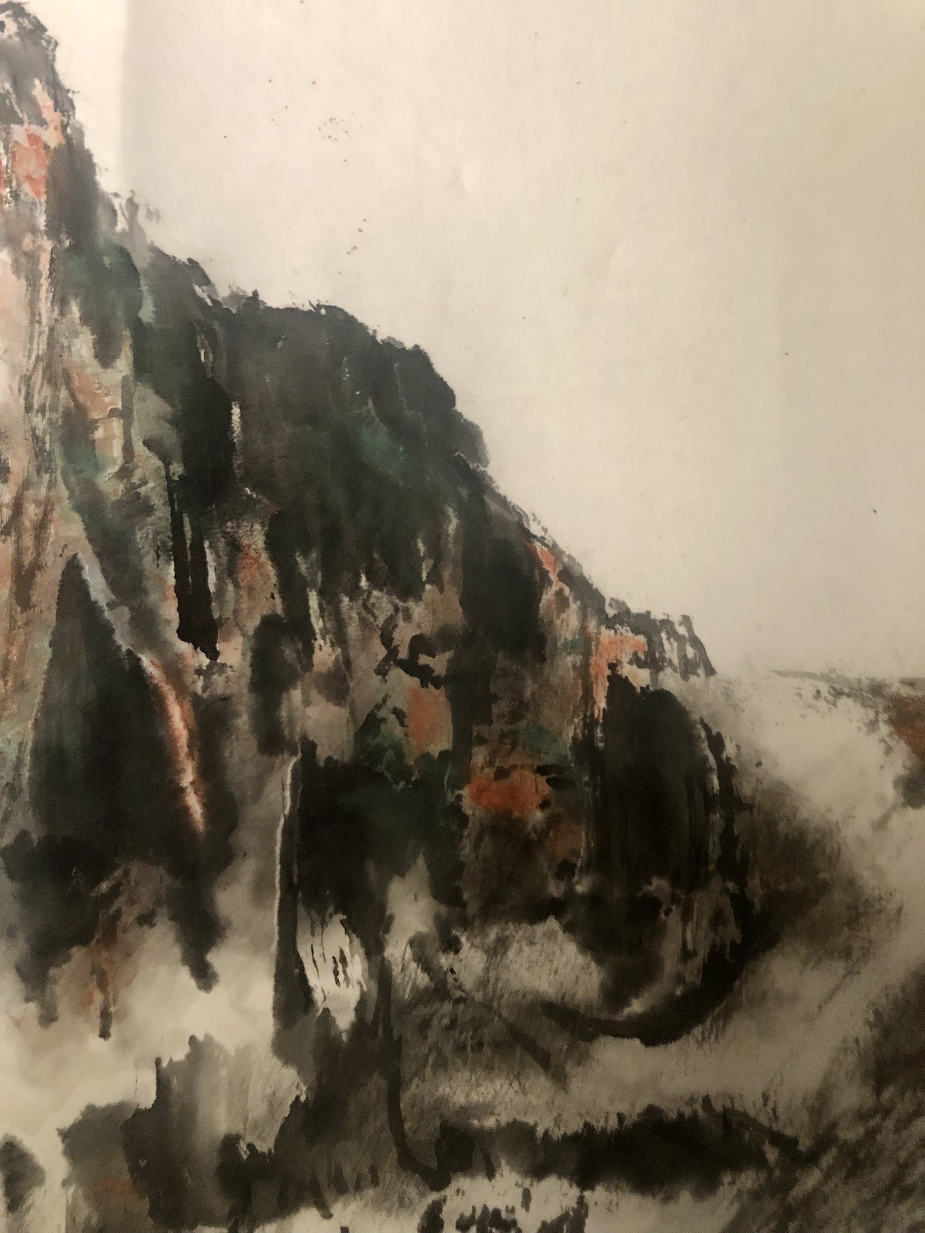
Normally Xuan paper is not conducive to heavy staining or repeat brushstrokes.  Chinese brush painting hinges on the artist making the right brushstroke the first time.  Whatever comes out of the brush is indelible and seals the fate.  What I am internalizing is not something that is airy or elegant.  It is musty and dense and confused.  I have to attempt to lay down as many brushstrokes as possible without wearing down a hole in the paper.  I am not going to adhere to the usual Chinese Brush preferences.  I decide to use the gold speckled Xuan that was gifted to me.  This paper is more substantial than the standard Xuan.  


The random gold speckles elicit the feeling of the shimmering surface of the pond.  I hope to enhance the appearance of patches of reflected surface with the help of alum solution.  Alum as you recall is used for sizing Xuan paper.  It makes the paper less absorbent.  I use a spray bottle to spray some saturated alum solution on the paper and allow that to dry.  The hope is that these droplets will block subsequent coloration and give off a painted surface with random voids in it.


AS long as I am experimenting why don't I mix the blue color into my saturated alum solution.  Hopefully the spray will help form the foundation of the water.


I do the same with the green color, for my algae.


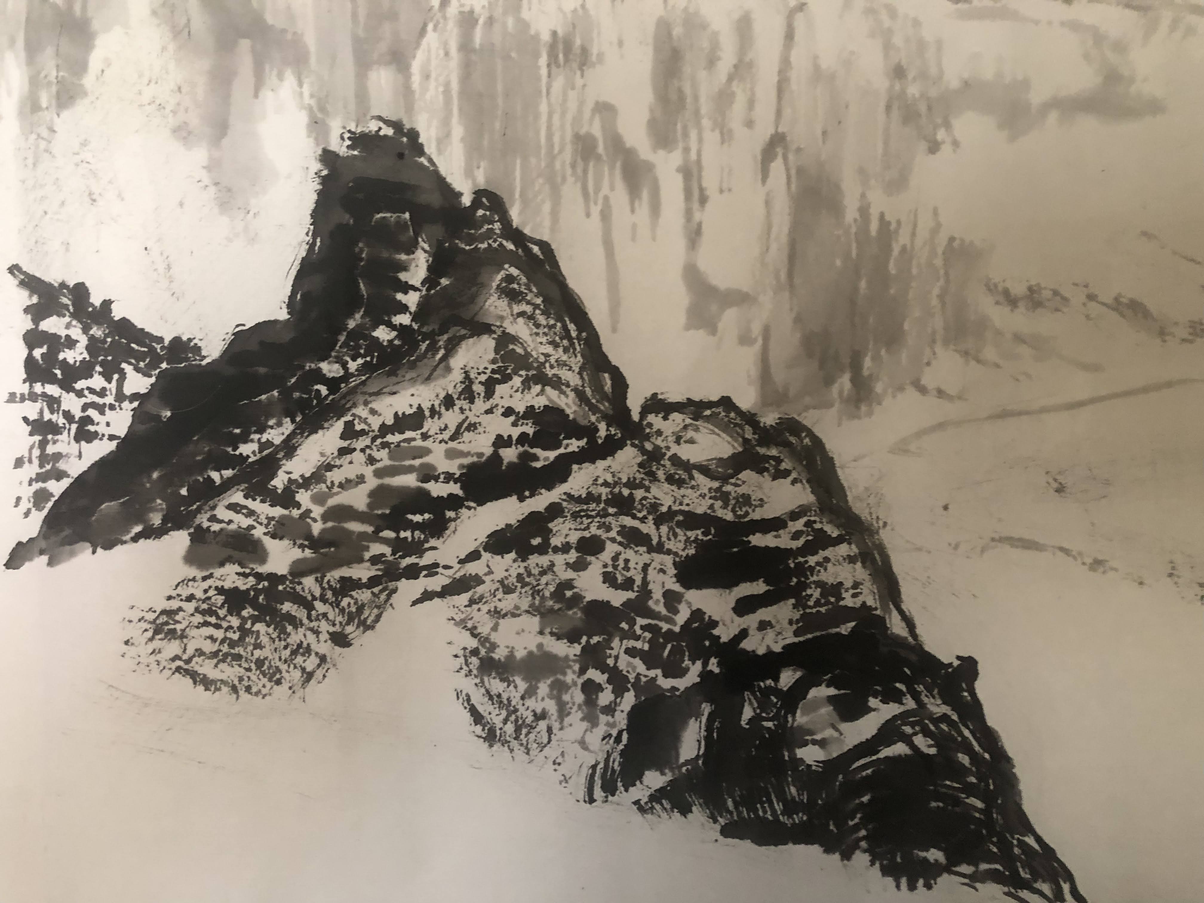
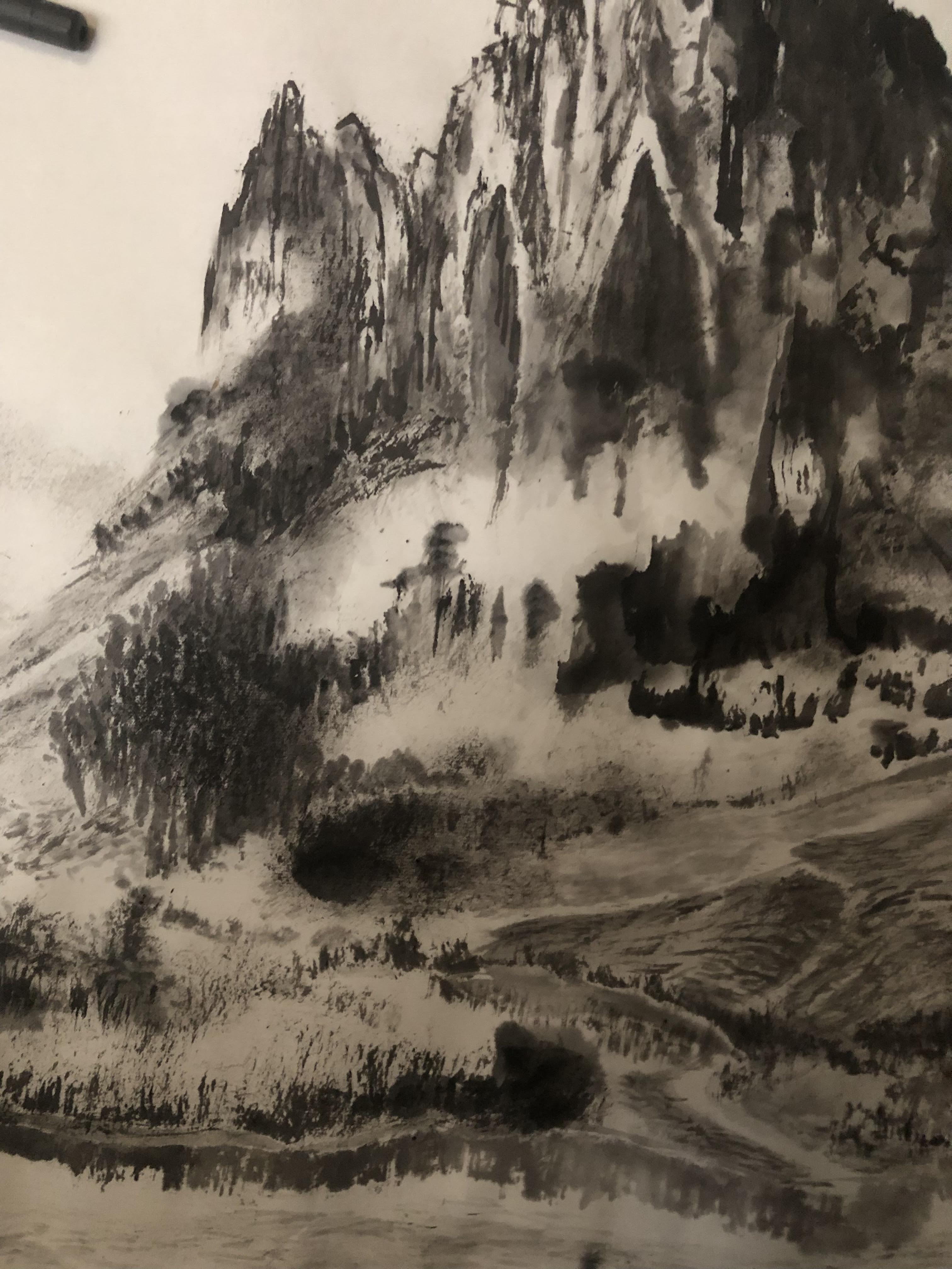
There is only one way to find out if my theory works or not, and that is by doing it and let the result speak for itself.  One can see clear borders around the droplets, especially the small ones.  The large drops are overwhelming their neighbors and obfuscate the clear border.  So I am on the right track.

It is time to write numerous brushstrokes, each emulating a minute part of the water surface.  The surface of the gold speckled Xuan has gone through three sprayings containing saturated alum solution, thus these brushstrokes stay wet longer without going into the paper fiber quite as fast.


In other words, these markings are less indelible and more forgiving.  The gold speckled paper behaves more like a watercolor paper than Xuan.  It allows the color to float a bit.  


I am using a yellowish green as highlights on my algae patches since that's the way I perceive them.  I just hope that the color is not too overwhelming. Yellow is such a tricky color.


This is what I get after all the dust has settled. I am now writing the report for my experiment.


The droplets of alum solution can be traced to all the round void spaces. I think they are nicely juxtaposed with the rest of the brushstrokes, showing off the reflected sky and the algae in the water.  The gold speckles are not obvious at all in the photography but they are more noticeable in person.  One has to view the painting at a certain angle to see the sparkle.

Dense and garbled.  The way I saw it.  

Saturday, September 17, 2022

Framing my 16 Vestal Virgins

I received notice that my Whiter Shade of Pale painting has been adjudicated into an exhibition.  While I am elated about this opportunity I am also concerned that I must now find a proper way to display my painting, and to be able to do that before drop-off day. 

My painting of the 16 Vestal Virgins was done on gold speckled Xuan paper and I chose to wet mount it with a 4 in wide white speckled Xuan border.  I was trying to emulate the classical mounted scroll appearance.  I had stored the painting rolled up in a mailer tube since completion of the work.  The gist of the matter is that I simply can't house all my paintings in a frame; I would simply run out of storage.  Having the painting mounted on paper precludes me from displaying the work as a Sulio Xuan Ban float, or a canvas mount.  The only option left is to present it in a conventional picture frame. 

My mounted painting with borders measures 26in x 46 in and there just aren't any ready made picture frames for that size.  I was able to find a cheap custom made frame shop online that would sell a frame with backing and 060 plexiglass for around $75.  Unfortunately I will need to pay a shipping cost of $50.  Ouch!

My only option left is to make my own picture frame.  I prefer to use 1x2 in. pine stock over my usual poplar for my frame.  I think the natural color of pine will be a perfect match for my gold speckled paper and pine is quite a bit cheaper than poplar.  

I am using my dado blades instead of a router to cut a shoulder into my 1x2 stock.  Using a router would have required securing the skinny 1x2 stock before running the router bit over it whereas I already have a table saw and it is just a matter of changing out the saw blade and run the 1x2 stock through.  A much easier and safer proposition.


Cutting a shoulder into the 1x2 stock


The shaped 1x2 stock is then cut to size, sanded down and glued and finished in clear urethane.  I am not using any stains on the pine stock since I want the natural wood color to match my painting.  I apply several coats of the clear urethane, with steel wool polishing between the coats.


You recall my painting has a 26 in. measurement on one side, yet a standard piece of board for backing comes in at 24 in x 48 in.  That means I am 2 inches shy unless I spring for the next size up, which is 48 in x 96 in.  After some consideration, I trim off one inch of my white speckled border on all 4 sides and that reduced the measurement to 24 in in width.  That means I can now use the standard 24 in x 48 in board for backing.  I am left with a 3 in border, which still looks good on the painting.  I purchase my cut-to-size plexiglass for the cover glass from a local plastic shop.

My frame measures 44 in x 25in. and I am concerned that the pine is a little too flexible for the 44 inch span.  My fear is that people would pick up the painting by the long side of the frame and cause the wood to bow.  I therefore cut and screwed in an anchoring support post in the middle of the frame to help stabilize the frame.  The frame is rock solid now with that bracing. 


I use D-rings for anchoring my picture wire and the cut ends of the multi-strand wire is wrapped in heat-shrink tubing.  I've poked myself and drew blood on the loose strands of a hanging wire thus I am extending the courtesy of shielding other handlers from potential mishap.


Here is the new home for my 16 Vestal Virgins.  I am right about the natural pine being a good match for the paper.  I am happy to say their new home only costs me $50, instead of the the $125 if I had bought it on mail order.  This is not only more economical, but is made with love and looks great.


I am actually doing this as a journal for myself to read in a future date.  I often am amused by how I invite problems by not recognizing them to begin with, and the process and remedies I take to mitigate the road blocks.  

As I look at this finished product, a final step so to speak, a strange emotion overcomes me.  I had stored the painting rolled up in a mailer tube, little thought was given to how to frame it to begin with, if at all.  My thought process just don't extrapolate that far ahead.  Or is it not counting chickens before the eggs are hatched?  Anyways the emotions I am feeling is like my son has surreptitiously grown up and out of the blues he is ready for his first prom night.  He is asking to borrow my tie and my dress shoes because all he has are sneakers.  Thus I am fidgeting with his attire, polishing the shoes for him, taking pictures and beaming with smiles, as a proud father should be.  Making sure that he is presentable to his date, his schoolmates, and the world.  I am so happy that he is growing up, but secretly feeling sentimental that my days of being an empty-nester won't be too far off.  So as the painting that I had spent so much time on, the painting that I have grown attached to, is getting all dolled up, I must however, need to acknowledge the fact that there's a possibility that we might be parting ways?


Thursday, September 1, 2022

Born Free

My latest landscape painting with the Central Oregon theme has gone through a few tiny revisions here and there and I am resigned to accept it as being done.  I've been ruminating on how to mount this painting, if at all.  I am trying to not mount or frame every piece that I have completed ( the ones that speak to me anyways ) because I don't want to be hoarding all these pieces, collecting dust.  Anyways this is one of those works that pulls me to the wall now and then and I feel like that it deserves a stage.

My last landscape painting, Chibi Nostalgia is mounted on canvas; the method I coined Xuan-Boo (Xuan paper on cloth).  I like its presentation so much that I am going to make a companion for it.  It just happens that both paintings share the same 1:2 aspect ratios.  A lot of Xuan paper come in that native ratio, i.e. a 4 foot long piece would have a 2 foot width.  My Chibi measures 18 in x 36 in and this new piece is a little junior to that, at 15 in x 30 in.  I fashioned my canvas using a piece of canvas drop cloth wrapped around a wood frame and covered with gesso. 

Starch is used for the wet mounting process.


The over-hang margin is tucked under the wooden frame and secured with starch. The over-hang conceals the bare canvas, and gives the piece a more "finished" appearance. 

A dry broad stiff brush is used to pound on the surface, under the protection of a couple sheets of  newspaper.  This pounding process is my poor-man's press; it helps to form a good seal between the Xuan paper and the canvas.  The newspaper also helps to wick up excess moisture and helps with the drying process. 

The freshly pounded painting is left in a cool corner to dry.  A slow drying process is preferred, as it ensures even drying and thus tightening of the paper.  Quick, uneven drying can lead to warping of the frame with this mounting method.


The wet Xuan paper is extremely fragile and delicate at this stage, and any rough handling or even thumbing on the painting could cause a tear.  I have many procreative expletives for those occasions.  I learn my lesson the hard way.

The mounting is totally dried after a day and one can handle it with relative ease now.


I apply a coat of Liquitex gloss medium and varnish onto my finished mounting.  The medium helps to restore the "wet" look of the painting, as if the Xuan paper was still wet.  I can also look forward to it forming a physical protective film over my painting, defending an occasional errant fingerprint. 


I know it is rather difficult to discern the difference between the coated and the un-coated pieces from these photos, especially after they've been transferred and uploaded and are subjected to web constraints.  Hopefully one can see the bottom version ( coated ) looks richer, more vivid and reveals more detail about the brushstrokes.  It has more depth. 

Many will argue that this coating process destroys the "paper" ambience, especially when it relates to paintings done on Xuan.  The coating renders the painting more like an oil painting than a painting done on traditional Xuan, especially when I mount it on canvas instead of a scroll.  I know and I don't disagree.  God knows I've received tons of flak for my practice.  The trouble is, I do enjoy this variant and I think some of my paintings benefit from this presentation. I try to employ this method judiciously. 


Painted 1x3 boards are used for the frame.  A dado blade carves out a narrow channel around the inside edge, framing my canvas mounted painting and wearing a more polished look. 

I name this piece Born Free because of the 14 horses; being somewhat obscure notwithstanding.  


Wednesday, August 17, 2022

Adding Human Interest

 I am staring into the finished colored version of my most recent landscape painting and am at a lost to find a connection with the painting.  Perhaps I've been doing a number of similar paintings lately and the subject matter has become trifle trite?  Perhaps I've become a little habitual in my presentation.


Time to call in the cavalry for the rescue, sans the soldiers.  I am hoping that the presence of horses might add some human interest to the landscape, which  helps to connect with the viewer, me.  


I am blending in the horses with the background to make them look less obtrusive, but using dabs of titanium white as reflected highlights to make the animals stand out.  Now that sounds like an oxymoron.  I am also adding in wilted trees to augment the landscape.  After all this is the landscape of the west shown in cowboy movies, I surmise.  


I am really going to town with the highlighted effect so I am painting all my horses with that kind of illumination.  For the horses in the front row, I am actually painting the silhouette with white first and then come back to fill in with other pigments, leaving a sheath of white to achieve the back-lit effect.  


I am trying to break up the even spacing of the animals by adding a black one in the back and using dead tree trunks to further disrupt the perceived uniformity in spacing.


I am making the eroded, gouged faces of the landscape more prominent, to better illustrate the truncated part where the river cuts through.


I suppose my painting now is more animated, figuratively and literally.  

Thursday, August 4, 2022

Route (Root) 66

Route 66 ( established on 11-11-1926 ) used to be a main route cutting across the US continent before it was replaced by the current Interstate Highway System.  I remember watching a television series by the same name decades ago, trying very hard to understand the dialogue.


Thursday, July 28, 2022

Looks better in color

I remember long time ago a viewer offered me more money for a black and white ink painting of mine if I would paint another one just like that for her, but in color.  I politely refused; unyielding with my principles.  Being snooty perhaps.  I must admit however, sometimes that sentiment is legit.  Obviously there are many occasions a black and white brush painting imparts a certain je ne sais quoi which would be robbed if done in color; but my latest landscape painting is not one of those occasions.

I've been looking at that painting for almost two weeks now and it has not grown on me.  Perhaps it is neither luminous nor moody.  Time for cosmetics. 

I have grown to like the practice of coloring from the back of the Xuan.  I am starting with the rocky structure on the left and the distant hills in the background.


Phthalocyanine blue and ocher is now painted over the top of the under-painted rock.  The resulting color is not one would expect if one was to simply mix and paint all 3 colors together on the surface of the paper.  This is one of the properties of the Xuan paper that one can exploit.


The original alum mixed brushstrokes help to define discrete edges of hard surfaces, setting up the  loose ambiguous brushstrokes of the foreground.  I am borrowing the bokeh effect from photography now and I love the presentation.


The alum solution helps to fix the ink more readily onto the paper, leaving visible margins even after coloring or additional brushstrokes.  The patchy appearance reminds me of crusty lichens on rocks or tree barks.  A lot of brush/Xuan painters shun such effects for being too "rigid" or "lifeless" but I think it is perfect for adding texture to hard surfaces. 


Coloration somehow adds drama to the void spaces.  I believe there is a lot of room for me to feather out the edges, with the help of color of course, if I choose to.  I think eventually this would be a battle between how much of the brush or bleeding or wash I wish to reveal.  In traditional Chinese Brush, this is known literally as the balance between brush and ink.  


I am tempted to leave the painting in this state.  It has an interesting, albeit an unfinished look.  Oh well, since I am not Schubert, I better finish my work.  


The color looks more saturated or vivid when wet.


This is how it looks on the wall when dried.


Friday, July 8, 2022

Yet another landscape

After my attempt at painting Chibi (the red cliffs) I want to try my luck on another landscape painting, with cliffs or stony features as my main player; again.  Whereas the Chibi painting was sort of dreamy and poetic, I intend for the current production to be more hard and staunch in character.  

For this attempt I am mixing my ink with alum solution to paint on traditional Xuan paper.  The slight bleeding from the brushstrokes allows the paper the stage to express soft strokes.  Alum working as a mordant tends to eliminate that quality by fixing the ink before it has a chance to escape into the microfibers of the paper.  I am looking for harsher brushstrokes to help depict the rocky texture of my intended landscape.

My model comes from the central part of Oregon where it is a little less lush with greenery but more abundant with rocky outcrops and mesas. The Deschutes River and the Crooked River are landmarks that inspire me, so I shall use them as my references and give the Columbia River Gorge a pass.


First item on the list is a rocky structure occupying the left side of the painting.  I suppose I've not found my rhythms yet and the brushstrokes feel very contrived.  Of course the remedy for my shortcoming is to immediately paint the background with diluted ink and loose brushstrokes without the alum as a conspirator, thus the markings are much more relaxed. 


Contrasting with the hard edges of the rocky structure are not only the diluted ink for the distant hills, but also the soft non-discrete foreground, as if the camera is out of focus and the viewer is using the bokeh to frame their image in the head. 

The center portion of my painting is taken up by the sharp, chiseled rocks of the landscape.


The alum/ink mixtures helps to cement the brushstrokes before they have a chance to bleed; offering a stern appearance.


One can see discrete and distinct white margins unmolested by ink due to the fixing property of the alum.  


Previous brushstrokes tainted with alum also function as a resist, and allow subsequent overpainting with other brushstrokes.  Typically this is an absolute no-no but in this application the juxtaposition makes interesting patterns.  We are talking about nuances of brush works on Xuan paper now, so this might not be evident to a casual observer.  I've experimented with painting with alum solution on the back of the paper first to achieve this effect, but that takes a lot of planning and is less spontaneous than mixing the alum with ink.  This is an experimentation anyways, so the jury is still out as far as I am concerned.  


The flat exposed rock face on the right of the painting is done with the folding ribbon chuen brushstroke.  Diluted ink is also applied at strategic locations to emulate vegetation from the crevices; to soften up the harsh edges of the composition.


An assortment of line chuen, akin to the hemp chuen is used to doll up and texturize the non-rocky parts of the landscape.  I mean, if Monet and Van Gogh can employ dots and lines to fashion their works, why can't I, right?  Actually the dot and line chuen technique has been in practice in Chinese brush techniques since antiquity, I am just making light of them.


The dry rubbing technique is a way to create shadows and change up light values.  When paired with a wash, the combined effects are often employed to describe mist or to dissolve and integrate a void space into the painting.


Just as a make-up artist using eye liners and shading to prop up the cheeks and shape the jaw,  I am using vegetation and reflections to depict a river, something that is fluid to contrast with the otherwise harsh features.  Hopefully a story line can emerge!