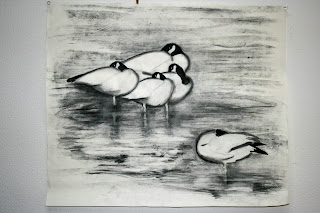
My initial impression was obviously to play up the black and white content of my subject matters, but I wanted to treat the bodies of the geese as my void spaces. Therefore the background needed to be dark to reveal the bodies.
As I looked at the first draft, I immediately felt that the painting was TMI, too much information. It is true that the strokes were haphazardly written, as I was formulating the construction as it was evolving, nonetheless the only "impression" I perceived was "garbage".
My vision had gotten a little clearer. I would like to frame my subjects in
a. A dark background
b. A white body
c. A distinct black and white neck
d. A fuzzy, ink bled lines of the body contour to suggest down feathers
These geese would be sleeping with their heads tucked back. My premise was that I would have a contrast of a few teardrop bodies vs one such body, the Su (sparse) and Mi(crowded) contrast, and that the necks would be tucked in opposing directions for balance.
Notice that I added blue tint to the contour line to add a little flavor.
Working off this basic blueprint, I tried on a less heavy costume. My background became a much smaller patch of gray, but I used pencil marks to accentuate the geometric forms of geese with their heads tucked back. A more minimalistic view.
And I also tried different arrangements, with the bodies painted in.
I was not too thrilled with the results up to this point. I blamed it on my brush techniques, and a lack of control of my ink bleed. Being a resourceful person, I tried the unthinkable.
A quick trip to the local art supply, I armed myself with a charcoal pencil and a bunch of charcoal sticks. For the next couple of weeks, I fretted about how I was going to proceed. Finally it came.
I did everything ( save the neck ) with charcoal. The necks were done with brush and ink and the contour lines was gone over with a moist ink brush to fill in the gray and was allowed to bleed a little.
The painting was interesting. That was a polite way of saying " ah, not that good ". I would have like the lines to be quite a bit fuzzier to animate down feathers. Unfortunately that wasn't the only problem that ailed this painting. This piece assumed too much of a "graphic" look. The worst part was that all the contour lines were continuous and unchanging, a big no no in Chinese brush painting, where Bi-Fa is all important. ( I'll delve more into "continuous lines" in my next blog). I tried to break up these chained lines by darkening the necks and the lower bodies such that a break was more noticeable in the continuum of patches.
Well that didn't work so well. Back to the drawing board.
That was my last attempt at my impressionistic geese. I need to sleep on this for a while and see what happens. I can't feel anymore. I just hope that I haven't cooked my geese.


No comments:
Post a Comment