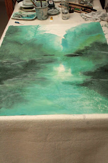
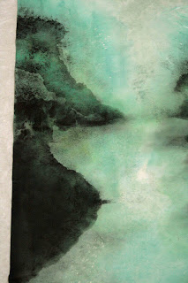
I've been looking at my attempt at Beaverton Creek for a week now. Some of the lustre and vibrancy has gone, now that the Xuan has dried completely and the painting bestows a different ambiance. My dilemma however remains the same; should I continue to paint on the back side or the front side of the Xuan?
I love the hazy, filtered look of the back side, oh and the vivid specks caused by alum droplets. What if I continue to work the back side to better define the overall contours and tree lines? When viewed from the front, would they not present me with the hazy, misty look I was after, but with more detail?
defining tree lines etc
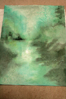
I wetted down the Xuan again and allowed it to be 70% dried. I wanted to paint definite shapes without being too discrete and weighted, taking care to insert a few tree spikes. I worked to intensify the banks/reflections and what have you. The repeated brush strokes had taken a toll on the delicate Xuan and lints were everywhere.
lint on surface of paper
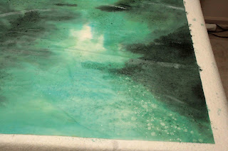
As expected, the painting took on a different feel when viewed from the front now. The additional wash/staining on the back of the paper caused the alum specks to be quite visible from the front now. Somehow I was able to confuse the specks to think the front is the back and vice versa ( or was I being confused?). Chalk this up as an unexpected bonus!
visible specks in lower left corner
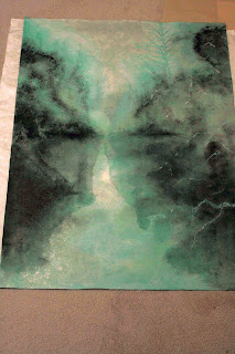
Now that I had attained the feel of the painting, I worked to define the landscape and the incidentals. I didn't want to destroy the feeling of reve, so I decided to use the split hair technique to define my shapes with dots, which is what pixels do. This is done with an old brush whose prime has gone and is ready for the waste basket. The surviving beat up bristles are ideal for rendering these random fine dots. Discriminate use of dabbing defined shapes, shades and texture. I wanted to display certain ambiguities with this method; were those shadows or foggy mists? The layering of these pixels of various saturation actually helped create an illusion of depth; allowing a description of spatial relationship and texture of the various features.
old abused brush finds new life
split hair (scattered dot) results
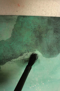
My attention now turned to the banks and reflections. I preferred a more defined outline, since I am working with the supposed surface of a body of water. I described that with a darker colored wash, onto the dry Xuan this time. I wanted these brush strokes to leave a distinct mark.
Using a mixture of titanium white and Label No. 3 green I painted in some branches on the right hand side. These would serve as my foreground incidentals. Some of these features were done with alum initially, just as the specks of sparkle in the water. My vision was to reveal these branches as negative space to contrast with the hazy landscape. I chose to outline (Gou) a few selected branches and trees to make them stand out a little more. The dark thin outline created a border around the brushstroke, achieving an effect similar to digitally sharpening an image. When done right, the effect is subtle but palpable. For me, it is a little Gonbi in Xieyi..............
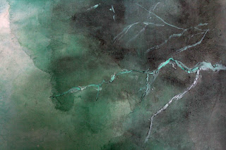
selective "gou"
selective "sharpening" as a result of "gou"
 contour lines depicted.
 ribbon "chuen"
 hemp "chuen"


