Showing posts with label landscape. Show all posts

Monday, March 25, 2013

Beaverton Creek (yellow)

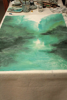
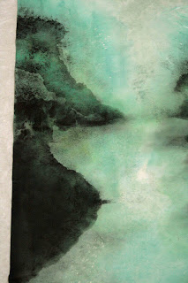
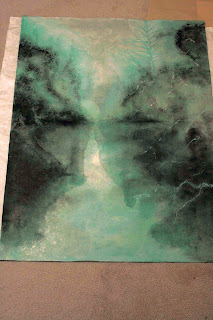
The last Beaverton Creek painting done in green was very impressionistic.  I liked it enough to build a canvas frame for it so that I could mount it a la Xuan-Boo style.

In the mean time I want to try my hands on something a little less wild, but still Xieyi.  The image I conjured up was a landscape bathed in a golden light.  Beaverton Creek, yellow !

 back of  Xuan


Again I mapped the landscape on the back of my Xuan.  This  process allowed me more freedom to flick my brush.  I could then concentrate on building up the painting  on the front side of the paper.

front of Xuan


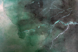
My first step was to add visible branches and tree trunks to the scene.  I punctuated the highlighted areas with tips of branches.  I was trying to achieve the effect which I discussed at my "Visual Acuity" blog.  It is important to extend the exposed tips and branches down, at least in appearance, if not in physicality.  There is a saying in Chinese brush   "bi duan yi lian", meaning the  brush trek is broken up, but the meaning (spirit) still connects.  Sort of like driving down the freeway and using the dotted line to inform you of the virtual divide.  The extraneous branches and stems could be blended in very nicely with the split hair technique.


A few contour lines and hemp chuen  took care of the foreground, transforming a patch of grey into a bank with rocks and texture.


Looking at the rough draft, I noticed a white right triangle sticking out at the lower right quadrant of the painting.  Somehow there was a white line forming a vivid hypotenuse with the white branches.  This is most awful; especially when you are now aware of this flaw.


My remedy was to fill in the hypotenuse and turn it into a contour line.  I now have a more defined shore lobe extending into the water.


Right now this lobe seemed a little awkward, but I better stop now before I commit some knee-jerk changes.

Thursday, February 28, 2013

Mountain Lobes

I've been asked quite frequently as to how to paint mountain lobes.

As I explained in the "Ridge Top Explained" blog,  we treat them like slices of the whole mountain range.  Since mountains come in different shapes, we can paint them into any forms our imagination leads us.

The problem I see is not with the shape, or contour of our paintings, but rather with the interpretation of  the light values.
 contour lines depicted.


My advice is to look at our fingers for illustration.   Each finger represents a lobe or a slice of the mountain.  The outline of each finger is defined by the contour line.  We can see in this picture, the darkest part of the "lobe" is immediately on top of the contour line from the finger below.  The brightest part is right under the lobe's own contour line.  These light values help to define perspective and contribute to the three dimensional feel of the object.  There is no line separating the sliver of bright area from the dark area.

We do want to paint in the contour line ( in most cases ) to define the lobe ( or finger in this case ) but we do not want any lines in between the dark and bright.  The light value line is a concept, not an actual line.  This is the reason that "chuen" marks are preferred in the shaded areas of the lobe, and that the bottom edges of the "chuen" strokes should meet the contour line from below, thus avoid leaving misplaced "bright" areas.

A misplaced line can wreak havoc with our perception of the landscape.  We must not confuse the contour line with the imaginary light value line.

 ribbon "chuen"
 
 hemp "chuen"
 
 
Even complicated landscape masses like the 2 inserts above can be dealt with step by step, as long as one recognizes where the contour lines are, and do not paint a line to denote light values.  Strategically placed shading brings out the 3 dimensional feel.  Pay attention to these nuggets of information next time we look at rock formations.  Garnish the details, but address the entire mass to evoke that "feel".

When in doubt, look at our own fingers.

Saturday, February 16, 2013

Beaverton Creek Cont'd

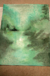
I've been looking at my attempt at Beaverton Creek for a week now.  Some of the lustre and vibrancy has gone, now that the Xuan has dried completely and the painting bestows a different ambiance.  My dilemma however remains the same;  should I continue to paint on the back side or the front side of the Xuan?
 
I love the hazy, filtered look of the back side, oh and the vivid specks caused by alum droplets.  What if I continue to work the back side to better define the overall contours and tree lines?  When viewed from the front, would they not present me with the hazy, misty look I was after, but with more detail?


defining tree lines etc


I wetted down the Xuan again and allowed it to be 70% dried.  I wanted to paint definite shapes without being too discrete and weighted, taking care to insert a few tree spikes.  I worked to intensify the banks/reflections and what have you.  The repeated brush strokes had taken a toll on the delicate Xuan and lints were everywhere.

 lint on surface of paper

As expected, the painting took on a different feel when viewed from the front now.  The additional wash/staining on the back of the paper caused the alum specks to be quite visible from the front now.  Somehow I was able to confuse the specks to think the front is the back and vice versa ( or was I being confused?).  Chalk this up as an unexpected bonus!

 visible specks in lower left corner


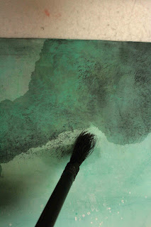
Now that I had attained the feel of the painting, I worked to define the landscape and the incidentals.  I didn't want to destroy the feeling of reve, so I decided to use the split hair technique to define my shapes with dots, which is what pixels do.  This is done with an old brush whose prime has gone and is ready for the waste basket.  The surviving beat up bristles are ideal for rendering these random fine dots.  Discriminate use of dabbing defined shapes, shades and texture.  I wanted to display certain ambiguities with this method; were those shadows or foggy mists?  The layering of these pixels of various saturation actually helped create an illusion of depth; allowing a description of spatial relationship and texture of the various features.

 old abused brush finds new life
 
  split hair (scattered dot) results


My attention now turned to the banks and reflections.  I preferred a more defined outline, since I am working with the supposed surface of a body of water.  I described that with a darker colored wash, onto the dry Xuan this time.  I wanted these brush strokes to leave a distinct mark.


Using a mixture of titanium white and Label No. 3 green I painted in some branches on the right hand side.  These would serve as my foreground incidentals.  Some of these features were done with alum initially, just as the specks of sparkle in the water.  My vision was to reveal these branches as negative space to contrast with the hazy landscape.  I chose to outline (Gou) a few selected branches and trees to make them stand out a little more.  The dark thin outline created a border around the brushstroke, achieving an effect similar to digitally sharpening an image.  When done right, the effect is subtle but palpable.  For me, it is a little Gonbi in Xieyi..............

 selective "gou"
 
 selective "sharpening" as a result of "gou"
 

Wednesday, February 6, 2013

Beaverton Creek

It had been a cold January.

I resolved to make no resolutions for the new year.  Don't want to disappoint myself.  The inactivity has contributed to the build-up of my love handle.  I really didn't want to be snatched up by Michelin to be their tire model, so I ventured out to my favorite hangout Beaverton Creek, despite the lingering freezing fog.

The sun was actually trying to fight through the fog.  It was interesting to experience the stillness of this crisp morning through the haze, involuntarily wiping my wet nose with the back of my hand.  I was a kid again.

So I've been thinking about painting this experience.  I just couldn't decide on how to convey my feelings.  Eventually I decided on forging ahead with the first stroke to get things rolling.  Too much thinking and plotting actually destroys the spontaneity.  I am hoping that once I started, I would be in a groove.

I wanted to let the color of the painting to set the mood.  I prepared a very weak wash using Label 3 Green and laid down the landscape using the splash ink method.  Splash ink could literally be pouring a dish of pigment onto the painting surface if it is large enough, and guide the flow by using brushes or tilting the surface.  In this case I used a large brush.  This is very therapeutic.  This is Xieyi at its extreme.  Large expressive movements without too much concern for details.


I then prepared different hues by mixing Label 3 Green (173) with Label 3 Blue (493) and ink.  I worked to reveal layers of trees and shore line.  Using yellow I dabbed  in the initial highlights.


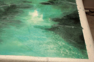
I had envisioned a glistening water surface of the creek despite the lack of direct sunlight that day.  I misted my Xuan paper with a solution of gum and alum with a spray bottle, and had hoped that these droplets would work as a resist and not take on pigments, thereby revealing white spots as glistens and voids in the woods.  This effect is usually more pronounced when viewed from the back of the paper.
 backside of Xuan

 front of Xuan    


I am now faced with the dilemma.  Should  I now paint on the back of the Xuan or continue to work on the front.  Working on the back would allow a stage for the alum white specks and would be more true to what my initial concept was.  The back it is !

 Alum white specks


But then the left and the right side of the image would be flipped. 


Oh well, it is time to take a break.  I'm going to walk away from this and look at it again in a few days or weeks and gather my thoughts again.

Thursday, April 26, 2012

7 Years Ago, 2005

Last week I hopped onto a plane and traversed 1000 miles to go back to my birthplace, Hong Kong.  My mom will be 90 this month.  I am going to wish her Happy Birthday in person.

What kind of gifts should I bear.  My family is not big into this tradition at all.  In fact, we are not into celebrating birthdays at all.  I need to show my thoughtfulness and affection without any materialistic overtones.  Why not paint her something.  This grand idea hit me the week before my departure.
The painting I wanted to write for her is one by Bai Xueshi, a contemporary landscape painter.  I have used his work for my collaborative painting post on 4/22/10.  In fact I have used this piece of work as an example ( similar to using tie in calligraphy ) just recently.  With a goal in mind, a deadline to beat, a painting to emulate,  and adrenalin flowing free, I forged ahead.


The premise of the painting is really simple.  The painting is seemingly split into two halves by the water line, contrasted with elements of "sparse" on the right and "dense" on the left.  The two fishermen on bamboo rafts are thus framed, being highlighted by the void space.

What I have done differently this time is to write the bamboo first.  I then filled in the mountain pillars and their reflections.  The rafts take up the last act.  I learned this sequence the hard way.  What I had done in the recent past was to paint the landscape first.  The coloring actually sized the Xuan paper.  By the time I was ready to lay down the bamboo the paper is no longer as absorbent and the ink ended up just sitting on the paper.  This affected the brush strokes and raised my anxiety level quite a bit.


The above picture showed finished landscape, without the rafts and script.


This picture showed a "failed" painting, not only in terms of the qualities of the brush strokes, but also in the lack of control of ink bleeding.


Here are the 2 attempts pictured side by side.  My mom received the one on the right.  This is the one where the bamboo was done first. There is a far better control of shading and diffusing of the ink to show dense clusters of leaves.  The clear brush marks on the reflections of the mountains left no doubt about using splash ink side tip technique.  The treatment of the outside borders of the mountain added complexity to an otherwise plain splash ink stroke.  The darker center pillar brought itself front and center and pushed back the other pillars to create depth.  The faint and yet distinct water line separated the land mass from the water and created a virtual shoreline.  As a whole I am pleased with my efforts this time, except for my calligraphy.


What made this painting especially meaningful for me, and for my mom is that back in May of 2005 when I visited her, I was just starting to study Chinese Xieyi landscape.  I chanced upon this painting and I unabashedly painted for her.  My mom was (is) so proud of this that she scotch-taped it to the wall of the living room and would tell any visitor who cared to listen that "My son did this".

I did my "good" painting this time in the Xuan-Boo fashion, mounted on canvas and protected from the Hong Kong humidity by Golden gel medium.  It is obviously interesting to make a comparison of
my works, 7 years apart, almost to the date.  The important thing is, mom likes them both; because I did them.

Thursday, December 29, 2011

Silent Protest

This pond would have a dwarf weeping cherry tree and the Heron would come and stand next to it.  Perhaps the bull frog season has ended, the Heron did not find much to stuff through its long neck.  The creature just turned away from the water and chose to face the Dwarf;  motionless, whilst the wind whipped up its chest feathers, betraying its presence.


 I gave the title "ODD COUPLE" to this painting.

The painting was done in a cold tone.  I tried to do the neck as a single brush stroke but I failed.   It took several passes to get the shape down.  I was hoping to write the neck as a reverse "S".  The feathers were side tipped brush strokes.  I used a rather dry brush to begin with, intended on bringing  out the texture of the feathers but the resulting bird was too harsh.  A moistened brush dabbing over the original strokes took care of that.  The outline of the bird was done broken style.  A continuous smooth line would resemble too much of the Gonbi style and would render this "motionless" heron "dead".

The dwarf weeping cherry on the other hand, was made to look menacing.   The clawing branches and the exposed arthritic roots seem to mock the heron.  There is a tension between the 2 subjects.  The tension is not of an overt hostility, but a muted resolve of c'est la vie, que sera sera, whatever !!  The heron has sought solace from an unlikely source.  The tree can't just get up and walk away.  It is what it is.  How often do we find ourselves in this predicament, an uneasy acceptance of our fate?

I was a participant at a bazaar for arts and crafts, hawking my paintings at a ridiculously low price ( so I was told ).   It was a juried event and I applied as an artist doing Chinese Brush Painting.  This venue labeled me as a Sumi-e artist on the program.   Granted my works do use ink and wash, but I am not a sumi-e artist, especially when I did not label myself  as such.  What is the big deal, you might ask.  Let me put it in this perspective:  A Chinese is an Asian, but not all Asians are Chinese.  What's scary about this ordeal is that the event was sponsored by an art school as a fund raiser.  Imagine how that  school would teach Asian art?

So how did the art form that originated from China ended up being labelled here as sumi-e?   When I was looking for teachers for my Chinese Brush Painting, I came across our local cultural center, whose putative mission was to bridge the cultures, and it offered classes in Spontaneous Chinese Brush and Elaborate Chinese Brush.  Obviously I was confused.  Fortunately I could read Chinese.  What the center meant to advertise was that it offered classes in Xieyi and Gonbi styles of Chinese Brush.  I objected vehemently to this advertising and was told that the non Chinese would not understand Xieyi or Gonbi.   So how do we bridge the east and the west?  How do we bridge any culture if we can't even be honest with ourselves, by calling a spade a spade, instead of saying an implement shaped like a flat scoop with a long handle used for digging.  My suggestion was to stay with the proper nomenclature Gonbi and Xieyi, and put(  Elaborate Chinese Brush ) and (Spontaneous Chinese Brush ) in brackets.  Exposure is everything; we must allow people the opportunity to be familiar with and start using the proper terminology.

Do we translate proper nouns?  Would anyone attempt to translate President Bush other than phonetically?  Likewise we would not allow Chairman Mao to be translated as Chairman Hair! (Mao means hair in Chinese)

When China changed the nomenclature of Peking to Beijing, she asserted to the world that she wants the world to address her as she would address herself.  Peking was probably the  result of some foreigner trying to emulate Chinese pronunciation of Beijing.   At first I was led to believe that this was pidgin English but later I understood pidgin English was something else totally.  Yet during the last Olympics many of the news anchors from  the U.S. ( some of them well known national personalities ) while doing the broadcast in situ , would insist on pronouncing the simple "J" sound in Beijing as a "J" sound in  French "bon jour".  These anchors must have known in their daily contact with the locals and yet they insisted on their assumption.  The word Beijing meant "North" "Capitol".  I am glad that it was not translated literally and only phonetically.   When we insisted on calling Chow Mein by its proper name, people learned to accept it for what it is, just as they accepted crepe and baklava.   Unfortunately us overseas Chinese, especially those of us in the States did not have the spine to insist on calling our fried rice as Chow Farn, thus allowing us to be the butt of the joke for saying  "fly lice".  I, for one, refuse to believe that Chinese could not distinguish "B" and "P" sounds, or that we are deaf to "R" and "L" sounds.  My belief is that we are afraid to "stir up" trouble.  We don't want to make a mountain out of a mole hill.  We were taught to not offend others.  After all people do get the gist of it, so why insist? 

At the bazaar I overheard some Asians telling their western friends to ignore my booth because my "stuff" was "not Chinese" and they were really "not good".  Obviously mine were not museum nor gallery pieces, but neither were any of the other artisans.  Perhaps my pieces did not fit the stereotype?  Did tramping on a fellow Asian elevate us to be more sophisticated and savvy or did it expose our own insecurity?   Would I have felt the same betrayal had the people saying that were not Asians?  For the price I was asking for, my works were real bargains, but that really wasn't the issue.

For my town of half a million souls, the population is innocently naive when it comes to Chinese Brush painting, or at least most of the fellow artists that I had dealt with are.    Words like sumi-e and kanji are used generically sans ill will, just as Google had enjoyed the transformation from a noun to a verb.   People are eager to show that they know something of the eastern culture but stumbled in their quest because they were never told the truth.

So there is this feeling of injustice, insecurity and ambiguity in me.   Should I continue to voice what I perceive as inaccurate or just tolerate with a patronizing smile.  Should I allow myself to be casted as a sumi-e artist doing spontaneous painting on rice paper?   Need I worry that if I insist too strongly then there might not be a role for me to play at all, because the public would have perceived me of having a "bad attitude"; to coin a favorite corporate  Management verbiage.   The fact that local Chinese restaurants that serve Chinese food have few Caucasian clients and the Chop Suey joints here have no Chinese customers speak volume for my concern.   Perhaps what I am serving up on my Xuan-boo is chop suey??

I blame this outburst  on the holidays.  I am told that people are a little moody around this time of the year.  .  I should know, I am a pharmacist.  I must be the Grinch of the X'mas.  Could it be I am just suffering from SAD?  Better up my Prozac dosage, and in the meantime I'll protest in silence.

 Let it be, just let it be, uttering under my breath.

HAPPY NEW YEAR


Friday, September 23, 2011

PS Taming of the Silk

As I mentioned in the last blog, my painting on silk was not colorfast and I had to display that behind a glass pane, which is kind of a pain for me.  The reflection off the glass really bothers me and I can't afford museum grade non-reflective glasses.

I thought of using Scotchgard.  Unfortunately my local arts supply store does not stock it  and a quick visit to Target found them out of stock on that item.  Just my luck.

Was cleaning out my garage one day and behind a box of medicine vials, masked  by cobweb was a can of Camp Dry.  This aerosol can must be 20 years old at least.  It is a product used to water-proof boots, tarps etc. for outdoor activities.  So I decided to give it a try.  What the heck, I have nothing to lose and everything to gain.  This whole thing about painting on silk was an experiment to begin with.

I wiped clean the aerosol can, followed the direction, 3 applications with 4 hours drying time in between.  I sprayed generously onto my painting, not even bothering to test for discoloration or anything.


To my utmost gratification, the result is awesome.  Not only is my painting repelling water like a shellacked hull, but the product also made the painting look richer.  And the best part is, no glares!!

This pack rat has found salvation.

Saturday, September 17, 2011

Taming of The Silk

A good friend of mine , a Hua Yu ( meaning members who paint), gave me a roll of silk for me to paint on.  My friend does beautiful Gonbi style paintings, and she was showing me her paintings, and relating how different brands of  color and gouache work on silk.  She must have sensed my eagerness to try and graciously let me have some.

Unfortunately I always thought I knew better.  This is my Achilles Heel.  I felt that the silk that was given to me feels too synthetic (feels crispy and looks shiny) so I was determined to find "real" silk.
A few phone calls later checking into the usual craft stores and fabric outlets, I located some silk at the local Mill End store.  So here is my friend who knows a lot about painting on silk, and yet I wanted to be my own trailblazer.  I must also clarify here that this is not an original work by me.  I was trying to emulate some ancient painter (Ming, or Song Dynasty??).  I am sorry I can't remember who the arts was, so enthusiasts could trace back to the original and learn from the master also.

My nightmare is about to begin.

The silk I purchased is brown in color ( I want to do paintings with the antique look), soft and feels heavy in the hand.  I couldn't wait to take out the fabric from the plastic bag and began to write a few words in ink on it.  To my horror, the ink just ran off the fabric, like water on the back of a duck.         They must have used something in the dye to render the fabric water repelling, so  the silk went into the bathtub,  and I poured in a generous amount of denatured alcohol, and Resolve, and detergent.   Whatever it was in the fabric, I was determined to  extricate that.  My bathroom permeated with the scent of alcohol, reminded  me of a clinic; a clean smell.  I am glad I am not a smoker.

Well that trick did not work.  I remember my friend telling me that she had to use a gum and alum solution to size the silk before she paints on it.  To me, this was counter-intuitive.  Sizing would add to the water repelling property. 

For some reason this worked, albeit just a little bit.  The fabric would take on ink now, but it required several passes before the ink stroke registered.   I like the fact that the pigment in the gouache seems to migrate to the edge of the stroke, leaving a natural border to the stroke.  I don't know if I could attribute this artifact to the silk.


Since I had to make overlapping  passes with my brush, any brushstroke qualities became virtually indistinguishable.  The texture of the silk fabric, tandem with multi-layered strokes, made the lines take on the air of a  charcoal drawing .


Bamboo stems, which needed to portray the bouncy tensile, showed instead a string of splinters, reminiscent of a bad whittling job.


This absence of brush stroke would absolutely ruin the bamboo leaves.  The blades had to suggest an edge, a point, at the very least.   I remembered  the "Magic Brush" I bought in Hong Kong.  It has a very soft (felt) tip, behaving much like a fine brush, and is fed by disposable ink cartridge.  I bought it for use for my plein aire sessions, but it fit the bill quite nicely here.  Whatever the cartridge holds, takes to the fabric pretty well.


The final obstacle came when I was trying to mount this silk painting on canvas and discovered that ink and color was coming off the fabric.  Back to the drawing board, literally!

I need to use the silk that my friend gave me.

Sunday, August 28, 2011

Multnomah Falls Again?????

It is one of those days, hot and muggy.

As I picked up my feet and placed one in front of the other, dodging the red dragonflies that had wandered into my path, I kept counting, almost audibly to myself, the numbers of switchbacks I had taken.   It was a steep and steady climb, perhaps the grades were too much for my silvery brows, they were soaked.    Breathe easy, I told myself.  Stick your chest out, can't let other people see me panting like a dog.  The sign said 11 switchbacks to the top, and I made only 4 so far. 

The familiar lapping sound nudged me onwards.


As I closed the distance to the next turnaround, I felt the air charged exclusively with  negative ions;  there was this freshness that automatically invited my lungs to expand.  Out of the corner of my eyes, just beyond my eyelashes, framed by the sentries of trees, a silver ribbon was fluttering downwards; flaunting a few pirouettes before it disappears behind he trees.  As I looked upwards towards the sky, the flanking basalt walls were featureless against the sun, decorated with a golden hue around my vision field, exacerbated by my cholesterol deposits around my pupil. 

So here I am, back to painting the Multnomah Falls again.


In this attempt, I shied away from using the Falls as my main character.  Rather, I am using supporting characters to frame the subject.  Thus I did not want to burden the Falls with exacting accounts, but to give it a mere "presence".  A presence that is sonorous and delightful.  I wanted to hear the choir through the pillars of the hall;   I was not interested as much in the faces of the ensemble.


Obviously I stayed away from my past mistake of placing the Falls front and center.  To "write" the trees, I decided to use the tried and true techniques of the more classical eras.  The near ground trees/shrubs were done using the "outlined" method.  I tried to impart different types of leaves to the woods to suggest a diverse vegetation.  The shapes of the leaves need not bear resemblance to the real plants; these were products of rote learning.  The emphasis was to have an assortment of trees and to be able to establish a spatial relationship of the bodies.


The "outlined" trunks and leaves transitioned to a "boneless" method of portraying for the more distant objects.   This technique is used quite frequently in Chinese landscape paintings.


My design was to have a very dark outer ring of details to contrast the empty spaces ( the falls).  In order that the darks are not too heavy and covered  up details, I layered in my dark values on the back of the Xuan paper.   I also wanted to leaves and trunks in the foreground to retain that translucent quality, so the colors were mixed with alum to give them more of a resist property.  The tree trunks were meant to be empty spaces, to contrast them sharply with the dark background.  Unfortunately the "dark side" was too intense and the "force" was not with me,so now they look tinted, which is still acceptable, albeit  not what I had planned.


I had to go over the "outlines" a few times to revive the lines lest they get buried under all the stains.  This "going over" is actually kind of a boo boo in Chinese brush painting.  This is akin to "touching up" and it takes away the spontaneity and the expressiveness of the brush strokes.  I really need to practice on my patience............ do a light outline, just enough to start the painting, and then finish with the dark brush strokes just once, as the final act.


Wednesday, August 3, 2011

Multnomah Falls Impression

After my last attempt, which was a more Xieyi (expressive) interpretation of Multnomah Falls, I decided to carry that momentum a bit further.  I wanted to express motion and spatial relationship with more of a "presence" than descriptions of details.  The following picture was my attempt in this endeavor.


Not everybody has been to the Falls or seen pictures of it.  So I decided to play it up a little.  I used blue streaks to create the upper cliffs.  The streaks were done so that they themselves resemble moving water.

The blue wash was mixed with alum applied side tip fashion onto Xuan.  Alum functions as a sizing
agent, helps to delineate the brush strokes;  makes the brush strokes more vivid in the sea of blue wash.  Thus we have a laminar flow of blue ribbons, rounding the corner to flow into the hour-glass void below.   A grayish overlay is then applied over the blue streaks.  The grey wash was again created by using alum solution as diluent.   This was done to prevent the wash from totally blending into one big flat surface.  I wanted stroke marks to show up a little better, simulating the horizontal crevasses in the cliff wall.    These marks also helped to suggest interruptions in the stream ( even though the grey area is not the stream ) and gave an illusion of  motion.
The actual narrow ribbon of upper fall was again painted with alum first to establish a base layer of resist, to ward off  as much unintended seepage of wash as possible.  At the head of the upper fall, I just held my brush and waited for the color to slowly bleed out to the desired spaces before moving on.   This controlled osmosis when executed alongside of alum sizing will create some artifacts that will indulge your ocular senses.

The hour-glass void represented the lower fall.  Its shape was inspired by the exaggerated proportion of a woman's body.  Imagine Marilyn Monroe coming at you with open arms, donning a black cape.  Get the picture now?

The lower fall is flanked by bold side tip brushstrokes.  This was my interpretation of the near scape of the land.  The hour glass shaped lower fall was again defined by the use of alum.  I was careful to not make the entire structure black.  I took time to make sure I leave some white slivers in them, so they can breathe. 

I wish I had done the bridge in a more Xieyi fashion.  More nonchalant, more expressive.  Right now it looked too stiff.    I was pushing it too much.
There  you have it.  Multnomah Falls, Impression!

Sunday, July 24, 2011

"Multnomah Fall" Chinese Style

It is no secret that I am not happy with my Multnomah Fall painting and have attempted some remodeling to the painting.  Yet I am still bitten by the bug.


I've decided to try to depict the fall more as a presence than as a specimen.  I employed simple lines.
I created 3 stages, the near, the middle and the far.  The learn by rote training came into play.  It wasn't too difficult to snatch different scenes from repeated practices.


  The near scene enjoys the darkest lines and is shacked with the most details.  Trees are done in the outlined style, sort of.  The middle stage cradles the bridge and the lower fall, which then empties into the creek.  The far scene is staged by the upper fall, flanked by sentinels of straight cliffs.  The fog and  mists at the bottom of these cliffs are used to push them way back, further away from the rest of the masses.  I should note that in the original draft, I felt the width of the lower fall was too wide.  I cleverly turned the right edge of the lower fall into a steep embankment, effectively narrowing the spillway.


I kept the color scheme simple.  The indigo blue was used mainly for effect.  The cold color helped to foster distance, yet adding punch to the painting.


I did the frame a little different from the traditional way.  Instead of an assembly of 4 sides, I skillsawed an opening into a plank of pine to accommodate the canvas.  The pine is finished in gold to render an "antique" look.


This piece was submitted to a Calligraphy and Painting competition hosted by the Confucius Institute.
Whereas I have not received any notices from the Institute,  I am very happy to see my work poted as the promotional piece  on their main page under the C and P category.
http://promotion2011.chinese.cn/index.php


Saturday, June 25, 2011

Etude


Examples of  Landscape practice pieces.  I intend to use some of these as instructional materail.  Why not?  Write a blog and be able to use it for teaching...... I guess this is what you would call killing two birds with one stone.