Monday, July 18, 2016

Destruction, Reconstruction

I painted this version of Beaverton Creek in a more traditional manner, trying to incorporate classical techniques of showing mixed flora and landscape.

It is now looking more awkward to me everyday.  Perhaps it is my color scheme; too vibrant.
The tree at the bottom is too ostentatious.  I remembered intentionally picking that color, sort of like a punctuation mark.  Perhaps it was mod when I did that, but now it looked really out of place.  Like going out dressed in a Victorian outfit.

Perhaps I was too busy sorting out the different techniques and I forgot about the cohesiveness of the painting as a whole.


I've been itching to do something about it.

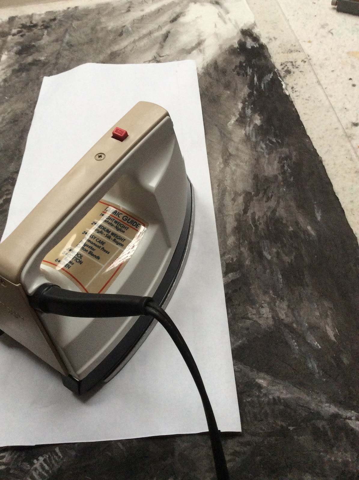
Once a painting on Xuan is mounted, in this case on canvas, there's virtually no way to make any corrections. Then the idea came to me that I must be willing to sustain some casualties for any corrections to happen.  The question is how much am I willing to gamble or sacrafice.

Go for broke, I finally decided.  It would be a fun exercise and experience for me.

My weapon was sanding paper.  Yes sanding paper.

I decided that I needed to destroy some of the things I had built into this painting before the phoenix could arise from the ashes.

Gingerly I sanded away with my 100 grit paper.  The image was getting lighter, ever so slightly.  The lines were becoming less well defined and the painting assumed a more relaxed attitude.

OOps, I sanded too harshly.  There was a hole.

Pull back, breathe easy.  Easy does it.

I stopped before I totally mutilated my painting.  I mixed a dilute paste of gesso and ink and scraped that on with a putty knife.  


I started to re-paint on the dried gesso, changing color, shape and what not.  Everything was fair game.  I held no prisoners.


After the repainting had dried, I proceeded to sanding again.


As I discovered, the process of sanding and re-gesso and re-painting actually formed intricate overlapping layers of paint and gesso and the combined effect was almost like something done with air brush and displayed depth that wasnt there before.

I love this amalgamation process.


The lines and brushstrokes dissolved into mere suggestions with easy transition from one area to the other.
Notice the hole I created from sanding too vigorously.


The heavy lines of the bridge was sanded off and now wore a weathered look.


I retained the clear lines and saturation at the lower left corner


The right side of the bridge was obscured further by repeated sanding and re-staining


The patch where the lookout was located became just a suggestion, with mottled rails


In this rebuilding process I changed the perception of the water by introducing haze.  It could be mist, it could be the reflection of the sky.  I changed the color and shape of the foliage at the bottom.  I lightened the bridge quite a bit and concealed the ends more fully such that the structure is less harsh.  I also retained the clear brushstrokes at the lower left corner for contrast with the rest of the painting.  I expanded the color field around the trees, i.e. the barren tree in the middle had a color cast way beyond its branches. The entire left half of the painting had clusters of yellow hues.  I found myself drawn in by the scent of these baits and wanted to explore more.  The painting might look hazy but as one looked through the fog, there was still a lot of detail for the audience to travel through.  That satisfies the depth perception, in the Chinese painting canon anyways.

The painting looks western, and yet the way the mixed foliage is portrayed is classical Chinese brush, choice of color notwithstanding.

This painting now reminds me of a place that is dreary and misty and grey.   A place I call home.  A place where the disease called SAD exists.  The acronym stands for Seasonal Affect Disorder.  That's when a person suffers from mood disorder because of insufficient exposure to daylight.  The remedy is phototherapy, where artificial light is used to fill in the gap. 

I think the transformation was quite dramatic.

Thursday, July 7, 2016

Face, Second Phase, Third Phase

For my second face on that huge piece of paper, I wanted to expand on the theme of eyes closed.

No, not eyes wide shut as in that steamy movie, but something more cerebral.

For some reason, Buddhism came into mind.  I wanted to paint the attainment of Arhat.  Such state encompasses ridding of all thoughts, worries,pain, matters of life and death, and removed from all worldly  burdens.

For this face, I chose to do something a little different.  I wanted to paint it with reversed values.  I needed it to resemble a photo film negative.

I began by sketching the basic construct with very light ink.


I then worked on building up the values, black is white, white is black


Finally all the values are in


The original sketch showed slits for the eyes, where eyeballs would reside.  In this negative rendition, I intentionally left out the eyeballs.

The interesting thing is, to me anyways, that after I looked at the picture for a while, my brain seemed to work overtime and started to fill in the blanks and the image no longer resembled a film negative anymore.  It started a life of its own.  The fact that it had no eyeballs was not relevant anymore, nor was it evident. In fact it seemed like Arhat had his eyes closed also.  The eyeballs were just surreptitiously missing.

I did the face in this fashion because I had a statement to make, which I will delve into more deeply in the future.  The gist was I wanted the negative image to be a contrast with the rest of the faces.  I imagined that the audience would  sense the disharmony  but they probably couldn't tell right away.  In fact I was hoping this divergence would create a certain level of discomfort or apprehension but one was not able to attribute to the source.

For the third face I chose a figure from the Buddhist theme again


here is the painting with all the faces


At this point I really am not sure what my next step should be.  My intention is to call this quits; before I do something stupid.

Sunday, June 26, 2016

Saving Face

I was having fun painting the face of the Dream State piece.

Make hay while the sun shines, strike it while it's hot....... enough of dorky cliches!

I decided to do more faces.


Well, that's one face.  It's a start.

My intention is to paint a few faces on this piece of Xuan, perhaps carrying the same mood or theme.   I'll let that thought brew for a while.

Wednesday, June 22, 2016

Oil and Water expanded

Knowing that my oil and water method leads to results, I am itching for new experiments.

I recall the picture I took of people doing Tai Chi in a courtyard dotted with sculptures.  In this picture I had the face of a sculpture in focus and the rest of the scene was out of focus.  I decided to paint this scene.

My premise is to create a conflict, or contrast by utilizing focal points and ink tones.

My first task is to paint a face, a face of a statue.  This face is consciously distorted; not only to remove any references or semblance to photography, but also to format it to fit the dimensions of my Xuan.  Bulging eye, fat lips, short chin.  Really complex emotions.  Somehow it seems to work.


I now tidied the shadows of the face a bit, and begin my painting of the Tai Chi gestures.  I am using oil to depict my gestures.  This is set on a red matte board so I can more easily see the figures.


The wet areas around the oil laden figures is a diluted ink solution, ready to reveal the oil slicks as voids when dried.


I took this picture in dim light to better show off my gestures painted with oil, revealed by ink.


I am at a point now where I don't know what my next move should be.  I don't know what else to add to or modify.

At this point, I'm also concerned about whether the oil would go rancid or not in the future and how is it going to affect my mounting.  Oh well, too late to worry about that now.

Good time for a break.

I am calling this piece Dream State, or Der Traum; for now.

Sunday, June 19, 2016

Getting down to the nitty-gritty of Suliao Xuan Ban

I See The Light is ready for mounting and framing.

To say that I'm a little apprehensive is an understatement. I' really don't want to ruin my piece in this delicate process, especially now that the piece has been adjudicated into an exhibition.  I need to have it done.

I'm employing my Suliao Xuan Ban method to make the painting appear like a float; to highlight the fragile Xuan and the starkness of my light show. This process involves the dry mounting process, when the tissue paper like Xuan is affixed onto a sheet of clear plastic.  The adhesion is provided by fusing the paper to the substrate with heat transfer fusion paper.

In the wet mount method the starch glued piece can be soaked to rid it of adhesion and begin the mounting from ground zero if a boo boo was made.  This luxury, if one can call that as such, is not afforded by the dry mount. The bonding cannot be reversed easily.


First the fusion  paper is tacked onto the clear plastic. My favorite tool for this purpose is a heating iron left over from my model airplane building days. I used this to iron on the skin to the spars of  the models.

After the backing on the transfer paper is peeled off, my attention turns to the air bubbles.  I burst them with a pin and press them flat using a rubber eraser, avoiding body oil from using my fingers.  I don't know if such precaution is necessary, but I rather be safe than sorry.


The Xuan with the painting is now laid on the bonding surface, and is ironed on through a cover sheet to avoid marring the painting.   The procedure of tacking  in place with the small iron is repeated, followed by using a regular iron for a uniform surface.  The trick in tacking now is to use sufficient heat for some fusion to take place, yet not too hot to allow wiggle room for the Xuan to shed its creases and wrinkles.  This is where tender loving care comes in. The big iron is used only after I am satisfied with the quality of the painting's surface.


A blank piece of Xuan is then bonded onto the opposite side of the plastic for white balance.


Here is the finished product in the custom frame I made,


The white border around the painting is not matte board, but rather the wall behind the frame.

Thursday, June 2, 2016

It's Like Oil & Water

I've been struggling with my lines.  The quality of lines.

I seemed to be sketching and tracing, rather than laying down decisive, strength laced calligraphic brush strokes.

I know I must practise on my calligraphy, there's no two ways about it.  Somehow I resent such exercises.  I feel restrained, contrived,  trying to copy all the nuances in each brush stroke precariously, all the time wishing that I could just write like that.    My frustration is that I never seem to be able to lift any benefit from this arduous task.  Whatever I learnt from  brush calligraphy somehow defies to be translated into painting.

No I'm not having the blues, I just happen to find my old Tai Chi painting from the pile in the corner of my room.  I have the urge to revisit that subject matter, with a twist this time. I'll side step the lines. Find an easy way out.


I shall do the gestures in forms and not line figures.

Since I've been doing black and whites lately, I shall continue my pursuit in this vein.

Instead of using alum to block off my forms, I decided to experiment with using oil.  My theory is since oil and water don't mix, perhaps the space occupied by oil will prevent water or ink from seeping in.  So goes the experiment.

The following is one of the gestures done with just plain cooking oil.  I let the oil dry overnight before I attempted to do anything more to the experiment.


I found out that the oil patches could be overcome if I used concentrated ink.  So I throttled back and started out with a more diluted solution, subsequently building up to the desired degree of blackness.  The oil laced gestures actually helped me tremendously in deciding which part should be filled in with ink or not, and also allowed me some freedom as to modify the boundary between oil and water.  I found myself morphing the figures as I went along and it was quite exhilarating.  Almost like chiseling out a marble  figurine.


Then this idea suddenly crept into my consciousness.  I've been leafing over pages on acupuncture books and I was in the process of trying to understand the 12 main meridians and the organs they are associated with.  Why don't I illustrate my gestures with these meridians.  Who knows, they might be educational, for me at least.  My plan is to gather them into groups of Hand Ying, Hand Yang, Foot Ying and Foot Yang, plus the Du and Ren (Governor Vessel and Conception Vessel).  This should account for the twelve regular meridians, plus two of the eight Vessels.  That's a plan anyways.

Here I painted in the three Foot Yang meridians (Stomach, Bladder, Gall Bladder) in red


I also experimented with depicting the meridian (Foot Bladder)  from a second sheet on the bottom, since the figure part is quite translucent


Foot Kidney meridian (Ying, in blue)


I've been ruminating.  Had my command of brushstrokes been better, I would never have thought of all these "tricks" to experiment with.  I suppose if everyone was naturally beautiful and perfect, the hair dye, mascara, lip stick industry would not have existed.  Necessity is the mother of invention.  Just saying!

Before I segue too far from the topic, I just wanted to say that I'm not too happy with the portrayal of the meridians.  I shall look for a more artistic way to depict them.  I am hoping for a way to combine science and art into one.  

In this particular instance anyways.

Thursday, May 19, 2016

For What It's Worth

There was a painting competition for high school students.  The subject matter was flowers. This happened in Hong Kong.

This was probably a project sponsored by the likes of urban parks council or parks and recreation, etc.  A noble effort to promote art and participation and drew attention to the merits of a city park.

The result of the competition, along with the works was posted outside the administration office, where the public can view during operation hours.

The  First Place winner of the group is


The Second Place winner is


I remembered the unsettling emotion I felt when I saw the results.  I was confused, perplexed.  I felt the judges were wrong.

It really was none of my business.  I was just someone who loves and appreciates painting, certainly not a juror by any stretch of the imagination.  Art is a very subjective thing.  Beauty is in the eye of the beholder.  How do you agree or argue with a urinal being accepted as modern art, or breaking a Ming vase as a program of arts had any redeeming values.  I am venting again with these off the cuff remarks.  My apologies.

Anyways I was prepared to do a rather informal, unscientific survey of my own; I asked my painting cohorts to rate these 2 paintings.

I did not tell them what this was about or who did them.   I just presented them with the 2 images and asked them to rank them.  They did not even have to tell me why they ranked them that way.  I was not looking for a reason, just a ranking.  I believe this way people feel a little more secure in the sense that they need not expose their thoughts or feelings or biases.

To my delight, only one person agreed with the judges.  The rest of us thought it should be the other way around; that the Second Place winner should be awarded the First Place.

I don't know if this has anything to do with our social indoctrination or our immediate cultural environment.  I am sure that it does.  I have my own theory.

The top painting seemed more exuberant, full bodied and vibrant.  A value more often associated with prosperity, happiness and abundance.  It closely animated the Chinese saying of A Hundred Flowers Blooming Together.   Auspicious is the word that comes to mind.  A more traditional value in the Asian culture.

Whereas the second painting seemed more abstract and airy.  Ostensibly a merit in the Xieyi style of painting, nonetheless succumbed to the relative frugality of floral arrangements. There was a distinct feeling of the subject matter and the background, the host and the guest.   Whereas my cohorts and myself are Asians but we are now immersed in western culture and perhaps are more receptive to the  less representational presentation.

Or, my cohorts and I instinctively shared the same affinities.  The fact that we agreed on something just says we have the same taste, not that we are right or wrong.

Our tastes have changed.

Just a thought, for what it"s worth.

Sunday, May 8, 2016

Who! Where?

Our local educational channel aired a program on owls.  It turned out that a huge forest park close-by is actually a habitat for a certain species of owl.  This particular species is not nocturnal and can be seen during the daytime, its inclination for secrecy notwithstanding. 

I've tried to venture out and see it for myself but have not had much luck.

I thought of a painting of the woods that I did some time ago.  I thought that painting was missing something.  For one thing the painting looked a little anemic.  I had wanted to depict the ambience of woods in scattered light, punctuated by the crisscrossing trail.  What a perfect opportunity for me to jazz it up with a couple of owls.

So I filled in more foliage to make the painting look fuller, and  to give it a more structured feeling.  I also painted in a wash of very light dark green, barely perceptible; perhaps as a subliminal stamping that the scene is of a woods.  A couple of owl was inserted atop of tree stands.


Can you find the owls?

This following is the "before" look of the painting


Friday, April 29, 2016

I See The Light, the verdict

After looking at the pinned painting on the wall for a couple of weeks, I couldn't think of what other changes I could make to it.  I personally thought the effect was quite dramatic.  I had mulled the painting from near and afar.  I would look at it from 10 feet away, to see if it hit me in any way.  I would examine it from 2 feet away, looking at minute details and brushstrokes.  I wanted the painting to have a visual impact that could reel in the audience, then smother them with fine details, like reading the pages of a fine novel.

I would walk into the room with my eyes looking away and then turned my attention to the painting abruptly, just to see if I could get a rise out of it.  Some Geek, I know.  But that's the joy of painting, for an amateur like me anyways.


Before I got too indulged in my own work, I decided to solicit the opinion from the pros.

The first pro is a famous artist who studied in China and France and is well versed in both Chinese and Western arts.

The artist did not like my using of the alum, or gouache or gesso at all, which was really surprising to me.
"Dirty" was the comment. It looked unnatural and smudged.  Too much covering up.  Try to paint by leaving voids was the advise.


However this artist really liked my treatment of the trees in the background.  It was subtle, full and yet not cluttered at the same time was the encouraging comment.  Again urging me to rid the contrived highlights.


I took the painting to another professional painter for critique.  This artist studied in China and is well versed in charcoal and oil, doing landscapes and portraits.

I told this artist about my reservation and ambivalence in using gouache and gesso and alum since these are rather unconventional ways for painting on Xuan and the reply was that I need to paint the way I see it.  My only concern should be on how I express myself. There is no right or wrong in painting so don't let my own ignorance shackle myself.

This artist had exactly the opposite opinion from the last pro.

This artist didn't think there was any problem with the alum etc and the painting was not "dirty" as the other pro would have put it.  This artist thought my use of the highlight was quite effective and gets the point across.

The problem however was with the background.  It was felt that my repeated washing and re-adjusting of my black/grey areas rendered the painting too "heavy".  Thus the ethereal feel of ink and water on Xuan was  lost.  I had forsaken the translucent, fragile feel for this heavily caked look.  The advice was to brush up my perception of the values and just do it with simple aplomb and certainty rather than repeated staining.

This was especially refreshing for me to hear, coming from a artist who normally deals with canvas and heavy stock paper, to have such an insight on the feel of the paper itself.

I have forgotten that the Xuan that I painted on is an integral part of the work, and not just a passive substrate.  It too could effervesce a nuance into the overall presentation of the piece.

My saving grace, hopefully, is the fact that I had planned to frame this piece of work using my Suliao Xuan Ban method to allow the painting to be shown via back-lit lighting.  I am convinced that the translucent virtue of Xuan would still come through.

We shall see.

Monday, April 18, 2016

I See The Light, cont'd

Now I needed to tend to the main element of this painting, the light, or beams of light to be specific.

My basic premise was a black and white painting having a diagonal divide, with a darker right lower half contrasting with the lighter left upper half.  The center beam of light would be the most pronounced, hitting the fern plant in the foreground.  Half of the plant would be highlighted, to add to the drama of the light show.

In order to train my brushstrokes to the proper orientation to showcase the rays, I cut out strips of newspaper and placed them in the pattern of the rays.  My design was to have these protected areas be the light beams, thus whilst I could paint in the background, I could just paint over these strips of newspaper, not having to worry about broken or disjointed brushstrokes.  In my mind, the painting would be sliced up by these swaths of void, but I didn't want the piece to feel scrambled.  I wanted that knife edge feel of a search light beam.


The newspaper covered areas would not be totally vacant, since I had started to paint in the background already but using ink diluted with alum.


 Now I would ramp up the intensity of the "dark" areas to show off the voids.  It's all an optical illusion.


The rays of sunlight seemed too staged and rigid in the painting.  This was not unexpected, since I was rather draconian in blocking in my light rays.  Fortunately this offered me an opportunity to gradually change the black or grey values, to make the painting look more pleasing and less mechanical.  That required patience, something I am constantly reminded as a virtue that I am lacking

I needed to manipulate the length, the width, the intensity and the spacing of these rays..

Somehow the painting still looked odd to me.  I couldn't quite tell what was wrong with it but I knew something was missing.

After I got tired of scratching my head, and some other parts of my anatomy, I cheated by digging out the photography again; just to see if the picture could help me re-live the moments when I snapped it.

What was missing became imminently apparent.  It was the details at the upper right hand corner.  What I had now was a huge hole.


I was thinking beams from the sun, all the while forgetting that the light squeezed in through spaces at the tree tops.  That little bit of detail at the upper right corner made all the difference.  It defined the portal where the beams sneaked through.


A lighthearted and well placed smudge by the brush fixed that problem. 

The painting looked finished now, all pieces were accounted for.  While I was plugging up the hole on the upper right, I also added some finesse to the painting.  I added some highlights to the tree trunks and branches.  I mentioned that I mixed ink with alum solution to hopefully get some clear margins on my brushstroke edges.  Well that didn't happen as I had hoped, so I did my own garnishing.  I used a watered down white gesso as my pigment.  I was just experimenting and the results were fine.  These seemed less luminous than the gouache and showed the highlights in a subtle way.  Definitely not overpowering like the fern leaves.


Thursday, April 14, 2016

I See The Light

I recalled a photography I took while walking in the woods.

It was a foggy kind of morning and the sun was out.  The beams of light from the sun were piercing through the tops of tall fir trees, and wiggling through leaves and needles of cedar;  illuminating the morning mist as they descended onto earth, turning the space into an outdoor cathedral.  I could place myself in a dim duomo,  the swirling smoke from the burning incense being caught by the light coming in through the stained glass windows.


I wanted to paint this.  In black and white, with ink and Chinese brush, on Xuan.

Immediately I was faced with a challenge.  How would I portray the fern that caught the light?

In traditional Chinese painting light value is seldom an issue. The emphasis is always on brushstrokes, whether they possess rhythm, strength and if the composition is ethereal.   Here my emotional connect was with this theater of light beams, and I am using ink to establish my values; to set my stage.  Traditions out of the window.

I would normally use the unpainted areas of my Xuan as my reference for white, but that seemed inadequate in this setting.  In my mind the untouched areas are "neutral", and I needed a way to depict "brightness" beyond neutral.  I needed to find a way to go into the "positive" values.  I wanted to be able to show that the fern was in the lime light, its fish-bone like leaves were emanating the reflected solar energy.

I called on my old trusted friend alum, exploiting its sizing quality.
 
I first painted the lit areas of the fern with a saturated solution of alum and allow that to dry completely.  This process helped to protect my fern from future staining by ink, as long as the ink was kept light.  In other words, if I could paint  in the surrounding spaces judiciously, I could stay away from the brushstrokes laid down with alum.  This is sort of similar to using masking fluid in watercolor painting,   Masking fluid could not be used in conjunction with Xuan because the paper is so fragile,  Imagine using masking fluid on toilet paper!  I would not be able to erase or peel off the dried mask.


Because the alum could not shield ink completely, I chose to go over my brushstroke with titanium white or white gouache again.  So why did I not just do the gouache in the first place?  That would save time and effort.

By adding a real opaque layer on top a semi translucent layer of alum, I was having 2 overlapping white ( or void ) layers, slightly juxtaposed, creating body and thickness.

I had to insert a colored under-pad to see my white brushstrokes, since the white wool pad that I normally used did not help to create a contrast.


I then painted in some of my background firs.  Here I diluted my ink with alum solution.  The purpose was to laid down tracks that were semi impermeable to subsequent brushstrokes, such that it could be seen as vague and solid at the same time.  I was concerned that any future staining, washing of the background could render these stands into oblivion; into an abyss of darkness.  I wanted the outlines to be discernible at the very least.  I wanted to create an air where one senses the presence of the trees, but is not aware of them as individuals.  Also I was hoping for some of the alum would migrate to the edge of the brushstroke before drying, thus forming a thin clear margin, representing the lit edges of the trunks.  Hopefully that would happen serendipitously.


Friday, March 18, 2016

Postscript To My Exhibition

I am sorry the exhibition is now over.

All the planning, visualizing, coordinating, plot maps, surveys, mounting, frame making, meetings, anticipating, joy and angst are now all but memories. 

The exhibition was a still-born to begin with.  We were rejected initially.  Fortunately one member of the group persisted and one year later we got the gig.  One puts forth all that energy, to have a moment of discussing art in a legitimate and conducive environment, and be able to grasp the moments of stimulating exchanges, only to be dealt the inevitable ebb that follows; 

There is no real reason to start a new day now.

Is this what postpartum blues feels like?

There were some moments during this exhibition that were endearing to me.

Typically the conversation during such an event revolved around  "what is your medium", "do you use India Ink?","is that water color?" , "what is that red mark, is that your name?"; and ended with " Xuan? Oh you mean rice paper!"

I encountered none of these this time around.

3 pieces of my work received a lot of attention.

The first one is labelled  LONELY.


It was a dark piece, both in tone and in substance.  Ostensibly I was trying to depict a lone wolf crying to the moon.  However the birds in the barren tree revealed by the cold moon told a different story; at least in my mind.  The birds had found refuge, they had a place to nest, even in an unforgiving tree, yet the wolf beckoned.  For what, I don't know.  Surely the animals are of different species and any kinship is unlikely, yet the wolf longed for company, be it the moon, be it the birds, be it the tree, be it just the cold night.

Most people who would open up and discuss the painting with me got the message. I was convinced the title helped to convey that.   It was interesting however to note the other extreme of the spectrum.  A visitor asked me what kind of birds were in the trees, to which I answered with a rhetorical and perhaps annoyed tone: "Does it matter?"  At this point other visitors chimed in by offering me moral support, by adding to my quip, by saying the species of the animals did not matter at all.  They were just convincingly opportune props for my story telling.

The piece I named GOING HOME was originally called All By Herself.


I renamed it because I thought the new name was more apt to tune people in.  I believed Going Home was a more encompassing title, able to corral more complex emotions.  I had written in the past about whether a piece of work should be named or explained.  My assertion was that yes it should, and a proper title helps to steer people.   I sought the help of a lone woman, in eminently disappearing daylight, and a place yet to collect diners, to set the stage for inopportune occasions; wrong place, wrong time.  Time waits for nobody.

For those who got the message, they distinctly remembered the title, and vividly described the emotions they felt.  I could never forget the quivering voice that uttered to very few words but that the painting was "poignant". I could look into her eyes and saw her soul.  We were at the same place.

Then there was the INTREPID TRAVELERS.


No one asked me how it was done.

I stated in my previous blogs about the composition and the technique employed in completing  this piece.  The landscape and the reflections of the riders in water were just there to showcase and to challenge my craftsmanship.  The real dialogue was delivered by the vast sky.  It was this 90 percent of the painting that the visitors were relating to, telling me how they perceived the story.  In a way the vast empty space with coffee and tea stain functioned like a Rorschach inkblot test.  It was a vehicle by which people told of their own personal experience.

In this particular instance, it was paradoxical that the title did nothing to guide the audience to the four creatures in the painting.  They were not fooled by the prop and were able to look at the bigger stage.

The stage of emotions and feelings, and all the textures that accompanied them.