A friend of mine turns wood as a hobby and gave me a turned vase for the heck of it. He had applied a coat of sealer on it (the purple coat in the picture). It offered me a new playground.
I brushed on 3 coats of white gesso, allowing each coat to dry before the next application. I mixed in some custom lime green color on the final coat to give it a very light greenish hue, reminding me of an Araucana chicken egg shell.
After smoothing out the brush marks by sanding, I painted a few shrimps on the vase. I made this work "legit" by painting my chop on it, since a flat seal would not go on a curved surface. The entire surface was then sealed with urethane from a spray can.
The result was pleasing, I thought.
I am an enthusiast of Chinese Brush Painting and I would like to share my trials and tribulations in learning the craft. I want to document the process, the inspiration and the weird ideas behind my projects and to address some of the nuances related to this dicipline. I hope to create a dialogue and stir up some interest in the art of painting with a Chinese brush on Xuan. In any case, it would be interesting to see my own evolution as time progresses. This is my journal
Tuesday, March 5, 2013
Thursday, February 28, 2013
Mountain Lobes
I've been asked quite frequently as to how to paint mountain lobes.
As I explained in the "Ridge Top Explained" blog, we treat them like slices of the whole mountain range. Since mountains come in different shapes, we can paint them into any forms our imagination leads us.
The problem I see is not with the shape, or contour of our paintings, but rather with the interpretation of the light values.
My advice is to look at our fingers for illustration. Each finger represents a lobe or a slice of the mountain. The outline of each finger is defined by the contour line. We can see in this picture, the darkest part of the "lobe" is immediately on top of the contour line from the finger below. The brightest part is right under the lobe's own contour line. These light values help to define perspective and contribute to the three dimensional feel of the object. There is no line separating the sliver of bright area from the dark area.
We do want to paint in the contour line ( in most cases ) to define the lobe ( or finger in this case ) but we do not want any lines in between the dark and bright. The light value line is a concept, not an actual line. This is the reason that "chuen" marks are preferred in the shaded areas of the lobe, and that the bottom edges of the "chuen" strokes should meet the contour line from below, thus avoid leaving misplaced "bright" areas.
A misplaced line can wreak havoc with our perception of the landscape. We must not confuse the contour line with the imaginary light value line.
Even complicated landscape masses like the 2 inserts above can be dealt with step by step, as long as one recognizes where the contour lines are, and do not paint a line to denote light values. Strategically placed shading brings out the 3 dimensional feel. Pay attention to these nuggets of information next time we look at rock formations. Garnish the details, but address the entire mass to evoke that "feel".
When in doubt, look at our own fingers.
As I explained in the "Ridge Top Explained" blog, we treat them like slices of the whole mountain range. Since mountains come in different shapes, we can paint them into any forms our imagination leads us.
The problem I see is not with the shape, or contour of our paintings, but rather with the interpretation of the light values.
My advice is to look at our fingers for illustration. Each finger represents a lobe or a slice of the mountain. The outline of each finger is defined by the contour line. We can see in this picture, the darkest part of the "lobe" is immediately on top of the contour line from the finger below. The brightest part is right under the lobe's own contour line. These light values help to define perspective and contribute to the three dimensional feel of the object. There is no line separating the sliver of bright area from the dark area.
We do want to paint in the contour line ( in most cases ) to define the lobe ( or finger in this case ) but we do not want any lines in between the dark and bright. The light value line is a concept, not an actual line. This is the reason that "chuen" marks are preferred in the shaded areas of the lobe, and that the bottom edges of the "chuen" strokes should meet the contour line from below, thus avoid leaving misplaced "bright" areas.
A misplaced line can wreak havoc with our perception of the landscape. We must not confuse the contour line with the imaginary light value line.
When in doubt, look at our own fingers.
Saturday, February 23, 2013
Snakes, just for Fun
This is what happens when I get restless. I should be doing other things more useful but I find many excuses! This is one of them............... Happy Year of the Snake.
Saturday, February 16, 2013
Beaverton Creek Cont'd
I've been looking at my attempt at Beaverton Creek for a week now. Some of the lustre and vibrancy has gone, now that the Xuan has dried completely and the painting bestows a different ambiance. My dilemma however remains the same; should I continue to paint on the back side or the front side of the Xuan?
I love the hazy, filtered look of the back side, oh and the vivid specks caused by alum droplets. What if I continue to work the back side to better define the overall contours and tree lines? When viewed from the front, would they not present me with the hazy, misty look I was after, but with more detail?
I wetted down the Xuan again and allowed it to be 70% dried. I wanted to paint definite shapes without being too discrete and weighted, taking care to insert a few tree spikes. I worked to intensify the banks/reflections and what have you. The repeated brush strokes had taken a toll on the delicate Xuan and lints were everywhere.
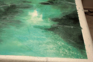
As expected, the painting took on a different feel when viewed from the front now. The additional wash/staining on the back of the paper caused the alum specks to be quite visible from the front now. Somehow I was able to confuse the specks to think the front is the back and vice versa ( or was I being confused?). Chalk this up as an unexpected bonus!
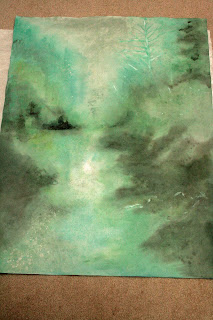
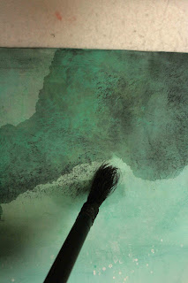
Now that I had attained the feel of the painting, I worked to define the landscape and the incidentals. I didn't want to destroy the feeling of reve, so I decided to use the split hair technique to define my shapes with dots, which is what pixels do. This is done with an old brush whose prime has gone and is ready for the waste basket. The surviving beat up bristles are ideal for rendering these random fine dots. Discriminate use of dabbing defined shapes, shades and texture. I wanted to display certain ambiguities with this method; were those shadows or foggy mists? The layering of these pixels of various saturation actually helped create an illusion of depth; allowing a description of spatial relationship and texture of the various features.
My attention now turned to the banks and reflections. I preferred a more defined outline, since I am working with the supposed surface of a body of water. I described that with a darker colored wash, onto the dry Xuan this time. I wanted these brush strokes to leave a distinct mark.
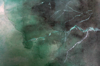
Using a mixture of titanium white and Label No. 3 green I painted in some branches on the right hand side. These would serve as my foreground incidentals. Some of these features were done with alum initially, just as the specks of sparkle in the water. My vision was to reveal these branches as negative space to contrast with the hazy landscape. I chose to outline (Gou) a few selected branches and trees to make them stand out a little more. The dark thin outline created a border around the brushstroke, achieving an effect similar to digitally sharpening an image. When done right, the effect is subtle but palpable. For me, it is a little Gonbi in Xieyi..............
I wetted down the Xuan again and allowed it to be 70% dried. I wanted to paint definite shapes without being too discrete and weighted, taking care to insert a few tree spikes. I worked to intensify the banks/reflections and what have you. The repeated brush strokes had taken a toll on the delicate Xuan and lints were everywhere.
As expected, the painting took on a different feel when viewed from the front now. The additional wash/staining on the back of the paper caused the alum specks to be quite visible from the front now. Somehow I was able to confuse the specks to think the front is the back and vice versa ( or was I being confused?). Chalk this up as an unexpected bonus!
Now that I had attained the feel of the painting, I worked to define the landscape and the incidentals. I didn't want to destroy the feeling of reve, so I decided to use the split hair technique to define my shapes with dots, which is what pixels do. This is done with an old brush whose prime has gone and is ready for the waste basket. The surviving beat up bristles are ideal for rendering these random fine dots. Discriminate use of dabbing defined shapes, shades and texture. I wanted to display certain ambiguities with this method; were those shadows or foggy mists? The layering of these pixels of various saturation actually helped create an illusion of depth; allowing a description of spatial relationship and texture of the various features.
My attention now turned to the banks and reflections. I preferred a more defined outline, since I am working with the supposed surface of a body of water. I described that with a darker colored wash, onto the dry Xuan this time. I wanted these brush strokes to leave a distinct mark.
Wednesday, February 6, 2013
Beaverton Creek
It had been a cold January.
I resolved to make no resolutions for the new year. Don't want to disappoint myself. The inactivity has contributed to the build-up of my love handle. I really didn't want to be snatched up by Michelin to be their tire model, so I ventured out to my favorite hangout Beaverton Creek, despite the lingering freezing fog.
The sun was actually trying to fight through the fog. It was interesting to experience the stillness of this crisp morning through the haze, involuntarily wiping my wet nose with the back of my hand. I was a kid again.
So I've been thinking about painting this experience. I just couldn't decide on how to convey my feelings. Eventually I decided on forging ahead with the first stroke to get things rolling. Too much thinking and plotting actually destroys the spontaneity. I am hoping that once I started, I would be in a groove.
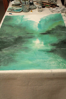
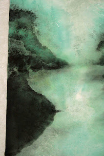
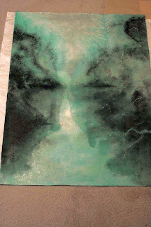
I wanted to let the color of the painting to set the mood. I prepared a very weak wash using Label 3 Green and laid down the landscape using the splash ink method. Splash ink could literally be pouring a dish of pigment onto the painting surface if it is large enough, and guide the flow by using brushes or tilting the surface. In this case I used a large brush. This is very therapeutic. This is Xieyi at its extreme. Large expressive movements without too much concern for details.
I then prepared different hues by mixing Label 3 Green (173) with Label 3 Blue (493) and ink. I worked to reveal layers of trees and shore line. Using yellow I dabbed in the initial highlights.
I had envisioned a glistening water surface of the creek despite the lack of direct sunlight that day. I misted my Xuan paper with a solution of gum and alum with a spray bottle, and had hoped that these droplets would work as a resist and not take on pigments, thereby revealing white spots as glistens and voids in the woods. This effect is usually more pronounced when viewed from the back of the paper.
I am now faced with the dilemma. Should I now paint on the back of the Xuan or continue to work on the front. Working on the back would allow a stage for the alum white specks and would be more true to what my initial concept was. The back it is !
But then the left and the right side of the image would be flipped.
Oh well, it is time to take a break. I'm going to walk away from this and look at it again in a few days or weeks and gather my thoughts again.
Thursday, January 10, 2013
Two Female Nudes
I came across a black chalk painting by the French artist Aristide Maillol ( 1861-1944 ) . It was a painting of 2 nude females. What captured my attention was the impressionistic depiction of the female body with firm bold lines and exquisite light values. As a fan of photography, I wish my photos could exude those qualities.
I studied the painting for a few weeks, and decided I would try to copy the painting, using my understanding of Gou, Chuen, Ts'a, R'an. I started out with charcoal sticks on Xuan paper, developing my lines and rubbings with charcoal. I then used the coffee that I was drinking as a pigment to process the lines and shading, to get that sepia look. Ink was used to further enhance the lines and the shaded areas. Raw Xuan paper turned out to be a perfect media for this endeavor.
It took on the charcoal nicely, and by paying attention to the stray (excess) charcoal dust, one can incorporate them into a nice gradient when applying the wash. The thick lines give thickness to the image and help to bring a 3 dimensional feel to the drawing, as was discussed in how to paint contour lines in my landscape blogs.
I don't want to merely learn from Aristide Maillol's interpretation of the female body, I also want to exploit the translucent property of the Xuan. My scheme was not to paint the two bodies together as the original work did, but to paint them on separate pieces of Xuan, and then superimpose the images. The result is quite interesting. The two bodies seem to be in different dimensions now, and the conversation between them becomes more intriguing.
I studied the painting for a few weeks, and decided I would try to copy the painting, using my understanding of Gou, Chuen, Ts'a, R'an. I started out with charcoal sticks on Xuan paper, developing my lines and rubbings with charcoal. I then used the coffee that I was drinking as a pigment to process the lines and shading, to get that sepia look. Ink was used to further enhance the lines and the shaded areas. Raw Xuan paper turned out to be a perfect media for this endeavor.
It took on the charcoal nicely, and by paying attention to the stray (excess) charcoal dust, one can incorporate them into a nice gradient when applying the wash. The thick lines give thickness to the image and help to bring a 3 dimensional feel to the drawing, as was discussed in how to paint contour lines in my landscape blogs.
Wednesday, January 2, 2013
Amending the Tree
Riding on the energy and motivation of finishing the tree project, I decided to add to the 70%.
I tidied up the background with hints of vegetation with scattered brush. I used these, along with titanium white to soften up the dark patches. A yellow wash is applied to the whole painting after the Xuan has been thoroughly moistened. Yellow is a very difficult color to handle, but it think it would coordinate the color scheme and give that impression of filtered light. Dark green dots are placed along strategic branches to exaggerate the layering. I've also darkened some of the branches to appear more as a silhouette but leave others quite faint, to simulate the effect of squinting into bright light and the edges dissolve.
Finally I re-cropped the painting to give it more of vertical bias. I think this helped to rationalize the overly long lines of the person's back. Now I need to figure out a way to move the tree away from the center !
Subscribe to:
Comments (Atom)


