Wednesday, February 26, 2014

We have a problem

I have been casting that occasional glance at my horse paintings, especially the joie de vivre  piece.
These seemingly casual encounters actually help to form the basis of a non-analytical analysis.  What an oxymoron!  What I meant is that I started to feel instinctively something is good or bad, and that motivates me to pry into the causes for my concerns.

I felt that something is amiss. 

Well let me see what is good first.

I liked the effect of the white margins left by the alum solution.  As I said before, my inclination to use alum is probably due to my inadequacy in my brush strokes, my Gi Bun Gong, and my lack of control of the proper amount of water.  A good painting is a successful interplay of ink, water, paper and brush.  I have used different types of Xuan paper.  Aside from different absorbency and tendency to bleed, some will retain a more distinctive margin in between brush strokes.  Since I am not a connoisseur of Xuan or ink, I only had the pleasure of chance encounters with said products.  I do not know enough to seek out a particular type or brand to acquire.

Anyways I was able to portray the apparent feel of tendons and muscles by giving them definition with white margins in the following example:


The white margins left by alum also helped to add layer and depth in the hairs of the mane and tail:


And of course I love the body language of the horse, enough to name it  joie de vivre.  What gives this painting a sour taste is the neck area of the horse.


I suppose the painting of animals do require a certain understanding of anatomy.  In this particular case the strong neck muscles needed to control that long cervical spine is totally missing in the representation.   What I have depicted is almost like kids playing with sand on the beach, trying to build a sand horse.  Bucketfuls of sand is piled on top of the chest to depict the neck, without regards to how the neck should be attached for articulation.  What I have erected was a column that I called a neck and placed it on top of the body, without accounting for how this column should be rested on the shoulders.  Hence begging the question, should anatomical proportions and placements be exact when doing Chinese brush painting?  According to 6 doctrines prescribed by Xie He (謝赫 )likeliness only assumed the number 3 position of relative importance.  Can I write off  this miscalculation by saying brush strokes trump proper anatomy?  I don't know.  I wish I know!

From the painting, we can see the white margin left by the original brush stroke of the neck.


In subsequent shading and augmenting the lines, I had changed the contour of the neck column.

This is the result after digitally erasing the extraneous brush strokes outside of the white margin to shape the neck better.  Does this alteration render a better fit for the neck to the shoulders?


Did this simple change breathed new life into the painting?

Friday, February 14, 2014

Joie de vivre

I had my Happy Year of the Horse painting pinned on my wall;  indulging myself in narcissistic glaring sessions.

After the initial euphoria had subsided, I stepped back and began my self critique phase.

I need better looking lower limbs on that horse.

I started with the same basic outline of the animal, but with a broader stroke.  I was going for sort of a boneless brush stroke, creating more of a silhouette than outlines.  I was hoping this would make my brush more expressive.


I was treating the lower shanks more like a calligraphy stroke;  with discrete stops and lifts and pressure variation.  I also pre-wet my brush with alum solution.  As you recall from all my toying with alum solution, I was going for that discrete white margin around the brush strokes.  As I overlay and correct my lines, these white margins would give an illusion of muscle groups and tendons.  If I was a master in brush painting, I would have left the "white spaces" to my brush but I am not at that level yet.  Thus I cheated with my faithful alum solution!


Another thing I need to mention is that I had tried to paint the mane and tail with side tip strokes and they just don't look right.  After I looked at Xu Beihong's horses, I realized that they should be done with center tip brush strokes.  Since the lines go every which way, it is important to rotate the shaft of the brush such that the tip is always lined up with the changes in direction, thus maintaining the center tip attitude.


Side tip strokes


Center tip strokes


This is the revised version of my horse.  I am certain we can still find fault with my techniques and craftsmanship, but I am happy with the expression and the feeling the painting conveys.  I especially appreciate the neck and head movement.


I sense that the horse is speaking to me.  This is a Happy-Go-Lucky horse.  This is a horse with that Joie de vivre swagger.

Wishing you all the same!

Monday, February 3, 2014

Horsing Around (with horses this time)


The last time that I was horsing around, I was trying to paint a herd of zebras back in 2009.  I was more intrigued with the black and white contrast and the shape of the herd.

My motivation for horsing around this time is because of the Year of the Horse in our lunar calendar.  You can say that I am trying a little  harder, and with a little more heart.

I started out by sketching a horse on my sketch book with a brush fountain pen,  just to get a feel of how the animal might look with brushed lines.


Then I started in earnest with a Chinese brush to doodle on Xuan paper.


I found a reference book with paintings of horses by Xu Beihong( 1895 -1953).  Mr.Xu is acknowledged as an authority of  horse painting in modern Chinese painting.  I tried to study and emulate his brushstrokes and style.  He actually spent some time studying drawing and oil painting in Paris.  I think his horses display a strong sense of Chinese brush strokes mixed with a western flavor  of anatomy and shading.


Emboldened by his examples, I tried the following


Using a combination of brush fountain pen, Chinese brush and charcoal, I rendered this horse on drawing pad as the model for my horse painting.


This time around I line drew the horse on Xuan with brush and ink.


Filled in shading.


Touched up my lines.  Using the coffee that I was drinking to add further shading.  I thought that added warmth to the tone.


Friday, January 31, 2014

Friday, January 10, 2014

Depiction of shape and form


I enjoy painting Canada geese.  It is their black neck with the white break just behind their eyes that catches my fascination initially.  I consider that particular feature, along with their knobby legs to be perfect models for practicing my calligraphic strokes.

Xie He was a Chinese critic in the 5th century who proposed the 6 doctrines, or canons , of Chinese painting.

He listed Vitality, possessing of energy as the top priority of the art form. This was followed by the mastering of brush strokes, calligraphic traits. The 3rd on the list was depiction of shape and form.  I had his words in mind when I started out to explore how to paint Canada geese.

I assert that these 3 doctrines are tightly intertwined.  I also believed that depiction of shape and form trumps the first two.  Only after one masters the depiction of form and shape can one transmit the confidence and savvy into lively brush strokes with conviction.  Obviously one has to master the foundation of brush strokes in order to proceed.

Allow me to share some of my sketch studies when I first embarked on painting Canada geese.

The black band at the front of the head reminds me of a parallelogram with a spout attached to the bottom.  The white band begins behind the eye and ends at where the neck would begin, with the lower edge forming the bottom of the head.


The neck itself is the expressive part.  This is where good practice of center tip brush stroke comes into play.  The curvature and attitude of the neck animates the story.


The body of the goose reminds me of the shape of rhombus or football (rugby).


Alternatively it could be a teardrop shape when viewed from above, or tail fin shape when the bird is floating on water;  just hark back to the Cadillacs of years gone by.


As far as the lower extremity is concerned, I would play up the knobby knee joint with the bow legged pigeon toes and I can parlez the feel of the goose waddling down the grassland.


By observing these birds feeding  and playing, one could successfully incorporate different neck attitudes with certain gaits and really bring your painting to life.  This is a proposition with a sanguine outcome.

Hopefully my observation and interpretation of the Canada goose will help any geese  enthusiasts with their painting projects.

Good painting to all.
.

Wednesday, January 1, 2014

Ole Oak Tree- Happy New Year 2014

Today is the first day of 2014.

 I am not a person to make new year's resolutions.  I know too well that I make them  just so I have something to disappoint myself with :).  I have been harboring this image of oak trees, and I have no explanation for it. 

Why oak trees?  Perhaps they provide a big and sturdy umbrella?  Perhaps they weather the winter well?  Perhaps they are there !

There is no better day than today to record that on paper.


Happy 2014.  I welcome thee.


Saturday, December 28, 2013

Mounting problems

I have come across a really thin paper, known as the Cicada wing paper.  Very delicate, very translucent, very airy.  Paintings done on this paper have a different ambiance.  There is a loss of saturation with the ink and color, in exchange one gets an ethereal accounting of the brush strokes.  It is excellent with "mood" paintings.  It has a muted feel.

When it comes to mounting works done on this paper however, I was faced with all kinds of obstacles.  I was definitely in uncharted waters.

The paper tends to give up pigments and dyes if these are laid down too heavily.  This presents a grave problem in the customary wetting down the paper to relax the fibers before mounting.  To sidestep it I tried to apply starch to the mounting substrate instead and brush on the dry painting.  This alleviated the bleeding out problem ( for the most part ) but it was such a pain trying to brush out all the creases.  In fact I tore up a few practice pieces in the process.

After I finally got better at this, the final product was far from ideal.  Once the piece of "cicada wing" is fixed on a piece of substrate, it loses the very quality that gives it the tenuous feel.  I've experimented with different substrate thickness, but even the thinnest substrate I have is still too smug, breathless and stiff.  Imagine a beautiful lady donning elegant sheer lace, only to have the presentation destroyed by wearing something underneath the sheer garment.  You get the picture.

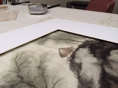
I experimented with not mounting the painting at all, but to just pin it down on foam board, and surround the work with a border of foam board.  On top of this border is the frame made with mat board.


 Basically I was playing with a float type presenting of the artwork.  The floating mat frame casted a delicate shadow and created a little breathing room such that the piece of cicada wing assumed a less restrained attitude.


This seemed like a workable solution to present works done on cicada wing paper.  In the meantime, I am looking forward to more experimenting in 2014!