Thursday, July 28, 2022

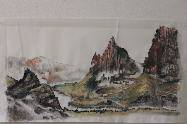
Looks better in color

I remember long time ago a viewer offered me more money for a black and white ink painting of mine if I would paint another one just like that for her, but in color.  I politely refused; unyielding with my principles.  Being snooty perhaps.  I must admit however, sometimes that sentiment is legit.  Obviously there are many occasions a black and white brush painting imparts a certain je ne sais quoi which would be robbed if done in color; but my latest landscape painting is not one of those occasions.

I've been looking at that painting for almost two weeks now and it has not grown on me.  Perhaps it is neither luminous nor moody.  Time for cosmetics. 

I have grown to like the practice of coloring from the back of the Xuan.  I am starting with the rocky structure on the left and the distant hills in the background.


Phthalocyanine blue and ocher is now painted over the top of the under-painted rock.  The resulting color is not one would expect if one was to simply mix and paint all 3 colors together on the surface of the paper.  This is one of the properties of the Xuan paper that one can exploit.


The original alum mixed brushstrokes help to define discrete edges of hard surfaces, setting up the  loose ambiguous brushstrokes of the foreground.  I am borrowing the bokeh effect from photography now and I love the presentation.


The alum solution helps to fix the ink more readily onto the paper, leaving visible margins even after coloring or additional brushstrokes.  The patchy appearance reminds me of crusty lichens on rocks or tree barks.  A lot of brush/Xuan painters shun such effects for being too "rigid" or "lifeless" but I think it is perfect for adding texture to hard surfaces. 


Coloration somehow adds drama to the void spaces.  I believe there is a lot of room for me to feather out the edges, with the help of color of course, if I choose to.  I think eventually this would be a battle between how much of the brush or bleeding or wash I wish to reveal.  In traditional Chinese Brush, this is known literally as the balance between brush and ink.  


I am tempted to leave the painting in this state.  It has an interesting, albeit an unfinished look.  Oh well, since I am not Schubert, I better finish my work.  


The color looks more saturated or vivid when wet.


This is how it looks on the wall when dried.


Friday, July 8, 2022

Yet another landscape

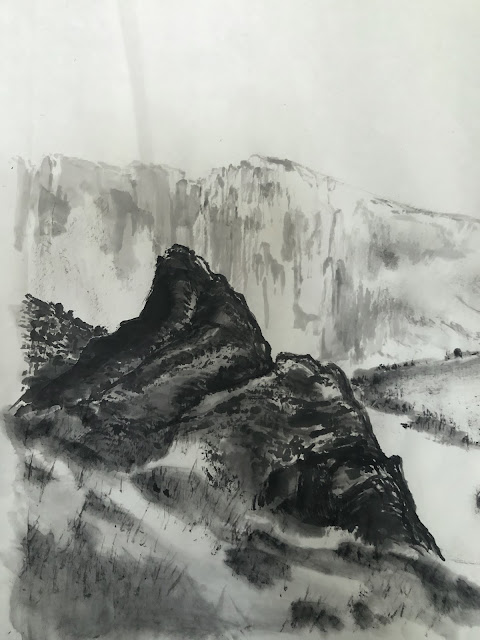
After my attempt at painting Chibi (the red cliffs) I want to try my luck on another landscape painting, with cliffs or stony features as my main player; again.  Whereas the Chibi painting was sort of dreamy and poetic, I intend for the current production to be more hard and staunch in character.  

For this attempt I am mixing my ink with alum solution to paint on traditional Xuan paper.  The slight bleeding from the brushstrokes allows the paper the stage to express soft strokes.  Alum working as a mordant tends to eliminate that quality by fixing the ink before it has a chance to escape into the microfibers of the paper.  I am looking for harsher brushstrokes to help depict the rocky texture of my intended landscape.

My model comes from the central part of Oregon where it is a little less lush with greenery but more abundant with rocky outcrops and mesas. The Deschutes River and the Crooked River are landmarks that inspire me, so I shall use them as my references and give the Columbia River Gorge a pass.


First item on the list is a rocky structure occupying the left side of the painting.  I suppose I've not found my rhythms yet and the brushstrokes feel very contrived.  Of course the remedy for my shortcoming is to immediately paint the background with diluted ink and loose brushstrokes without the alum as a conspirator, thus the markings are much more relaxed. 


Contrasting with the hard edges of the rocky structure are not only the diluted ink for the distant hills, but also the soft non-discrete foreground, as if the camera is out of focus and the viewer is using the bokeh to frame their image in the head. 

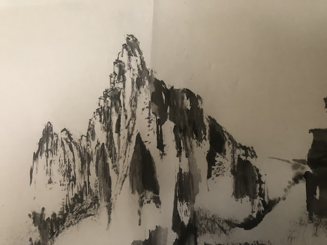
The center portion of my painting is taken up by the sharp, chiseled rocks of the landscape.


The alum/ink mixtures helps to cement the brushstrokes before they have a chance to bleed; offering a stern appearance.


One can see discrete and distinct white margins unmolested by ink due to the fixing property of the alum.  


Previous brushstrokes tainted with alum also function as a resist, and allow subsequent overpainting with other brushstrokes.  Typically this is an absolute no-no but in this application the juxtaposition makes interesting patterns.  We are talking about nuances of brush works on Xuan paper now, so this might not be evident to a casual observer.  I've experimented with painting with alum solution on the back of the paper first to achieve this effect, but that takes a lot of planning and is less spontaneous than mixing the alum with ink.  This is an experimentation anyways, so the jury is still out as far as I am concerned.  


The flat exposed rock face on the right of the painting is done with the folding ribbon chuen brushstroke.  Diluted ink is also applied at strategic locations to emulate vegetation from the crevices; to soften up the harsh edges of the composition.


An assortment of line chuen, akin to the hemp chuen is used to doll up and texturize the non-rocky parts of the landscape.  I mean, if Monet and Van Gogh can employ dots and lines to fashion their works, why can't I, right?  Actually the dot and line chuen technique has been in practice in Chinese brush techniques since antiquity, I am just making light of them.


The dry rubbing technique is a way to create shadows and change up light values.  When paired with a wash, the combined effects are often employed to describe mist or to dissolve and integrate a void space into the painting.


Just as a make-up artist using eye liners and shading to prop up the cheeks and shape the jaw,  I am using vegetation and reflections to depict a river, something that is fluid to contrast with the otherwise harsh features.  Hopefully a story line can emerge!


Tuesday, June 28, 2022

Revisions

I revised a couple of my old paintings and since I've recently acquired a new camera lens I was eager to find excuses to put it through its paces.


Wednesday, June 15, 2022

Red Cliffs Nostalgia, The Grand Finale

At the onset of the painting I laid out my objectives for this painting, and one of them was to be able to highlight each of the 4 landmarks of the Columbia River Gorge by incorporating them into my fictitious staging of a real historical Chinese naval battle, the Battle of Chibi.  The landmarks are of course the Vista House on top of Crown Point, the Multnomah Falls, the Rowena Loops and the Stonehenge replica.  I also wanted these 4 subplots to be able to stand on their own rights as a painting by themselves.

Now that the painting is finished, let us delve into these 4 elements.

The Vista House at Crown Point:

The red cliff face is adorned with loads of vertical hemp chuen brushstrokes to give the surface texture.  These brushstrokes stand out nicely against the staining done from the back of the paper.  The Vista House itself is too big when compared with the real structure.  Visually speaking, the building should be perhaps on the scale of 1/50th the height of the cliff.  So my Vista House is at least 10 folds too big.  I suppose my zeal of wanting to emphasize the structure got the better of me!  To my defense, this is a fictitious painting, so accuracy is not a prerequisite and anything goes. 

The Multnomah Falls:


I like to draw the viewer's attention to the hemp chuen brushstrokes in the light areas of the hills.  The red color reveals beautifully against the light staining from the back of the paper.  Together with washings of different ink tones, a rich texture is achieved without rendering a messy appearance of unbridled brushstrokes.  In other words, a clean look.  

The Rowena Loops:


Realistically speaking the winding roads should be more on a level plane than hanging off the sides of the cliffs.  But this is much more dramatic!  Right?  I really enjoy the dreamy background of distant ranges as depicted by the very loose and relaxed brushstrokes.  

The Stonehenge:


I am particularly fond of the classical rendering of the shrubs and trees.  I also love the very simple coloring scheme.  It exudes an air of a Chinese painting for sure. 

I am going to be mounting my painting on canvas.  I already have my canvas primed with gesso and ready to go.

The painting is laid face up on a flat surface and wetted down to relax the fibers.


During the course of doing this painting, I inadvertently ripped a hole in my paper.


I used to freak out about such mishaps.  Now I don't fret over it anymore, because these tears will be almost imperceptible after mounting.  The glue will mend the tears as long as the flaps are kept intact.

The wetted paper is allowed to dry to a "moist" state such that there is no dripping water and the paper is soft and pliable without getting too fragile due to the additional weight of the moisture content.  Now it can be rolled up and be ready for the next step, which to affix it to my canvas.


Starch is applied to my canvas and the rolled up painting is aligned and unfurled onto the canvas and pressed down for good adhesion.  The whole assembly is allowed to dry.


Painting on canvas after drying:


With frame:


EPILOGUE

My inspiration of the painting came from bantering with my overseas friends about using Chinese literature in songs etc. and I was motivated to put in my two cents with my painting.  As I have stated, my painting borrows from the landmarks of the Columbia River Gorge.

I have done a painting of Columbia River Gorge before, a strictly scenic rendition.  I am putting these two paintings up for comparison. 


I feel that my Red Cliffs Nostalgia piece is infinitely more poetic.  I believe the fact that I have the words of Su Dongpo to teach me makes a huge difference in my interpretation of the otherwise identical  river gorge, albeit with a few landmarks rearranged.  

My new painting wears a understated elegance; as if it was cloaked in a Sarong of silence, allowing the words of Su Dongpo to enunciate:

"大江東去浪淘盡 千古風流人物
江山如畫 一時多少豪傑
故國神遊 多情應笑我
人生如夢 一樽還酹江月"

  "The incessant waves urge the river eastward, taking with them all the accomplished people.  Such picturesque landscapes, how much history have they witnessed.  Perhaps I am being too sentimental, reminiscing the days gone by.  Life is but a dream. allow me to scatter my wine, ode to the river, and to the moon."
 

Friday, June 3, 2022

How Red Are The Red Cliffs

With the blue section done on the painting, it is time to paint the red cliffs

So how red should the cliffs be?  I had not intended for the painting to be a faithful representation of any facts, other than my nostalgic feelings about Su Dongpo's verses.  Do these cliffs resemble the red landscape one finds along the highways of Utah?  I researched online trying find pictures that show what the Red Cliffs look like today but I failed.  It turns out that the exact location of the Battle of Chibi (Red Cliffs) is still a highly debated topic.  There is a city called Chibi in China's Hubei province but the photos online does not give any indication about cliffs that are red, other than the huge carvings of the words Chibi in the rocks.  I suppose this supports the debate that the term Chibi (Red Cliffs) perhaps got its name from the flames illuminating the cliffs in a reddish color during the naval battle.  

I happen to have a photo from the central Oregon desert where the Painted Hills are located and with the help of photoshop I cut and paste my own Red Cliffs composite.  Just to get the feel of it, that is.  


I am assuming the red color comes from the high concentration of hematite in the rocks.  The ferric oxide turns to rust and gives off the red color.  

So my red shall be a rusty red.  Perhaps I could scrape off some rust somewhere and use that as my organic pigment!  A future project perhaps. 

I apply my rust color from the back of the Xuan paper, as I did with the blue hues.


I wait for the color from the back of the paper to dry first before working on the front of the paper, reinforcing the namesake of my painting.


In the end the newly finished painting looks like this


I love the feel of the painting. It has an understated elegance to it.  I am glad I did not paint everything a solid red color as in my composite.  I am absolutely convinced that my current representation is infinitely more poetic, more evocative of "nostalgia".

There is one item that I have a problem.  I do not like the shape of the reddish rock on the right.  There is a landmark within the Columbia River Gorge area that resembles the painting, and it is located within the Rooster Rock State Park.  Unfortunately I find it too much of a monolith in this setting, and seems to have detracted from the description of cliffs; especially when it receives the most "red" in the coloring scheme.


By extending the red rock formation to the right to render it as a continuation of the red landscape that was carved away by glaciers eons ago, the painting seems more fluent and with less hiccups now. 


Thursday, May 26, 2022

Painting the blues

Now that I have the entire painting sketched in, and my basic chuen brushstrokes and light values established, I can concentrate on the task of coloring.  

The painting pays homage to Red Cliffs, so I am dedicating the right side of the painting to the red cliffs; since that portion of the landscape is facing the audience, so making those cliffs red would be more fitting for the title.

I am going to start with the left side of the painting.  This is the shore across from the red cliffs alongside the river.  My choice of color be something along the bluish line.  In painting I am always reminded of the relationship among the different parts of the painting; how they contrast or support each other.  I am not sure if there's the concept of color wheel in classical Chinese painting and I might be out of place by saying that the application of color wheel is a strictly a western practice but I think it serves my purpose in this case.  I've not attended art school or anything, all I know is that colors on opposite sides of the color wheel are complementary color combinations and they tend to be more dramatic.  Drama is what I want in this painting!  Since I am not using a pure red I suppose I can fudge a little by not using a pure green.  I decide to use blue and green as my complimentary color to "reddish" for this part of the painting. 


I am also continuing to explore the coloring from the back of the Xuan paper method.  The paper I am using is sufficiently thin and translucent for the color to come through from the backside of the paper.  The advantage of coloring from the back is the presentation is more subdued, and it allows for more transparency for subsequent application of color on the top side.  In a way it resembles working with layers or masks in photoshop and not so much with mixing colors in a dish.


The darker areas of the red cliffs also receive a layer of blue color applied from the back of the paper.


This is how everything appears from the top side of the Xuan paper,


Tuesday, May 17, 2022

Red Cliffs Nostalgia IV Rowena Loop and Beyond

The remaining point of interest that I set out to include in my Red Cliffs painting is the Rowena Loop.  It is located at a circular lookout atop a ridge somewhere between the towns of Mosier and The Dalles, about an hour's drive east from the city of Portland.  The lookout is a perfect vista for the Gorge on one side, especially in the Spring time when flanked by a carpet of wild flowers; and a stretch of a couple of needle loops on the back side.  It is fun to watch cyclists laboring up in their low gears, and sports cars downshifting at the bends, looking to carve a perfect line up the hill; only to be foiled by the procession of cyclists.  Everybody who comes up this route eventually has to show their face at the Loop lookout, and people who have been watching the drama on top gets to place a face to the unsuspecting  motorists/cyclists.  

Just like the Vista House portion of the painting, I am painting the serpentine road and the circular vista much bigger than they really are.  Here however, drama is aided by the steroid-fed scale of the landmarks.


Brush wash is used to create the faint suggestion of mountain range of beyond, to help frame the enclosure of the river gorge.  The ample void spaces help to create separation, thus depth and also helps to eschew too much details about the distant landscape.  It gives the painting breathing room, as we might say.


A few nonchalant dots with the brush wash on the top side of the brushstrokes give the impression of vegetation growing; without having to give details.


With my 4 main areas of interest all painted in, here is a first look at the flesh and sinew of my Nostalgia piece, being built on the skeleton of the Columbia River Gorge: