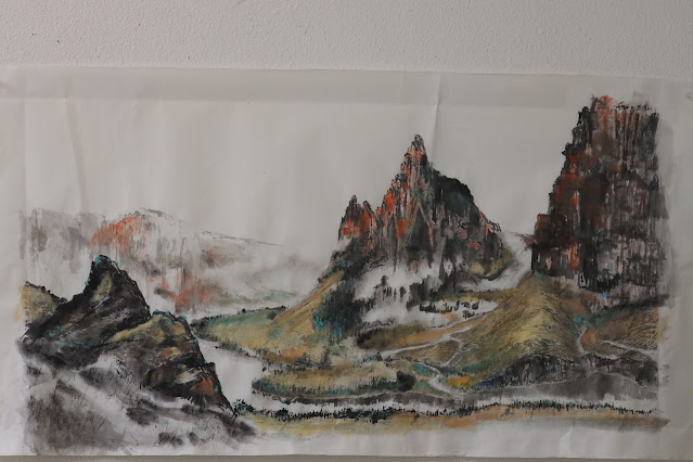
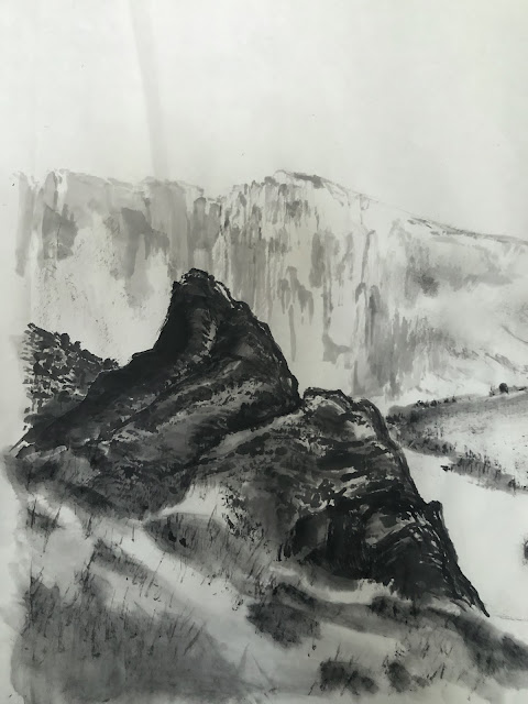
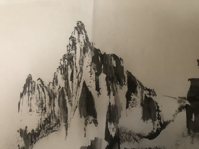
I am staring into the finished colored version of my most recent landscape painting and am at a lost to find a connection with the painting. Perhaps I've been doing a number of similar paintings lately and the subject matter has become trifle trite? Perhaps I've become a little habitual in my presentation.
I am an enthusiast of Chinese Brush Painting and I would like to share my trials and tribulations in learning the craft. I want to document the process, the inspiration and the weird ideas behind my projects and to address some of the nuances related to this dicipline. I hope to create a dialogue and stir up some interest in the art of painting with a Chinese brush on Xuan. In any case, it would be interesting to see my own evolution as time progresses. This is my journal
Wednesday, August 17, 2022
Adding Human Interest
Thursday, August 4, 2022
Route (Root) 66
Route 66 ( established on 11-11-1926 ) used to be a main route cutting across the US continent before it was replaced by the current Interstate Highway System. I remember watching a television series by the same name decades ago, trying very hard to understand the dialogue.
Thursday, July 28, 2022
Looks better in color
I remember long time ago a viewer offered me more money for a black and white ink painting of mine if I would paint another one just like that for her, but in color. I politely refused; unyielding with my principles. Being snooty perhaps. I must admit however, sometimes that sentiment is legit. Obviously there are many occasions a black and white brush painting imparts a certain je ne sais quoi which would be robbed if done in color; but my latest landscape painting is not one of those occasions.
I've been looking at that painting for almost two weeks now and it has not grown on me. Perhaps it is neither luminous nor moody. Time for cosmetics.
I have grown to like the practice of coloring from the back of the Xuan. I am starting with the rocky structure on the left and the distant hills in the background.
Phthalocyanine blue and ocher is now painted over the top of the under-painted rock. The resulting color is not one would expect if one was to simply mix and paint all 3 colors together on the surface of the paper. This is one of the properties of the Xuan paper that one can exploit.
Friday, July 8, 2022
Yet another landscape
After my attempt at painting Chibi (the red cliffs) I want to try my luck on another landscape painting, with cliffs or stony features as my main player; again. Whereas the Chibi painting was sort of dreamy and poetic, I intend for the current production to be more hard and staunch in character.
For this attempt I am mixing my ink with alum solution to paint on traditional Xuan paper. The slight bleeding from the brushstrokes allows the paper the stage to express soft strokes. Alum working as a mordant tends to eliminate that quality by fixing the ink before it has a chance to escape into the microfibers of the paper. I am looking for harsher brushstrokes to help depict the rocky texture of my intended landscape.
My model comes from the central part of Oregon where it is a little less lush with greenery but more abundant with rocky outcrops and mesas. The Deschutes River and the Crooked River are landmarks that inspire me, so I shall use them as my references and give the Columbia River Gorge a pass.
First item on the list is a rocky structure occupying the left side of the painting. I suppose I've not found my rhythms yet and the brushstrokes feel very contrived. Of course the remedy for my shortcoming is to immediately paint the background with diluted ink and loose brushstrokes without the alum as a conspirator, thus the markings are much more relaxed.
Contrasting with the hard edges of the rocky structure are not only the diluted ink for the distant hills, but also the soft non-discrete foreground, as if the camera is out of focus and the viewer is using the bokeh to frame their image in the head.
The center portion of my painting is taken up by the sharp, chiseled rocks of the landscape.
The alum/ink mixtures helps to cement the brushstrokes before they have a chance to bleed; offering a stern appearance.
An assortment of line chuen, akin to the hemp chuen is used to doll up and texturize the non-rocky parts of the landscape. I mean, if Monet and Van Gogh can employ dots and lines to fashion their works, why can't I, right? Actually the dot and line chuen technique has been in practice in Chinese brush techniques since antiquity, I am just making light of them.
Tuesday, June 28, 2022
Revisions
I revised a couple of my old paintings and since I've recently acquired a new camera lens I was eager to find excuses to put it through its paces.
Wednesday, June 15, 2022
Red Cliffs Nostalgia, The Grand Finale
At the onset of the painting I laid out my objectives for this painting, and one of them was to be able to highlight each of the 4 landmarks of the Columbia River Gorge by incorporating them into my fictitious staging of a real historical Chinese naval battle, the Battle of Chibi. The landmarks are of course the Vista House on top of Crown Point, the Multnomah Falls, the Rowena Loops and the Stonehenge replica. I also wanted these 4 subplots to be able to stand on their own rights as a painting by themselves.
Now that the painting is finished, let us delve into these 4 elements.
The Vista House at Crown Point:
The red cliff face is adorned with loads of vertical hemp chuen brushstrokes to give the surface texture. These brushstrokes stand out nicely against the staining done from the back of the paper. The Vista House itself is too big when compared with the real structure. Visually speaking, the building should be perhaps on the scale of 1/50th the height of the cliff. So my Vista House is at least 10 folds too big. I suppose my zeal of wanting to emphasize the structure got the better of me! To my defense, this is a fictitious painting, so accuracy is not a prerequisite and anything goes.
The Multnomah Falls:
Friday, June 3, 2022
How Red Are The Red Cliffs
With the blue section done on the painting, it is time to paint the red cliffs
So how red should the cliffs be? I had not intended for the painting to be a faithful representation of any facts, other than my nostalgic feelings about Su Dongpo's verses. Do these cliffs resemble the red landscape one finds along the highways of Utah? I researched online trying find pictures that show what the Red Cliffs look like today but I failed. It turns out that the exact location of the Battle of Chibi (Red Cliffs) is still a highly debated topic. There is a city called Chibi in China's Hubei province but the photos online does not give any indication about cliffs that are red, other than the huge carvings of the words Chibi in the rocks. I suppose this supports the debate that the term Chibi (Red Cliffs) perhaps got its name from the flames illuminating the cliffs in a reddish color during the naval battle.
I happen to have a photo from the central Oregon desert where the Painted Hills are located and with the help of photoshop I cut and paste my own Red Cliffs composite. Just to get the feel of it, that is.
I am assuming the red color comes from the high concentration of hematite in the rocks. The ferric oxide turns to rust and gives off the red color.
So my red shall be a rusty red. Perhaps I could scrape off some rust somewhere and use that as my organic pigment! A future project perhaps.
I apply my rust color from the back of the Xuan paper, as I did with the blue hues.
I wait for the color from the back of the paper to dry first before working on the front of the paper, reinforcing the namesake of my painting.
In the end the newly finished painting looks like this
I love the feel of the painting. It has an understated elegance to it. I am glad I did not paint everything a solid red color as in my composite. I am absolutely convinced that my current representation is infinitely more poetic, more evocative of "nostalgia".
There is one item that I have a problem. I do not like the shape of the reddish rock on the right. There is a landmark within the Columbia River Gorge area that resembles the painting, and it is located within the Rooster Rock State Park. Unfortunately I find it too much of a monolith in this setting, and seems to have detracted from the description of cliffs; especially when it receives the most "red" in the coloring scheme.


