Thursday, September 28, 2017

Painting on photo paper

I was toying with painting on photo paper in my last post.  I really don't have a good reason for why I chose to do that, perhaps subliminally I knew I was doing a portrait.

Anyways I was a little astonished at the result.  The finished painting seemed to have the pop that I've not seen from using Xuan.  Perhaps the photo paper was designed to reflect more intensely from the ink or pigments?   Same reason they make projection screens with different gains for a variety of venues.   The paper I used was HP premium plus photo and proofing gloss.  I'm not trying to endorse or advertise for HP, but I should let people know in case they want to play with it too.  I suppose any photo paper would do the trick;  I'll experiment with matte photo paper when I have a chance!

I thought I would paint something cute and cuddly; like Pekingese, or is it Shih Tsu.   I certainly am pretty naive about the different breeds; as a kid I would generically grouped them as lion dogs, because they look like lions with manes.  In fact I think the word Shih Tsu sounds very close to the phonetic sound of  the word lion in mandarin.  Perhaps it was a mis-communicated lost in translation. Oh for heavens sake, a mutt then.

I started out by claiming the rough shape and features of the animals.


I was using tea color and a dirty brush that was not totally devoid of ink.  My sloppy trait!

Working to define the snout and the eyes a little better, and adding facial hair to help define a 3 dimensional topography


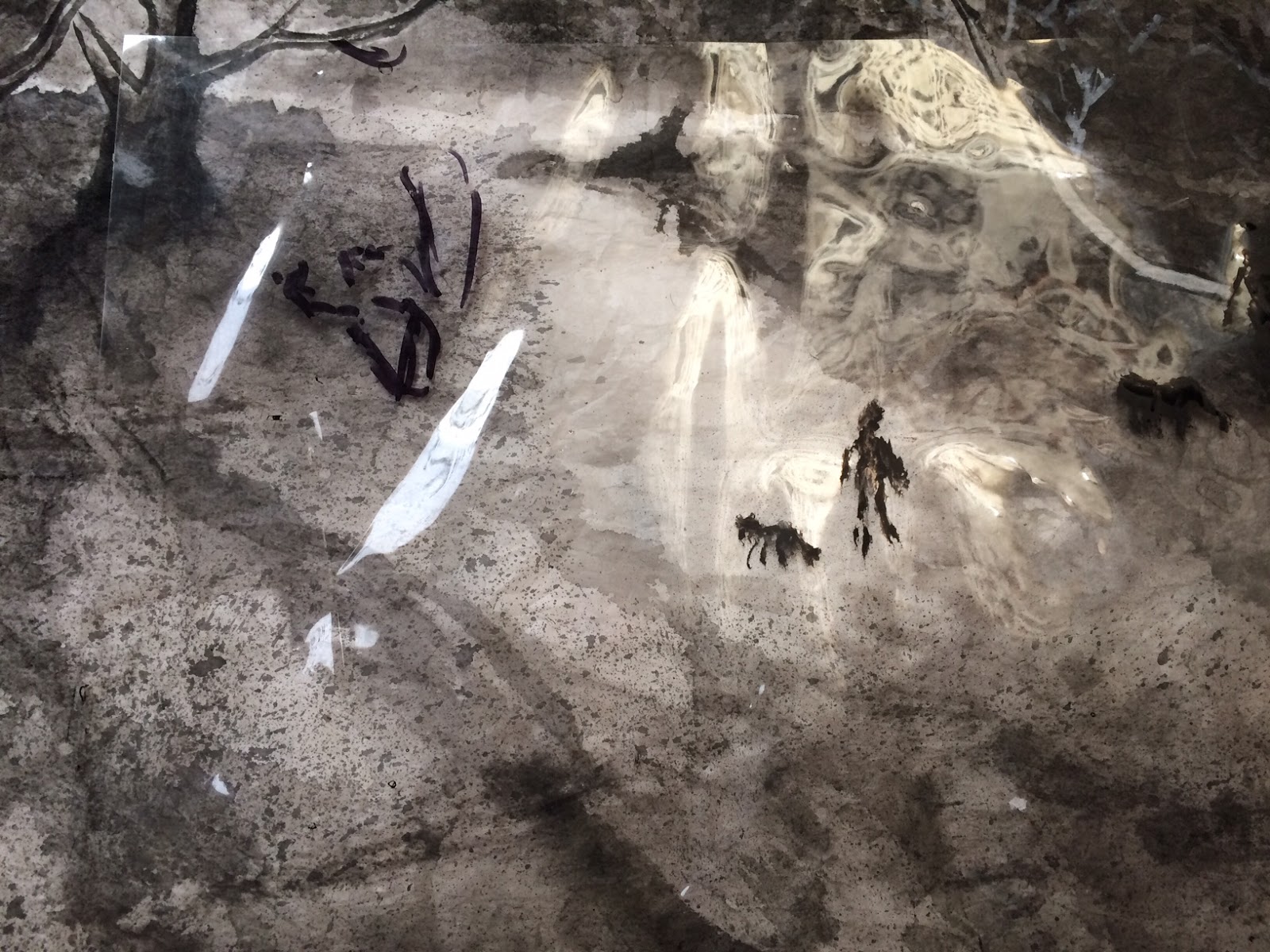
I tried to use plain water to wash off the ink a little around the snout and the eyes to create the pupils etc.   It appeared that I needed to reinforce the highlights more by using titanium white.  I also inadvertently let some water dripped onto the front leg of the dog on the left.  As I was trying to remove that water, the surface peeled off like a face mask, resulting in a blank spot.  Obviously how much water I allowed on the surface affected the final result.  Too much water resulted in a peel off.

I then dressed up the dog on the right with titanium white mixed with tea color and vermilion, and improved the pupils and the nose


extending the work to the left


This is when I decided to get cute.  I thought I would add just the slightest hint of shadow to the duo.
The slightest!

So I diluted my brush wash, dipped my big brush in the container, gave it a good whirl, allow the brush hair to soak up an ample amount of liquid, hoisted it from the container and flung the brush onto the photo paper.  Just the slightest hint of a shadow!

I was so pedantic.

I thought I was doing a wash on Xuan.

I had forgotten that too much water on photo paper actually peeled off the surface if I laid a brush on it again.  I was amnesic about the hole I created to the dog on the left.

When I tried to dab up the excess water, I created 2 peeled streaks on the photo paper; on top and under the 2 dogs.  A hasty attempt to dry the area further actually ruined it more.  A track of what seemed like eraser debris is formed.  Whatever was the coating on the photo paper was now like soap scum on a bathtub.   The only difference is I didn't know what kind of detergent to use to rid of it.   I should have quit when I could.


In disgust I threw the piece onto the floor.  I wanted to stomp on it.

After sulking for a couple of weeks I decided to hide my mistake.

I remembered the masterpieces of paintings or calligraphy of ancient times had all these seal chops on them, as they were passed from emperors to emperors, connoisseurs to connoisseurs.  Those were stamps of approval.  So why can't I do the same?!

I took out my chop collection and unabashedly sealed my own fate. [ pun intended ]


I should work in a junkyard as a salvager.

Tuesday, September 5, 2017

Farewell


April 29 1922                                                                                                                  March 10 2017

as the number of my teeth dwindles
my capacity to understand expands
I can feel, at last
what permanence is like

Sunday, August 27, 2017

Continue To Break It Down

Using the systematic approach of knocking off a small portion at a time, I had the main features of the landscape painted in.


Don't be afraid to build on the features when you feel that the brush has the right tone and wetness.
I must emphasize again that the Gou, Chuen, Ts'a, R'an and D'ian steps are not discrete and separate events, but rather a mix and match affair.  It's a continuous train of thought.


I then transferred my attention to the backdrops.  In a traditional style of landscape the background could be quite similar to the foreground.  The artist however needs to bring out the elements of the 3 perspectives that populates a traditional landscape painting.


Height Perspective- demonstrates how tall and mighty and stalwart the mountains are
Depth Perspective- leads the viewer deeper into the painting by revealing the little ancillaries,
                                huts, steps, hidden falls and streams etc.
Level Perspective- describes the distance from front to back


In Mr. You's piece, he used a waterfall in the backdrop to steer the viewer beyond the huts and trees in the foreground.  The stream and steps and huts on right side yonder were his effort to lead the audience past the immediate trees and hut in the foreground.


Thus the stacking of the mounds and hills followed the Height Perspective, and the strategic placement of the stream, huts, stair and waterfall satisfied the Depth Perspective requirement.

Judiciously  building up the hills to the right of the waterfall by accentuating the Chuen and Wash brushstrokes.


As more and more information was added, the painting took on a 3-dimensional appearance.  There was a tremendous amount of satisfaction to see the paper slowly transformed from lines of ink to something that seemed to have substance and life; booboos notwithstanding.

Chinese landscape paintings are known as Mountain and Water Paintings by literal translation.  Obviously mountain and water features are the main characters in the plot.

simple and repeated Hemp Fiber Chuen brushstrokes helped to define the shape and texture of the flanks of the mountain.  The conifers in the front had different leaf brushstrokes from the dotted leaf brushstrokes in the back hills on the right.


A waterfall is typically painted as a void space, with edges not defined by visible lines, but tone values between the ink and the void.  A variety of leaf brushstrokes defines a mixed cultivation and the practice is a textbook standard.

Steps leading up to a platform on a precipitous is again very cliche in landscape paintings.  The assembly helps to reveal the Depth Perspective by including lots of vistas along the way as the viewer scans the composition.

 Mr. You defined this hut by using mostly a negative space with a few heavy lines below the roof to add shadow and suggest structures.  I really appreciated the effectiveness of this style of painting a building.

The brush wash had by now attained the right ink tone to paint the far far away hills.  I soaked my brush generously from the brush wash bowl and laid it flat against the paper and splashed on semblance of distant peaks.

Now the remaining perspective, the Level Perspective, which describes distance, had been captured.


This is when I needed to stand back and try to give my painting a critical eye, and tried to mitigate the obvious mistakes that I could detect.  In the final analysis, I was not unhappy with my efforts this time around.

I thought I was able to write down a lot more information on paper, to the point that my first attempt looked almost incomplete.  My patience and a more studious approach did pay dividends for me.


It was interesting to note how different the two paintings look when placed side-by-side.


Tuesday, August 22, 2017

Breaking It Down

My friend was cleaning out her Mom's belongings and found a few ink stones and ink sticks and gave them to me.  Her mom practiced Chinese brush calligraphy when she was alive.

It must have been 60 years since I last laid hands on something of this nature.  We used to have to use them during our penmanship class.  As the school day ended, I squeezed the still wet stone into my overstuffed canvas brief and flung it over my shoulder.  The left over ink would crawl its way amongst my books, seeped through the canvas and stained the white school uniform I had to wear.  Obviously that ink stain stayed forever; my younger siblings had to suffer too because they had to wear the hand me downs.

Memories!


As I was exploring a little more about the subject of ink, I chanced upon a Chinese brush painter by the name of  You Wuqu ( 1910-2006 ).  Mr. You was well versed in the art of poetry, calligraphy, painting and seal making.  What caught my attention was that he championed the splashing ink method of painting ( perhaps splashing water in his case )  because he considered water as a main element in the art of painting.  He elevated water to the same importance as the brush and ink; establishing his view on the synergistic use of the brush, ink and water.

I hope to study more about that subject, but in the mean time it was one of his more traditional painting that caught my eye.  It was a landscape painting with ink, and it incorporated the 5 basics of Gou, Chuen, Ts'a, R'an and D'ian ( roughly translated as outline, texture, rub, wash and dot ).  Perhaps he is more akin to being a contemporary, his traditional landscape is easier to digest and more approachable than the Masters in Song and Ming Dynasties for instance.

I started to emulate this painting with aplomb.  I was in the mood.


This is how the painting looked after it dried.  The wet version looked more saturated and with less dynamic range.  I often overreached my corrections at this stage and painted the dark areas too dark, anticipating a lighter appearance when dried.  Also it was easy to pile on indiscriminately,  ruining any possible dynamic range.


I sort of did the painting non-stop.  I was driven by some unknown urges.  Having been satisfied by the initial result, I decided to give it a second try, with a more serious attitude this time.

I commenced by capturing the foreground, using medium and light tone ink.  The ink gets lighter on its own, as the brush is depleted of the initial load; and it also gets drier.  Thus we have to be opportunistic, in the sense that we have to learn to take advantage of the ink tone and brush wetness at a particular moment.  I often committed the mistake ( especially when I was a rookie ) of thinking that each of the 5 steps ( Gou, Chuen, Ts'a, R'an and D'ian) is a discrete stage.   It was only through repeated guidance and confidence building that I became more aware of the intertwine and the transition and coordination of one brushstroke style to the next.


In the above example, the process of Gou ( outline ) and Chuen (texture) with hemp style line was carried out simultaneously and I allowed the ink tone to change on its own.

In doing the Chuen (texture) and Ts'a (rub) and R'an (wash) the beginner is often confronted with where to place the brushstrokes.  If we have to refer to the original painting with each line, the process became laborious and mechanical.  It is permissible to take certain liberties in adding or subtracting from the original.  The trick is how to reasonably accommodate our inputs.  It is therefore imperative that we have a good understanding of  the placement of these brushstrokes.

I often would use my own fingers as a "live model".


In the above example, my fingers are like the lobes of  mountains in a typical Chinese landscape painting.  The blue lines are Contour lines, they represent large vertical slices of this mountain.  They are the contours of the land mass.  The tiny yellow lines (my wrinkles)  are the Chuen lines, they represent the tiny vertical segments of the structure.  They help to further define the contour of the slopes, albeit in a much smaller scale.   In this particular example, they are what I would call Hemp, or Hemp Fibre style Chuen.  The white dotted lines represent Light Value Lines and normally we do write in a line.  Rather, we would use Ts'a ( Rub) or R'an (wash) to render a darker tone , using that dotted line as a reference line to effect a change in light value.  Notice that the darkest portions are places just north of the each finger, and the top ridge of the finger is the brightest.  Armed with this instant guide, one should be able to map out where and how these lines should be placed properly.

I reloaded my brush with dark ink and worked on the leaves by using the D'ian (dot) technique. and continue on with the landscape, moving to the right, transitioning from foreground to middle-ground.


During this process it's okay to continually add to and modify the previous sections.  Again it is vital that we know how dark and how wet our brush is at that moment, so we could best take advantage of it, and make sure that the places we are modifying are reasonably dry such that our brushstrokes are not going to bleed out all over the place, unless that's the desired effect we are seeking.

Tuesday, August 15, 2017

My Bag Of Tricks In Adding Human Interest.

I've been receiving some positive feedback on my Adding Human Interest piece.  For me, knowing that I had dragged this from obscurity into the open, modified it a little and enjoying it all over again was very similar to reconnecting with a long lost friend, or better yet, playing with a toy that had disappeared under the sofa for years and managed to reappear somehow.   I would therefore share the steps I took to accomplish this.

The was the painting that I started with.


I was toying with shadows in this painting.  The shadows were stylized, in the sense that I had exaggerated their proportion and  orientation to the bright area off the middle, at the end of the path.  So instead of the shadows all following one direction, they seem to radiate from a bright spot behind the trees to the left, like the spokes of a wheel.  I did that to draw attention to the virtual intersection of two paths.  A friend had commented that the painting had the feel of a birds-eye view to it.  I suppose the extreme close-up description of the branches on the right helped to create the impression as if the painting was a photo taken with a wide angle lens from above.

Once I had decided that I wanted to incorporate a human figure walking a dog into the scenery, I not only had to decide on the best location for my subjects, but how to play out their shadows to blend in with the overall flavor of the painting.  After I painted in the added ancillaries, I made similar cutout figures on a piece of scrap paper.


I then folded these where their feet meet the ground, and placed them on a white surface and shone a low angled light behind them.  This helped me visualize and learn where the shadows cast.


Now that I was assured of my modeling technique, I placed the cutouts over the subjects I had painted and again shined a low light behind them and painted in their shadows for real.


After all that, I had this:


I just did plein air in my room.

There are those who accuse me of being fastidious.  After all I should have been able to portray shadows and add to the ambiance  without going through all this.  How difficult is it to paint in 2 shadows?

My answer to that is "Perhaps! But I enjoyed rigging all that up!  It's the journey that I enjoyed"

Wednesday, August 2, 2017

Doodling

I saw a photograph of some old Chinese dwellings with interesting looking ridge line, or fascia?
I really am not sure what the proper terminology is.

It was an array of these buildings with dark clay tile roofs and white washed exterior walls, with an amplified separation of the foreground from the background, like those distorted images taken with a wide angle lens.  I wish I could remember the photographer's name so I could give due credit.

I was so enamored with this style of building that I researched the subject online.  I was really surprised that the Five Elements had a say in these styles.  I lifted the following information off the Internet.


The Five Elements are Metal, Wood, Water, Fire and Earth.  The roof I saw in the photograph had a ridge line resembling a pried open hair pin.  I guess that would put it in the Wood Element.

Armed with that trivia, I wanted to paint what I could remember.  It really was just doodling, as I would call it.  A lighthearted way to break my period of laziness and cycle of low energy.

What I ended up with was some really weighty roof ridges.  My obsession with them was obviously betrayed.  This etude also seemed rather terse, and was screaming out for more detail.


The second attempt certainly was filled with more information.  I thought the brushstrokes were playful.  The work had composition, contrast and tonal merit.


Encouraged by the modest success, I tried a third time.

Well I seemed to have held on too tight this time.  Perhaps my obsessive compulsive disorder did a cameo.    Yes I did pile on a bunch more information in this etude.  I even planted some bamboo to garnish the heavy roof ridge.  I thought the spacing was good and the work was sort of impressionistic, without being vague;  just the way I remembered the photo.


However, it seemed too meticulous.  The brushstroke seemed restrained, tentative, contrived and lack that je ne sais quoi element of artistic energy.

My consolation?  I was just doodling.  I looked up the definition of doodling, which was to scribble absentmindedly.

That's where I failed.  My mind wasn't absent enough.

Tuesday, July 11, 2017

Adding Human Interest

It has been two years since I finished my Shadows painting (Chronicle Of Shadows) and it is still pinned on the drywall in my studio.  I normally would either mount my paintings or just throw them in a pile as my etudes.  In that particular blog I used the term epilogue, thinking that I had written the last chapter on this work and I would close the book.

Little did I know.

After two years of casting occasional glances, ruminating on the vibes of the painting, I am convinced that the painting needs dressing up.  My playing with light values and casting shadows was fun, a lot of fun.  Now it feels almost anti-climatic.


Isn't it time to smoke a cigarette?  Wink! Wink!  Ah but I've severed my friendship with tobacco!

I need to add some human interest to this painting.  I am thinking of adding a jogger, a couple, someone, on the path.

I must confess that I had entertained this thought from the very beginning.  I have this one artist who eschews cliche and would chide me for being "redundant" as I recall.  Having people on the pathway is so mundane.  Is it?  How does one decide what is vapid and what is "just right"?

It must have been a broadcast on public educational channels that showed neuroscientists employing transcranial magnetic stimulation (TMS) to study how our brain deals with art.  Aside from a neuroaesthetic response, there seems to be a neuromotor response also.  Thus an image of a runner elicits a response from the area of the brain that controls our legs, though no physical movements from our own legs ensued.   We literally immerse ourselves in the picture.  Being a pharmacist with some biomedical knowledge, this topic intrigues me.  It would be interesting to study the different kinds of responses when we are subjected to various genres of subject matters.  Does ethnicity, culture and social economics have a say to which areas of the cortex is activated?  Why do some of my friends find a visit to the Grand Teton boring and others jubilating.  How is our preference of one thing over something else arrived at?  Does it have anything to do with dopamine, the neurotransmitter that is associated with pleasure; or oxytocin, the chemical that causes uterine muscle to contract amongst other things, and bonding.  So if we avoid something, is it due to an inhibition in these pathways?  I'm way off the subject now.

I suppose I should not be taking a reductionist point of view.  There are things that cannot be defined by a formula;  how and what we paint is one of them.  Beauty is in the eye of the beholder.  Now this is definitely cliche!

I decided to include a girl walking her dog in my Shadows painting.  Putting a person in the painting is what I call adding human interest, literally.   I now need to find out where's the best location to insert them.  I summoned the help of my clear vinyl sheet.


With that I have freedom in moving the subjects around to find an optimum size and location.  I started out by painting the girl and her dog on this clear sheet and placed it over my painting.


I added a different sized silhouette to gauge the fit.


Then I moved my clear sheet to a different location to decide


I finally decided to put them at the bend next to the edge of the path.  I particularly enjoyed how the dog's tail was serendipitously pointing towards the out swung hand of the girl.  A connection was made.  Whether the dog was leashed or not would remain an enigma.  To define that further would be trite.


In the end I assuaged my indecision whether to add the pedestrian by going off on a tangent with some logical excuses perhaps, but mostly by just painting it.  Perhaps the Shadows painting has lost its initial appeal and I can afford to take no prisoners the second time around?