Wednesday, February 13, 2019

Presenting Mr. Pig

I decided to mount my Mr. Pig painting and frame it for a proper presentation.  This is the Year Of The Pig after all and due respect must be paid.

I went with my Suliao Xuen Ban method again.  After the Xuan  paper was tailored and mounted to the proper location of the clear plastic, the fun began.


This is going to be a celebratory painting so I need to jazz it up a little bit.  I wanted it to blink a little.  I had some gold glittered Christmas ribbon laying around so I drafted it for my project.  I harvested the glitter by scraping the ribbon with a knife.


I didn't want it to sparkle like a Swarovski  piece, but definitely enough to make it noticeable.  Since the painting depicted a bountiful harvest with the stalks of grain, I applied a heavy sprinkle onto that area to emphasize its presence.


After the application of glitter, I sprayed the the painting and the plastic with Urethane.  The aerosol helped to fix the glitter and rendered the clear border semi-opaque ( newspaper is blurry now in the background).  It also helped to provide additional shielding from the elements.


I built a frame with poplar for the piece and painted it gold to adorn my painting, befitting a regal and auspicious year.   I wanted quiet simplicity and  elegance.  Two holes were drilled on the vertical member of the frame for hanging.  A small hole on the inside for the transparent fishing lines to pass through and a larger one on the back side to hide the knots which secured the fishing line.


The fishing lines were threaded through a short piece of heat-shrink tubing.  This little tube would fit around the lines snugly once a heat source is applied, i.e. with a heat gun or a flame.  I chose to let it ride freely on the lines.  This was meant to be an added protection of the lines from abrasion.  Just an insurance policy against premature breakage from normal wear and tear.


My set up allows the frame to sit perfectly flat against the wall without any tilt.  Fishing line was used such that it is less obtrusive through the semi-opaque border of the plastic piece,  accentuating the float effect of the painting.  I hope to create the illusion that Mr. Pig just appeared in thin air.  He is a diety after all. 


Here is the framed piece.


Tuesday, January 22, 2019

The Pig as an archetype, experimenting as I go

Armed with all the notes and test sketches that I had accumulated on my pig, I decided to launch the painting project in earnest.

I decided to sketch out my image.  Who was I kidding, I was very much concerned about the painting needing to look  "perfect".  I was willing to sacrifice a certain degree of spontaneity in exchange for the comfort of knowing that my brush wouldn't stray too far away from the intended targets.  I could recall when I first started with Chinese brush I was dead set against sketching.  I always thought that sketching was reserved for novices.  I've came to realize that I needed to do what was right for me, and not for anybody else.  So what if I was a novice.


I shied away from using too much ink as my shading base layer, especially on the face.  Too much ink imparted a grimness to the feel of the painting.  I also cheated by purchasing some cheap off the shelf flesh color acrylic.  I used that to lay down my base coat, and used vermilion as my main shading color and vermilion plus tea if I wanted a darker shade.


Again I resorted to the unbleached Xuan with fibers that looked like the butt wiper paper of the yesteryears.  The base color plus the exposed fiber added the "organic" nuance that I so endeared.  It happened that one of the fiber particles in the paper popped up in the area of the forehead, just above the eyebrow.  This was such a serendipitous delight for me, because now my pig archetype had a huge mole on his forehead, adding to the persona of my protagonist.  I couldn't have planned it any better.


I had mentioned in my mountain lobes blogs that the side-tipped contour lines denote more than the contour, but also the thickness of the slab we were describing.  I've applied the same technique and understanding to the strokes used to describe my shadows.  Here an example of a side-tipped brush stroke of uneven width gave the illusion of the lapel not lying flat against the chest wall.  The neck was farther away than the rest of the body, therefore a wider area of black void.


The side-tipped brush also worked well on describing the undulations on the robe.  The vertical brush strokes of vermilion on the right were simply a lightly loaded brush of very diluted vermilion with its tip dipped in undiluted vermilion.  The Xuan paper allowed the color to form its own gradient, demonstrating dark and bright areas along the robe.


I was not happy with the heavy drape lines on the front of the robe, especially after seeing how nicely the two vertical side-tips turned out.


So I reapplied the drape lines using a vermilion brush with ink tip for the color gradation.  Since the paper already had a layer of color on it, it became a sized paper effectively.  Thus the mixing of the color was not as dramatic as the vertical ones.  I believe that is one of the reasons that in traditional Chinese Brush we discourage going over a painted area repeatedly.  Doing so destroyed the fine details of the brush stroke.


I applied the same technique to the blue over coat.  I prepared a blue/ink dish and a blue/white dish to help me further differentiate thedifferent areas of the blue robe.


The upper arm area was done with the blue/ink side-tip and the forearm was done with blue/white


For the navel I judiciously darkened circular areas around the navel leaving a ring of the base color to denote the rim, and a much darker center and just below the navel to suggest the depression.


By writing a half arc as a shadow, a nipple was formed without much fanfare.


I bought some metallic gold acrylic to paint the lapel and the waist belt and the inner sleeves.  I used gold strictly for its dramatic effect and it worked well for my purpose.  The acrylic formed a thicker and harder surface than the rest of the painting not done with acrylic.  The buckled paper convinced me that these areas were more like collage art than a two dimensional painting.  Interesting.  Whether it would retain this look after mounting remained to be seen.  Perhaps I would deliberately not smooth out those areas during mounting so that I could preserve this illusion.


I was able to appreciate the difference between acrylic and watercolor, especially when they appear in the same painting. I definitely know my brush and the paper reacted quite differently to the two.
All the experimenting was invigorating, perhaps I was breaking all rules, by my own accord at least.  I sketched with pencil, I dared to use different media, and went over painted areas repeatedly.  I used metallic paint.  I dared to shade.  Nothing esoteric, but just experimented what I felt like.  I could now tell what a pure Chinese Brush artist deemed as dirty or muddy, versus the simple, single and transparent strokes of the traditional Chinese Brush.

I also added a faint shadow by using what was in my brush wash basin.  I was being mindful that the shadow did not diminish the ethereal quality of my archetype.  I wanted Mr. Pig to cast a subtle, non-distracting presence, as one would on a overcast day.


That was my photography alter ego speaking to me!

Friday, January 4, 2019

The Pig as an archetype, learning as I go

Now that I am pretty comfortable with my concept, I need to execute it.

I am basically on uncharted territory.  This painting now has become an experiment, a game for me.  I'll research, apply, and make corrections as I go.  Quite stimulating I must say.

I reworked the face and tried different ways of shading

I did not gauge the position of the snout correctly in the above example.  I had put in too long and wide a shading on the left side of the snout, which seemed to end on the cheek now, instead of along the smile line.

again the same mistake as the first example; improper shading of the snout, forming a weird structure.

As I was doing my research and reading up on portrait photography, I found out there is such a thing called the Rembrandt triangle.  It is the illuminated triangle under the eye on the dark side of the subject.  This triangle is bordered by the shadow of the nose and the sunken eye socket and renders a pleasing geometric form of the face.  Such Rembrandt triangle was sorely missing from the 2 examples above.

I knew my pig had fat cheeks, but I still would like to test the theory, so came yet another attempt


 This one did look more natural and pleasing with the Rembrandt triangle in place except that I messed up on the lower lip and now the pig seemed to have forgotten to put in his lower false teeth.  His lower lip was caving in.

I must also tried to find out what is the best color for the Marshal's clothing.

                                                                        all blue

red robe with blue pants

blue robe with red pants


I also tried different hand positions.  The bottom example has a higher grasp by the left hand.
I thought it left too much exposed real estate on the belly and chest.  I'll probably go for the lower grasp.

I tried a more relaxed and spontaneous brushstroke rendition, one that was not mired in a lot of details


I also fell in love with the paper with the heavy fibers.  This is a unbleached, unsized paper that reminds me of the ass-wipers from way back.  I certainly remember it from my childhood.  It has such a un-pretentious, wholesome feel to it.  The fibers also complement well with the lines of the figure.  I know the term organic has been way overused these days, but this is a fine example of an "organic" paper.

I definitely shall gravitate towards that as my choice paper for this painting.

Oink Oink Oink


Monday, December 10, 2018

The pig as an archetype

I ended my last blog with the sketch of a pig mated to a humanoid face.

In pursuing my little project of painting the pig to welcome the impending Year Of The Pig, I was exploring different options to depict the animal.  Legend has it that when the Jade Emperor summoned the animals to seat the Zodiacs, the lazy pig happened to be the 12th animal to show up and thus occupied the last space. So when I thought of the  Zodiac pig I saw the image of a sluggish, harmless pig.  A cute little piglet comes to mind.  After all pet stores have these petite porkers on their inventory, demonstrating the popularity of these critters.  The other pig that comes to mind is the plastic piggy banks that I played with as a kid.  Their appearances are not that different from a real pig so I am basically dealing with the same model.  Finally there is Zhu Bajie.

Zhu Bajie is a legendary fictional character made famous by the novel Journey To The West.  This character has the face of a pig and the body of a human.  The story states that Zhu Bajie was the Marshal Canopy in the Heavens, but he was on the Jade Emperor's gaga list because he committed crimes of passion.  He was thus banished to Earth.  He landed in a pigsty and thus materialized as a human with a pig face, and carried a 9-tooth rake as his implement.  The character Zhu Bajie was one of the three helpers who accompanied Tang Sanzang; the monk who trekked to India in search for sutras.  Zhu Bajie's partner in crime was the famous Monkey King, Sun Wukong.  These characters are no strangers to Chinese people.

What is interesting and intriguing is the fact that Marshal Canopy is actually a Daoist deity associated with the Dipper constellation.  Apparently not a pig.  It was the inadvertent, or incorrect usage of the title Marshal Canopy by the author of Journey To The West that made the label so famous.  Thus Zhu Bajie the pig was forever associated with Marshal Canopy.  Since this iconic character has attained archetypal status in our culture, I decided to borrow the concept of Zhu Bajie the pig as my model.  Obviously I would not portray him as a rake wielding beast, but a proper Marshal donning rich threads and bringing fruits of the  harvest, as an ambassador of abundance and fulfillment.

To reinvent the brand, I borrowed the image of a carved sculpture that I have.  The figure is a rather popular, generic version of a carefree, go-happy peasant, with the typical attire of  a loose robe and bare chest and belly.


He fits the image of a carefree, joyous, obese pig.  With this concept in mind, I worked on the feasibility of a pig face.  I referenced a plethora of examples and studied the ones that were not as cartoonish.


as I became more familiar with the model, there was a commensurate improvement in my brushstrokes


Exploring where the shadows fell, I had better control and luck if I sketched it out first


How about this one, with round eyes and what not.  For some reason I thought this one looked more babyish and too cute?  I suppose I was bound by my notion that the character needed to be some sort of a Marshal.  My character needed to exude the air of a bureaucrat.  Inexplicably I thought the squint eyes were more convincing.


I thought I wound get a handle on the robes and how it drapes and the general morphology of such a figure before I got myself in deep feces.


Here's one with a more formal sleeve, like the ones in the Chinese Opera costumes


All these are pretty spontaneous doodling.  I was having problems with how wet the brush was but I didn't care.   These extemporaneous etudes were stimulating and fun.


Now I marry the pig head to a human body


My Marshal, my pig will be carrying harvested cuttings of grains in his hands in lieu of the 9-tooth rake.


another attempt at modeling, with the stalks of wheat sketched in


Seems like I was a lot more serious now, or I was having a more concrete idea as to what I wanted to paint.  The lines were less tentative, and the shading was more precise.  God knows I must have looked at all the reference images a million times while conducting my research.   All the repeated attempts at painting the same image certainly didn't hurt.  They helped to build a muscle memory in my painting mechanics.

Oink Oink Oink

Saturday, December 1, 2018

Soul and paintings

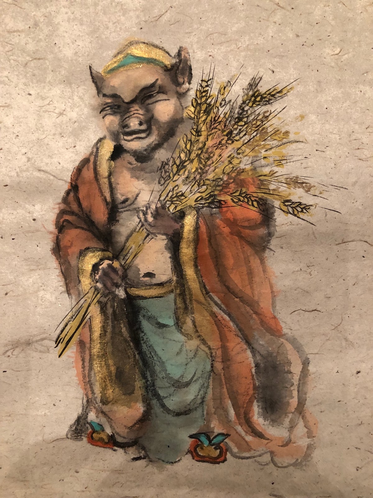
As I was wrapping up with my sketches of the pig, my thoughts were steered to posing the animal.
How could I make the subject matter interesting and cute, and most of all, auspicious.  My selfish motivation was to have a representational painting to welcome the Year of the Pig, which will happen in about 2 months' time.

Again I was faced with the choice of style for my rendition, whether to paint the pigs Gongbi or Xieyi style.  I just couldn't shake the shackle despite my understanding that this was so unnecessary.

My sketches were obviously line drawings, so I thought I would attempt the Gongbi style, but I knew my calligraphy was very weak and I was afraid to reveal my weaknesses.  The narcissist in me was urging me not to do it.  It was really cumbersome.  Before I could even wet the Xuan I was having trepidations already.    I was very conscious of the fact that since I identified myself as a brush artist, then I had better show my expertise in the brush.  I suppose Chinese brush has so much nuances about the brush tip, the flow and Qi that it has become very intimidating.

I had an opportunity to admire Vincent Van Gogh's works in their original forms and I came away with the impression that his lines showed none of the virtues I looked for in Chinese brush.  His tree branches, outlines of buildings and objects were what I would call wet noodles, totally devoid of the Qi that I was look for; and yet his works are so valued and admired.  Other than his bold, short brush stroke patterns, the quality of his brush was pretty monotonous.  Obviously this is purely my own impression.

Take his famous Sunflower painting for example


and contrast that with a Chinese painting


one could sense a huge difference in where the emphasis was.  Both were representational art, but immensely different in their impressionistic appearance and feel.  The Chinese painting was all about brush strokes and ink tones.  It displayed the intimate relationship amongst the brush, paper and ink.

Let us take a look at a landscape painting  Wheatfield With Crows by Van Gogh,


and compare that with a Chinese landscape painting by Chao Shao-An, a master of Ling-nan School painting


the intricate brush strokes of Chao was in stark contrast with the bold dabs from Van Gogh.

I remember an occasion when a fellow student told my teacher that she was going to paint a Chinese painting in Van Gogh style.  I didn't exactly know what she meant by it or how she was going to do it but my teacher was incensed.  He actually asked that student to not take lessons from him again.
The teacher was irate because he demanded the practice of Ji Ben Gong, the craft of the fundamentals.  Every brush stroke must encompass the calligraphic virtues by showing the tip used, flow and Qi.  His ire was more than a manifestation of tribalism.

Van Gogh was interested in Japanese paintings and he tried his hands in a few.  He painted this Courtesan


and here's a painting of a Dunhuang character from a Chinese painter, Zhang Daqian


again we saw how succinctly different were the way the lines were written.

I was hoping to present the notion that this is not a matter of which is better, or more valid.
How do you compare a Pinot noir to Huangjiu, or Moutai to Vodka.  Before we venture to compare these different alcoholic beverages, we do however need to know what they are and what makes a good Vodka or Moutai.  One would not try to find the hint of tannin from huangjiu.  A vodka bottled in a Chinese vessel does not make a moutai.  But regardless of whether they are brewed with grapes or millet, when these fermented or distilled liquid reaches certain levels of excellence, they shall all be appreciated and consumed.

Having said that, allow me to be the devil's advocate.  Allow me to pose a question.  Van Gogh's love for Asian art notwithstanding, could his Courtesan painting pass for Asian art?  If we found that painting in an attic with no signature to reveal the painter, what would our appraisal be?  Would that be an Asian painting done in Van Gogh style?  Or a western painting trying to emulate the Asian flavor.  What is Chop Suey?  Is that Chinese food?  When I see westerners put soy sauce in their tea I wonder if they were being naive, or was it their preconception that soy sauce goes with everything?  Could it be that they were just thinking outside of the box and was on an intrepid journey to explore tastes?  You might be surprised to learn that there is a soy sauce flavored ice cream!

I suppose the art of painting is not a monolith of just brushstrokes, or color or composition or style.  It is an amalgamation of all the techniques, but most importantly, emotion.  A great painting must have a soul.  A great painting must have a personality, one which moves us.

Soul is defined as an emotional or intellectual energy or intensity, especially as revealed in a work of art or an artistic performance.  The essence or embodiment of a specific quality; that je ne sais quoi.
Thus where I might deem Van Gogh as not possessing the calligraphic brush strokes, nonetheless his works effervesces in other ways and tugs at me just the same.  The standards and parameters are simply different.  A dog does not have plumage and a bird has no fur.  His works possessed a soul.

I suppose all I was doing was trying to convince myself again, repeatedly, to let go of my inhibitions and preconceived hurdles.  I should be worried about the soul and not the shell.

So I just painted whatever came to my mind, and not worry about the style


Incidentally van Gogh is pronouced differently in Amsterdam than from the States.  So should I insist, during the course of my conversation, that people here pronounce van Gogh the way Dutch do, as a gesture of reverence and risk coming off as a pompous orifice between the gluteus maximus ?

Oink Oink Oink