Showing posts with label Chi. Show all posts

Wednesday, August 9, 2023

Gestures

I don't know why but I've always liked the pose of a ballerina on toes.  Perhaps that stance forces the dancer to assume a good posture, tensing the right muscles to place the center of gravity within the confines of the mere square inches of footprint.  Toeprint in this case.  The pose inexplicably projects energy, or Chi, as I call it.  

Chi is something a Chinese brush artist relishes and reveres.  Our brushstrokes must exemplify Chi.  One can tell if a snake or a worm is dead or alive without them moving.  Perhaps dead things look desiccated and deflated, that's how we know.  Bad brushstrokes lack Chi, they look withered.   

Perhaps I had one too many music box with a twirling ballerina to play with as a kid, that image is seared in my mind.  I would often doodle a ballet dancer.  As I come to find out, there's a fancy term for it.  They call it gesture drawing.

I suppose my Whiter Shade of Pale painting of 16 Vestals is a culmination of different gestures, albeit not of ballerinas.  Even before that painting I've done studies of dance movements and martial arts movements.  


The last two examples are from me playing with silhouettes as in void spaces.  In traditional Chinese brush techniques I was taught that ink has 6 colors (some schools would say 5) and we should strive to achieve them.  We consider Chinese ink as a color, and the 6 colors of ink ( perhaps more appropriately the 6 variations ) is dry, moist, saturated, light, burnt and strangely. white (actually means absence of ink; a void space in the western vernacular ).  Thus a brushstroke with saturated ink may look dry, or moist, or burnt; depending on the manipulation by the artist, and more than one attribute could exist at the same time.  A brushstroke with light ink is therefore not necessarily dry in appearance.  When we speak of the "white" color in ink, we are referring to how the "white" defines or complements the black.  Sort of like the theory about employing "voids" in the western discipline.  Generally speaking, there are often more "whites" or blanks in a Chinese painting. Bodies of water, waterfalls and the sky are usually left blank.  "Whites" are often preferred even with a "saturated" black brushstroke.  White streaks left in a bamboo stem brushstroke help to define texture and adds character.  My teachers often barked at me, " Liu Bai, Liu Bai !" ( Liu means "to save" and Bai means "white", so the phrase means leave room for voids.)  For that reason we don't usually use a white pigment to paint "white" but opt to leave the space blank instead. Some schools will go as far to say that only a Chinese could understand these concepts.  Thus my void silhouettes are actually using dark ink to define an empty space and allow our mind to see what it wants to see.  My "saturated" ink was an example of it looking "moist" in that last silhouette by the way, and the "white" was used to complement the "black".

As I was playing with and shuffling these studies, somehow my silhouette paintings were superimposed on the other line drawings.  One of my silhouette painting was done on a piece of very translucent cicada skin Xuan, and allowed the bottom painting of martial artists to come through.

That gave me an idea of mounting the two paintings together, superimposed.  This is like working with layers in Photoshop.  How exciting!  I only wished I could control the degree of transparency from each layer.  

My silhouette painting would be the top layer, so it goes face down first.  Since the paper is so thin and delicate, wetting it and flattening out the wrinkles was not an exercise for the faint of heart.  I learned throughout the years that I needed to treat it like attaching window tinting.  I had to use copious amount of water to float the paper, so that it could be shifted slightly or flattened.  It was counterintuitive but it worked. 


I used a soft brush to apply starch and squeeze out the wrinkles.


The next step was to pile on my line drawing of people practicing Wushu.


The Wushu piece was done on regular Xuan paper so it was hefty enough to withstand the rigor of a stiffer brush for starching and flattening. 


The above picture shows the Wushu painting starched on top of the silhouette painting.  A blank Xuan paper backing was applied as the last step and the 3 layer sandwich was allowed to dry.


This is how it looked after drying


Interesting!  Ballerina superimposed on martial artists.  Movements galore.  

Serendipity!  I came upon this setup while shuffling my study pieces around.  

I must also give credit to the person who posed for me for the original silhouette study.  It was at a museum's ballroom which was not in use at the time.  Perfect timing for me to sneak a photo.


Since I was doing a silhouette, I lack the proper training to depict any sort of foreshortening, or a leg bent behind the thigh in this case.  So I changed the pose a little for my painting.  I suppose my study was more about form and feel than just about gesture.


Sunday, June 18, 2017

Han Shi

Using the light ink version of my home spun Te, while paying emphasis on the visual clues from a printed version, I started the do my calligraphy on the Han Shi poem, with a proper calligraphy brush this time.

As I had discussed in the last blog, I was hoping that by having the light ink to trace with, I could be devoting one hundred percent of my attention to the quality of my brush strokes.  I was trying to cheat a little bit by not having to internalize the piece as much.  Though I would not deny nor negate the merits of that pretense, I found myself fighting the tracing.  The emulation turned out to be a comprehensive process, and I was over-thinking and plotting it, hoping that I could do a better job by splitting the task into smaller components.  Even the mundane effort of emulating and copying was not able to escape the inevitable  deviation  and personal interpretation of the archetype.


The following is a photo of the original Han Shi poem


One might say that I did an ok job in the emulation, but the persona of the piece has changed from a taut, chiseled and rhythmic piece to something that is languid and impassive,   as if a steeplechase athlete had turned into a middle aged office worker.

Aside from the overall presentation of the piece, I was also critical of the quality of my brush strokes. I still did not have a good command of my edges and my brush tip.

Here is an example of employing side-tip instead of the center tip.  The uneven edges betrayed my incompetency.  The sharp edge on one side vs. the rough edge on opposite side of the stroke is a tell tale sign for a side-tip blunder.


Here is an example of tracing for tracing's sake

I seemed totally lost with this word.  I seemed more worried about following the track than putting the brushstroke down with my own will.  Wet noodles is how I would describe my brushstroke!

Here is an example of a nice center-tip execution.  There is uniformity on both edges of the brush stroke and the character looks stalwart.


There is an ongoing debate amongst my friends as to whether non-Chinese reading people are better students at Chinese brush calligraphy.  The notion is that if one cannot read Chinese, then the calligraphy is pure graphic to that person, allowing that individual to appreciate and examine the calligraphy in its purest and fundamental qualities.  As for someone who reads and writes Chinese, that person has been exposed to and perhaps developed a habit of writing in certain styles and nuances, therefore a lot of the finer details in the brushstrokes are overlooked.  This person already has a preconceived notion of what that word looks like, and is not always congruent with the Te that is at hand.

I submit that Chinese calligraphy requires an interpretive component.  When we refer to such calligraphy, especially the ones that are good enough to be passed down as Te, they are not trivial recipes or shopping lists.  Often times they have historical relevance and importance in literature.
This Han Shi Te is a prime example.  In this poem the writer Su Shi wrote of the riveting disposition that he was in and screamed out the injustice and abandonment that he had to endure.

When we look at the piece as a whole, we can see that the font size is irregular, as is the spacing.
The fonts got bigger and bigger as Su wrote from right to left, especially with respect to certain words.  The red circled area shows a distinct enlarging of the fonts, perhaps signifying the increasing drama in his thoughts as he proceeded to describe the dilapidated abode that he had to endure.  The font size became huge when he wrote about the  broken stove (blue circled area) that he had to cook in.  He was pissed.


The characters with a downward ending stroke all showed exaggerated elongation and terse extension of the brushstroke ( circled in blue).  This is the same as a sharp, long stroke on our "p's", "y's", "g's" etc.   These could likely be Su letting off steam with these straight, forceful downward strokes; since they are not followed by another stroke.  Su seized on this opportunity, consciously or subconsciously, to discharge his pent up emotions.  These long strokes were his lightening rods, discharging.


I am just pointing out the fact that if one does not read Chinese, then one is missing out on the emotional aspect of this work.  One would be missing the phrasing, the fortissimo, and the fermata of the composition.

Now lets take a look at the overall presentation.  The irregular spacing and font size added to the artistic quality and gave this piece its character, especially when one takes into account its content.
The energy, or chi,  of the piece derived not only from his expertise with the brushstrokes, but perhaps with the inadvertent display of irregularities, thus illuminating his state of mind.

I did an experiment with the help of digital manipulation and rendered all the fonts approximately the same size and the long downward strokes shortened to normal length.  Inexplicably the piece lost its spirit.  It is now a deflated balloon.


Such is the magic in beautiful calligraphy.  It emanates not only proper brushstrokes, but a composition, contrast and proportion, like a painting.   It radiates a scholastic mettle.  It helps if one could read it.

This has been a fun exercise.  I can always find useful means to exploit my practice pieces.  They sometimes end up as window cover for the skylights in my studio.


Tuesday, September 13, 2011

The Frustrated Apprentice

Some people would differentiate art from craft in that the former requires originality on top of the skills which are required by the latter.  Hence learning by rote runs the risk of asphyxiating one's inspirations, and railroading one into unimpassioned styles.
But how else are we going to learn?  Hopefully from the works of great masters.  Here again, " great " is in the eye of the beholder.  We must have a good core before we can sprout our wings.

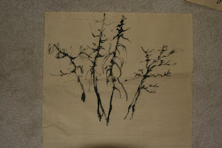
The following is a glimpse of tree trunks painted by a Ming Dynasty master, followed by the works of a frustrated apprentice.


As we can see, the second photo insert showed basically the same form, yet exhibited no "life" to the brushstrokes.  This is especially evident towards the top of the trees, where little branches are formed.

In Chinese brush painting, the terms "Chi" or "Li" describes force and strength and spirit and energy.
It is a concept that refuses to be explained, especially to the casual observer.  Mumbo jumbo, exclaimed the ignorant.  I often pose the question, what is the difference between a stationary live snake and a dead one?  They both possess the exact same morphology.  Yet somehow the live one portrays life.  Perhaps  the muscular tension exerted to each pair of ribs gave that away, or was it the turgid appearance a living organism, however subtle.   What we are aspiring for is the stored potential energy in a brush stroke.  Each stroke should exude the feeling not of  a wet noodle, but of a drawn bow ready to flex.

Here is work done by a Qing Dynasty master.  The brushstrokes here are rather colorful and free spirited.


Frustration in trying to decipher the strokes, the force needed, and the correct dry/wet brush.  All these considerations dialed in too much damper to the hand and mind machinery, resulting in stencil like babbling.


Getting a little better.


Throw your caution to the wind.  The exact likeness is not there, but the strokes are effervescing with "Chi". 


"So now you tell me, "copying" does not mean "copying", or does it? " says the frustrated apprentice.
"Paint me a live snake", says the master.