Showing posts with label Su Shi. Show all posts

Tuesday, March 15, 2022

Red Cliffs Nostalgia I, The Stonehenge

Now that I have the calligraphy in the bag, I can proceed in earnest to work on my painting.

As I mentioned in my last blog, the verses are from the famous Song Dynasty scholar/official Su Shi (Su Dongpo) when he visited Chibi and was being sentimental while reminiscing the historical events that happened some 800 prior.  The Battle of Chibi ( English translation Battle of the Red Cliffs) was about a naval war between  adversaries and the outcome depended on a change of wind direction.  Which way the wind blew was vital because fire was employed as the tactic in this conflict.  Whoever could predict and take advantage of the change of wind direction became the victor.  The exact location of Chibi is still highly debated, but suffice to say that it is along the Yangtze River.

The Columbia River Gorge in the Pacific Northwest is a designated National Scenic Area and the town of Hood River has the distinct honor of being the Windsurfing Capital of The World.  This section of the gorge compresses the east-west wind and amplifies its magnitude.  On windy days tourist would venture up to the Vista House on top of Crown Point and try to stand up unassisted in the 70 mph winds.  When the east wind blows, we get dry heat funneling through from the east in the summer, and cold frigid winds in the winter.  Westerly wind brings moderation and weather system from the Pacific Ocean.  Present day Gorge is dotted with wind turbines now.

Farther east from the Vista House, we have the famous Falls area, Multnomah Falls being the most well known.  Beyond that near the cities of Mosier and The Dalles lies the serpentine stretch of Historic Columbia Rivery Highway, where cyclists and motorists alike enjoy the challenge of the winding blacktops.  At the end of such switchbacks is the Rowena Loop, which is a circular drive at the Rowena Crest Viewpoint where one can enjoy the Columbia River down below.  Spring wild flowers and birds harnessing the updraft from the cliffs for take-offs make this Viewpoint a popular respite for travelers.  Thirty minutes car ride east across the river from the loops  gets one to the Maryhill Museum, Maryhill Winery and the adjacent Stonehenge replica.

What if I utilize all these vistas and the Columbia River as a backdrop for my painting?  I think it is a perfect setting for reminiscing and it reflects the spirit of the meaning effused by the verses from Su.  I also find a special connection with and relate to the wind in the river gorge.  I can definitely visualize a battle involving the use of fire being carried out here. 

I am making up some rules for me to follow in doing this painting.  One is I shall not hurry. Two is I shall try to present the painting with more classical means of depiction and brushstrokes.  Three is I shall incorporate each of the four vistas mentioned and each vista can be viewed as a painting by itself.

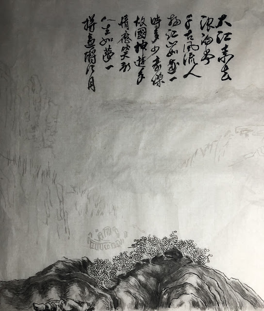
I am starting with a sketch of my main points of interest and the general layout of the proposed painting.  This makes it much easier for me to work on individual sections later.  Somehow I feel more disciplined this way, and more apt to take my time in developing the details.

First come the Stonehenge, occupying the lower left hand corner of the painting.


I am defining the light value first.  I find this helpful when I render my "Chuen" or texturing brushstrokes. 


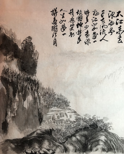
A more developed painting, with light values and initial texturing.  Notice the classical presentation of foliage.


Continue to develop the left side of the painting:


This is how the left side fits in with the whole painting:


I can square-crop just the left side of the painting, with the calligraphy and make that a painting.  So far I am adhering to my own rules.  

Sunday, June 18, 2017

Han Shi

Using the light ink version of my home spun Te, while paying emphasis on the visual clues from a printed version, I started the do my calligraphy on the Han Shi poem, with a proper calligraphy brush this time.

As I had discussed in the last blog, I was hoping that by having the light ink to trace with, I could be devoting one hundred percent of my attention to the quality of my brush strokes.  I was trying to cheat a little bit by not having to internalize the piece as much.  Though I would not deny nor negate the merits of that pretense, I found myself fighting the tracing.  The emulation turned out to be a comprehensive process, and I was over-thinking and plotting it, hoping that I could do a better job by splitting the task into smaller components.  Even the mundane effort of emulating and copying was not able to escape the inevitable  deviation  and personal interpretation of the archetype.


The following is a photo of the original Han Shi poem


One might say that I did an ok job in the emulation, but the persona of the piece has changed from a taut, chiseled and rhythmic piece to something that is languid and impassive,   as if a steeplechase athlete had turned into a middle aged office worker.

Aside from the overall presentation of the piece, I was also critical of the quality of my brush strokes. I still did not have a good command of my edges and my brush tip.

Here is an example of employing side-tip instead of the center tip.  The uneven edges betrayed my incompetency.  The sharp edge on one side vs. the rough edge on opposite side of the stroke is a tell tale sign for a side-tip blunder.


Here is an example of tracing for tracing's sake

I seemed totally lost with this word.  I seemed more worried about following the track than putting the brushstroke down with my own will.  Wet noodles is how I would describe my brushstroke!

Here is an example of a nice center-tip execution.  There is uniformity on both edges of the brush stroke and the character looks stalwart.


There is an ongoing debate amongst my friends as to whether non-Chinese reading people are better students at Chinese brush calligraphy.  The notion is that if one cannot read Chinese, then the calligraphy is pure graphic to that person, allowing that individual to appreciate and examine the calligraphy in its purest and fundamental qualities.  As for someone who reads and writes Chinese, that person has been exposed to and perhaps developed a habit of writing in certain styles and nuances, therefore a lot of the finer details in the brushstrokes are overlooked.  This person already has a preconceived notion of what that word looks like, and is not always congruent with the Te that is at hand.

I submit that Chinese calligraphy requires an interpretive component.  When we refer to such calligraphy, especially the ones that are good enough to be passed down as Te, they are not trivial recipes or shopping lists.  Often times they have historical relevance and importance in literature.
This Han Shi Te is a prime example.  In this poem the writer Su Shi wrote of the riveting disposition that he was in and screamed out the injustice and abandonment that he had to endure.

When we look at the piece as a whole, we can see that the font size is irregular, as is the spacing.
The fonts got bigger and bigger as Su wrote from right to left, especially with respect to certain words.  The red circled area shows a distinct enlarging of the fonts, perhaps signifying the increasing drama in his thoughts as he proceeded to describe the dilapidated abode that he had to endure.  The font size became huge when he wrote about the  broken stove (blue circled area) that he had to cook in.  He was pissed.


The characters with a downward ending stroke all showed exaggerated elongation and terse extension of the brushstroke ( circled in blue).  This is the same as a sharp, long stroke on our "p's", "y's", "g's" etc.   These could likely be Su letting off steam with these straight, forceful downward strokes; since they are not followed by another stroke.  Su seized on this opportunity, consciously or subconsciously, to discharge his pent up emotions.  These long strokes were his lightening rods, discharging.


I am just pointing out the fact that if one does not read Chinese, then one is missing out on the emotional aspect of this work.  One would be missing the phrasing, the fortissimo, and the fermata of the composition.

Now lets take a look at the overall presentation.  The irregular spacing and font size added to the artistic quality and gave this piece its character, especially when one takes into account its content.
The energy, or chi,  of the piece derived not only from his expertise with the brushstrokes, but perhaps with the inadvertent display of irregularities, thus illuminating his state of mind.

I did an experiment with the help of digital manipulation and rendered all the fonts approximately the same size and the long downward strokes shortened to normal length.  Inexplicably the piece lost its spirit.  It is now a deflated balloon.


Such is the magic in beautiful calligraphy.  It emanates not only proper brushstrokes, but a composition, contrast and proportion, like a painting.   It radiates a scholastic mettle.  It helps if one could read it.

This has been a fun exercise.  I can always find useful means to exploit my practice pieces.  They sometimes end up as window cover for the skylights in my studio.


Saturday, June 10, 2017

Lost

I've been avoiding the brush; avoiding most everything for that matter.  I still can't accept the fact that she's gone; the person who gave me life.  Not when it was so sudden.   I am desperately trying to find a way to unclog my head.  There are too many cross talks.  I just don't know how to organize my thoughts.
'
I'm not trying to fill a void, it's just like there's less meaning to all the things I do now.  It's difficult to imagine a grown man was still motivated by the thought of the "NEED" to hand in "Home Works".   I suppose the simple act of turning in some piece of work suggested not some sort of  an accomplishment, but it was a way to show the I was doing fine, and nothing in my life had altered my routine.

To help me get back on the horse I decided to go back to calligraphy, to a piece that I had studied in the past.  The beauty of revisiting this study is that it is familiar and I just need to follow and emulate the Te, and the circumstance of this piece of work is meaningful.

I am referring to the work of Han Shi Te by Su Dongbo.

Han Shi ( Cold Food Festival ) is a festival that falls around the time of Qingming Festival ( Tomb Sweeping Day).  Qingming ( April 4th or 5th) is a day to show respect to ancestors, thus tidying up the tomb site  and offerings of food and drinks and incinerating paper money (currency of the underworld ) are traditional practice.

Legend has it that Han Shi (Cold Food Festival) was ordered by an ancient Emperor as a redemption for his horrific mistake.  The Emperor was seeking the service of his friend, who did not aspire to fame nor glory, and avoided the Emperor by vanishing into the woods with his aging mother and entertained a life of simplicity.   In his infinite wisdom the Emperor decided to force his friend to reveal himself by setting fire to the woods,  subsequently causing the death of his friend and his mother.  In his remorse, the Emperor decreed that no fire or burning was allowed for 3 days.  Thus there was no way to cook and food had to be consumed cold, hence the Han Shi Festival .

Su Dongbo (Su Shi)  (1037-1101)  was a famous calligrapher, poet, foodie and a statesman of the Song dynasty.   He somehow angered his Emperor and was banished to a remote place.  During his exile he held a post in name only but received no stipend, thus was living in poverty.  One could only imagine the smorgasbord of emotions that he had to endure.   Shrouded in the shadow of injustice he wrote the Han Shi poem, where he referenced the Han Shi Festival as a means of noting the seasons.  His calligraphy Han Shi Te  hence became one of the gold standard for studying the walking style of brush calligraphy.

He wrote about the incessant cold rain and the dilapidated hut he dwelt in was like a boat in a rising torrent .  He was trying to cook on a broken stove with wet hay and only sensed  it was time of the Han Shi Festival by noticing that birds were carrying incinerated paper in their beaks.  He was far removed from the central administration despite his continued desire to serve and he couldn't even fulfill his duties by observing the Qingming Festival.  He talked about how all the blooms had wilted  and fallen overnight, perhaps drawing a parallel of his own fate.

What made this poem famous was the picture it portrayed of the desolate bleakness of his emotional state.  What made this piece of calligraphy astounding was the air it exuded, of the author's anguish, frustration and longing, by means of the irregular font size and spacing and the different ink tones.  His was not your typical calligraphy piece.  It was a testament to his circumstances.

I reacquainted myself with this piece by performing the usual ritual of shadow writing; following the brushstroke in my head and analyzing how each stroke was shaped and delivered.  My first job was trying to emulate his brushstrokes.  I started to copy his writing.


My next goal was to emulate the whole piece as a complete organism.   I would try to gauge the spacing, the ink tone and the rhythm in the script.  I tried to find the punctuation, the phrasing of written passage.  I needed to sense where the fermata is, which words were pizzicato and which words should be treated like legato; to borrow a few musical terms.  Perhaps I was over-analyzing or was being pedantic, I found myself hesitating with my brush edge and pressure.  I found myself  already arriving at the end of the brushstroke and I still wasn't able to form the correct shape.    This was like a novice horn player having difficulty with finding the correct embouchure, causing  the notes to come in late or drag on for longer than intended.

I devised a method to combat that.  I thought I would write in light ink first and my emphasis would not be on the quality of my brushstrokes, but rather on the placement and the relative size of the words.  I could thus start the emulation with less pressure, by dealing with the more graphic aspect of the project.  My intention was to re-trace my light ink with the proper brushstrokes, done to the specifications of Su Dongpo.  I was eager to see if this plot would work.


To help ease my trepidation with this emulation, I chose an old brush that somehow survived 18 years of abuse and really was not fit for calligraphy.  I figured that would help me to not place too much emphasis on the quality of the brush edge and pressure etc. but to seek out the spacing and the form of the whole piece.  I was treating this work as a painting or sorts.  I spotted the position of the columns of  characters by creasing the paper along those lines.


Somehow I mis-calculated the numbers of columns I needed and the words did not fit into the original places.   I tried another piece, and still managed to omit the last column ( where Su titled his work).   Is there hope for me?!


To be frank, I wasn't disappointed with my efforts, so far.  The brush strokes actually were not that bad.  They were free and energetic.   I think the fact that I was using an old brush and all that gave me an excuse to fail, thus taking off a lot of pressure from me.  Such was my psyche.   I wished perfection right off the bat, and I had to will myself to be not so demanding.  I was my own worst enemy!   I was always so uptight about everything that I just couldn't relax.  I recall that I used to bowl a little bit and my scores were always hovering around 100.  After a couple of beers I could come near 150.  The score would fall back to 100 as alcohol left my system.  My bowling score was an uncanny indicator of how much beer I had to drink!

Anyways my next step would be to use a good brush and attempt to do "real" calligraphy by tracing my light ink.  Hopefully I could now be paying more attention to the brush edges and pressure, and not so much in the form and spacing.  That is my intention anyways.