The water in my astrological water sign is having a herculean tidal pull on me. I just can't get the thoughts of water out of my mind. Something compels me to keep using water as a subject matter for my paintings.
When I started out to paint my algae in the pond work last November I was just toying with alum solution. I tried to depict the messy blobs of algae with a certain fanfare. Then I graduated to painting Rusalka, using water as my stage. For my "tedious project" I was experimenting with my interpretation of the Gongbi style painting.
I am running the risk of being disrespectful to all the Gongbi artists out there. Here I absolutely need to make a nota bene point, that I know little about the Gongbi discipline. How dare I pass my work as a Gongbi painting.
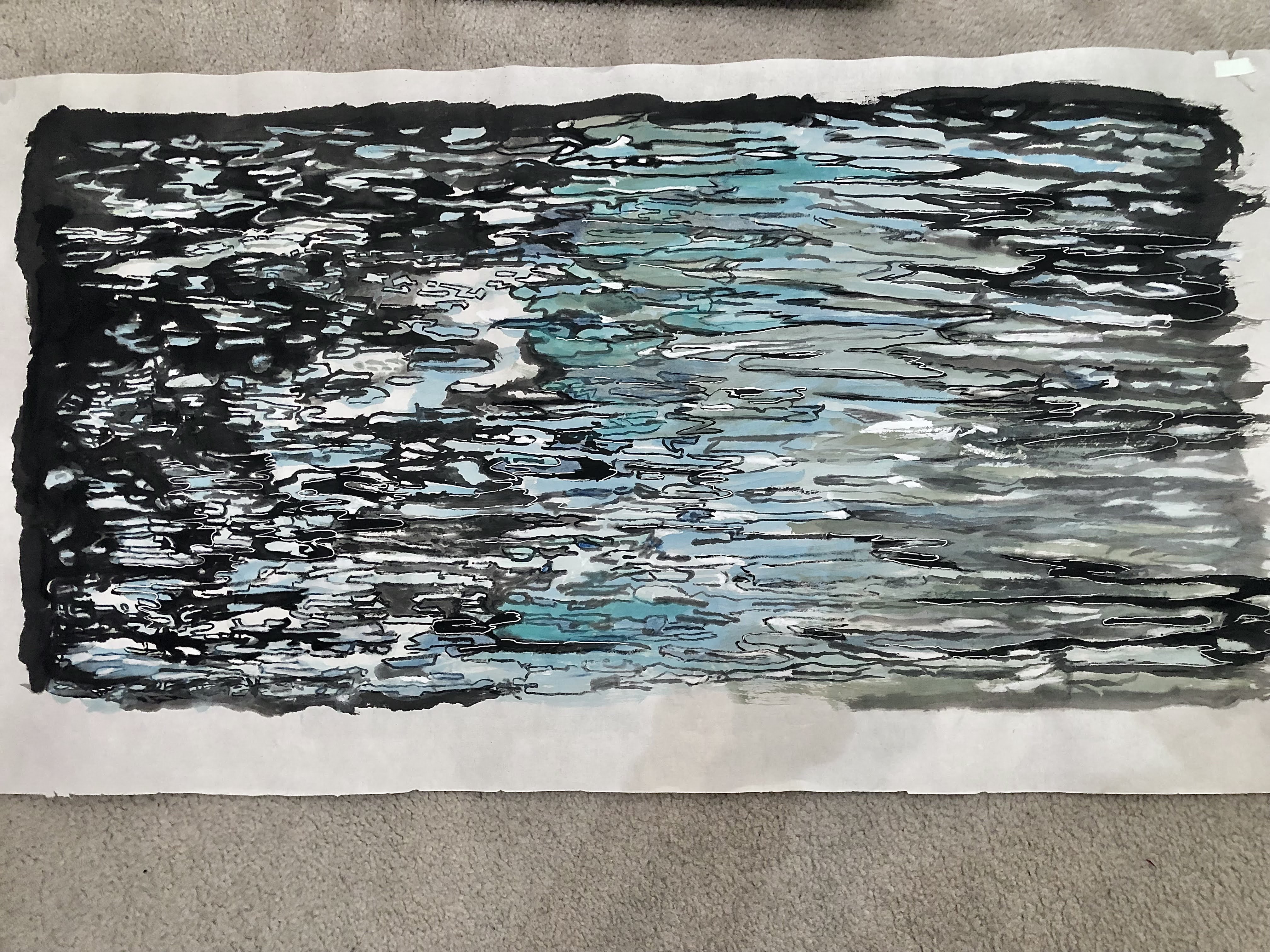
By definition, Gongbi style painting demands finesse and patience; qualities that are sorely missing from moi. Perhaps I can substantiate that statement by showing part of a painting from my friend, who happens to be a skilled Gongbi painter.
I implore you to examine the quality of the lines, the brushstrokes and how smoothly the colors are blended together. That's Gongbi painting!
Mine is Gongbi-esque at best. I do not have the patience to study Gongbi style painting properly. It is always too "tedious" for me.
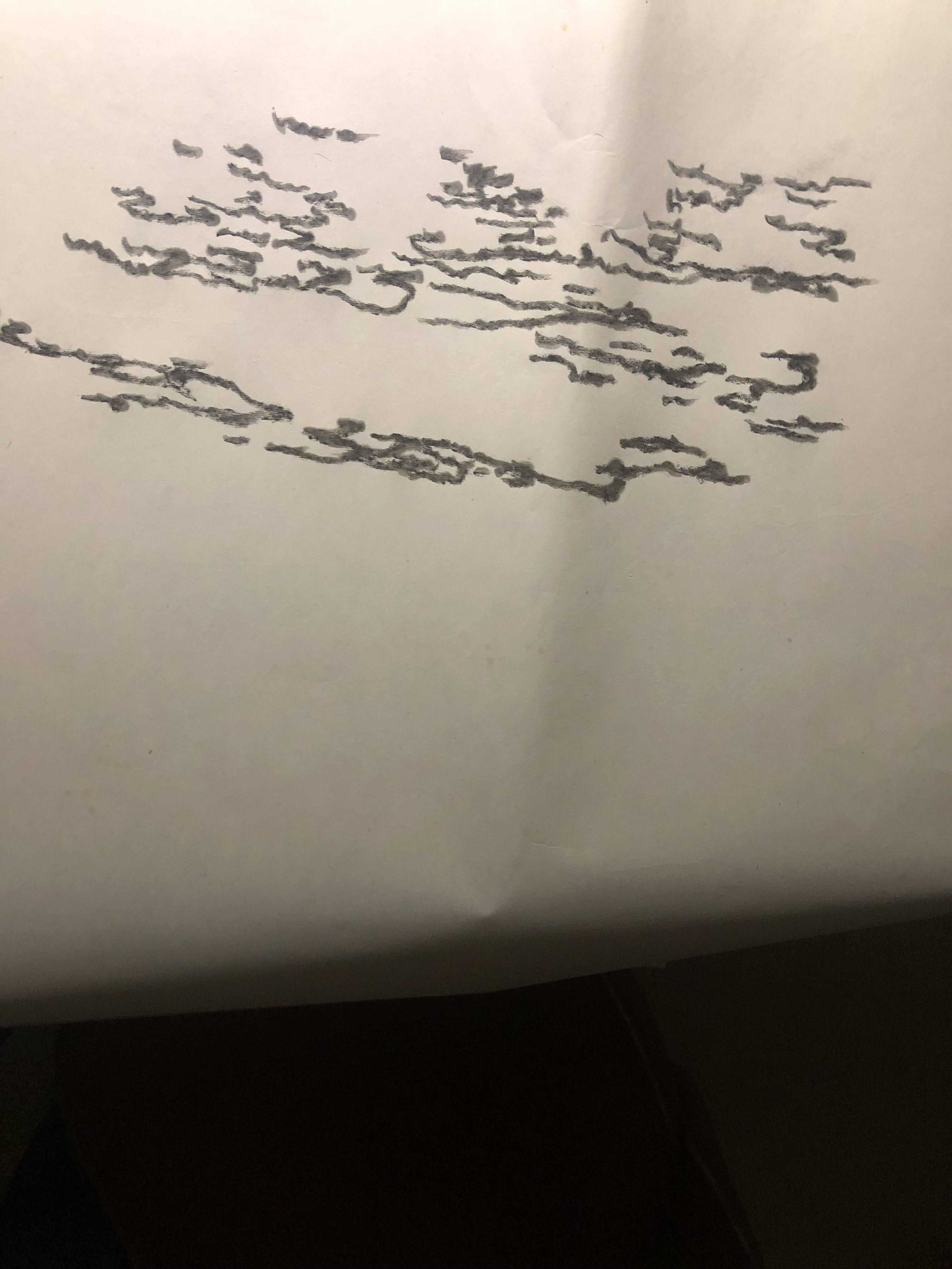
So what is percolating in my head now is another Gongbi-esque attempt in painting water. I am starting with the multitude of forms and reflective patches and I am outlining these areas with my brush. Instead of writing in the fine and disciplined lines like my friend did, I shall attempt to hide my incompetency by pretending those forms and shapes are complex Chinese characters. Thus I am practicing my calligraphy if you will.
Actually these brushstrokes remind me of Sanskrit or Hebrew alphabets. Actually they resemble Arabic writings. I am definitely not trying to be disrespectful to the cultures that I've mentioned above. I know nothing about their writings or alphabets so perhaps I should not be using them as examples. But instinctively that's what comes to mind. I am sorry if I am offending someone.
Employing the same rhythm and mindset I am writing more lines and forms on the other side of my paper.
I am thinking about composition already. I need to create a contrast of density. The haves and have nots. Lets call the left side the "rich" and the right side the "poor".
I am using very light ink for my brushstrokes to write swirls to fill some of the voids. Light ink is also used to create a contrast with some of the thick black ink-lines.
The swirls are actually my way of doodling. Frankly I am at an impasse in deciding what to do with the rest of my water feature. Thus writing swirls is relaxing and non-committal. It gives me a respite.
When I look at the painting now I feel a certain sudden emotion, as if something had struck me.
The painting looks interesting the way it is, without all the other embellishments! It has a simple, impressionistic, naïve feel to it. It is in black and white, with so few, and yet so much information. Our minds are (at least mine is) doing the work of completing this painting.
I am writing in a few more phrases towards the lower right hand corner. I feel that the sentence from the left needs to be a bit more structured. That little tail forms a connection with the lines in the upper right hand corner.
The red smearing is my way of digitally trying to decide where to place my seal.
Like a proverbial optimist, I do live in the moment. I am placing a 24 in x 48 in frame over it just to see what the finished product might look like.
So I started out with the intention of doing another pretend Gongbi painting of water, to writing pretend calligraphy to emulate the wavy undulations on the water surface, to stopping the painting process with the bare minimums of information. I have escaped all the tedious work of writing in the rest of the water. All because something feels right for me. At this particular moment.
Is this restraint, or a cop-out?


BW_9x18.jpeg)


