Showing posts with label Xieyi. Show all posts

Sunday, June 9, 2024

Water continued


Time to finish my water mosaic painting which was started back in January.  Perhaps due to the fact that I had committed so much on the painting already, and frankly I got sidetracked with other paintings, I find it difficult to change course or alter significantly what I have done so far.


I am holding tight to my boat's wheel and sail on.  I want to identify a body of glistening water by assigning a bluish color to it


Now I pick out the areas of occasional shimmers by mentally labelling them with my red lines and painting them in blue.  As one can see I am not confining the color within the boundaries of the lines as I should have.  Again I blame this on my "not wanting to lose my train of thought" or "sense of place".  Seems like a valid excuse!


Dark ink is used to fill in the "non-shimmering" areas of the water.  The stark contrast of black ink and color helps to bring the features of the water to life.


The right side of the painting gets a lighter ink treatment.  Again I am not being a good student.  My coloring goes outside of the outlined areas.  In a way this is like a hybrid of Xieyi and Gongi style paintings.  Hmmm.


I am adding a thin white line as an additional border to some of the black in pieces of my mosaic.  It is a subtle effect but somehow I am convinced that it adds to the nuance of the water mosaic.  Perhaps these lines reinforce the interpretation of shimmers on water?


In the end, my hybrid style of Xieyi and Gongbi Water Mosaic.  What a mouthful!


The above painting does not have the added white lines around dark ink.

The one below does have the added white lines.  If nothing else, it seems to have more definition and information.  I think the white lines add to that je ne sais quoi feeling of the painting.  I am just experimenting.  I do believe that some photo-editing software "sharpens" an image by imparting an artificial border of white to fool the eye of perceiving more contrast around the edges.  Perhaps this is the reason behind my saying that there's more definition and information as a result of painting in these white lines.  Serendipity!


Wednesday, January 10, 2024

Rooster and Hen

Happy New Year!

My family zodiac painting still needs two more inhabitants to complete, two chickens.  In Chinese zodiac, the translated word should have been the gender non-specific "chicken", and not "rooster" as what is popularly referred to.  I suppose the "Year of the Rooster" sounds better than "Year of the Chicken" in the western society.  In this particular case, there happens to be a male and female chicken in my family zodiac.  

As in the case of the Rat, I've done a painting of the rooster for the Lunar Year of the Rooster, so I proceeded with not much planning or plotting.  Perhaps it was more like uninspired; I had done this before. This was not my first rodeo, right?


I kept looking at this and I really didn't like it.  There was something wrong with my painting but I couldn't put a finger on it.  It was just a feeling. 

Perplexing!

Today the fog finally lifts.  My rooster looks frazzled.  

The tail feathers just don't look right.  The brushstrokes of the black feathers are nowhere near the quality of the lighter brown ones.  They look thin, dry and malnourished, like the hair of someone afflicted with terminal illness.  Definitely not befitting a proud rooster.

I'm trying to recall the way I painted those black feathers.  I recall that I was really concerned about the silk that I was painting on; it didn't disperse nor allow bleeding like a normal piece of unsized Xuan paper would.  I was also concerned about the backing paper might separate from the silk itself, since I had absolutely no prior experience with this craft "silk" and I didn't know how much abuse by wetness it could take.  Thus I was using a brush that was perhaps too small and too dry for the required brushstrokes.  The result was a bunch of overlapping black streaks, each brushstrokes attempting to hide and modify the previous one.  They were very different from the blades as described by the brown ones.  I was no longer "writing", but sketching! Compare the black brushstrokes with the brown ones, and my analysis should be quite evident.  

I am hoping this can be ameliorated by using a bigger brush, and better ink.  This requires some bold moves on my part.  I am using the "blackest" ink in my inventory for this attempt.  This is an ink that I normally shun, due to the "shine" it imparts.  It gives the brushstroke a glossy finish.  Maybe I can exploit this, as heathy feathers are shiny?

I am also pre-wetting the destined brushstroke with a clean wet brush first.  I am hoping that the wet track would make the subsequent dark ink flow a bit, perhaps bleed a little, so that it is more in line with the Xieyi style of Chinese Brush. 


Much better!  That's more like a rooster.  More forceful and calligraphic brushstrokes, and there are actually natural areas of voids or lighter ink within the brushstroke, thanks to the pre-wetting by the clean wet brush.  The brushstrokes are now alive with nuances, and no longer just dead markings. 

Onward with the Rooster's partner, the Hen.  Having enjoyed some success with correcting the Rooster, my brushstrokes enjoy a moment of unrestrained zeal.  They appear and feel much freer, with more aplomb.


I am so happy that the straight-on perspective turns out to be sufficiently convincing.  


Here comes the Hen.


Thursday, February 2, 2023

Starting a tedious project

A painting at an art exhibition spoke to me.  I really don't know how to describe the painting because I am not familiar with the various styles of western art.  Labels like pop art or art deco are all Greek to me, or is is it French?  The painting that spoke to me reminds me of Andy Warhol's silk screen.  I guess what caught my fancy is the challenge ( or ability ) to define different areas of the painting with very specific color and the lack of a gradient within that particular space.  To me it is like re-defining my concept of a pixel.  Here my pixel could be a line, an entire square or whatever shape.  Actually I think I am making things more complicated than they really are; what I am really trying to do is to create a mosaic.  In my mosaic, all the "tiles" are painted on paper and each "tile" can assume a specific color, and one color only.

If I am going to construct a mosaic painting, my usual Xieyi style brushstrokes would be useless here.  I think a Gongbi style approach might work.  Generally speaking Xieyi brushstrokes rely on broad brushstrokes to give shape ( as compared to filling in with color to render shape ) Gongbi style painting requires outlining everything in the painting and then filling in with color.  It is way more meticulous and rarely spontaneous.  There is always careful staging and posing for Gongbi style painting.  Hence I believe my mosaic demands Gongbi.  

Gongbi painting is always done on sized Xuan paper.  Alum is used as the sizing agent.  The paper is less absorbent after sizing and allows the color to flow more freely.  Xuan paper that is not sized would absorb ink and color instantaneously and whatever mark one makes is indelible.  With sized Xuan there is some room for negotiation and the painting techniques are vastly different. 

The typical brush used for writing the outlines has a long and slender brush profile.  The long hair makes the brush less susceptible to force exerted by the wrist and therefore writing a uniform line with it is easier; in theory that is.  An ordinary brush has a much bigger belly and any variations in applied pressure results in brushstrokes of varying width, anywhere from a fine taper to a broad streak.  Hence the basis of our brush calligraphy.


An expert Gongbi artist shows the craft by presenting flowing lines of uniform width and intensity with no hiccups or kinks at all.  The attached photo is an example of bad Gongbi skills.  The lines are not uniform at all and they are rough and not pleasing to look at.  The student would get a fail grade.


Thus the first step of creating a Gongbi style painting is to create a workable outline drawing.  This is when the artist stages and poses whatever subject matters into the painting.  I suppose one can look at that as a stencil, upon which a piece of translucent sized Xuan or silk from art supply stores is placed, and the artist can now trace the stencil with that long slender line brush.  Typically Gongbi students always copy the stencils provided by their teachers. 

The painting I have in mind to paint is this fashion is the same one I did recently; the colorful one with the ducks in a pond.

Since I have to work out the stencil myself, I would cheat by basing it on a painting that is mine and is already in existence.  I just have this obsession about all the different reflections in my pond painting and I think these reflections are interesting mosaic material.  As I delve into my thought process and mental preparation I realize that each of these shimmers and wiggly lines could be a piece of the mosaic tile and therefore I would be dealing with formulating hundreds of tiny pieces.  A most daunting task.  

Since I haven't made any New Year's resolutions yet, I shall resolute to attempt this seemingly tedious project.  I think the challenge that this could be laborious motivates me.  I am reminded of these paint-by-numbers coloring books that are sold in craft stores.  The ones that are for kids 12 years and older can be very complicated, with lots of numbers to sort out and paint in.  Often times one does not know what one is painting without first looking at the key and the finished picture to get a sense.

I am taking my time but keep a steady foot on the gas pedal and begin in earnest to plot my stencil of outlines.  For my stencil I am using a brush pen.  It is much easier to handle, especially for the purpose of making dark lines quickly and succinctly.  


It is hypnotizing to figure out all these "tiles" and frankly this is not as bad as I thought it would be. Perhaps it is my OCD, I frankly do not sense the passage of time.  Whenever I want to take a break, I keep thinking of the next wiggle, the next "tile".  Just one more, I told myself.  Obviously having my original painting as a "stencil" to work from helps immensely.  I just hope that I can make sense of all these lines, all these little enclosures.  I can always refer back to my original painting if I am lost, as I reassure myself.  It is also surreptitiously comforting to know, perhaps, that by having this "stencil", I could do an iteration of my ducks in a pond.  That hasn't crossed my mind before until now.


Tuesday, January 12, 2021

Not Chinese Enough

 I switched the frame of my Wetlands painting.  It used to be a poster frame with thin black borders.


So I paraded my newborn, as a proud parent would have done.

Immediately I heard mumblings of "your painting is not Chinese enough".

As I said in my previous blog, I had intended to make an overtly "Chinese" painting because of the type and color of the paper I was using.  The fact that people recognize that this was an attempt at the Chinese genre, I have halfway succeeded.  But "not Chinese enough"?  Really?

I have always maintained that my style is neither western nor Chinese and this has struck the wrong chord with many a purist; but to have someone point that out to me, especially behind my back somehow cuts into me a little bit.  I couldn't help but be reminded of the time when I was hawking my paintings at a school bazaar when some patron wanted to look at my works and her Asian friend told her to shun me because in her words "his work is not good Chinese painting".  I remember muttering, in my head at least, "give me a break, what do you expect for a lousy 75 bucks!"  Not that the price is a reflection of whether my paintings are good or not, but you get the gist.  So now it seems that I'm faced with the same dilemma again, to fit into the "good Chinese" genre.  

So what is "Chinese".  Does it have to be a Mandarin in pigtail?  Must I accept the remark that I use shoelace as my blindfold?  One would say wait a minute, these could be construed as racist overtones these days and certainly we are not talking about that.  Can the perception of a race be translated to things like songs, paintings clothing, buildings, food, etc.  Does a Chinese painting carry the same weight as Chinese food for example?

So does the "ethnicity" of a piece of work have anything to do with the "ethnicity" of  person and is it defined the same way.  Do stereotype and preconception apply to a piece of work the same way as to race?  Are we just talking about appearance?  My wearing a suit and tie does not make me a westerner anymore than an American blond girl wearing Cheongsam a Chinese maiden.  Now if I could obscure her head and hide her identity could she convince us that she's Chinese under that qipao dress?  If I say that she's still "not Chinese" enough, what causes me to say that.  Could it be her bone structure, her body frame, her posture or her mannerisms?  I think we need to be able to be comfortable in discussing the nuances in how we perceive race and cultures without being narrow minded.

Now let's look at the following 2 works,


I know this is not fair since the top painting clearly shows a Kimono donning lady so one would assume that it was not a "Chinese" painting.  I know this is a weak argument since it is also entirely possible for a Chinese painting to depict a Japanese figure, so right away we are led to another cul-de-sac that we could address.  But there are many similarities in the 2 paintings.  Both paintings show a female figure in ornate robe and headdress.  Both paintings show exposed fingers and toes.  One might detect a distinct difference in the portrayal of the face however.  Actually the top Courtesan painting is a work by Vincent Van Gogh.  Thus for the sake of argument, is there anything from that painting that tells you the work was not "Asian"?  If there was, then how "Asian" was that painting.  Could one accuse Van Gogh's painting of being "not Asian enough" and if so then what was the criteria?  Are we able to witness a difference in the brushstrokes here?  Are we observant enough to see that one of the painting was not done with a round brush?

What about the attire of the subjects in a painting.  Does that influence our sorting or perception?
Which one of the two paintings below is "Chinese"?


The bottom painting clearly shows halter top and skirt and anklet that one normally does not associate with the Han race, and yet the painting was done by the great master Zhang Daqian.

What can one tell about this painting:


The above is a Gongbi style painting and this is the more formal and rigid type of rendering, with outlines and filled in color, quite different from the Xieyi style painting which deals with spontaneous brushstrokes.

Now compare the above painting with the this one:


It seems to have been painted in the same genre as the top one and utilizing flower as a subject. Actually both paintings are works by Giuseppe Castiglione, an Italian Jesuit missionary to China in the 1700's.  I am almost sure that most of you are surprised that these are works from a westerner.  So is one of these 2 paintings more "Chinese" and if so what betrayed it.   Can one use the caption that it is a Chinese painting, just not Chinese enough?  Does the bottom painting remind one of a Chinese in suits or a western blond in qipao?

 A 5th century artist Xie He established the Six Canons of Chinese Painting, which governs and defines the 6 main attributes of Chinese painting and they are :

1. Rhythm
2. Strength in brush strokes, reflecting the spirit of the artist
3. Fidelity to nature
4. Appropriateness of color
5. Composition
6. Learn by emulation

When I attempted my piece on Wetlands, I tried to utilize that as my mantra.  I thought I established pretty good rhythm by utilizing consistent brushstrokes in the form of lines and dots.  I believe my brushstrokes were all calligraphic in nature,  thus the rhythm was similar as in carrying a prose.


The lines and  even the wings and bodies of the birds were written and not painted per se.  One can trace where the tip of the brush landed and lifted.  The painting was definitely faithful to nature, as evidenced by the photo I attached in the last blog of the actual wetland.

Now the color might not be carry the same aforementioned fidelity but I was trying to create a mood for the painting by just keying on two colors.  I mean I could as well paint the entire thing in ink and water and just rely on my ink tones; but I didn't have the correct paper to paint on for that style of work.  Plus that wasn't my intention to begin with.

I thought my composition was pretty good.  I somehow was able to account for foreground, middle-ground and background.  I cunningly eschewed the details in the middle and let the viewers decide if the void was water or vapor.  It is not uncommon for Chinese painting to leave the body of water or clouds as a blank space without a smidgen of information.  My birds in flight were heading towards the flocks in the background, forming a connection.  The strong deliberate wings were a good contrast to the scattered specks in the distance, the yang and the ying, in Chinese vernacular.  

My interpretation of  trees were strong indication of the traditional presentation of mixed trees as presented by the gold standard Mustard Seed Garden:


and the ground these trees sat on wore a distinctly Chinese appearance, judging by what Mustard Seed Garden had revealed:


Thus compare the Mustard Seed Garden examples with my rendition:


I must say I did a pretty good job of emulating while didn't stray too far from he actual scenery.

If I had satisfied the 6 prescribed canons of Chinese painting, why is my painting "not Chinese enough"?

Is it the picture frame; the fact that the painting was not mounted and bound by silk cloth into a scroll that one could hang?

Is it the subject matter; the fact that I was not painting the traditional landscape of soaring ethereal mountains in Shangri-La like presence?


I did the painting above some years ago and I had it professionally mounted and bound in a scroll format.  Does it look "more Chinese" ?

What if another Chinese person comments that the painting is "not Chinese enough", is that person being tribal or does his comment hold any more weight.  It is not my intention to be polemic.  The reason I am raising these points is perhaps beyond a wounded ego, this might actually be a reflection of struggling for identity.  The simple truth is, I'm trying to defend myself.

One thing is for sure, I had planned for a certain identity in doing this painting, no matter how superfluous it might be.  When one uses a rice bowl and chopsticks one eats rice or noodles, right?  My agenda was to make it overtly "Chinese",  ostensibly triggered by the yellow calligraphy paper I was using.  In doing so I forgot the innocence in painting and the "profite de l'instant".  I happen to subscribe to the notion that the artist often leaves a piece of his soul and identity in his creations.  In my case I am a Chinese transplant, which is very obvious in my diction when I speak, in spite of my 5 decades of immersion here in the States.  I am sure there are a lot of tangible and intangible attributes of the western culture rubbing off on me. Thus the more likely indictment would be that I am "not American enough".  So why was I trying to be "overtly Chinese" knowing that I am Chinese; that seemed like an oxymoron.  Perhaps all these years spent away from the Chinese culture has made me "less Chinese".  I also know that I could be accused of extending the ethnic flavor hyperbole into ethnic identity, but what if there is some correlation?

Another way to look at it is a traditional Chinese painting, landscape painting in particular, is seldom a work of en plein air, and has very little to do with the actual trees or rocks.  Often times the painting is an assimilation of thoughts, philosophies, fables and euphemisms.  As such the painting might be mired in details, but the details are not as black and white as in western landscape paintings.  Often times there are waves of details and incidentals in a traditional Chinese landscape painting that guide and propel the viewer to cascades of reflections and deep thoughts; sometimes based on political turmoil or personal losses.  They are more like settings and situations than actual sceneries.

In the end the painting perhaps was a little contrived, as in striking a static pose.  Perhaps I was trying too hard.

I'm still at a loss as to what is meant by "not Chinese enough" after all the rambling.  I am convinced that it has as much to do with the flavor as with the appearance. The enigma is in defining "flavor".   If we see a dragon dance parading with various high school bands and drum corps down Kearny Street in San Francisco to celebrate Chinese New Year, would we say the event has a Chinese flavor or a western flavor?  Could the event be "not Chinese enough" since the style and contents are not exclusively Chinese?  Is one being pedantic or is there some merit to the accusation? 

To quote a famous philosopher, perhaps it is the same as pornography; you know it when you see it!


Thursday, March 15, 2018

Prepping For A Demo

I was asked to do a Chinese Brush painting demonstration at one of the local venues.  I told them I would, and my topic would be landscape paintings.

Landscape painting is among the most difficult genre to master.  Needless to say it requires expert brush skill, but it is often laden with so many rules and doctrines, to the extent that it smothers creativity.  Chinese landscape paintings are in essence impressionistic abstract paintings that portray a a state of mind, a philosophy, rather than an object.  It is this ether that gets lost in the process.  I suppose one could describe a well manicured garden with all its physical attributes, design elevations and its eclectic collection of flora but it is the enjoyment of the garden, be it rests merely on the surroundings, or otherwise the sentiments it evokes, that ultimately establishes the garden.

I am certainly no expert in this area, and that is exactly why I wanted to take up this self imposed challenge.  I wanted to approach this demonstration from the standpoint of a student.

A student must do homework, and I need to have a clear road map in my mind as to what I plan to present, so I settled down to devise my program.  My experience with these demonstration sessions are that they are always fluid.  Some audience members are surprisingly well versed, whilst others are totally uninformed and I need to be able to talk at both levels at the same time.  We could be examining one topic and it quickly digressed to something else.  That is the reason I need to be more than a one trick pony and have an arsenal of useful skills and information that I can retrieve from.

Students of classical Chinese Brush are aware of the two main styles of painting, namely the Gonbi and the Xieyi; where the former is a more formal style with distinct outlines and filled in color and the latter is more expressive brushstroke ( especially broad side-tipped used to describe surfaces) format.  Landscape paintings demand a good understanding of the Ji Ben Gong ( fundamentals ) which deals with Gou, Chuen, Ts'a, R'an and D'ian ( outline, texture, rub, wash, dot )

Landscape paintings are often a combination of the two, although there are works that are predominately one or the other.  I shall start with the study of the more brushstroke-weighted ( surface weighted) one.  Here the brushstrokes represent a shape, a landmass in this case; and also the light values and shading.

I reached into my tools bag and dug up an old model that I fashioned with foam core board


using charcoal I rubbed the contour onto my Xuan ( I must emphasize that this is not the traditional way of doing Chinese landscape paintings, but strictly something I devised to help myself and others understand the brushstrokes)


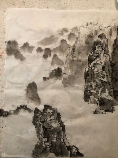
I started on the left side and built my backdrop of a trail with steps using light and medium ink


Using dark ink, I sought out the areas that are shielded from the light and did my side tip brushstrokes


As the ink is depleted gradually from the brush, take advantage of that by laying into areas that require a lighter value.  A clear understanding and concept of how the rocks are presented helps to write in these brushstrokes.  In an ideal situation, the charcoal contour lines should not be visible at all, since they never existed to begin with.  They are only "cheat lines" to help the student visualize the structure.  Thus I was trying hard to conceal these lines.


Moving on to the right side, I inserted the rest of the backdrop


Voila, the completed sketch


Before I proceed to my next etude, let me just say that I am not too happy with the above rendition.
The more brushstroke-weighted (surface-weighted) style is supposed to be more spirited and free and yet I don't see that at all.  I believe the culprit is in my charcoal sketch lines.  Those were supposed to guide me as to where to write in my brushstrokes but they ended up being quite restrictive.  I was trying to conceal them as well as follow them and thus my brushstrokes looked more like tracings than actual strokes.  They lacked gusto!

While my scheme MIGHT help us understand where to wet the paper with ink, it also created a rather rigid image.

I turned my attentions to the more traditional method of painting landscape, half Gonbi, half Xieyi.
This process begins by establishing outlines of hills, rocks, trees etc., anything that is in the foreground or middle-ground.  These areas enjoy a more rigorous and detailed description from the brushstrokes.  Thus the process of Gou is the first step.


As the ink gets depleted from the brush, which also gets drier as the writing continues, we need to strategically start writing in areas that demand a lighter tone, also the process of Chuen and T'sa as the opportunities present.  In other words, Gou started out as a single minded procedure, but as the brush changes its characteristics then we take advantage of the situation by incorporating Chuen and T'sa.  This concurrent administering of the 3 techniques gives the painting a more cohesive feel.


The background, or objects far far away are always depicted with the broad strokes without Gou lines. These are suggestions that something exists out there.  The broad side-tipped strokes are used.


After the basic skeleton is acquired, it is time to employ R'an, to add shading and establish the darker tones.  R'an can be most effective and dramatic when corroborated with the Chuen that is already in place.  It really defines the faces of the rocks and the texture.  It helps if we can hypothesize and visualize where and how the light illuminates the formations.


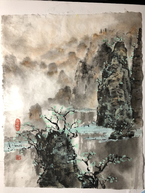
Using burnt sienna, or tea, we judiciously color in the highlighted areas


Write in the darker areas with indigo and ink mixed.  Do this before the tea or burnt sienna dries so the transition of color is smooth and is easier on the eyes.  Also use a non transparent color like green label one to write in the flat land and shore  at the base of the conical pillars.


Close-up of fine tuning the rock face


The reason for using a non transparent color of the shores is so that when we put in the reflection of the pillars in water, the gouache like color is not covered, retaining the integrity of the shores.


D'ian is selectively applied to hide bad lines, or to accentuate a contour line, suggesting vegetation in the crevasses, tree stands, blades of grass along the shoreline or simply as decoratios to take up space, like a potted plant in the corner of a room.  Obviously tree leaves are prime candidates for its application.


The brushstrokes need to be lively and expressive, despite the fact that they seem like mere dots.


The finished painting


which is loosely based on this scene from Guiln


I feel a lot better now.

I feel like I have given the impending demo an honest preparation.

I feel like I have gone to the confession booth and have all my sins absolved.......