Saturday, September 6, 2014

All bummed out

I received notification about an exhibition event that I've applied to.

For this application I employed three different treatments of the same subject matter, using different techniques and perspectives.  I've posted about these works on my blogs before; it was my quest to explore what really constitutes Chinese brush painting.  I've also stated my agenda in my artist's statement when submitting these works for jury.  My resolve was to find a public stage to state my case, while instinctively  prepare for the real possibility that the judges might not be equipped with the requisite knowledge to discern.

When one looks at a picture of a waterfall with the water looking like a silky ribbon, those not-in-the-know might say "Oh, how pretty".  Those in the know would say, " Oh, how pretty, the photographer used a long exposure to achieve that effect."   Such is the difference between  a juror having the proper knowledge about photography and one who just appreciates.   Granted, if the picture is good, then it is good regardless.  However, the judge with photography background is able to add another layer into the validation process.    If I was asked to judge dogs, I should at least know what qualities to  look for in different breeds of dogs, and not just a dog that pulls at your heart and makes good companion.

Regrettably, the piece labeled Traditional Brush got rejected.  I don't want to speculate the reason behind it.  If  I was given a choice, I would rather prefer the traditional brush piece be accepted in lieu of one of the other ones.

The Impression had the least semblance to Chinese brush.  Yes it was executed with Chinese brush on Xuan, but that was about it.  It was like a child born to Chinese parents but grew up adopted in Deutschland.  This kid knew nothing of the Chinese culture, spoke no Chinese and ate no Chinese food.  The only thing Chinese about this kid was the the genetic makeup.

The yellow painting was the same adopted kid, but spoke a few words of Chinese.  There were hints of  a Chinese traditional brushstroke, especially when describing topography and texture of the near shore on the left is concerned.

What was novel about this piece was the fact that alum was used to size certain parts of the paper to create that neither solid nor empty but kind of translucent look, adding a third dimension to the otherwise 2 dimensional feel.  These sized areas were represented by the highlights of the trees and the branches.  Contrast these voids with the empty spaces of the sky and the water and you'll know what I mean.

The traditional brush piece was the same adopted kid in Germany but was immersed in the local Chinese culture as well.  Therefore she knew the culture, spoke the language, ate the diet, but was not dressed in the traditional Qipao (Cheongsam).  The brushstrokes were all traditional, the "chuen" strokes were traditional, the fashion to describe assorted woods was traditional, the multi-layered application of color was traditional.  What was not traditional was again the composition, the utilization of alum to accentuate the conifers, and the choice and intensity of the coloration.  Where as the painting might lack that je ne sais quoi, it takes someone with Chinese brush acumen to discern it.  This kid was trying to be as chinesisch as possible, albeit wearing western garb.

I was really hoping that by showing these 3 pieces together, I would be able to raise the conversation: what is Chinese brush painting.  Perhaps this event is not the proper forum.


Beaverton Creek  Impression
 
 
Beaverton Creek
 
 
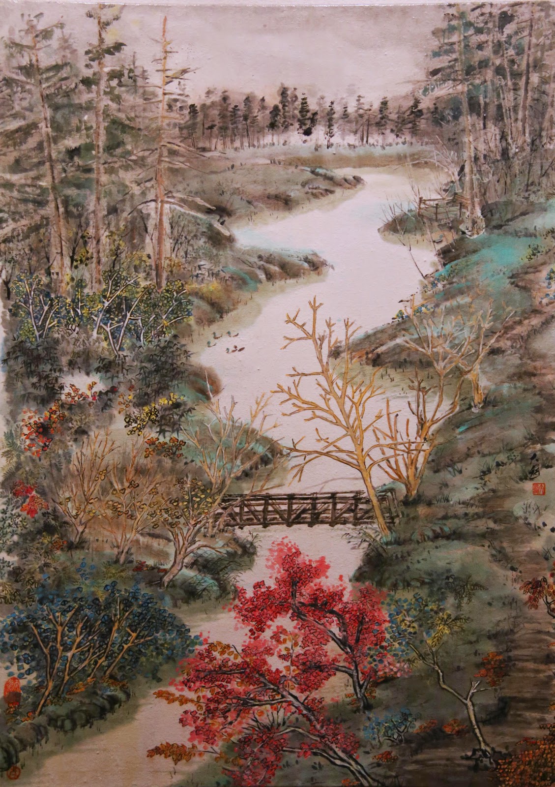
Beaverton Creek, Traditional brush
 
 
My quiet resignation goes out the window; I am all bummed out.


Thursday, September 4, 2014

Building a Chinese garden

I got my hands on some semi-sized Xuan.  This one is very thin and translucent; feels like a giant sheet of onion skin.  I like this kind of paper due to the fact that it allows a build up of layers of ink.  The regular unsized Xuan would not tolerate this practice.

Lately I've been drawn to some of the classical elements of a formal Chinese garden.  I decided to further explore this arena.

I sat down with a pen sketching of a plausible layout


At this stage I was trying to pin down the spatial relationship of the different structures.  I wanted to glorify the sweeping roof lines and use them as a back-drop for the cozy enclosure.  I have not decided on how to treat the pond.  I am inclined to leave it blank, with a ribbon of pond lily as garnish.

I hoped to be able to use the center pavilion as the focal point, but somehow my attention was diverted to the side structures


I kept embellishing my sketch


Never for a moment thought that this would be an exercise in futility, I pressed on.

I started to brush down an outline in very diluted ink, and piled on subsequent  layers to achieve the different tones.


Eventually I established the general arrangement of the structures.


I took a break at this point.  I was having difficulty concentrating.  Actually I was running out of ideas.   I felt like I was manufacturing instead of creating.

I just realized that I stopped because I was bored.  It wasn't fun anymore.

I left this on the table and examined it from afar, from close-up, skewing and tilting my field of vision.  Unfortunately I could not find one iota of emotion in this rendition, not at this stage anyways.
Everything looked so rigid and stoic.

Like Cougars said in Top Gun, " I'm holding on too tight, I've lost the edge"

I was thinking about what I paint, and not painting what I think!

Monday, August 18, 2014

Planting a tree, a cosmetic remedy

I've been looking at my recent attempt at the pavilion, the one with the huge hair-do, the one I conceded to be difficult to amend.

I can't surrender that easily.  Surely there's something I can do.

Why don't I just plant a tree?  Use the foliage to hide the pompadour! ( I used to think it was Pinocchio's nose !)

With the innocence of a child, and the eagerness of going out on a first date, I proceeded to plant my tree.


The ink being so intense, I had to mix in some titanium white to the  Green Label Three to add some opacity to the foliage. 

I also painted in the tiles on the breezeway and the rest of the shrubs on the ground.  This was done to shield  the prominence of the new tree that I planted.  I was actually adding something to the painting to try to take away other things.

I also mentioned that I didn't like the way the rocks by the water edge looked.  I painted a thin ribbon along the water's edge and that seemed to account for the boundary without the original harshness.
I adhered to leaving the body of the pond as an empty space.

I'll sit on this one for a while, like I usually do.

Monday, August 11, 2014

More Pavilion

I did a pavilion painting a couple of months back.  In that attempt, I liked the feel of the pavilion, but not the way I dotted the shrubs.

I also thought the arrangement of the elements was a little too cozy.  I thought the garden should be a bit larger.

My challenge is to set the pavilion up in a more elaborate and spacious environment, but still make the pavilion the focal point of my exercise.


The paper now has a wider aspect, forcing me to stretch out the placement of the different elements.


Right off the bat I thought the painting looked a little cold, too austere and not very becoming.
I also felt the separation of the breezeway from the pavilion was not handled as well as the original painting.  I needed to bring out the pavilion without making it ostentatious.  I mixed indigo with ink and dressed the tiles of the pavilion


That seemed to address the problem alright.  The subdued blue pulled the pavilion out without a disconnect from the background.

The painting did not have enough headroom, especially considering the fact that I wasn't going to paint in the reflections like I did on the last one.  I could have moved the whole thing down a notch.
Also the rocks by the waterline seemed lifeless.  I would try to add in a thin bordered waterline when I have more time to contemplate the remedies.

The tree next to the pavilion was at even height with the pavilion.  This did not speak of a nice contrast of the two, and presented a rather dull relationship of the elements.  This could be corrected rather easily.

But then I noticed a glaring mistake:


The roof ridge on the left ( circled in red ) was too thick, too big and too solid and totally distracted from the focal point, unless I was painting Pinocchio's nose of course.   It should have been a lot lighter and fading out to the sweeping lift, to blend in with the disappearing tiles.

This mistake could not have been corrected easily.  Seems like a new attempt is in order.

(please visit "Planting a Tree" dated 8/18/14 on the follow-up)

Monday, August 4, 2014

"Wall" inspection

Now that the "wall" painting is done, it's time to conduct a building inspection.

I mounted the work on canvas like I usually do and put my miter saw and router into service to craft a frame.  After securing the canvas onto the frame, I turned it over and with the same eagerness as a new parent, I examined my newborn.


Well, it was kind of a let down.

I was immediately overtaken by the terse statement put forth by the frame.  It seemed too thick for this painting.  I thought the stark black paint would go well with the ample black tones in the painting but the frame seemed suffocating.

I had painted in the bottom dark bands to make the painting more grounded, but the thick frame made that move seemed redundant.  There wasn't enough empty spaces between the leak window and the bottom and this compounded the claustrophobic feel imparted by the frame.


I also noticed that the side tip brushstroke by the window was too long and did not blend in with the upper horizontal brushstroke.  This in turn created the illusion that I was painting a corner rather than a flat wall, with this brushstroke working as a light value line, denoting different light values of adjacent walls of a corner.  I wish I wasn't so carried away with my downward brush movement.


I do like the effect of painting lighter lines next to the branches, not only to make them look fuller, but also adding depth to them.  I could be convinced that the wisteria was casting a shadow on the wall, as opposed to  laying flat against it.

I also liked the fact that the upper tiles were not totally painted in.  The void spaces worked great with the frame and allowed breathing room.

I suppose the inspection gets a passing grade but could benefit from future design modifications.

Tuesday, July 15, 2014

"Building" a wall, continued

Other than these obvious corrections to my first attempt at this painting, I've also done something that was not obvious to the casual observer.

In the version that did not have the ground, I painted in the window lines on all 4 sides.  In fact I also brushed in shading along the left edges of the window to help delineate the opening.  I have in fact debated this with my colleagues and it was agreed that the line was necessary.


But I did not buy into it.  Not wholeheartedly anyways.

I decided to define the left edge of the window by the darkened pattern of the window.  I wanted no harsh confines for that part of the window.  This practice of defining a void space ( in this case, the window's edge ) with values and not lines is similar to how I would paint a stream or waterfall.   I also felt that the eloping wisteria vines was further enhanced by the absence of a line.


I tackled the problem of some of the branches being too thick by painting a shadow on the back of the Xuan.  This added volume without adding mass, and seemed to work.

I had enough quest in me to try another copy.  I painted the vines with more straight lines and less curves.  Somehow I did not like the vines as much as my previous attempts.  I think my anxiety of breaking up the curves into short straight segments go the better of me.  The lines also looked a little anemic to me and lacked that oomph.  Perhaps I should not have done this one?  Was I getting bored?


 I was not going to use color for this series of paintings.  I was going for that black and white graphic look with elegant lines and interesting contrasts, remember?  In fact, light values and the look of graphic design sounds more western than Chinese, but I think the vocabulary is the same, just the language is different.  Well I need to be flexible and see the possibilities.

Out came the color tubes, Titanium White and Green Label Three.  I scratched in patches of leaves. 

For now I'll pin my salvage on the wall and ponder, like I always do. The wall that I am building is now done and we shall see if it will stand up to the test of time.

I am still ruminating on why does the vine want to get out?   Surely road side auto exhaust couldn't be better than the lush flowers and ponds inside?   How does one argue with nature.

Sunday, July 6, 2014

"Building" a wall

The traditional formal gardens in old China is surrounded by a wall, which shields the various pavilions and bridges, ponds and rock structures from the outside.  The structures inside the confines of the wall are often arranged to re-create a "borrowed scenery", to fulfil the imagination and the fantasy of the property owner. 

It is this wall that I find most interesting.  Whereas its main function is to establish a physical barrier, it is often punctuated by framed windows such that people on the outside can take a peep into the garden, a bit of a tease if you will.  I look at it as a fine lady trying to hide her assets, yet strategically revealing just enough to perk one's curiosity.  I am convinced that a half clad person is definitely more intriguing than one in a full birthday suit.

We have such a garden in town.  Lucky me! 

Aside from the intrinsic beauty such wall and window radiates, I like the arrangement for other reasons too.  The stark white wall is a perfect contrast to the dark tiled tops.  The lattice, or pattern on the window casts interesting shadows and creates movement.  I like the simplicity of it.  Contrast, simplicity, elegant lines; what else can I wish for.

I hastily painted a rough draft, to see if I can parlez all these into a painting. The painting would have the dark tiles on top.  The whole upper portion of the painting would be dark and heavy.  This is the "solid", the "yang" part.  The lower and left part of the painting would be the "vague" or "ying" areas; complementing and contrasting.  There should be a strong emphasis of lines, along with the black and white patches, this could pass off as a graphic design also.


I am convinced that this could work.  Armed with that conviction, I sat down to do one in earnest.


Two things became apparent rather quickly.  Firstly the "ying" was too much.  There was too much void on the lower half, to the extent that window and wall top seemed to be suspending in air. The painting did not feel grounded at all.  Secondly, the vines were too jumbled up.  They looked like entangled yarns, lacking direction and movement.

The next attempt tried to fix the aforementioned shortcomings.


 I put in the lower edges/ground of the wall.  I appointed the main branches of the vine.  One could clearly identify  a horizontal 8 now as the main branches, albeit they were a little too thick.  I've made the black tiles at the top to be in rows of a slight angle and much darker  to break up the monotonous  look.  In fact I made no attempts at all to cover up or fill in my brushstrokes.  I want the ink to breathe.  I also painted in the continuation of the vines behind  the window.  I wanted the audience to sense ( perhaps subconsciously ) the satire that whilst the wall was trying to rein things in, the vines were actually trying to get out..............   This attribute is by itself a notion for the complement/contrast aspects of Chinese painting.  Perhaps more importantly though, especially on an emotional level, this is the half cladding that started my fascination.

to be continued


Monday, June 30, 2014

An old friend re-visited

My formal training in Chinese brush was in landscapes, but I found myself doing a lot of geese, insects etc.  I just paint whatever captured my imagination and more often than not, these critters caught my fancy.

I had done a few  insect paintings in the style of Master Qi Baishi over the years.  The two that I am most fond of was one with a cicada and one with a grasshopper.  I decided to re-visit the grasshopper again.  I want to see if I can show an improvement in my brush.

I found a piece of  triple Xuan measuring 15 x 18.  I wanted a thick paper because I wanted to do it a la Xuan-boo style;  a thicker paper would stand up to the abuse I put it through.   I will be preparing my own canvas and making my own frames etc.    I use the commercial painters drop cloth as my canvas.  I enjoy the more pronounced texture from the drop cloth, over the anemic feel of the canvas frames sold in stores.

The problem ( and the advantage ) of using commercial drop cloth is that the fibers are not always uniformly wound.  Sometimes a few loops go astray and swell inordinately with the application of Gesso.  This apparent irregularity actually adds to the uneven feel and the character of the canvas.

I started out by laying down the stalk with a  coarse brush.  The stiff bristle makes a bone brushstroke that much easier, and the white streaks left at the end of the stroke is very enticing and enigmatic.


I did the upper leaves a different hue from the bottom ones to add dimension and interest.


Using very faint indigo and ink and pencil, I blocked in the shape of the grasshopper.


The insect is coming into life with a fine brush.  This part of the painting is more Gongbi than Xieyi.


A close-up reveals  the interaction between the fabric and the brushstroke.  At this point, no one would have believed that the painting was done on Xuan.  The paper assumed a feel of the fabric underneath.


Made a frame and colored it with dark mahogany.  That dark sultry red tint was a perfect match for this painting.


I do think this work is better than the previous attempt!  My brushstrokes are more convincing now.

Sunday, June 29, 2014

Coffee, Ink and semi-sized Xuan

I was just finishing my 2 days old coffee.  I admit to leaving unfinished coffee on my desk and drinking it days later.  No belly aches, no vomiting, no problems.  McDonald's had raised their coffee price from 30 cents to a dollar and 30 cents.  I was baited, and got reeled in.  I blame my parents for not making me smarter.  So, I am not about to waste any coffee.

I don't often work with semi-sized paper, but the few times that I had tried it, I fell in love with it.
For me, the paper is more forgiving.  It won't bite me back when I misjudged my water load in my brush.  Yes the brushstroke loses some acuity and the stroke floats a little bit before sinking in, sort of like a delayed reaction,  but I feel emboldened to be a little reckless. 

I found a nice piece of classical work to study.  The artist's name escaped me, but I really liked his way of addressing each stroke and defining each line.  I thought the semi-sized paper would be particularly useful for this study.  I could take a little more time in putting together this jigsaw puzzle and not worry about if my brush was too wet or too dry.


The semi-sized paper was able to faithfully record different ink tones


Each brushstroke, no matter how faint or delicate, showed a presence.  The audience is encouraged to read the painting, as more clues are revealed upon each cast of the eye.


The painting was finally finished with my days old coffee as color, filling in shades and  shapes.  Literally an exercise of good taste.

Monday, May 26, 2014

Good-bye

Good-bye Mrs. C
You're finally freed
free to soar the beach that you loved


I miss you

Sunday, May 25, 2014

Pavilion

Having to do a themed exhibition right after a trip overseas while I was in the stupor of jet lag is definitely not fun.  It's amazing what adrenalin does to a person.

After the anti-climax, I needed to get back into the swing of things again.

The brush felt so foreign.  I have not touched it for a while.  Could the heart grow fonder after the short absence?  I shall find out.

I decided to reacquaint myself to the brush by doing some doodling.  Well, sort of. 

I did some grass style calligraphy; just to get the blood flowing.


I talked about appreciating the brush stroke during my spiel at the exhibition, so I decided to pay extra attention to  my brushstrokes.  I want to work on my center tips.

I deem the lines of a Chinese pavilion interesting.  I want to portray the high sweeping ridge line.
I want to capture the emotions emanating from the dancing soffits.

I started out with a brush saturated with ink to write the arching ridge line.  I wanted a moist, wholesome look to the lines to reflect on the massiveness and the energy that these lines give off.
This is going to be a pavilion in a lake, a la classical gardens for the rich bureaucrats in the old days.


Using light ink, the surrounding covered breezeway was put in place.


Writing in the tree, paying attention to leave a little space between the branches and the pavilion, to establish  perspective.


Using Green Label 3, I dressed the branches and the waters edge.


I know it's a cliche but I just couldn't resist painting the reflections on the water.  I tried to be scant in the details.  I restrained myself from using more color to the painting.  I wanted to keep the airy, impressionistic feel of the paining.  I surmise that my cinnabar colored chop will add that speck of punctuation that I was look for.  It had to be strategically placed.


My dots seemed too evenly spaced.  They were restrained and not interesting.  This is something I need to work on.


Monday, April 21, 2014

Relationship, no, not that kind

Since I had quite a few pages left on my drawing pad, I thought I would fill some pages with quick charcoal sketches.


Armed with this sample drawing, I went on to painting with brush on bamboo paper.  I really like the texture and warm color of this paper.  There is something very organic about this piece of fancy butt wiper.


I don't know why I truncated the bodies into halves.  Perhaps I thought it was a more interesting composition?  Perhaps I thought the relationship of the two geese were intriguing.  Were they chatting, greeting or quarreling?  Who knows!  In my mind their necks seemed to be the story teller.  Their  body language  was  translated into neck language.  This is a plausible explanation for painting just half a goose.

I wanted to explore this relationship by humanizing the geese.  What if one goose tries to playfully sneak up on a dozing partner?


I thought the leaves were too big for this composition.  I don't know if this was a painting about leaves or geese.  I can't sense any goose/goose or geese/leaves relationship in this work.

What if I moved the geese closer to each other.  That will form a relationship for sure.


Well the leaves still stole the thunder.  They were too overpowering. One goose seemed  to be giving the other one a cold shoulder. There was too much size disparity between the 2 geese.  Was the sleeping one much farther back to have appeared  smaller?   If so, I need to perhaps paint it in a much lighter tone?  Or separate the two with blades of grass?  I really have not established the relationship of the 3 items in this painting at all.  Something to remember in my future trials.

Monday, April 14, 2014

Am I sick of it?

We had an unusual winter.  We saw some snow, enough to cause traffic problem and closed schools.

During one of those off days, my friend snapped a picture of the highway.   Just a random picture.  Something to do with the index finger on the iphone.


That picture was about ready to be deleted.  It was not intereting.  But what do you do with your day when you try to stay off the road as much as possible?  Play with all your pictures, my friend said.  Cropping is easy to do.


"I want to paint that."  That was my impulse after I saw the cropped photo.

My first attempt at the photo was too "faithful".  I think I was too busy recounting all the details, down to the little bush in the foreground.  The bush looked out of place in the painting.   For one it was too small to really establish a perspective.  Besides, it really took away the  abstract patch type ambiance.  I also thought the horizon lines very too strong. They were too rigid and confining.  This painting attempt had all the undesirable misgivings of painting from a picture.


On my second attempt I thought I would just recall from the photo.  I think I was playing a little more with the elliptical shapes of the landscape, rather than the landscape itself.  The lines definitely livened up and were not as forbidding.  Gone was the redundant bush in the foreground.


I wanted to play with the shape partitions more,  i.e. the sky, the bend in the highway on the left, and the filed in the foreground.  In my mind, this had turned into an exercise of painting patterns and lines.  I was reluctant to do this a third time.  I seemed to me that I had spent my soul in the first attempt already, and anything subsequent to that is boring and repetitious.  Perhaps I just want to prove to myself that I have discipline and I can work at something until I am satisfied.


I looked at my third attempt and I saw haste and desertion.  What have I done!  I was a mad man.  I really couldn't make anything out of it.  The painting looked disjointed.   I should have stopped at two.  Perhaps I was tired of toying with the same time over and over again.

Could I just be sick of it?

Tuesday, March 18, 2014

Taking a break

I was really getting tired of my brush calligraphy.

Every stroke was a chore.  I had no flow.  I was flustered. 

I was told that this is a sign of energy not flowing and it would be pointless to continue.  So I looked for a diversion.  I painted instead.

The painting was done on sized Xuan, the same piece that I aborted my brush calligraphy on.   This paper is better able to retain the original brilliance of the pigments used.   I used it for calligraphy practice because it was scrap and was easily within reach!


The painting was done without much thought process nor planning.   I did it just so I didn't have to practice my calligraphy.  It just flowed.  I am now looking for ways to crop this so I can present it in a proper format.


or


I have lots of time to muse over this.

Monday, March 10, 2014

Crash and Burn, attempting woodblock

I took the prints from my first attempt at wood cut to my teacher, who happened to be an expert in this field.  My teacher excelled in woodcut prints while studying art in France.

I wasn't ready for the appraisal I received.  Nothing about the print was right.  Not one iota!


I was trying to state my case.  The wood was too hard.  I used a crooked pine board.   I used ink instead of the proper print paint.  I didn't have a roller.  The paper I used was not card stock.  I really liked the feel of it.  I tried to demonstrate a spatial relationship of the 2 trees.  There was variation of in ink tone.

My teacher demanded to see my carving knives, which I did not bring.  I asked instead for my teacher to base the critique purely on the merits of the image alone.  Why must one involve my carving knives.  Why couldn't we talk about whether the print surface was properly primed or not.  So the discussion evolved to discussion of whether one could do proper Chinese brush calligraphy with a brush for house painting, or must oil painting be done on canvas, etc.

After much discussion, the take away I got was that there are distinct traits of merit for every discipline.  For example we kept talking about bi-fa in brush strokes, be it brush calligraphy or brush painting.  Correspondingly, wood cuts need to demonstrate the way of the knife, for lack of better terms.  It was this lack of knifesmanship that doomed my print.  I failed to demonstrate any control of the edge.  What I deemed as pleasing, i.e. the wood grain coming through, the mottled look etc. should not be and could not be a substitute for proper cutting technique.

This reminded me of my own blog  Isn't Being Cute Enough?  I was too preoccupied with the First Time fever to see it.  I fell into the same pit.  Thus my lack of skill in wood cut was not concealed by
any sorts of pretence;  at least not in the eye of someone who knows.  The advice for me:  don't rely on gimmicks to save me.  Learn to do it properly.

This is what I like about my teacher.  The ability to conduct open, thought provoking discussions.