Sunday, September 29, 2013

It's Kinda Private

It has been an introspective period.

I went and paid my last respect to a dear friend.  His family requested a painting from me to be carved onto his headstone and that had just been completed.

I was then invited to attend a party for the developmentally challenged.

There was a Blues band playing for the banquet and this young lady with Down Syndrome climbed onto the stage uninvited.  Normally this would have been a social disaster, but perhaps because of the company that we were in, nobody bothered.  Except for two people.

The young lady was enthusiastically swaying to the music, keeping time to the snares, having a jolly good time.

And the mom was busy capturing the daughter's every animation with her cell phone,  exuding utter joy from her face.

I couldn't help but think about the pure innocence and elation exhibited by the child, and the unqualified pride and amazement felt by the parent.  That was a private moment, even though the venue was a very public one.  Such was the dichotomy.  We could only guess, perhaps, what was going through the minds of these two individuals.

Kinda like viewing (or reading ) our paintings.  There is no mass hysteria, it is not a rock concert.  There is no protocol to like them, or to dislike them, it is not science.  We can talk till we are blue in the face about techniques, theories and what not but it all boils down to the private  conversation we have with our audience.  Our paintings are our ways of letting people take a stealthy  glimpse of ourselves.


Nothing else matters.  It's like taking  a stroll on a beach.  I'm awash in my own thoughts.

The thoughts are all mine, and they are kinda private.  I'll confide sometimes, somehow, to someone.

Monday, September 16, 2013

Arpeggios In Brush Strokes

Chinese calligraphy is sometimes recognized as the highest visual art form in Chinese art.  It is the foundation governing the use of the Chinese brush.  I have been told that a good calligrapher can evolve to be a good painter with relative ease, but a person naive to calligraphy could never be a good painter. 

I practise calligraphy not only to hone my skills with the brush, but because this was something ingrained into my upbringing long time ago.  Calligraphy was taught as part of the curriculum, even at the primary school level.  I now regret that I did not pay close attention to it during my formative years.  I blame this on the absence of inspiring teachers.

My current calligraphy teacher wanted me to do the grass script calligraphy. My teacher proposed a therapeutic goal of opening me up and allowing me to be more open and expressive.  I have read books on handwriting analysis; on how personality can be revealed by the manner a person crosses the T's and dots the I's.  This is a novel  idea to employ calligraphy as a tool to modify personality.


Instinct told me that the grass script  is the hurried style, when the person was writing in a hurry and the strokes were simplified and also became connected between characters.  This impression was supported by the amount of voids or empty streaks in the brush stroke, hinting fast brush speed on the paper, and the thin silk like brush strokes, again hinting speed and haste.  This style is carefree and elegant to me, all at the same time.

I tried writing them fast and furious.  I tried to write them standing up in my kung fu stands and using my hips and shoulders to effect change of directions.  I tried using dry brush so it was easier to lay down streaks.  I tried using a very stiff, almost wire brush like tufted brush to achieve better transmittal of strength from my body onto the paper.  I tried to gyrate and tilt my brush laterally to an acute angle, to obtain the sharp edge so I can demonstrate the fine corn silk like threads.


Boy was I wrong.  I have never been so far from the truth. I was so misguided  in my assessment that it wasn't even funny, especially to my calligraphy teacher.

Despite the  appearance of hasty cursive, I still needed to start slow and steady.  The form and energy lied within the proper execution of the brushstrokes and not merely the apparent shape.  The empty streaks were happy accidents and not from purposed manufacturing.  The thin threads were from natural lifting and the desire of the mind to go to the next character.  Thus my kung fun stands and using wire brush and tilting the brush amounts to a cartoonish  tracing and not "writing".  I was engaged in theatrics.  I was being superficial and ostentatious.


And this is so true.  More often than not, we were so consumed by gingerly trying to form the perfect image that we either forgot or were unable to comprehend what is important at hand.  We forgot what we must do to get there.  When we look at the photography of a prancing antelope we saw the grace and agility, but we forgot that was just one moment captured by the shutter. There was the running, the  recoiling of the legs, the arching of the back, the extension of the body and neck.  Everything happened in a fluid continuum and not as discrete micro movements.  Despite the best craftsman, mannequins are just that; and the figures in the best wax museum are only life-like, but do not exude life.  I was trying so hard to imitate each brushstroke, each character, that I lost sight of the flow and the narration of the script.  I was trying to create a quantum leap of a prancing anetlope from one that stood still.

So my calligraphy teacher demonstrated by writing just 2 characters.  They looked nothing like the original Te.  There were no thin threads, no streaking brush strokes.  Yet there was the palpable grace and energy which conformed with the grass style script.


After the benevolent brow-beating, I learned to look at the grass style writing in new light.  I settled down and concentrated not so much on the shapes and nuances but on the brush strokes themselves.
It became apparent that even the strokes seemed hurried, they still needed to be extended fully before changing directions.  It was analogous to snapping a wet towel or cracking a whip.  The tip needed to travel all the way  until it was fully extended before snapping back, thus getting that extra leverage to deliver that sting.

I also became more lucid about the delivery of the brush strokes.  I gave myself permission to be free from copying every single brush stroke, but to feel the whole string of characters.  Pretty soon a natural rhythm was starting to take shape.  Some characters felt better if the continuation is through several change of directions, while others  could be just one stroke. There is a cadence to this dancing of the brush.   I call this the arpeggios in brush strokes.  It is true that the arpeggio consists of progression of notes, but we play them as a fluid string rather than segmented stops.  And then when we get good enough, we can impart color and character to individual notes even in a legato.  In fact calligraphy is not unlike bowing.  There is the frog, the tip, up bow and down bow, much like  the belly, the tip and brush travel in various directions.  There are musical passages requiring successive down bows or up bows, or expressive frog to tip, or several bows to make one seamless note.  The pressure, speed and placement of the bow has to come from within, and not manufactured from a set of instructions.


There is hope for me. Yet.


Saturday, August 31, 2013

To gel or not to gel

I have been continually amending my Beaverton Creek classic style painting for a while now and I am really afraid that one of these days I might go overboard and make it ostentatious.  I suppose I could not gauge for myself whether the painting is 80% complete or 99% complete.  One way to cure this urge and OCD nonsense is to sign off the painting and mount it.

I did just that, in my usual Xuan-Boo fashion.

 Xuan mounted on canvas


I mentioned that I would coat it with a gel medium as a final step, not only to protect the surface of the delicate Xuan, but also to restore the brilliance and depth of the ink and pigment after they have dried.  I remember when I was first starting out, I was so absorbed by the appearance of the painting when wet, only to be disappointed after it is dried, as everything dulls.  What if I find something that will retain that wet look?

My prayer seemed to have been answered by employing the gel coat.  It definitely brings back and depth and brilliance of the original attempts.

 left 1/3 coated with gel

 right 1/3 not yet coated


I've been criticized by people in the circle for doing this.  Perhaps of the glossy finish the gel imparts, or perhaps the look and feel is too non-Chinese?

I suppose some of us use hair dressing in our hair while others don't.   I am at peace with my choice.

Wednesday, August 28, 2013

Chiseled in clay

Tea was served while visiting my friend.

I was nervously fidgeting with objects on the coffee table as my mind was racing, trying to find a polite and meaningful conversation.  I am just not adapt at social gathering with people that I barely know.  More often than not, I was afraid to be too opinionated, once engaged in an exchange.  Surprise!

Then my sight latched onto this teapot.


I've always maintained that Bi-fa is the quintessential element in defining Chinese painting.  Here is a simple drawing of a dwelling on water.  None of the associations in this scene made any sense.  In fact it bordered on being absurd.  Nonetheless we know immediately this is a Chinese painting.

Was it because it has Chinese thematic objects?  Probably.  It was the Bi-fa, however, that I consider to be the calling card in this instance; albeit the work was not done with a brush but with a carving utensil.

The scratch marks detail clearly the starting points, progressing to lines with various pressure and width.  This is really no different from drawings made with pencils or charcoal sticks.  The pressure and speed and decisiveness of the strokes are clearly documented.  Thus the tracks made were not wet noodles, but lines with Li (strength, energy).  Bi-fa is used generically in this instance.

The layout itself follows the traditional landscape doctrine, subscribing to the Three Perspective practice, height, level and depth.

 hemp chuen           

Trees were depicted in the traditional abstract fashion.  Hemp chuen was applied to boulders in the fore front and hills in the right background, whereas the rock pillars on the left received the Axe chuen.  These are all classical methods used to describe texture and topography.

 axe chuen on pillars


So even with  clay, and without using a brush, the artisan still followed the tradition and demonstrated the traits of a Chinese painting.


Wednesday, August 14, 2013

Semi-sized vs Unsized Xuan

I was continuing my efforts to emulate Gong Xian's paintings;  I find his Jimo ( accumulating, layering with ink )  technique fascinating.

I started out using a regular Xuan, actually an excellent quality Xuan.  Right away I found myself ill at ease.   

One of my Achilles heels is the fact that I tend to doodle.  Perhaps this is an exaggeration,  but I tend to go over my my brushstrokes over and over again, must be my OCD.   I was hoping by honing my Jimo skill I will learn to be more decisive and discrete with my doodling, but the unsized Xuan caused a lot of bleeding.  It is true that I can still see distinct tracks if I hold up the Xuan against the light, but when viewed under ambient illumination, the  painting looked muddled, or dirty as we say.  I stopped before finishing the painting.


I dug out my semi-sized Xuan stock and tried to paint again.  The semi-sized Xuan is less absorbent.  The ink floats on top of the paper for a while before getting absorbed into the fibers.  Once the ink is dried to touch, I can pile on more ink/color and I can push the original track somewhat, while keeping the original brushstroke more or less intact.

Here is a side by side comparison of the 2 versions.  The one on the left is semi-sized.  The brush marks are better delineated.


I like the semi-sized Xuan much better for this particular exercise, and I took the painting to completion.


Sepia color achieved by using left over from my cup of coffee !!

Thursday, August 1, 2013

Simple is as simple does

As part of the exercises of building my painting skills, I am always looking for interesting pieces to emulate; especially pieces that exemplifies brush strokes and composition.  I suppose this is learning by rote, but I look at it more from a standpoint of exploring and expanding my envelope.  It is no different from studying Paganini and Heifetz if I was a violinist.

The works I choose are  usually simple, not elaborate.  I can only take in a few things at a time.

I came upon 2 ink wash paintings.  My first impression was the paintings had interesting composition.  As I examined further into these works, I was intrigued by the  ink tones and the soft yet discrete brushstrokes.  The lines seemed to be blurry and distinct at the same time.

The first scene included a boat, waters, a hut and hills.  A dominant horizontal aspect described by prominent undulating contour lines and light value lines. The circumventing path punctuated with such subdued flair.  Neither the boat, nor the hut assumed a main character role, but they answer to each other across the hill, with the hut half hidden by bushes. The riveting bushes showed delicate tips by the ink layering technique.  (A different technique and feel was explored in my  Playing with Visual Acuity blog )


The second piece showcased a forest hiding a house, with a winding path/stream breaking the vertical lines.  The lessons to be learned here was how to handle the different ink tones and building up the branches/leaves to a pleasing form with perspective and attitude.  The painting made a deliberate statement about the relative positions of the trees in the foreground.  This was however, a more interesting example than the ones shown in the Mustard Seed Garden.


As I completed my emulation exercise, I liked the pieces so much that I researched deeper into them, and I was even more astonished.  The works that I emulated were by Gong Xian (1619-1689).  Imagine someone in the 17th century China emoting over the natural beauties and was able to depict them  in what seemed to be simple paintings. The simplicity was actually cloaked in interesting composition and brush strokes.  As it turned out, Gong Xian was credited with being the fore bearer of the Jimo (  accumulating layers of ink ) technique.  I am glad that I've at least identified the correct technique to practise on.  In fact, do these paintings not look like some of the contemporary works by western artists?

People have honored Simplicity as one of the merits/attributes of Chinese Brush painting, but just as Qi Baishi said with his catfish painting, to emote with a few simple strokes is difficult indeed.  Too many professed Chinese brush artists promise to show how to paint a fish or a bird in a few strokes.  Whereas the technique might be true, but the path to get there is not.

Monday, July 22, 2013

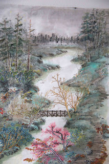
Beaverton Creek (classical) amended

I've received a lot of criticism regarding this attempt in a more traditional depiction of Beaverton Creek via Chinese brush.  Interestingly a lot of them had to do with composition and whether everything made sense.  The ones I found to be most valid had to do with my rendition of the fir trees at the upper corners.

The trees at the upper left corner looks like 3 incense punks, quipped one observer.  Fir trees do not grow in a single file row, quipped another viewer, pointing to the trees on the right.

I agreed with both of these assessments.  My excuse was that I was too intent on adhering to the Three Perspectives theory in creating this birds-eye view of the plot that I had fragmented the scenery into distinct cue cards;  not to mention the fact that the 3 punks did exist, albeit amongst much shorter woods.  In short, I failed to integrate and transition the different frames into one continuous strip.

I took the advice and added in trees behind the existing ones, and filled in some undergrowth bushes at the bottom of the fir trees.


This is how the amended painting looked:


Just for the heck of it, I took a black and white photo of the painting:


That was interesting!  I might try to paint this again in black and white, hoping that my brushstrokes will emote differently.