Thursday, September 25, 2014

Courtyard

I was quoting Cougar in saying that I was holding on too tight and have lost my edge and I was frustrated.

My solution to that was to hang everything up for a while, and not feel guilty about it.  After all I am doing this for fun, and my livelihood does not depend on my lifting a paint brush.    For anybody who has come through this gate, we know that we are just pretending to not think about it consciously.. the computing still happens, just not on the desktop.

I finally decided that if my tendency was to be nitty gritty, why don't I just go with the flow and not fight it.  I'll find something meticulous to paint.  I want to give my anal retentiveness a work out.  So I tackled with painting a courtyard.  A formal Chinese courtyard.

I chose to use the semi-sized paper again. I felt like this paper would be more suited to the repeated layering and build-up that I intended to do to this painting.

Instead of trying to paint this in a traditional Chinese style, I decided to just paint what comes naturally.  For me, it would be what one would see from a photograph.... a black and white photograph.   I know I've written about what constitues Chinese brush painting before,but  I am willing to let all theories slide, and just let my painting happen.


My first step was to sketch out my plot with diluted ink.  The focal point would be a huge Lake Tai limestone that are ubiquitous in formal Chinese gardens.  This feature would be framed by the intricate lattice work found in the pavilion and breezeway.  I would add drama to the painting by playing up the light values, something that is not emphasized in traditional painting styles.


I tried to put down all the darkest values first, to give me a framework of subsequent greys.
I also wanted to portray some of the branches and trunks as a negative space.  This is the part that satiated my compulsion of being nitty gritty with details.  I was allowed the opportunity to design the conduit where the branches would occupy, and darken the areas around that with details of leaves and dots and what not.


The blank area between the tiled roofs ( red circle ) is there not only for aesthetic reasons, but to show separation and establish the fore/aft relationship.


The contour line on this Lake Tai limestone felt week and tentative.  The line was suppose to describe the physical property of the object.  After re-tracing, the line looked a little sterner, more befitting the rock.


I decided to do some of the stalks as positive space, while others as negative ( red circles ).  This is to create a dialogue and intrigue between the lower left and right halves of the painting. I've also planted a few blades of grass on the negative space grass bed (blue circle).  I enjoy this effect because it added  to the 3 dimensional feel.


Drama was achieved when I boldly applied ink at the base of the rock as well as strategic spots in the grass bed.  I tried to even up the tone of the painting by applying a diluted layer of ink wash.


The sepia color was just the wet paper playing tricks to the camera.  I might use that to
stylize the painting.  For now, I'll take a break.

Wednesday, September 24, 2014

My beef with Rice Paper

People here always ask me if I paint on rice paper. 

At first I was confounded.  What do they mean?

"Oh, you mean Xuan paper?"

I've been trying hard to correct this misnomer until I searched Wikipedia.  I am disappointed that the paper which has nothing to do with rice is called rice paper.  The term was supposedly coined by Robert Morrison, a missionary back in the 1800's.

The main ingredient for making Xuan paper is fibers from the bark of the Blue Sandalwood.  The proportion varies from 40 to 80%.  To that is mixed in with fibers from indigenous area, and these may include rice straw, grass straw, hemp, mulberry and bamboo.

The rice paper I grew up with is an edible sheet of dried starch used to package food.  I am submitting a picture of a plum paste jelly/walnut snack wrapped with rice paper.  The paper shields the outside packaging from the sticky content and saves the consumer from having to peel off the wrapping  paper before eating the goody.


How could an ill adopted name from centuries ago survive this long.  Was there no one to speak up?

I am just saying. I believe in calling a spade a spade.

Monday, September 15, 2014

Sailing

I dropped my laptop and cracked the screen.  It now has a cluster of vertical lines on the left third of my screen. 

I was mad.

I found myself moving my head from side to side, trying to peek through those vertical lines, as if they were just a mesh screen blocking my view.

It was comical.

I continued my experiments with the semi-sized Xuan.

I painted some sailboats on the ocean; spinnakers, spinnakers, spinnakers.  Enough of the serious stuff.

Using center tip, I patiently laid down scores of horizontal lines, lifting with varying pressure and speed.  This was calming, almost zen like.  A perfect remedy for dealing with the cracked laptop screen.


The paper does not show black well.  It appears as sepia.

The painting looked too red to me, although only blue was used.

I remedied that by applying blue color on the back of the paper.  The translucent nature of this paper allowed the color from the back to permeate through.


The sail was done with a side tip technique.


The painting became lighter after it dried.  The dot in the background was an accident.  A happy accident.  I somehow managed to drop my brush on the paper.  After some laborious blotting and thinning, a smear resulted.  Seemed to give reference to a distant landmass.  Nice.


Saturday, September 6, 2014

All bummed out

I received notification about an exhibition event that I've applied to.

For this application I employed three different treatments of the same subject matter, using different techniques and perspectives.  I've posted about these works on my blogs before; it was my quest to explore what really constitutes Chinese brush painting.  I've also stated my agenda in my artist's statement when submitting these works for jury.  My resolve was to find a public stage to state my case, while instinctively  prepare for the real possibility that the judges might not be equipped with the requisite knowledge to discern.

When one looks at a picture of a waterfall with the water looking like a silky ribbon, those not-in-the-know might say "Oh, how pretty".  Those in the know would say, " Oh, how pretty, the photographer used a long exposure to achieve that effect."   Such is the difference between  a juror having the proper knowledge about photography and one who just appreciates.   Granted, if the picture is good, then it is good regardless.  However, the judge with photography background is able to add another layer into the validation process.    If I was asked to judge dogs, I should at least know what qualities to  look for in different breeds of dogs, and not just a dog that pulls at your heart and makes good companion.

Regrettably, the piece labeled Traditional Brush got rejected.  I don't want to speculate the reason behind it.  If  I was given a choice, I would rather prefer the traditional brush piece be accepted in lieu of one of the other ones.

The Impression had the least semblance to Chinese brush.  Yes it was executed with Chinese brush on Xuan, but that was about it.  It was like a child born to Chinese parents but grew up adopted in Deutschland.  This kid knew nothing of the Chinese culture, spoke no Chinese and ate no Chinese food.  The only thing Chinese about this kid was the the genetic makeup.

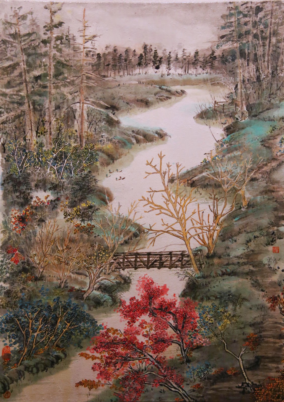
The yellow painting was the same adopted kid, but spoke a few words of Chinese.  There were hints of  a Chinese traditional brushstroke, especially when describing topography and texture of the near shore on the left is concerned.

What was novel about this piece was the fact that alum was used to size certain parts of the paper to create that neither solid nor empty but kind of translucent look, adding a third dimension to the otherwise 2 dimensional feel.  These sized areas were represented by the highlights of the trees and the branches.  Contrast these voids with the empty spaces of the sky and the water and you'll know what I mean.

The traditional brush piece was the same adopted kid in Germany but was immersed in the local Chinese culture as well.  Therefore she knew the culture, spoke the language, ate the diet, but was not dressed in the traditional Qipao (Cheongsam).  The brushstrokes were all traditional, the "chuen" strokes were traditional, the fashion to describe assorted woods was traditional, the multi-layered application of color was traditional.  What was not traditional was again the composition, the utilization of alum to accentuate the conifers, and the choice and intensity of the coloration.  Where as the painting might lack that je ne sais quoi, it takes someone with Chinese brush acumen to discern it.  This kid was trying to be as chinesisch as possible, albeit wearing western garb.

I was really hoping that by showing these 3 pieces together, I would be able to raise the conversation: what is Chinese brush painting.  Perhaps this event is not the proper forum.


Beaverton Creek  Impression
 
 
Beaverton Creek
 
 
Beaverton Creek, Traditional brush
 
 
My quiet resignation goes out the window; I am all bummed out.


Thursday, September 4, 2014

Building a Chinese garden

I got my hands on some semi-sized Xuan.  This one is very thin and translucent; feels like a giant sheet of onion skin.  I like this kind of paper due to the fact that it allows a build up of layers of ink.  The regular unsized Xuan would not tolerate this practice.

Lately I've been drawn to some of the classical elements of a formal Chinese garden.  I decided to further explore this arena.

I sat down with a pen sketching of a plausible layout


At this stage I was trying to pin down the spatial relationship of the different structures.  I wanted to glorify the sweeping roof lines and use them as a back-drop for the cozy enclosure.  I have not decided on how to treat the pond.  I am inclined to leave it blank, with a ribbon of pond lily as garnish.

I hoped to be able to use the center pavilion as the focal point, but somehow my attention was diverted to the side structures


I kept embellishing my sketch


Never for a moment thought that this would be an exercise in futility, I pressed on.

I started to brush down an outline in very diluted ink, and piled on subsequent  layers to achieve the different tones.


Eventually I established the general arrangement of the structures.


I took a break at this point.  I was having difficulty concentrating.  Actually I was running out of ideas.   I felt like I was manufacturing instead of creating.

I just realized that I stopped because I was bored.  It wasn't fun anymore.

I left this on the table and examined it from afar, from close-up, skewing and tilting my field of vision.  Unfortunately I could not find one iota of emotion in this rendition, not at this stage anyways.
Everything looked so rigid and stoic.

Like Cougars said in Top Gun, " I'm holding on too tight, I've lost the edge"

I was thinking about what I paint, and not painting what I think!

Monday, August 18, 2014

Planting a tree, a cosmetic remedy

I've been looking at my recent attempt at the pavilion, the one with the huge hair-do, the one I conceded to be difficult to amend.

I can't surrender that easily.  Surely there's something I can do.

Why don't I just plant a tree?  Use the foliage to hide the pompadour! ( I used to think it was Pinocchio's nose !)

With the innocence of a child, and the eagerness of going out on a first date, I proceeded to plant my tree.


The ink being so intense, I had to mix in some titanium white to the  Green Label Three to add some opacity to the foliage. 

I also painted in the tiles on the breezeway and the rest of the shrubs on the ground.  This was done to shield  the prominence of the new tree that I planted.  I was actually adding something to the painting to try to take away other things.

I also mentioned that I didn't like the way the rocks by the water edge looked.  I painted a thin ribbon along the water's edge and that seemed to account for the boundary without the original harshness.
I adhered to leaving the body of the pond as an empty space.

I'll sit on this one for a while, like I usually do.

Monday, August 11, 2014

More Pavilion

I did a pavilion painting a couple of months back.  In that attempt, I liked the feel of the pavilion, but not the way I dotted the shrubs.

I also thought the arrangement of the elements was a little too cozy.  I thought the garden should be a bit larger.

My challenge is to set the pavilion up in a more elaborate and spacious environment, but still make the pavilion the focal point of my exercise.


The paper now has a wider aspect, forcing me to stretch out the placement of the different elements.


Right off the bat I thought the painting looked a little cold, too austere and not very becoming.
I also felt the separation of the breezeway from the pavilion was not handled as well as the original painting.  I needed to bring out the pavilion without making it ostentatious.  I mixed indigo with ink and dressed the tiles of the pavilion


That seemed to address the problem alright.  The subdued blue pulled the pavilion out without a disconnect from the background.

The painting did not have enough headroom, especially considering the fact that I wasn't going to paint in the reflections like I did on the last one.  I could have moved the whole thing down a notch.
Also the rocks by the waterline seemed lifeless.  I would try to add in a thin bordered waterline when I have more time to contemplate the remedies.

The tree next to the pavilion was at even height with the pavilion.  This did not speak of a nice contrast of the two, and presented a rather dull relationship of the elements.  This could be corrected rather easily.

But then I noticed a glaring mistake:


The roof ridge on the left ( circled in red ) was too thick, too big and too solid and totally distracted from the focal point, unless I was painting Pinocchio's nose of course.   It should have been a lot lighter and fading out to the sweeping lift, to blend in with the disappearing tiles.

This mistake could not have been corrected easily.  Seems like a new attempt is in order.

(please visit "Planting a Tree" dated 8/18/14 on the follow-up)