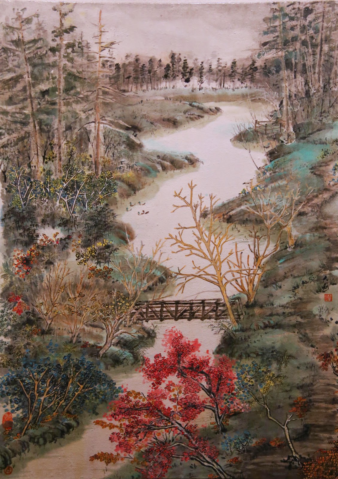
Rather than re-doing the last painting all over again, I decided to keep my interest fresh by painting the same courtyard, but viewed from a different angle. Instead of framing the enclosure with posts and beams, I will do it with shrubbery this time.
I began my plot with the usual light ink sketching of the intended characters, and made some of them really obvious so that I would remember what I had intended to paint, in spite of my senility.
Again I picked out some points of interest and elaborated on them first. I don't know if these were the most interesting or the easiest to paint, but I painted them a darker tone, to establish my black values I suppose.
I used different techniques to show layers and perspective. The front and back branches of this little tree in the courtyard is differentiated by the obvious contrast in ink tone and gesture. The front branch "a" is not only darker, but is a dryer brushstroke; thus harsher and conveys more texture. The back branch "b" is lighter and unremarkable. This tree is set up against a tree "c" from outside the courtyard. That tree is represented by scattered fat dots and negative space branches.
The little tree is set in front of the breezeway. That gesture is emphasized by the break in painting the lattice work ( circled in red). That little void or gap helps to establish the spatial relationship of the two objects. Paying attention to the perspective of the different focal points in a painting should be an organic process; pleasing to look at, and comes naturally. One feels the presence of the breeze without having to wonder why or where it comes from.
Layers of light ink wash was applied judiciously to highlight the different structures. Typical Chinese brush works do not cater to manipulating light values. My personal belief is "why not".
It helps to bring into focus and add interest to the work.
There are a couple of "oops" that are apparent. The first one being the "gou" lines were worked over too much, to the point that they obscured brushstrokes. The lines on the stone in the courtyard illustrated my point. The lines were smut and too dark. It was like smudging lip stick way past the contours of the lips, hoping to change their shapes.
The other oops was the tree branches at the upper right hand corner seemed to be too detached. There was no relationship between the branches and the rest of the painting. I remedied that by painting in layers of leaves, some of which even covered the top of the breezeway. I think this alteration made the painting more cohesive.


.JPG)
.JPG)