Sunday, February 28, 2021

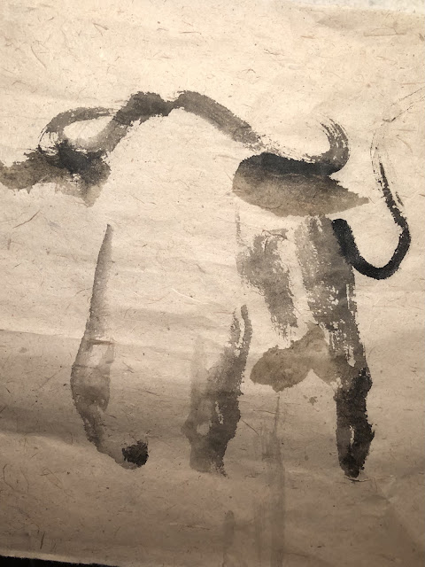
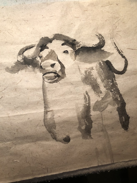
Ox painting, third and fourth attempt

Having realized that my attempt in painting an ox resulted in a painting of a lamb with Dumbo ears, I was determined to give another try.

To remedy the identified shortcomings of my last two ox paintings, I obviously had to make the ears smaller, but I also decided to make the horns having a pronounced upward turn, to shy away from getting confused with the head of a lamb.  I decided to situate my ox in grass, to give it a little context.


I painted the mouth and nostrils, rendering them a dark shade because I was very conscious of avoiding  the pig like snout.


Instead of a rigid triangle for the ridge of the nose, I took the more conventional avenue of shading in the ridge.  The shading brushstroke also defined the white area suggesting the front of the nose and mouth.  I liked this rendition far better than my previous attempts.  


I also decided to dress up the eyes a little better by giving them eyelids.


I realized that I lost sight of my moisture control of my brush, so the ink was bleeding more than I had intended.

My inattention was further exemplified by left front leg, which was fit for an elephant.  Instead of a hoof, I put down a meaty pachyderm foot pad.


At least the beast was animated enough to bestow an attitude, an energetic disposition.

Encouraged by the palpable improvements, I decided to give it another go.


I wanted to try a different treatment of the mouth and nostrils this time around, so I left the area as a void.


Through looking at pictures of a cow, I became aware that the area between the nostrils and the mouth opening had different colors and texture, and was not a simple black or white.  Armed with this revelation, I tried to emulate.


The eyelids were made conspicuous and protruding by judicious use of shading brushstrokes, which were nothing more than a few lines.  

The repeated exercises in painting the same animal had definitely improved my muscle memory and I learned what to avoid, as far as making mistakes was concerned.  I could see painting maturing with each attempt.


I had tried four times now, trying to paint my ox.

Saturday, February 20, 2021

Ox painting, first and second attempt

 I wanted to paint an ox for the Chinese New Year to replace the Rat of 2020.  A lot of the Ox paintings portray the ox as lounging around in the meadows, or being strung along by their nose rings.  That was not the image of the ox I wanted to paint.  Another favorite setting for an ox painting would be some little kid riding the ox playing a bamboo flute. 

 Poetic but banal.

Come to think of it, I don't even know what an ox looks like; I might have it confused with a water buffalo?   Does it matter if the zodiac animal is a buffalo or a dairy cow?  Personally I want my animal to have horns and be fierce, sort of like a bull, and certainly not passive.  I've had enough stagnation this past year.   So perhaps I'll paint what I deem is a bull ox, or ox bull ?  Something that could breakthrough the thick miasma from last year.  Not in the cliché sense of auspiciousness but actually taking charge.  Is there such an animal?

Perhaps too much bovine scat here, wink wink.

Thus I started out with a sketch,


I wasn't sure what this animal was, but it sorta fit the bill, so I proceeded to paint in on Xuan paper.  I was using the rough, fibrous kind.  The thick fibers gave a special nuance to the finished product, and functioned as incidentals to hide any imperfections of the painting.  Like trinkets on an empty wall, you get the picture.

I began with the horns and legs, basically trying to establish a general body proportion.  The ears were written as flower petals or leaves, using side tip brushstroke.  The horns and the tail were strictly center tip brushstrokes.


Then I moved onto the mouth and eyes


It was interesting to note that the brushstrokes pertaining to the mouth and eyes lacked the spontaneity exhibited by the horns, tail and legs.  The fact that I was trying to locate the eyes and nostrils in a proper location somehow zapped the energy out of the brush. A gingerly apprehension was evident.

I painted a triangle to represent the ridge of the nose and defined what the plane which housed the nostrils and the mouth.  I meant to darken the area above the eyes to show orbital ridges of the skull but ended up with two very conspicuous eyebrows.


Final touches to fill in the rest of the body,


Immediately the painting looked weird to me.  It finally dawned on me that mouth and nostrils were not only too rigid, as I had mentioned earlier, but I was too conspicuous in my efforts to define that mouth/nose plane and I ended up with the snout of a pig?

After I was done amusing myself, I decided to re-do the painting.  I tried a different profile, with the animal facing the right hand side this time.

I decided to darken the problem area of the mouth/nostril to make that area seem less flat.


Still something didn't look right.  I thought I could make it better by giving the painting a little sepia coloring, but it didn't help.  In my training I've been indoctrinated that ink itself is a color and that's why the ability to manipulate and display different ink tones is held in such high regard in Chinese brush panting, so I couldn't explain why I would even consider a recue by color.  I suppose when one is desperate, one tries anything under the sun.

I eventually came to the conclusion that my animal had too high a dome and resembled a lamb; too big were the ears and it reminded me of Dumbo!

That meant I needed to try my luck with the ox painting again, someday.

For now, I've had my laughs.  

It was definitely entertaining. 

Tuesday, January 12, 2021

Not Chinese Enough

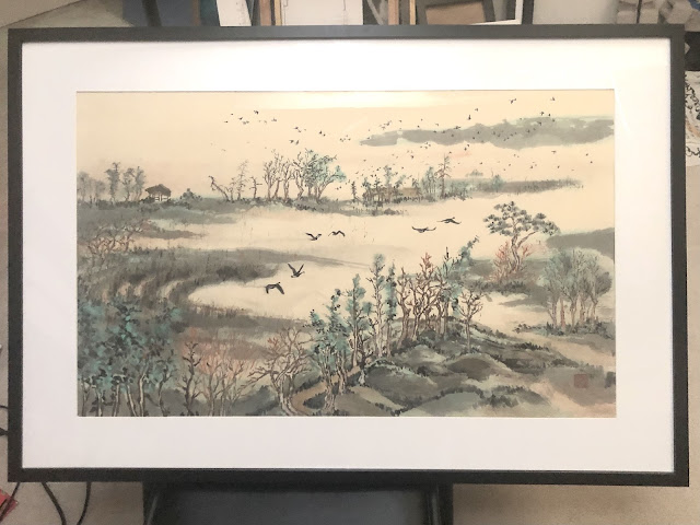
 I switched the frame of my Wetlands painting.  It used to be a poster frame with thin black borders.


So I paraded my newborn, as a proud parent would have done.

Immediately I heard mumblings of "your painting is not Chinese enough".

As I said in my previous blog, I had intended to make an overtly "Chinese" painting because of the type and color of the paper I was using.  The fact that people recognize that this was an attempt at the Chinese genre, I have halfway succeeded.  But "not Chinese enough"?  Really?

I have always maintained that my style is neither western nor Chinese and this has struck the wrong chord with many a purist; but to have someone point that out to me, especially behind my back somehow cuts into me a little bit.  I couldn't help but be reminded of the time when I was hawking my paintings at a school bazaar when some patron wanted to look at my works and her Asian friend told her to shun me because in her words "his work is not good Chinese painting".  I remember muttering, in my head at least, "give me a break, what do you expect for a lousy 75 bucks!"  Not that the price is a reflection of whether my paintings are good or not, but you get the gist.  So now it seems that I'm faced with the same dilemma again, to fit into the "good Chinese" genre.  

So what is "Chinese".  Does it have to be a Mandarin in pigtail?  Must I accept the remark that I use shoelace as my blindfold?  One would say wait a minute, these could be construed as racist overtones these days and certainly we are not talking about that.  Can the perception of a race be translated to things like songs, paintings clothing, buildings, food, etc.  Does a Chinese painting carry the same weight as Chinese food for example?

So does the "ethnicity" of a piece of work have anything to do with the "ethnicity" of  person and is it defined the same way.  Do stereotype and preconception apply to a piece of work the same way as to race?  Are we just talking about appearance?  My wearing a suit and tie does not make me a westerner anymore than an American blond girl wearing Cheongsam a Chinese maiden.  Now if I could obscure her head and hide her identity could she convince us that she's Chinese under that qipao dress?  If I say that she's still "not Chinese" enough, what causes me to say that.  Could it be her bone structure, her body frame, her posture or her mannerisms?  I think we need to be able to be comfortable in discussing the nuances in how we perceive race and cultures without being narrow minded.

Now let's look at the following 2 works,


I know this is not fair since the top painting clearly shows a Kimono donning lady so one would assume that it was not a "Chinese" painting.  I know this is a weak argument since it is also entirely possible for a Chinese painting to depict a Japanese figure, so right away we are led to another cul-de-sac that we could address.  But there are many similarities in the 2 paintings.  Both paintings show a female figure in ornate robe and headdress.  Both paintings show exposed fingers and toes.  One might detect a distinct difference in the portrayal of the face however.  Actually the top Courtesan painting is a work by Vincent Van Gogh.  Thus for the sake of argument, is there anything from that painting that tells you the work was not "Asian"?  If there was, then how "Asian" was that painting.  Could one accuse Van Gogh's painting of being "not Asian enough" and if so then what was the criteria?  Are we able to witness a difference in the brushstrokes here?  Are we observant enough to see that one of the painting was not done with a round brush?

What about the attire of the subjects in a painting.  Does that influence our sorting or perception?
Which one of the two paintings below is "Chinese"?


The bottom painting clearly shows halter top and skirt and anklet that one normally does not associate with the Han race, and yet the painting was done by the great master Zhang Daqian.

What can one tell about this painting:


The above is a Gongbi style painting and this is the more formal and rigid type of rendering, with outlines and filled in color, quite different from the Xieyi style painting which deals with spontaneous brushstrokes.

Now compare the above painting with the this one:


It seems to have been painted in the same genre as the top one and utilizing flower as a subject. Actually both paintings are works by Giuseppe Castiglione, an Italian Jesuit missionary to China in the 1700's.  I am almost sure that most of you are surprised that these are works from a westerner.  So is one of these 2 paintings more "Chinese" and if so what betrayed it.   Can one use the caption that it is a Chinese painting, just not Chinese enough?  Does the bottom painting remind one of a Chinese in suits or a western blond in qipao?

 A 5th century artist Xie He established the Six Canons of Chinese Painting, which governs and defines the 6 main attributes of Chinese painting and they are :

1. Rhythm
2. Strength in brush strokes, reflecting the spirit of the artist
3. Fidelity to nature
4. Appropriateness of color
5. Composition
6. Learn by emulation

When I attempted my piece on Wetlands, I tried to utilize that as my mantra.  I thought I established pretty good rhythm by utilizing consistent brushstrokes in the form of lines and dots.  I believe my brushstrokes were all calligraphic in nature,  thus the rhythm was similar as in carrying a prose.


The lines and  even the wings and bodies of the birds were written and not painted per se.  One can trace where the tip of the brush landed and lifted.  The painting was definitely faithful to nature, as evidenced by the photo I attached in the last blog of the actual wetland.

Now the color might not be carry the same aforementioned fidelity but I was trying to create a mood for the painting by just keying on two colors.  I mean I could as well paint the entire thing in ink and water and just rely on my ink tones; but I didn't have the correct paper to paint on for that style of work.  Plus that wasn't my intention to begin with.

I thought my composition was pretty good.  I somehow was able to account for foreground, middle-ground and background.  I cunningly eschewed the details in the middle and let the viewers decide if the void was water or vapor.  It is not uncommon for Chinese painting to leave the body of water or clouds as a blank space without a smidgen of information.  My birds in flight were heading towards the flocks in the background, forming a connection.  The strong deliberate wings were a good contrast to the scattered specks in the distance, the yang and the ying, in Chinese vernacular.  

My interpretation of  trees were strong indication of the traditional presentation of mixed trees as presented by the gold standard Mustard Seed Garden:


and the ground these trees sat on wore a distinctly Chinese appearance, judging by what Mustard Seed Garden had revealed:


Thus compare the Mustard Seed Garden examples with my rendition:


I must say I did a pretty good job of emulating while didn't stray too far from he actual scenery.

If I had satisfied the 6 prescribed canons of Chinese painting, why is my painting "not Chinese enough"?

Is it the picture frame; the fact that the painting was not mounted and bound by silk cloth into a scroll that one could hang?

Is it the subject matter; the fact that I was not painting the traditional landscape of soaring ethereal mountains in Shangri-La like presence?


I did the painting above some years ago and I had it professionally mounted and bound in a scroll format.  Does it look "more Chinese" ?

What if another Chinese person comments that the painting is "not Chinese enough", is that person being tribal or does his comment hold any more weight.  It is not my intention to be polemic.  The reason I am raising these points is perhaps beyond a wounded ego, this might actually be a reflection of struggling for identity.  The simple truth is, I'm trying to defend myself.

One thing is for sure, I had planned for a certain identity in doing this painting, no matter how superfluous it might be.  When one uses a rice bowl and chopsticks one eats rice or noodles, right?  My agenda was to make it overtly "Chinese",  ostensibly triggered by the yellow calligraphy paper I was using.  In doing so I forgot the innocence in painting and the "profite de l'instant".  I happen to subscribe to the notion that the artist often leaves a piece of his soul and identity in his creations.  In my case I am a Chinese transplant, which is very obvious in my diction when I speak, in spite of my 5 decades of immersion here in the States.  I am sure there are a lot of tangible and intangible attributes of the western culture rubbing off on me. Thus the more likely indictment would be that I am "not American enough".  So why was I trying to be "overtly Chinese" knowing that I am Chinese; that seemed like an oxymoron.  Perhaps all these years spent away from the Chinese culture has made me "less Chinese".  I also know that I could be accused of extending the ethnic flavor hyperbole into ethnic identity, but what if there is some correlation?

Another way to look at it is a traditional Chinese painting, landscape painting in particular, is seldom a work of en plein air, and has very little to do with the actual trees or rocks.  Often times the painting is an assimilation of thoughts, philosophies, fables and euphemisms.  As such the painting might be mired in details, but the details are not as black and white as in western landscape paintings.  Often times there are waves of details and incidentals in a traditional Chinese landscape painting that guide and propel the viewer to cascades of reflections and deep thoughts; sometimes based on political turmoil or personal losses.  They are more like settings and situations than actual sceneries.

In the end the painting perhaps was a little contrived, as in striking a static pose.  Perhaps I was trying too hard.

I'm still at a loss as to what is meant by "not Chinese enough" after all the rambling.  I am convinced that it has as much to do with the flavor as with the appearance. The enigma is in defining "flavor".   If we see a dragon dance parading with various high school bands and drum corps down Kearny Street in San Francisco to celebrate Chinese New Year, would we say the event has a Chinese flavor or a western flavor?  Could the event be "not Chinese enough" since the style and contents are not exclusively Chinese?  Is one being pedantic or is there some merit to the accusation? 

To quote a famous philosopher, perhaps it is the same as pornography; you know it when you see it!


Thursday, December 24, 2020

Wetlands

 I am blessed with a couple of wetlands within an hour's drive from home.  These wetlands are managed marshlands that municipalities use for water treatment and filtration, along with providing a preserve for migratory birds and other fauna and vegetations.  Ducks and Canada geese are common visitors and I am especially fond of the geese because of the contrast provided by the black neck and the white band on their tail feathers, hence I model them often.  My last blogs of Explorers and Reflection are examples of geese and wetlands being the source for my inspiration.

I've deemed these destinations as one of the few places that I could still go visit without violating Covid protocol.  They are outdoor venues and I could easily avoid nexus with other humans by maintaining a 2 meter bubble.  So I went to this 600 acre wetland that started out as a site for water waste disposal until enough complaints were registered to convince the city to mitigate the offense.  Now it is home for a well managed eco-system punctuated with vast lakes and sloughs oozing from culverts and providing respite for domesticated and wild souls alike.  I snapped a few photos for reference, and planned my next painting.


For this exercise I chose a Xuan paper that I bought for practicing brush calligraphy.  This is not the maobian paper that I alluded to before but is yellow all the same.  Unlike the more fibrous maobian this one is crisp and smooth.  This paper is good for calligraphy because it is quite absorbent and the ink does not bleed easily.  It can also withstand repeated rubbing from the brush without roughing up the surface into felt.  The drawback for this paper is that it is not good at rendering ink tones and the lack of differentiation could make the painting sort of insipid.  Nonetheless I picked this paper mostly because it has been a while since I last used it and I wanted to reacquaint myself with it.

The yellow Xuan paper reminded me of the aged scroll paintings in museums, so I wanted to do this painting in a decidedly Chinese fashion.

I started out with the trees in the foreground.  As far as I was concerned classical Chinese paintings had a very distinct way of depicting mixed shrubs and trees.  Whenever one sees a grouping of trees being painted a certain way, one knows immediately that the painter had left a calling card to say that this was a Chinese painting.


Typically the trees would be of mixed species, often times conifers and deciduous together and assuming various pleasing poses.


I placed the trees on an incline to aid the composition and solved the problem of not having to fill in as much the center portion of the painting.  I didn't want to give too much detail about the ground, so a few side-tipped brushstrokes delineated the topography.

The curved furrows left by tractors and the observation shed were points of interest when I visited the preserve, so I was determined to work them into my painting.  Those were the landmarks that I associated with this particular wetlands preserve.  I tried to adhere to the scheme of using just two colors and employed the classic dotting method of describing shrubs, stones or grass; and in some cases just for decoration and adding interest to the contour lines of the hill.


Modeling after the pair of Canada geese in my photo, I decided to use the middle void in the painting as the flight path for my geese.  I loved the simple silhouettes of these birds.  Their simple lines were conducive to treating them as Chinese fonts rather than birds.  One could literally write them out instead of filling them in with ink.


I would be seriously remiss if I didn't set the stage for the hundreds of birds that swamp the preserve.  They come and go in brigades of flopping dots in the distance and it was quite a sight to behold and to ponder if there was a vast body of water yonder obscured from my line of sight.  Their cacophonic chattering broke the stillness of the area, without being annoying.

Almost all of these could be written with two or three strokes using the very tip of the round brush.  It was fun to try to mix up the positions of the wings so they didn't look too unison.  After all the fowls were not marching.

Was there any symbolism in painting paired geese flying towards the flock in the yonder?  Could the grass be greener on the other side?

I had hoped for the formless brushstrokes in the distance, especially the strip on the upper right hand side to assume a much lighter value.  I painted them with my brush wash, thinking that would be light enough. As it turned it, it wasn't.  The culprit was the paper.  This kind of Xuan paper is good at registering brushstrokes but not in showcasing ink tones. 


The painting was wet mounted on a piece of regular white Xuan and then framed.


It provided me with something new to look at for a while.  


Thursday, December 3, 2020

Doodling, Calligraphy

I was not feeling particularly motivated to paint but I felt that I should not be keeping a distance from my brush and Xuan.  I had not practiced any calligraphy for a long time so this was a most opportune time to brush up ( pun intended ).  After all Chinese brush calligraphy is the foundation of Chinese brush painting.  The quality of the brushstroke is a major determining factor in the intrinsic virtue of a Chinese brush painting.

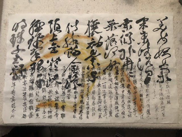
I rolled out the Xuan on my desk and decided to practice the running style of Chinese calligraphy.  As the name connotes, the running style is a calligraphy done in haste.  The brushstrokes are more than cursive however.  They are actually greatly reduced from the regular block fonts.  To illustrate my point, try to imagine a cottage with a gable roof and two dormers and a detached garage.  So these are the identifying features of this property.  The cottage might have red shutters and green doors and triple pane windows but these are not features that one could pick out readily.  Thus in the dim starlight, one can still pick out the gable roof and the two dormers and the detached garage.  If one was asked to do a quick rendering of this cottage, one would just draw a gable roof roof with two dormers and a detached garage.  

So are the brushstrokes in the running style of Chinese calligraphy.  A lot of the details are missing, and only the most distinct "roots" of the font is written.  Thus the running style fonts often require an educated guess to disambiguate, as they are not readily decipherable, especially when context is missing.

The fact that the calligraphy is done in haste, doesn't mean that I could write in haste, especially when I lack complete control of the brush.  Imagine trying to do a triple Salchow double toe-double loop combo in ice skating.  It looks graceful and fluid but it takes expert skills to determine speed, rotation and which side of the blade to exert force.  Now imagine the brush as your skates and you are the skater.  You can't rush it!  The running style calligraphy is so deceptive. 

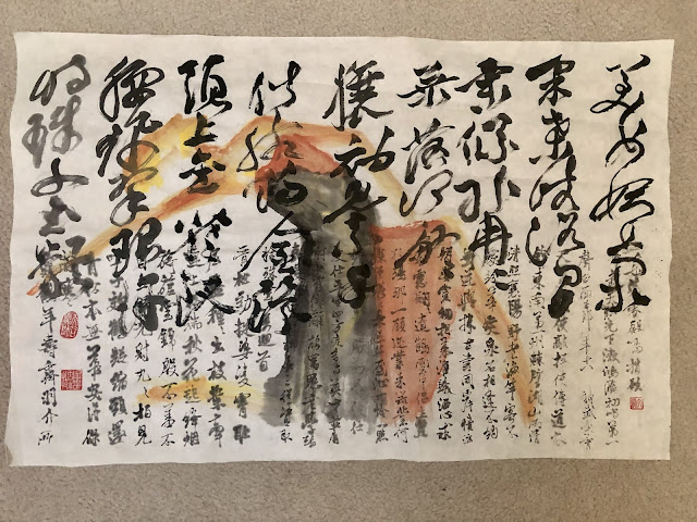
My inadequacy became readily apparent after I filled the page, emulating  a Ming calligrapher Zhu Yunming.


My hesitation and non-decision caused my brush to stay on the paper far too long resulting in a loss of definition of the brushstroke.  Instead of seeing a serpent wriggling I saw dead earthworms striking poses on paper.  The thin connecting brushstrokes should have happened naturally as a result of the brush lifting most of the way and then landing to form a new stroke.  I however was forcing an abrupt lift and landing of the brush.  I always compared this akwardness to people doing static poses to emulate runway models.  What we see in a glamorous photo from fashion models is a single frame derived from results of thousands of continuous shutter clicking trying to capture the fluid translation of a flood of arrangements of the body and limbs.  Thus trying to strike a static pose always seemed contrived and pretentious because it was not eased into.  There was no hint of  transition.   So was my calligraphy.

I knew I was using the wrong kind of paper for my calligraphy.  I read with tantalizing interest on the tidbits of stories of how these great masters of Chinese brush painting had their own custom papers and brushes made.  I was only practicing so it really didn't matter, besides I am nowhere near that level of competence or excellence to demand custom paper.  Suffice to know that different papers and different brushes do make a difference.  This is not hearsay or folklore.  My favorite paper to use was actually the one that is considered unrefined.  It is made with unbleached bamboo fiber and has a rough and yellowish tint.  I call it glorified toilet paper because it is super absorbent but doesn't bleed easily and is ideal for butt wiping.  It is Maobian paper that I am referring to.

So I tried the same writing on the Maobian paper


I do believe this paper was more honest, in that it did not amplify my shortcomings.  The brushstrokes seemed a lot more natural and mindful,  failure to lift my brush notwithstanding.  Perhaps they can make a little blue pill for my brush or my wrist.  But honestly, I believe that once I learned the lines and start treating the calligraphy as one continuous line of thought instead of individual characters I should see a better result.  The way I was doing my calligraphy practice was like posing hundreds of static poses.

Since I had room left at the bottom of my Xuan, I decided to do more calligraphy exercise.  This time with a the walking style calligraphy.  This style of calligraphy means it is done with less haste than the running style, thus almost all of the original structures of the word is retained.  It is definitely not as formal and rigid as the block characters and allows ample latitude for form and personality.  I believe the word cursive describes this style best.


Again it was painfully apparent that the ink bled like crazy and any reference to the tip and edge of the brush is all but gone.  I wonder how much of that was me and if a master calligrapher could make this work all the same.  

Just as I was ready to banish this piece of  calligraphy exercise to my pile of etudes, as I call them, I was suddenly imbued with a notion.  I caught a glimpse of my Pie Jesu piece in the corner of the floor.  I  attempted to visually dub the ballet dancer silhouettes with music score from Pie Jesu, perhaps I could add a dancer here to emulate Chinese calligraphy?

The limbs of a dancer seem perfect analogs for the individual strokes in a Chinese character, bending at the joints to give meaning or functionality to the dancer's pose, or to a Chinese character.  The continued movements of the limbs and the body and the head of the dancer are no different from the twists and turns in the brushstrokes of the running style calligraphy.  How far back does the dancer's head tilt and which shoulder is the gaze directed at is no different from the where the brush presses and lifts and where a vestigial dot ends up at.

Enough soliloquy, I picked up my brush and impulsively wrote my dancer, using whatever color was left in my dish.  I was afraid that even the scant time spent on squeezing out the color tube could render my thoughts less lucid.


After my " id " phase was satisfied, my "ego" phase plunged in and began to analyze what I  had done.  I was made aware of the two different styles of calligraphy occupying two halves of the paper.  Perhaps I could make my dancer along the same vein.

I decided to don my dancer in a two toned skirt to emulate the two font styles and I happened to have left over vermilion that I could rehydrate in the dish.  Vermilion should go well with ink.


My doodling got out of hand.


Tuesday, November 10, 2020

Explorers

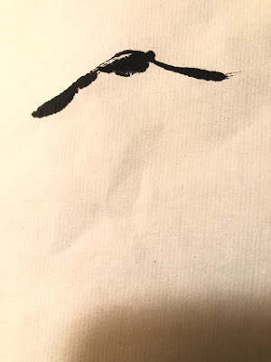
It didn't take too long for me to realize that my Reflection painting was too solitary. I am sure that notion was amplified by the curtailing of social activities and the collapsing of social circles by the pandemic. I have plenty of solitude from being locked up inside my house, and looking at the painting to satisfy my Mindful Moments as dictated by my health apps is a depressing proposition. In fact I had this primal urge to part the shrouded landscape, skim over the water and snuggle up to the branch tips, hazy smoke nothwithstanding. At the risk of being banal, I decided to add a couple of geese in flight for a little movement and drama. Canada goose is a subject that I'm pretty familiar with. I'm fortunate to call them friends, as a nesting pair live off my backyard and always introduce me to their offsprings. I've grown to know some individuals by their manner, or lack of, in taking food. Unfortuanately a bobcat ambushed the couple and I got to pay my last respects by bagging their mangled feathers and entrails. God is flawed; in creating a food chain which predicates on termination of life in order for the exchange of ATP to happen. Anyways I shall borrown them for my subjects. I painted my geese with a few extremely simple calligraphic brushstrokes. The Chinese round brush was the perfect instrument. I was WRITING my geese. I will break down the individual brushstrokes to demonstrate the simplicity of such calligraphy. I started out by writing an upward slant, nudging the round brush after establishing the initial point
Then I extended the brushstroke with a downward slanting one, with a nudge towards the end and feathring out. This formed the wings of the goose in flight.
Next came a side-tip brushstroke, resembling a hook
Position this hook beneath the wing, allowing a narrow slit between them to represent the telltail( a homophone pun ) white margin on the tail feathers of the Canada goose
Gave the figure a little dot where the head should be, and Voila,
The companion goose was painted the same way.
So now my painting has a pair of inquisitive Canada geese, ready to explore their surroundings. The saturated ink tone of the geese helps to create a perspective of distance.