Sunday, October 17, 2010

Scatter Brain

In this painting I wanted to paint a bridge next to a lily pond.  My original premise was that the bridge is almost silhouette like, swallowed in rolling fog, like a ghost ship in vast sea. It is the lily pond in the foreground that shall work as a lead-in to the scene, and sent up the perspective and the contrast to the vessel in the back. 

An issue that I have considered in painting the lily pond is that if I had painted all the stalks of  wilted lilies and reeds, the viewer would be bombarded with so much information and will make the scene quite messy.  This is along the same vein that I have alluded to in my Feng Sui blog.

Went back to my playbook and deployed my old trick again.....Ancient Chinese Secret Solution (alum solution).  As you recall, alum solution is used for sizing paper, works like a resist in watercolor works.   I therefore proceeded to paint with this alum solution to form most of the wilted lily stalks and their reflections.  After the wash is laid on it, the painted alum shows up as void spaces that hints of the presence of stalks, without these discrete black lines to jam your visual cortex.  What I was able to do was to create a "presence" without the usual boundaries, or harshness.  I picked a few strategic locations in plant my foreground, my vivid lotus stalks.   I thought that worked rather well in this setting.

What I have not followed through was the original premise.  Where was my Flying Dutchman?  I was too carried away in laying out the dead sticks in the pond, that my fingers took on a life of their own and started to paint a setting sun, and trees, and a cow and .......

Before I realized it, I had embellished too much onto my painting.  I got off on the wrong ramp, and how do I extricate myself now ?  This is when I decided to put in highlights on some of the foliage and the back of the cow herder to playoff the setting sun.  I can only lament.... what a scatter brain.


Monday, September 27, 2010

DON'T CROSS ME

I was showing a beginner how to paint bamboo.  This person painted quite a few vertical stalks of bamboo, consequently a lot of them crossed each other, and the painting looks like a wire mesh (exaggeration)!
 The remedy is to control the angle where the stems intersect.  Make those angles acute, and as far away from 90 degrees as possible.  Another remedy would be to hide the point of convergence with leaves.

I then used my Blue Heron painting as an example.  The blades of grass are bound to intersect with each other.  What I did was to deliberately wet that juncture with water to cause the ink to bleed.  The diffused ink helps to soften those corners.


To show the effect without the diffused ink, I used "PAINT" program to erase the bleeding ( I don't know how to Photoshop that out).  Hopefully you would agree with me that the one with the bled ink looks better.


I then totally erased the grass to see what the painting would present itself............................ well, what do you think?

Friday, September 17, 2010

Ghosts From Yesteryears

I decided to clean out my pigsty in preparation for the upcoming Portland Open Studios tour and came across some stashed away Opus Magnums from my past.  Oh my gosh these were done in 2003.  I remembered buying a box of water color tubes out of the blue and a booklet of papers and ventured into the world of painting. It appeared that I made no attempts to mix the colors, not surprising since I did not have a color pallet. It almost seemed like I painted straight out of the tubes.  Interestingly I was using aluminium foil as a surface for mixing colors when I first took lessons.


These images are like your baby pictures.  So untouched and natural.  You can tell that they are infantile, and yet soooooo innocent

Friday, September 10, 2010

Calligraphy and Painting


There are people who asserted that calligraphy is the basis for all Chinese brush work, including brush painting.  For me, this statement is quite true, especially now that I am attempting to teach people how to paint with a Chinese brush.

I had done some form studies on heron, and I've decided on adding calligraphy to  them.  The calligraphy will be used not in a narrative sense, i.e. telling a story about the herons, nor is it a poem about herons, but is used as a complementary tool to inspire and to augment the form of the heron.


In this work, the calligraphy which is in the cursive style  is done as a very faint background, so as not to distract from the main pictorial outlay, but its subtleties help to bring out the dance form of the herons.  Notice the single leg stance of one, and the ballerina like stance of the other.  The motion and energy of the main characters are derived from the calligraphy, and vice versa.

Wednesday, August 18, 2010

Wanderlust


Songs and Hymns
soar to the Heavens

This moment fills me
intoxicates me

I surrender myself to wanderlust


The above is a rough translation of the Chinese writing in the painting.   This style is called  the "grass style" or "sloppy style"  of the Chinese cursive writing.

This flowing style of calligraphy matches quite nicely with the very raw and bold form of interpretation of a bird.  No attempt was made to hide or ameliorate the brush strokes.  This really is the essence of the Xieyi style of Chinese brush painting......concrete thoughts, but free brushes.  

Good or bad, let it all hang out

Tuesday, August 17, 2010

Calligraphy

translation:

If
LIFE  is not witnessed by the present moment
then
when does

Living
is
to be able to
Do As You Wish

Tuesday, August 10, 2010

Isn't Being Cute Enough?


In the routine of preparing materials for tutoring, I have to answer a fundamental question about Chinese Brush painting, and that is "Isn't being cute enough?"

The word "cute" can embody a broad interpretation, but I shall use it in the context that it attracts an audience. Case in point is some of the so called Chinese Brush paintings one sees on the net or fair vendors are often crowned with the verbage "Isn't that cute?". I shall use paintings of bamboo to illustrate my point.

Bamboo is one of the 4 required proficiencies for people studying the floral theme in Chinese Brush painting (the others are plum flower, orchid and chrysanthemum). Bamboo is a study of many virtues in the Chinese philosophy. It is stiff, yet flexible. It bends but does not break. It is strong, yet hollow. It symbolizes an ideal personality, being forthright, without being conceited. Being flexible without being manipulated. Appears to be hard and cold, and yet has the room inside and the capacity to accept.

Thus the proper way to paint a bamboo is always straight up, stern and yet not overbearing. It must show the virtues, then one goes about the business of composition, where to park the leaves and the branches. Bamboo is a plant of the grass family, and yet the branches and the main stalks are always straight or bow like, ready to bounce back, and never bend and twist like noodles. The segments are usually painted using the bone method, usually using straight tip. The rings around the segments are very specific in the sense that it shows the remnant of the sheaths of the shoot. It also tells you whether you are look up or down the bamboo by whether is arch is an upward bow or a downward bow.

My experience with painting bamboo is very limited. I've only done my obligatory homework pieces when I was taking lessons. I used bamboo as a teaching subject because it truly is the most fundamental way to learn Chinese Brush strokes. It teaches one how to hide or show the points, straight tip, twisted tip, press and lift and all that jazz. In essence, one does not "paint" a bamboo, but "writes" a bamboo, because it requires the application of all the basic methods of the brush. Every segment of a bamboo painting can be broken down and reassembled in some Chinese calligraphy. It is like a basic Kata in martial arts. One has to learn a few basic moves to execute the Kata.

The left picture is the "cute" visualization of the bamboo, but is very unbecoming of the brush art because it answers to all the bad qualities of a bamboo painting. The branches and leaves are twisted, looking more like true grass than bamboo. The segments are not done right and the rings are feeble attempts to point, press, draw and lift. Yet these types of bamboo drawings are quite prevalent in greeting card stores, book markers. Yes they are cute, albeit not done correctly with the Chinese Brush strokes.

The picture on the right is the more accurate way of painting a bamboo using the Chinese brush. It showed the bone structure, the correct brush stokes and a gradient in ink tone. However it also has a lot of boo boos, i.e. the thin branches failed to separate and the nodes fused together, looking like a rope with knots on it. The leaves on the left hand side should be pointing downward instead of up.

So the six million dollar question is..... can "cute" and "proper" co-exist? I suppose this is not necessary an ideological debate. In our vernacular, does the word cute mean more than being pretty and fetching? More importantly I suppose, is "cuteness" what an artist seeks?

I suppose this is my fervent attempt to bring to light what Chinese Brush painting is about and ask all of us to be a more educated audience, so that we can all truly appreciate the art form, without the facade of being "cute".

Tuesday, August 3, 2010

Artist Trading Card


Part of the upcoming Portland Open Studios experience involves the creation of artist trading cards. I have done those before but I stopped short of affixing the image onto the card itself. Duh!! Trading cards without the cards, rather innovative!

Anyways now that I've been set straight, I applied gesso onto the back of the cards and all of a sudden they have a life of their own. They curled up like cooked shrimps.

For ease of application, I used rubber cement for paper instead of my starch concoction. This procedure did not correct the shoehorning of the playing card.
Fortunately a rolling pin did. I used a wooden rolling pin on both surfaces of the cards and this was done when the cards were almost dry. I then slapped on a thin coat of satin varnish to protect Xuan paper surface.

Sunday, August 1, 2010

Classical Landscape


This landscape painting is portrayed in a rather minimalistic fashion. The lack of color forces one to devote all their attentions to the composition and the line structure.

The painting is inspired by the Columbia River Gorge. The work was first done last year but I needed to change a few things. The opposing walls of the gorge is characterised by the 2 rows of serpenting land masses, obviously an exaggerated vision; nonetheless sets the stage pretty well in this application.

The trees in the foreground are painted in the classical sense of tree representation. Thus the leaves are circles, horizontal lines, and slashes of various shapes. This is very common practice in describing a mixed species woods.

The little skirts at the bottom of the hills is decorated with dots. These are there to represent shrubs, structures like posts, boulders, but the main function is to break up the lines so that they are not continuous ropes....... a no no in Chinese Brush painting. The "churn" method is the hemp line style. Churn lines are used to describe the texture and the topography of the hills.

Perspective is achieved by the obvious fading out of the land structures, with no discrete brush marks of whether it is water or fog or whatever. This is the all important "blank" space in the painting. Perspective is further achieved by the relative saturation of the ink. One can tell very easily that the near subjects are much darker than the distant destinations.

The one big failure in the painting is the bottom boulder, which assumed a different persona from the rest of the painting. The lines are too entangled, rendering it much more jagged than the others. The dark lines also give it a dirty/solid look, which is very uncharacteristic of this painting.

A painting like this is quite easy to consume, I think. Right off the bat you know that it is Asian. The downfall is that it pigeonholes what Chinese Brush painting should look like. This is due to the fact that all these "classical" rules or methods of painting is followed and it is easy to give the impression that all works have the same look and feel to it. This style of endowment have been around for at least a thousand years. Whereas it is important for us to study the techniques and basics of the Chinese brush, it is not necessary to keep on repeating or try to reproduce the styles that was popular way back when.

Tuesday, July 13, 2010

Evolution of a Heron


Months ago a giant array of feathers visited my backyard. As it descended it momentarily interrupted the rays filtering through my window; that was how it caught my attention.
So I wanted to paint a heron.
The photos tell the story of my attempt. I started to draw out what I recalled as a heron (top photo).
Obviously it looked rather awkward, in fact I had problems deciding what length of its legs should be; hence the two different lengths. As we go down the line, I was trying out the brush stroke styles and the ensuing image takes on a better resemblance of a heron. I have a little bit of practice now. I must point out at this point that my failure in depicting a heron not only lies in the fact that I knew very little about the bird, but I really did no know what I wanted to paint. I was more like a field biologist, wanting desperately to record its features. What grabbed my attention were those seemingly long legs and that gaze.
As the bird frequented my place more often, I realized what made it a heron was not its features, but its poise. The heron's neck seemed to tell all the stories.
With this new understanding I arrived at the third photo attachment.
The outlined drawings (4Th and 5Th photo)are perhaps more "classical"; in the sense that it is how most herons are painted. A smattering of colors, correct proportions to say that this is a heron and not a goose.
Last week the heron stayed for over an hour and was almost oblivious to my presence.
I decided to try my hands again in painting, this time using the brush to paint the forms, rather than relying on lines to define the boundaries. My emphasis now is totally on the neck, which narrates the heron so eloquently. The bottom picture is a record of that encounter. I like the motion and the energy this painting emits.
It seemed raw, but is so honest!

Monday, June 21, 2010

Bi-Fa (pronounced B-Fa)

A reader was a little taken aback by my comments in "What Brush Stroke". The quibble was about my tone of the language. I seemed to suggest that only Chinese Brush Painting pays attention to brush strokes. Whereas I know very little about other brush works, i.e. watercolor, oil, acrylic etc, I do know that Chinese Brush Painting places foremost emphasis on Bi-Fa, the method (discipline) of the writing instrument. Calligraphy and painting is about the same foci, Form and Bi-Fa (brush strokes). In fact, many teachers in Chinese Brush Painting would insist that students "write", and not "paint" the lines.

The Chinese Brush owes its characteristics to a round body with a pointed tip. I am told that there are 8 basic techniques in applying the brush on paper, utilizing not only the tip, but also the belly of the brush. Couple this with various speed, angle, degree of dampness, and whether the point is split or solid, the permutation on the possible ways to reveal with a Chinese Brush is endless.

The picture insert shows the start of a line with a point at the top line. The second line started with a rounded stroke, which is accomplished by travelling the brush in the opposite direction to begin with.


The importance of understanding the basic premise of the brush, is to understand how to take advantage of the brush. In this example I am trying to paint a "line" of various thickness. As I traverse the brush across the Xuan paper, different pressure is exerted, and the brush responded by spreading( or condensing ) its coverage.


Now we shall see how this "line" applies to painting. In the example, I am painting a dragonfly.

The picture on the right shows the result done with this proper technique. The "wing" is a line written with various thickness. It is all about the control of the brush. The wings look natural, and possess "Chi" (energy) and have "Li" (strength)

The picture on the left is done with the wrong technique. I blocked in the color. You might say that I "painted" the wings instead of "writing" the wings. Upon close examination, one can observe the border that I had painted around the outline of the wings, and then filled in with color. Obviously they look like wings, but they are devoid of the "Li" and the "Chi" shown on the other dragonfly. Perhaps it is the small imperceptible irregularities in the brushed shape, versus the static intentionally painted outlines that bestows the energy. I suppose this is the argument about hand tailored suits and hand stamped Ferrari bodies.


One might argue that to the casual patron of the Chinese Brush Painting, what is the big deal. The big deal is whether it matters to you or not. If you accept the premise that Chinese Brush Painting is about Bi-Fa, then you must learn to appreciate that.

You can play a G arpeggio on a violin using all 4 strings, but you can also play the G arpeggio using only the G string. To the untrained ear, they are the same notes. However a violin patron could tell the difference in the timbre of the notes and appreciates the skill level of the performer, lest not forget the composer's expressive intent in having all the notes played on the one string. Same dictum can be applied to the understanding and appreciation of Chinese Brush painting. It is not necessarily a matter of whether my art form is better than yours , but where the emphasis lies.

Wednesday, June 16, 2010

To Be or Not To Be


In a perfect world, under ideal conditions, we work on a painting, from start to finish, everything as planned, eyes to the heaven, say THANK YOU.

Reality is, we often sway from our original sketch, be it conceptual or physical.
Artistic expression, or any expression for that matter, is a dynamic process. This light might suddenly pop up in our head, or our own tentacles of curiosity might drag us into saying...WHAT IF ?

I usually resort to one of two ways of deciding which path I should follow.

The first one involves a transparent sheet of material... could be a plate of glass, acrylic, overhead projection transparency or a sheet protector. I would then lay this transparency over the spot where I am dubious as to what should be done, and I would do a rough sketch on it. Thus I am able to see the effect of before and after, without ever committing myself.

In this example, I have a painting of 2 fishermen working at night. I was trying to capture the reflection of the lantern and the moon in the water. Where I failed was the composition... I had the fishermen and the Beacon Rock all lined up in a straight line, and this is visually awkward. So I wanted to see if I could cover up the bottom fisherman with silhouettes of tree tops. Well, the jury is still out on this one.


The other trick I use is to just paint it out in plain water. Xuan paper is so absorbent, plain, clear water will leave its' traces, long enough for us to consider and reconsider. Note of caution, the brush should be on the dry side.... just wet enough to leave a mark for us to see the spatial relationship. In this example, I am trying to see if there could be a dialogue of trees and the bridge.

Since any brush mark on Xuan paper is almost indelible, the above tricks are most useful before you attempt on that part of the painting. It does not bode well if your intention was to totally change or substitute something after the fact.

Friday, May 28, 2010

Gesso Tricks


One of the attributes that I can exert some further control in working with my Xuan-Boo, is the matter of white balance/contrast.

Depending on the type of Xuan paper one uses, the "white" ( or blank space ) space is anything but white. While it is not necessary, nor is it critical, for me to display true white, nonetheless I would welcome the opportunity to modify my shades of white if possible. On top of that, my style of Chinese Brush painting requires the help of shading quite a bit.

Work done on Xuan paper loses its vividness once the pigment dries and before it is mounted. The depth of this brilliance is restored once the paper is wet. It is therefore paramount for a Xuan artist to not correct his/her work when the paper has dried up. I always wet my work first before I tidy up my work.

To facilitate in varying the contrast in my work, Xuan-Boo offers an unique avenue.... I can manipulate the gesso. By laying down a differentiated map of gesso, according to my needs, I can accentuate or tone down a particular area or color of the painting. I can actually affect the overall presentation of my mounted Xuan.

Example on the bottom picture shows the dried painting before it was mounted. To the left of that painting is the canvas with my custom gesso. Notice I painted the gesso in a gray scale according to my need.

The picture on the top shows the finished work on Xuan-Boo.
One can observe that the hill on which the gazebo sits on is now more 3 dimensional, thanks to the increased shading offered by the custom gesso. The staircase shows off better because the tree to the left of it is now darker and offers better contrast. The black roof tiles on the house is now more saturated.

Granted all these changes are subtle, but nonetheless palpable. I think it can be a very useful tool to remedy a "flat" painting.

Tuesday, May 18, 2010

Presenting my Xuan-Boo


As a kid I remembered looking up at the radio that perched on top of our 5 drawer dresser. Each time my dad would put his fingers on one of those big black knobs my breathing would stop for a second. I wanted to catch the magic. The magic of the front glass panel on the radio lighting up. A few minutes later I could hear high pitched whistles rising and ebbing, and then music or voices would be discernible amongst the interference. Turning another black knob left and right brings the program into clear. "Where did the voice come from?" I would ask. "There is a man inside the box!" said my father.

I remembered climbing on a chair, behind the dresser, looking through the perforated backing on the radio, to find that "man". Instead, I found several "light bulbs" inside the box; I could "smell" the heat emanating from these bulbs. As my dad turned the dial knob, I could see a string hooked up to a spring, which was attached to a slider on a track, and a needle moved. The whole thing was so mesmerising.....I can still smell that heat. I can still feel its radiance.

As I grew older, there is a new addition to our family. A much larger cabinet with a tiny gray window in the front. After the black knob was turned, this cabinet gave out a extraterrestrial high frequency hum, and after what seemed like eternity, a gray and white picture appeared. It took a another life time for the picture to get brighter and became "watchable". We had television. Again I somehow managed to get to the back of the cabinet, looking through the perforated backing, to look for the bulbs, and to "smell" the heat. The moments of anticipating an image appearing on the screen, and to have events happening in expected sequences,from the transformers humming, the capacitors charging up, to the flickers, and finally having my senses satisfied, are moments that I still cherish today.


Painting for me is very similar to the experiences I just described. There has to be awe, curiosity and appreciation. I paint because it is not instantaneous, no immediate gratification at play here. There is a process of going from conception to finished work, all the while filled with anticipation.

When we paint on Xuan paper, the overall appearance of the work changes as the work dries. Wetting the finished work restores most of the original saturation, hence mounting Xuan paper on another piece of Xuan paper is mandatory not only to give it stiffness, but to restore the brilliance and color accuracy. After days, sometimes weeks of working on a piece, we then spend hours on affixing it and hanging it up to dry. We really don't know what our work looks like until it is all mounted and dried.

My curiosity led me to explore new ways of mounting. Hence I invented this process/medium I called Xuan-Boo. Along with this new platform comes new challenges and that led to my making my own frames. I kept thinking how turning the knob made the dial move. Perhaps that is why I am not satisfied to just paint, but I want to be involved in as many facets as I can. I enjoy the complete process from laying down the first stroke, to hanging the work up. Today I am presenting you with the first batch of Xuan-Boo.

Of course the end is gratifying too, sometimes. There are some works that I would really hate to part with, because I had invested so much of myself in them.... "Every time you go away, you take a part of me with you!"

Every so often, after the National Anthem has played, and the TV station has signed off, I would still be watching the Station Calibration Wheel. There is nothing to anticipate now,nothing to be awed about, but at least I know the damn set still works.

Friday, May 7, 2010

Student Works from Hong Kong


The Municipal Park in Tsim Sha Tsui, Kowloon hosted a painting exhibition by students ( grade school and high school ). The paintings have to use the park as a theme.

Most of the nominated works are displayed in page protectors in a binder, therefore difficult to take photographs of. The few that I have posted here are on bulletin boards., i.e. the top 3 mentions.

The ones on top are from high school students, the ones on the bottom are from grade school kids.

Their works are so inspiring that I feel compelled to post them to share with readers of my blog

Sunday, May 2, 2010

Crying Fowl


Greetings from Hong Kong !! I thought it would be interesting to lay down a couple of blogs while I am visiting Hong Kong, my birth place. Like a salmon returning to the river where it was born, I have followed the the scent of the water and my instincts and landed here a few days ago; not to mate, but to enrich my life cycle, I hope.

I am happy to say that I escaped the jurists' waste baskets and have gained my place at the Portland Open Studios tours again this year. I have decided that the majority of my new works would be in the Xuan-Boo style, and I have picked the heron as my entry piece.

This painting was done on fibrous Xuan paper. The sizing on this paper is a little bit different ( not as absorbent ) and the color presentation is not as deep and saturated as the normally sized Xuan. However when mated to canvas, the apparent texture it imparts is particularly suitable for our feathery friend here.

I am trying to keep the color scheme really simple here, after all I am not creating a document nor an accurate depiction of the bird. However the characterisation, the mannerism of the bird is vital. My mission is not to let color overrun my pictorial essay. The simple creature is then garnished with a few blades of leaves.

One of the challenges is to describe the feathers without actually drawing them out. I have allowed a controlled bleeding of strokes along the frontal side of the neck to give it that feathered look. A brief outline helps to define the physical structure.

Intersecting leaf blades is a real headache as far as composition and presentation goes in Chinese Brush Painting. I have placed a few drops of water at strategic points of the cluster so that ink disperses to a much larger extent along those fronts. This is not a blemish, but a controlled artistic technique, a la moss dots in many of the traditional works.

Finally, instead of allowing the background to be blank, I used a Mosaic of nondescript patches of colors. I find great similarity between this and a photograph with a shallow depth of field. Perhaps this is an instinct carried over from my hobby in photography.

I must mention that for this piece of work, I stretched my own canvas, and built my own frame for the canvas. My only debate right now is whether to finish the frame in the traditional black color, or to leave it as is, with the gray primer only.

Thursday, April 22, 2010

COLLABORATIVE PAINTING


I have another collaborative painting to share with you.

my reasons for selecting the piece is as follows
1. quite characteristic of Guilin landscape
2. a new way of "churn" ( texture) that most of you have not attempted before. looks easy, but requires real Xieyi movements
3. wet staining of clouds/mist
4. distinct ways of showing perspective, shading. ranges from relatively colorless foreground, to "splash ink" method of distant hills.
should be a lot of fun.
The above is a direct quote from the e-mail I sent out to the group.

The image on the bottom is the original work that I lifted from a publication. The image on the top right is our work.

The original work is almost monochromatic with distinct separation of foreground and background landscapes. The brush strokes are deliberate and yet expressive. Succinct and yet interpretive. Tidy and yet free. I find myself transported to this serene Shangri-La., allowing myself to be immersed in this magical mist, floating as my spirit directs me.

Before we arrive at how our work turned out, let us go through the process of painting.

As I pointed out in my e-mail, the "churn" (texture) method in this work is different but quite common in a lot of the Guilin landscape paintings. It is basically a series of L shaped brush strokes stacked on or intersecting each other.
It could be done with straight tip down and side tip across or vice versa. This gives the lime stone land mass its cracks and shows the thickness of the slabs.
If these were done too orderly, you end up with a brick wall.

Black dots denote vegetation, but they are used to soften up the contour lines and corners. Green vegetation dots need to have titanium white mixed in them to stand out.

Mists are done with the wet wash method. It takes a while to get used to the idea that as you are painting the bottom of the rocky masses, you are actually painting the mist/cloud ( blank space ). Therefore the blank space as a real space is almost like a novice flying a on coming RC plane. Left rudder turns the plane to the right!

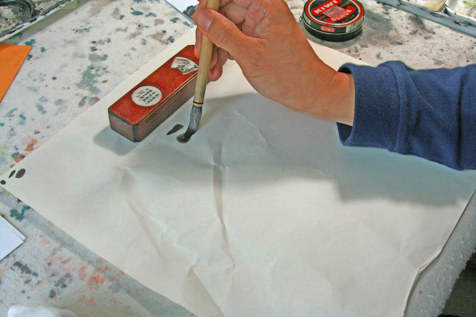
Color is witnessed by laying down several layers of pigments. Imagine staining a tissue paper with one pass of color. It is not substantive. We first lay down our shading with various shades of ink. Then vermilion is used as the base coat, followed by burnt sienna and purple around the dark areas. Finally mineral green is used as the top coats. Its opacity drowns out the foundation colors. By moderating the number of layers of the opaque colors, we can achieve the different hues of the landscape. The coloring is done after all the shading and churn is done. Coloring is akin to putting on your clothes. You do that after you have clean underwear, showered, shaved, put on your make-up, then put on your clothes.

Based on the fact that this was done with many people, all with varying degrees of craftsmanship, this is indeed an awesome piece of work.

How does that compare with the original work?? Obviously our brush strokes are far inferior. Our contour lines lack the controlled thickness, our side tips were too broad. Our rocky spires seemed too symmetrical when compared to the original. Many of our trees grow sideways instead of opposing gravity. Our mountain goats had the wrong thorax to abdomen scale and therefore look more like dogs than goats. The branches on the bottom left corner lacks the tensile feel of a whip. Brush strokes tapered at both ends and is fat in the middle and lacks "chi" or spirit. Contrast that with the ones on the upper right hand corner. The tree branches here show interesting angles, are not tapered and fat in the middle, and has tensile strength. I have no way of knowing who painted which tree, but this is a grand example to demonstrate the importance of brush strokes in Chinese Brush painting. This style of painting is all about Bi Fa. (method of the brush)

Our work is not so much monochromatic, so it imparts a different feel to it. This presents a strong argument for supporting emulation as a way to learn to paint. The image might be similar, but the results are distinctly different, and it is a teachable moment to be able to discern and describe the differences.

The original work is done by a famous contemporary Chinese artist by the name of Bai Xueshi. ( Bai is the last name, first name is Xueshi) For those of you who are interested in this artist, you can find a wealth of information on the net about him. Even U-tube showed videos about him.

Thursday, April 15, 2010

Xuan-boo

For those of you who have been following my blogs you know that I have been working on the process of mounting Xuan paper on canvas.

Xuan paper is translated as Rice paper in English. It resembles a piece of tissue paper. Paintings ( or calligraphy) done on Xuan paper has to be mounted on a substrate to make it either as painting ready to be framed, or as a scroll, ready to be hung. The mounting serves several purposes. The most obvious is to beef up the thickness of the painting so that it is more durable. The second purpose is to take out the wrinkles, so the painting is stiff and flat, devoid of creases. The third factor, which most people often forget, is that mounting adds the "white" backing to the translucent tissue like Xuan paper. This brings out the saturation of the image and makes the painting more vivid. The art of "mounting" Xuan paper is a craft in itself, and it contributes directly to the grade of the finished work.

By mounting Xuan paper on canvas, I can present a different feel and texture that is subtle and yet very perceivable. By applying varnish on all or part of the finished work, I can alter the "depth" of the colors which is not feasible with ordinary mounting of Xuan on Xuan. By applying my own gesso I can effectively control my "white balance" and this is most exciting. I am now offered a second chance to manage the overall "mood" of my work.

I am constructing my own canvas and building my own frames on my table saw and miter saw. All of a sudden, I am free from almost all restrictions. I no longer have to worry about dimensional proportions or finding a right sized frame or go to these astronomically expensive frame shops for custom frames. My only restrictions are my paper size, which comes in 4 ft widths and my imagination.

Since I am the pioneer of this process, I am going to coin it Xuan-Boo. Xuan meaning Xuan paper, Boo means canvas cloth.

So Xuan-Boo it is. We shall see if it catches on. I do Chinese Brush painting on Xuan-Boo.

Wednesday, April 7, 2010

FENG SHUI


This is not a painting about Feng Shui, nor do I know anything about Feng Shui. However, one of the concerns about this painting has to do with that....... so bear with me

In Xieyi style painting, it is imperative that your brush strokes flow with expression. Each stroke should lead towards an arena of thoughts and meanings, not merely occupying space. Chinese landscape painting traditionally depict soaring peaks, dreamy streams, bold rocks, wind bent centenarian pines. Visions of immortal beauties. The Xuan paper could look real busy if the artist does not create a focus, a mood, a statement. Hence blank space is vital..... we call that space "breathing". It can be used as a divider, or as a conduit, depending on the need.

In this piece, the blank space presents itself as a foggy mist; rolling down from distant ridges, creating distance, yet guiding your attention to the center of the painting. The water features are flanked by more detailed "cheun" ( applying texture ) of the rocks, as a contrast. "Cheun" in the center, where the butte stands is a lot more definitive.

The foreground is done with bold orchestration of color and branches. I used this scheme to make the painting appear less "busy". Thus, I break it down to basically a Chinese Brush painting with ink, augmented by red wavelengths to make a statement.

A comment from an art teacher was that I should paint a tunnel to accommodate the suspension bridge. He has missed the point totally. The bridge is there to link the butte with other land features, and to hint that there might be a river underneath, downstream from all those water falls. Xieyi is about imagination. It is definitely not about photographic accuracies. I did the trees in a "U" shape to cradle, to receive the "flow" of contents from above.

The stairs leading up to the vista is obscured by fog mid-span. Chinese culture does not prefer a long, straight staircase. Folks buying a 2 story house would prefer not to have a straight staircase at the front door.   Chinese do not want a Jacob's Ladder in their dwelling.  The superstitious labels this as "Feng Shui". The rational would tell you that it is better to have shorter sections of staircases with landings, to break your fall in case you tripped.

Cheers to "Feng Shui"

Tuesday, March 30, 2010

WHAT BRUSH WORK

<>


Part of the bargain of being in the Visual Arts Showcase was to function as a docent for a few hours. I picked up a couple of shifts and it was a very rewarding time. Rewarding in the sense that I was able to explain to people what Chinese Brush Painting is about. In this part of the woods, many savvy artists had the slightest of idea about Chinese Brush Painting. The overriding concern was whether it was water color done with a Chinese Brush. I guess this is as relevant as whether God Save the Queen was played on a sitar. As I had mentioned in my "Soap Box" blog, certain knowledge about the art form is mandatory in order to really appreciate the art form.

I had guests pointing out to me other works in the exhibit that were very Chinese Brush Painting-ish. I did not want to offend them by pointing out their ignorance. I simply emphasized what to look for in a Chinese Brush painting and how to appreciate the quality of the brush strokes. After all, beauty is in the eye of the beholder. Hence I am going to use 2 samples to again illustrate my point.

Of these 2 patches, which one is better? They are both results of collaborative painting. One is done by a group who has varying degrees of expertise in the craft. The other one is done by visitors at the art show, where a piece of Xuan paper and brushes are provided and people are encouraged to contribute their marks. I am not going to distinguish which one is which. I hope the difference is obvious.


I am going to further support my argument by providing an analogy to calligraphy, Western calligraphy. This is a page taken out of a Speedball manual. Here we see the study of form, shape, angle of slant and nib placement in order to effect the broad and narrow widths of the strokes. A non calligrapher will use the same nib but produce totally different results.

It seems frivolous to denote so much on the mechanics of Chinese Brush painting and not mention the emotional impact of this art form. Here is where I shall submit that I cannot prescribe a sensory illumination , instead, I am trying to provide a basic appreciation of the tactile attributes.

Tuesday, March 16, 2010

A New Beginning, 2010


The
City of Portland proclamed that the 2nd and 3 rd weekend in October as the Portland Open Studios weekends and to celebrate the 10th anniversary of Portland Open Studios, the City of Portland honored this organization by having a First Thursday event called the 10x10., I guess it meant 10 th anniversary in the year 2010 ?? Portland Open Studio artists were asked to submit work measuring no bigger that 10x10 to be exhibited in the City Hall during the month of March.


For some reason the image of 2010 left a fluorenscene in the synapses that no amount of Prozac could erase. I was so obsessed with 2010 that I was going to incorporate that into my painting, regardless. Perhaps I have this very personal desire to start out this year with a clean slate, free of old baggages.


I had wanted to paint something Asian, but inexplicably I reverted back to images of the Portland Westhills. I wanted to paint a cityscape at night, with a huge X'mas light that says 2010. I thought about painting downtown buildings at night with a bright marque screaming 2010.


After conferring with a few friends, I decided to forget about the Chinese motif, have to be honest with how I felt at the moment.


I chose to paint a dark, still night hushed in snow. I recall something about the darkest hour is right before dawn, so my painting is a euphemistic representation of my longing for a new beginning. I was able to show my fixation of 2010 as a mail box number.


The snow again was laid down using my Ancient Chinese Secret solution. I have developed enough confidence to use it in conjunction with ink, to create layers of gray, and that added so much to the 3 dimensional presence of the snow accumlation. By using undiluted ink around the buildings and in front of the conifers, I was able to really bring the snow out. I did the sky in a "streaky" wash to hint of inpending change, to create some motion in an otherwise still painting.

Mailbox number and box flag was done in red to add interest, and to match my chop.


2010, A New Beginning !!

Saturday, January 23, 2010

Serene Lake


This is one of those projects that took me a long time to finish.

In my mind I wanted to paint something serene, peaceful; something to day dream with.

I know I wanted to use a very simple color scheme. I do not want a palette of colors to distract from the feeling of the painting. I want it to be vast, something that can fully occupy one's visual field, such that one can be totally immersed. The only thing I did not know was what to paint!

In a way, that might be a valid way to proceed. The abstract thought of the work superseded the physical entity, and painting is just the process when the artist translates that thought onto a medium.

I finally settled on water. I must confess I am fascinated by water, and yet I am very much afraid of it. When I look at a body of water, I feel its presence, its inertia and its infinity. In this painting, I wanted to capture the feeling of being there, with a sense of peacefulness, with a underlying yearning to explore, to anticipate.

I know that the "void space" will take up the majority of the space. It is however, through this "void space" that I must communicate. I shall therefore summon the help of the shore line as the white lines on a black top. I put the shoreline one-thirds way across the paper, vaguely remembering the rule of thirds from my school days. I faded out the landscape from right to left, directing the observer's attention to the yonder. To add interest on the landscape itself, openings in the trees were made, to admit light from the other side to come through. This little window of illumination helps to play out the dance of the reflections. I thought it added tremendously to the life of the painting, without being so loud that it disrupted the tranquility.

The boats in the water are there to create perspective. The five dots on the left of the horizon represents boats so faraway that you can barely see them, thus helping to create the vast spread of the water. I had originally deployed only 7 vessels but my Chinese roots tell me that even numbers are preferred, thus one more dab of the brush makes a total of 8 vessels. Hm, interesting!

I had wanted to paint in some flocks of birds but decided against it. Too "formulary", and disruptive, I thought.
Alright, I am now on the water, and ready to traverse this lake, and let my mind drift.
After the completion of the painting, I wanted to mount it on canvas and not on tradition Xuan paper. Wow, I had no idea about the difficulties that I would encounter. With the help of my good friend Sandy, we embarked on this mounting project. Several hours into this, it was one disaster after another. Too wet, too dry, paper was not lined up properly (this painting is 4 feet long, not very forgiving about misalignment), too many air pockets, too many wrinkles. Sandy and I literally waited for the mounting to become dry so we can see the final product. We now know what "watching the paint dry" means. After all is said and done, we were very pleased with the result. The 4 foot wide piece of Xuan paper on canvas looked and felt right. Awesome !

But alas, several days after it was hung in my studio, the whole piece started to warp really
badly. The shrinking process in mounting exerted uneven forces on the canvas frame and is pulling a warp that you can't believe. My remedy was to shell out for a custom frame to beef up the canvas frame. Ouch! But now it really looks like a piece of art work.

This painting by the way, got invited by the Visual Arts Showcase sponsored by the Beaverton Arts Commission. It will be on display in the Beaverton Library starting Feb. 6, when there will be a Gala reception that evening.

Monday, January 11, 2010

Land Of The Falls


Happy New Year !!
I am fortunate to have 2 pieces of work accepted into the Beaverton Visual Arts Showcase this year. I submitted 3 pieces of work for jury.
They are "15 Zebras", "Land of the Falls" and "Serene Lake"
The "15 Zebras" piece unfortunately did not meet the standards of the jurors. "Land of the Falls" and "Serene Lake" did.
This painting was inspired by the Iguazu Falls ( Cataratas del Iguazu ) in Argentina. It was one of the most awesome sights that I have witnessed. In my rendition of the Falls, I was trying to exploit the translucent property of the Xuan paper to bring out the water. All the bodies of water in this painting are nothing but voids, empty spaces. The trick is to define these "voids" and to give them characteristics of vapor, spray, and flow.
Painting the land mass in a very saturated color scheme helps to bring out the water. This intensity is definitely a departure from the traditional Chinese landscape painting. The edges of the upper falls have a sharper margin, to give the ribbons that knife edge feel. The hill sides are inundated with silvery swords of water. This gives the painting energy and aura. I've added burnt sienna to the sprays to denote wash off of sand and silt.
The real Cataratas is a stretch of hundreds of falls hanging off a rim that is miles in length. I chose to condense a few falls into a plateau in this case, as if to put the falls on a pedestal. The trailing serpentine river gives reference to where the water might come from, and adds depth and distance to the scenery.
The rocky spines in the distance stand as testimony to erosion. Vapors run along side, sandwiched by the two land masses; hinting the presence of rapid waters?
I originally painted the foreground with light color rocks, but that scheme interfered with the voids of the falls. I remedied that by making the foreground even darker than the rest, and painted the rocks with the lush mossy feel. Throw in a few bamboo cultivations and stands of banana leafs, I made this painting credible.
Interesting side note, I had this old bamboo motif frame with non-reflective glass around and I thought it was perfect for this format. This painting is approximately 11 x 22 inches, a perfect 1:2 ratio, which is a standard ratio for Xuan papers. This is more conducive to landscape painting than the western frames. In fact I have picked up a few 15 x 30 canvas and I plan to do more landscape works on the Xuan paper on Canvas set up.