Monday, September 2, 2019

Korean Maidens

Having seen the digitized roofing of my Hanbok painting, I decided to do something I rarely do.

To re-paint my painting.  This time with a roof.

For some reason I really resend having to do anything over again, not only paintings.  It is as if I was giving birth to something, whatever comes out is whatever I'll get.  When I work on a project, I seem to give it all I have at the moment, albeit that it might not be enough.  Perhaps I get bored rather easily, and can't bear to retrace my steps.   I'll have to live with the finished product, regardless of whether it's a success or failure.  Such is the bane of my life.

In order to re-invent this painting so that it will be fresh for me, I decided to start off with the background first.  Which means I need to reserve the spaces for my protagonists.

I suppose in oil or drawing, one just sketch out the space and leave the designated area untouched.  In watercolor I can use masking fluid, which is like a rubber cement and one could just paint over it. Unfortunately the Xuan that I use is like a glorified tissue and it cannot withstand the erasing, peeling of the dried film.  I need to devise a way to save my voids.

So I was invigorated.  I found something to tackle.  I was no longer bored.

I sketched out the intended silhouette of my protagonists on paper.  One of the changes I wanted to make in this new attempt was to align the clothing to the more authentic style of hanbok;  making the "A"  frame of the chima more Korean, and less of a skirt of the western flavor.  My first attempt at sketching out the figure had all the proportions wrong.  The body was too short.   Perhaps I was reading the chima still at the waist level rather than at the bust level.  I had to resort to the proportion of the body being approximately 7 and a half times the height of the head to double check myself.  As you can see I ran out of paper.


I drew two silhouettes facing each other and cut them out such that I could stage them the way I wanted.


I then positioned them on my Xuan


In essence I was hoping that the paper cut-outs would function as my masking fluid.  I could paint over them without violating the allotted space for my maidens.

I started with my support columns, knowing that a few of them juxtaposed with my maidens.  These are the skeletons on which the flesh of the painting attach to.


I removed the cut-outs after the background architecture was finished.  I was left with a void space in the shape of the silhouettes I fashioned.

The idea worked.  I was definitely not bored.


So I proceeded to work on the hair and the bows and ribbons on the hair.


I finished dressing one girl, and decided to take a rest.  I knew better to be headlong in the painting process.  There need to be a fine balance between the creative drive and the calm examination.  I had revealed my Id, now I wanted to give Ego a chance.


The critique I gave myself was that the girl looked too stiff.  By that I meant the brushstroke, or rather the absence of brushstroke.  The girl figure had a paint-by-number look to it.  The space was filled in with color and not brushed in, giving it a rather uninteresting feel.  Perhaps the fact that I was painting into a prescribed void left by my paper cut-out had something to do with it.  Subconsciously I was following a outline, rather than a form.  I became rather restricted.

Having diagnosed my own problem, I needed to paint the other girl with a more expressive brushstroke.  That was the note I handed myself.

I also decided on assigning a more "traditional" color to her costume, at least the stereotype that was perpetuated to me.  Again I am not trying to slight another culture by my own ignorance, I am just saying it.


I am hoping that you all agree with me that there was a lot more energy in the brushstroke for the girl on the right.  Chinese brush is such an unforgiving tool.  It can be so uncompromising, especially in exposing weaknesses.

By the time I painted in the shadows, the feet from the girl on the left disappeared.  I did not handle to dark tones well on this part.


Perhaps I was being pedantic but it bothered me to no end that I had lost her feet.  I would bet that nobody else but me would miss them feet.  I just couldn't get over it.  So I decided to put in light dabs of titanium white mixed with ink and gave a hint of something being present beneath the skirt.  


I know.  I am hopeless.


Tuesday, August 27, 2019

To roof or not to roof

Having looked at my hanbok painting on the wall for a while now and I still like the way it is.
However my curiosity is killing me.  Am I never to find out what it will look like had I painted in the roof.

I figured out a way to make it work.  I could do this digitally.  Photoshop comes to the rescue.

This is the painting as it is, without the roof,


and here the roof is digitally added with the help of Photoshop


I didn't bother to select the correct color for the roof; and sepia happened to be the default color I had.

I thought I was being clever when I devised this scheme but it seemed to backfire on me.  I like both versions, each with its own ambience.

Now what do I do.

Thursday, August 15, 2019

Hanbok, Chima

The color had thoroughly dried and the basic construct of the two maidens were done, I hung the sketch on the wall awaiting further development.  I had an idea of using a traditional Asian architecture as a backdrop, but I needed to crystallize the mental image a little better.  I find the process of hanging unfinished paintings on the wall a great way for me to work.  I can afford to be nonchalant and casual about my works, and allow ideas to slowly ferment.  Sometimes the realization takes a while, but more often than not, it comes to me in a flash.  The key word for me is patience.  Try not to force it.


My composition would be to employ simple geometric forms, using the hard, austere lines to contrast with the softness of the feminine figures.  I will also use ink, or shades of gray in the background to make my subjects pop.


I placed my two maidens in front of a classical Asian palatial courtyard, where the supporting poles and beams of the open-air breezeway furnished the elements of geometric lines.

I painted in the shadows underneath the girls, not only to provide them with a presence, but that mere shadow provided a spatial perspective also.

I needed to make the inside walls of the breezeway a lot darker;  not only to augment the depth perception and add to the spatial information but also to contrast with the colors of the clothing.

I chose to paint my dark wash from the back of my Xuan.  I fully exploited the translucent property of the paper.  The shade was made to come through from the back of the paper, and presented the viewer with that je ne sais quoi feeling of ambiguous reality.  It rendered a presence more than a form.


The above insert represents the back of my Xuan.  Note how all the brushstrokes from the other side (top side) is muted and yet very discernible.  It is on this back side that I applied my ink wash to effect the dark wall.

The insert below shows the right-side-up painting after the wash dried.


Tied up a few loose ends by a little more definition on the contours of the maidens and by painting in the anchors of the wooden columns.


More shadows were added on the ground for texture and perspective.  I put in some slanted shadow to breakup the strong vertical and horizontal lines.


Before I proceeded to painting in the roof, I hesitated.  Something, someone, tucked on my hand and said stop.  The vast void, where the roof tiles were suppose to go, was talking to me.

So I stopped.  

I am going to be patient and look at the painting on the wall and let it speak to me some more before deciding what to do with that void.

I know my journey started with the words bustier, bustle and crinoline.  After I settled on the idea of painting Korean garb I did a little more research and learnt that the traditional Korean clothing is called hanbok, and the skirt is known as chima.  In hind sight the chima seems to have a much higher waist line, almost just under the bust.  What I have painted is perhaps the result of my western influence innocuously filtering in. I was preoccupied with the likes of crinoline and bustle.  I have painted a normal waist line.  My sincere apologies to my Korean friends.  This is not intended to be disrespectful, I just didn't know any better.  


Wednesday, July 31, 2019

Crinoline

I was in grizzly bear country during a recent hike and the guide kept reminding us to make some noise so as not to surprise any unsuspecting bears.  The guide said that the little bells that people wear on their clothing really are not loud enough to to anything.  As the group approached any blind curves on the trail we often stopped momentarily and uttered our "hello" first;  such that any bears coming upwind from the opposite side would not feel ambushed by humans.  We were also told to never turn our back and run, and never make eye contacts with any grizzly encounters.  Looking at them in the eyes would be a sign of hostility.

Obviously the guides all carried bear sprays for any unplanned meetings with the grizzlies.

The relaxed atmosphere led to kidding around as to what one could do to discourage the bears from attacking in the first place.

Making us look bigger was suggested by us city dwellers.  For some reason the ladies in the group  received the brunt of the joke by suggesting that they wear garments that will make them appear bigger.  At this point everybody was at a lost as to what such garments are called.  We were talking about the dresses back in the old days when the skirts were propped up like a lantern.

Someone said the word is bustier but that got rejected pretty quickly.  We all agreed that bustier had to do with the bust and that's not what we were referring to.  Finally the group agreed that the word is bustle.

After I came home from the trip I tried to look for the correct word.  Somehow the word bustle did not resonate with me.  Here is what I found


I don't know about everybody else, but what I had in mind was actually called crinoline.  This is a word that I am not familiar with so I am happy for this opportunity to be educated.

From that "A" frame princess style, my mind wandered off to the Korean style garments for the ladies.  The fascination of the new vocabulary inspired me to do a painting of such style of clothing.

I envisioned a painting with such traditional garb against a backdrop of Asian architectural motif.

I fetched my sized Xuan since it could accommodate some degree of pushing colors around, unlike the unsized version.

I divided the paper into approximate thirds by folding creases into it.  My subjects are to be placed at the intersection of the lower and the right thirds.


The subjects were sketched in


The heads were painted in


Next came the rest of the garments


I tried to decorate the fabric with patterns


Everything was loosely done at this stage.  I was not concerned about the correctness of the color or the lines.  I was treating the whole thing as a sketch so far.  I wouldn't do any changes until I painted in the architectural background so that I could digest the whole painting before I pay attention to any details.


Monday, June 17, 2019

Seeking frustration: painting on silk

A friend showed me a painting on silk and it looked very nice.  Except that I didn't think the material was silk.

Many of my friends do the Gongbi style of Chinese brush and they typically paint on silk.  They buy their yards of silk from art supply stores found on the Internet.  To me that material looks like a very fine mesh translucent screen and it feels stiff and brittle, more like nylon than silk.  It also tears rather easily.  I just can't believe that this is the revered silk that is used to weave clothes. 

I could recall seeing antique silk paintings in museums and I would very much try to re-create that ambience.  My plan was to get some silk fabric and use that as my canvas.

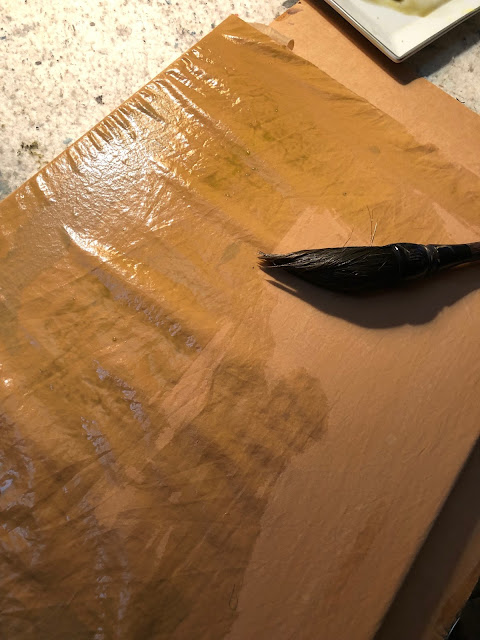
I had some scraps of a brownish silk fabric at my disposal so I cut out a swatch and stapled that on a regular canvas.  I was lazy.

The fabric looked a little too red for me, so I thought I could tone it down a bit by using a light green wash.  Except that the silk fabric would not take on the wash, as if it was treated with Scotchgard.  The wash was beading up on me.  


I figured I needed to condition the fabric first, so I mixed some alum solution with my wash and tried again.  Perhaps the alum in my wash could work as a mordant and make the color stick.  Maybe?


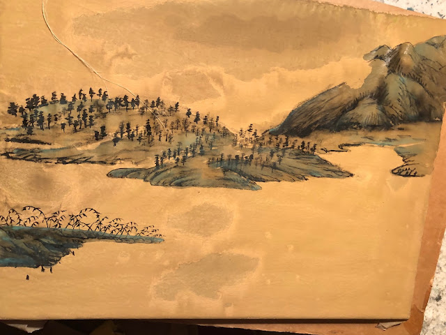
I didn't know whether it was the alum or was it my perseverance, the silk fabric was taking on the wash nicely now.  Unfortunately the fabric didn't present nicely at all after the wash dried up.  Somehow the surface was very blotchy.  Perhaps my alum solution was not mixed in evenly with my light green wash so there was uneven distribution of the pigments.  Now I was faced with painting something that could side-step or blend in with the discolorations.  The painting I recalled seeing in a museum had a very simple composition.  A spit in the middle of the river, with the mainland as the background, dotted with trees.  I remember vividly that it was the dotted trees that helped to define the topography of the land.  Sort of like the traditional moss dots, but transforming them into trees.  I could borrow the discolored blotches as the typical clouds and mists one sees in traditional Chinese landscape paintings.  How clever!


The soiled spots in the front center were too ostentatious.  I needed to tone them done.  I tried to hide them with a darker shade of green, suggesting a  body of water, with uneven surfaces caressed by the wind.


Distant mountains occupy the background, as I recalled.


The cloud/mist feature was perfectly represented by the swath of void.


Simple hemp fiber chuen depicted the landmass in the background,  nothing complicated.


After I had all the features down on the painting, I painted in a few punts.  The ones in the channel would get a white sail, adding an exclamation mark.


I wouldn't say this was an exercise in futility, but it was certainly frustrating; especially in the beginning.  I was constantly needing to find ways to amend my boo-boos but in the end I felt satisfied and enjoyed the journey.  I suppose that's the reason I paint. 

Friday, May 31, 2019

Epilogue to Yellow Mountain

I looked at my finished Yellow Mountain painting and I felt something was amiss.  I did not get the fulfillment I was expecting.  It took me a little while to put a finger on what was happening.

I did not create enough separation between the mountain features to effuse the grandeur and vastness of this landscape.

Upon re-examination of my work, the impression was that this was a bird's-eye view of a mountain range.  I could have and should have widened the perspective of the features.  I should have utilized my 18 mm lens and picked a different vantage point to capture the true ambience.  Obviously this was not photography and it was too late to do anything.

Or was it?

To prove my theory, I begged the help of technology, Photoshop.

I digitally separated my painting into 3 distinct areas.  The foreground on the left, middle-ground would be the 4 peaks of the mountain and the trailing features painted with splash ink brushstroke would be the background.   Cloud and mist features would be an effective means for the separation.  They are voids that would not appear as omissions.


Immediately I felt the painting opened up and now inviting me to be immersed as a participant.

Since I could not push back the features in what should have been my middle-ground, I experimented with another trick.  I wanted to add some incidentals in front of the 4 peaks, thus effectively adding distance.

So birds were deployed.


I had to change the birds from black to white in front of the peaks to make them more conspicuous.  Call that creative freedom if one must.


Did this help the painting?


Thursday, May 23, 2019

Yellow Mountain

Using my black and white sketch of Huangshan as a reference, I proceeded to paint a larger painting in color.  This painting shall have a pronounced yellow tone.  You might say that is the personality of this piece.

I loaded the right side of the painting with features and the left side relatively scant as a contrast.
The foreground would be allocated with more detailed brushstrokes, fading to the right and to the back.  This initial stage consisted mainly of the Gou and R'an (scribe and wash) portions of the Gou Chuen Ts'a R'an D'ian ( scribe, texture, rub, wash, dot ) process.


The mountains in the foreground is extended to the right and back, forming a S-shaped pattern.  This is to satisfy the prescribed requisite of  "level perspective" in the traditional sense of Chinese landscape painting.


Adding a light wash to the features allowed me to get a better perspective of what I was doing, especially when the paper was wet


After the wash had dried, I did my Chuen and T'sa (texture and rubbing) brushstrokes.  The painting began to take on a more realistic appearance due to the added information.


With the help of selective R'an (wash) brushstrokes, I was able to better reveal the 3-dimensional quality of the painting by depicting the different light values.


A close-up of the Gou, Chuen, T'sa, R'an process.  Notice the lack of D'ian (dotting) at this stage.  I typically would reserve that for the purpose of concealing bad lines and to add amorphous features to garnish the landscape.


The void expanse was tweaked with clouds and mist, basically a wet on wet technique to borrow from the watercolor vernacular.  The effects were exaggerated when wet.


I had a better sense of what the stage looked like after the cloud and mist dried.  I began adding more detailed incidental features to the landscape. 


This also involved the use of the D'ian brushstroke to ameliorate deficiencies in the painting;  to smooth out transitions from one value to another


There was prodigious use of D'ian (dotting) brushstroke in this painting.  This technique helped to conceal a lot of inadequacies in my brushstrokes and created a pleasant nuance.  If you looked closely and compared the before-and-after pictures of the same areas you would notice a lot of the tentative brushstrokes were well hidden now.  Perhaps this was pointillism in its infancy.  Wink, wink.  


Here is an example of how all the different brushstroke techniques worked together to form a cohesive feature, evolving from a purely two-dimensional drawing.


Time to stand back and give the painting a rest.  The wet paper made the painting very vivid.