A friend showed me a painting on silk and it looked very nice. Except that I didn't think the material was silk.
Many of my friends do the Gongbi style of Chinese brush and they typically paint on silk. They buy their yards of silk from art supply stores found on the Internet. To me that material looks like a very fine mesh translucent screen and it feels stiff and brittle, more like nylon than silk. It also tears rather easily. I just can't believe that this is the revered silk that is used to weave clothes.
I could recall seeing antique silk paintings in museums and I would very much try to re-create that ambience. My plan was to get some silk fabric and use that as my canvas.
I had some scraps of a brownish silk fabric at my disposal so I cut out a swatch and stapled that on a regular canvas. I was lazy.
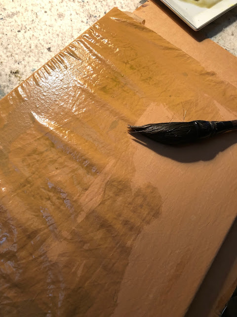
The fabric looked a little too red for me, so I thought I could tone it down a bit by using a light green wash. Except that the silk fabric would not take on the wash, as if it was treated with Scotchgard. The wash was beading up on me.
I figured I needed to condition the fabric first, so I mixed some alum solution with my wash and tried again. Perhaps the alum in my wash could work as a mordant and make the color stick. Maybe?
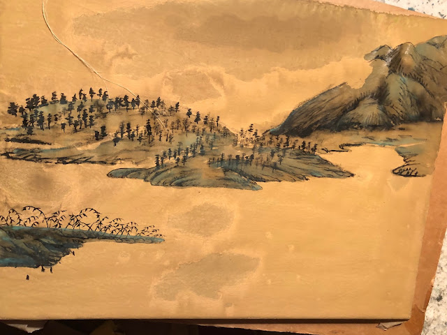
I didn't know whether it was the alum or was it my perseverance, the silk fabric was taking on the wash nicely now. Unfortunately the fabric didn't present nicely at all after the wash dried up. Somehow the surface was very blotchy. Perhaps my alum solution was not mixed in evenly with my light green wash so there was uneven distribution of the pigments. Now I was faced with painting something that could side-step or blend in with the discolorations. The painting I recalled seeing in a museum had a very simple composition. A spit in the middle of the river, with the mainland as the background, dotted with trees. I remember vividly that it was the dotted trees that helped to define the topography of the land. Sort of like the traditional moss dots, but transforming them into trees. I could borrow the discolored blotches as the typical clouds and mists one sees in traditional Chinese landscape paintings. How clever!
The soiled spots in the front center were too ostentatious. I needed to tone them done. I tried to hide them with a darker shade of green, suggesting a body of water, with uneven surfaces caressed by the wind.
Distant mountains occupy the background, as I recalled.
The cloud/mist feature was perfectly represented by the swath of void.
Simple hemp fiber chuen depicted the landmass in the background, nothing complicated.
After I had all the features down on the painting, I painted in a few punts. The ones in the channel would get a white sail, adding an exclamation mark.
I wouldn't say this was an exercise in futility, but it was certainly frustrating; especially in the beginning. I was constantly needing to find ways to amend my boo-boos but in the end I felt satisfied and enjoyed the journey. I suppose that's the reason I paint.
I am an enthusiast of Chinese Brush Painting and I would like to share my trials and tribulations in learning the craft. I want to document the process, the inspiration and the weird ideas behind my projects and to address some of the nuances related to this dicipline. I hope to create a dialogue and stir up some interest in the art of painting with a Chinese brush on Xuan. In any case, it would be interesting to see my own evolution as time progresses. This is my journal
Showing posts with label sizing. Show all posts
Showing posts with label sizing. Show all posts
Monday, June 17, 2019
Wednesday, August 3, 2011
Multnomah Falls Impression
After my last attempt, which was a more Xieyi (expressive) interpretation of Multnomah Falls, I decided to carry that momentum a bit further. I wanted to express motion and spatial relationship with more of a "presence" than descriptions of details. The following picture was my attempt in this endeavor.
Not everybody has been to the Falls or seen pictures of it. So I decided to play it up a little. I used blue streaks to create the upper cliffs. The streaks were done so that they themselves resemble moving water.
The blue wash was mixed with alum applied side tip fashion onto Xuan. Alum functions as a sizing
agent, helps to delineate the brush strokes; makes the brush strokes more vivid in the sea of blue wash. Thus we have a laminar flow of blue ribbons, rounding the corner to flow into the hour-glass void below. A grayish overlay is then applied over the blue streaks. The grey wash was again created by using alum solution as diluent. This was done to prevent the wash from totally blending into one big flat surface. I wanted stroke marks to show up a little better, simulating the horizontal crevasses in the cliff wall. These marks also helped to suggest interruptions in the stream ( even though the grey area is not the stream ) and gave an illusion of motion.
The actual narrow ribbon of upper fall was again painted with alum first to establish a base layer of resist, to ward off as much unintended seepage of wash as possible. At the head of the upper fall, I just held my brush and waited for the color to slowly bleed out to the desired spaces before moving on. This controlled osmosis when executed alongside of alum sizing will create some artifacts that will indulge your ocular senses.
The hour-glass void represented the lower fall. Its shape was inspired by the exaggerated proportion of a woman's body. Imagine Marilyn Monroe coming at you with open arms, donning a black cape. Get the picture now?
The lower fall is flanked by bold side tip brushstrokes. This was my interpretation of the near scape of the land. The hour glass shaped lower fall was again defined by the use of alum. I was careful to not make the entire structure black. I took time to make sure I leave some white slivers in them, so they can breathe.
I wish I had done the bridge in a more Xieyi fashion. More nonchalant, more expressive. Right now it looked too stiff. I was pushing it too much.
There you have it. Multnomah Falls, Impression!
Subscribe to:
Comments (Atom)


