Showing posts with label hemp fiber chuen. Show all posts

Tuesday, May 14, 2024

Mountain ridges, the background

Having completed the foreground and middle ground of my classical landscape, I am set for putting in the last player, namely, the background of the landscape.  I am also keenly aware that I still need to fulfill the "height perspective" of a classical landscape.  I need to have something soaring into the heavens.


For this exercise, I am sticking with a safe and seasoned player; mountain ridges.

Mountain ridges, or tops are common and standard features in a classical landscape painting.  In Chinese painting we will typically see a succession of hilltops, forming a mountain range.  I have alluded to this style of interpretation before, equating that to slicing up a potato into many pieces; each piece represents one vertical slice of the mountain.  When we arrange these slices of varying shape and height like pieces of domino tiles, we get to reconstruct the shape and volume of the mountain.

The picture below shows cardboard slices of a "mountain" that I used to help my students visualize a mountain when I was teaching landscape painting.


For my particular painting, I am using these slices from my inventory of shapes for my mountain,


This helps a person to visualize my mountain; my mannequin so to speak.


Typically I would lay down the contour lines of each "slice" of the mountain first.  For this painting however, I just pencil in the approximate position of the mountain and just splash down my individual slices, believing that this would result in a less rigid form.


After the paper dries to touch, I write in the contour lines of the individual slices.


And garnish my slopes with hemp fiber chuen, a technique used to add texture and further describe the topographic details of the landscape.


Shading helps to define the three dimensional structure of the mountain.


The top of these ridges are garnished with hints of shrubs and trees to add interest.


These decorative brushstrokes also serve the function of diverting the viewer's attention from the top dead center of the ridges.  In my haste of laying down the individual slices of the mountain, I committed the sin of lining up the apexes of the tops, forming a straight line towards the top.  By planting my shrubs and trees on some of the flanks of the mountain helps to create an illusion that the ridge tops form a curved and crooked line, which is more interesting and natural.  

Keeping in mind the requirement for depth perspective, which is to narrate a story or association of front and back, I am building a few simple shacks in this background.  


Thus it is plausible now, that people from these humble dwellings could perhaps visit the Ci En Pagoda, the waterfall, and walk alongside the path that sits at the bottom of a straight cliff with a platform on top, trek through the mixed woods and finally arriving at the temple in the foreground.  I trust this should satisfy the depth perspective.

To jazz up my "classical" landscape, I am going to emulate Zhang Daqian by brushing in some bold phthalocyanine blue.  Legend has it that Zhang would use a bowl to splash this bold and vivid color onto a huge painting painted on a enormous sheet of silk brocade, and his apprentices would help him lift the brocade to direct the liquid to flow to the strategic parts of the painting on that piece of silk cloth. 


I might be rushing things a little but I am eager to see what the final dimensions would be after cropping and mounting my painting.  I still have no idea whether I shall frame this painting the conventional way or mount it on canvas or board and then build a frame to house it. 


Monday, June 17, 2019

Seeking frustration: painting on silk

A friend showed me a painting on silk and it looked very nice.  Except that I didn't think the material was silk.

Many of my friends do the Gongbi style of Chinese brush and they typically paint on silk.  They buy their yards of silk from art supply stores found on the Internet.  To me that material looks like a very fine mesh translucent screen and it feels stiff and brittle, more like nylon than silk.  It also tears rather easily.  I just can't believe that this is the revered silk that is used to weave clothes. 

I could recall seeing antique silk paintings in museums and I would very much try to re-create that ambience.  My plan was to get some silk fabric and use that as my canvas.

I had some scraps of a brownish silk fabric at my disposal so I cut out a swatch and stapled that on a regular canvas.  I was lazy.

The fabric looked a little too red for me, so I thought I could tone it down a bit by using a light green wash.  Except that the silk fabric would not take on the wash, as if it was treated with Scotchgard.  The wash was beading up on me.  


I figured I needed to condition the fabric first, so I mixed some alum solution with my wash and tried again.  Perhaps the alum in my wash could work as a mordant and make the color stick.  Maybe?
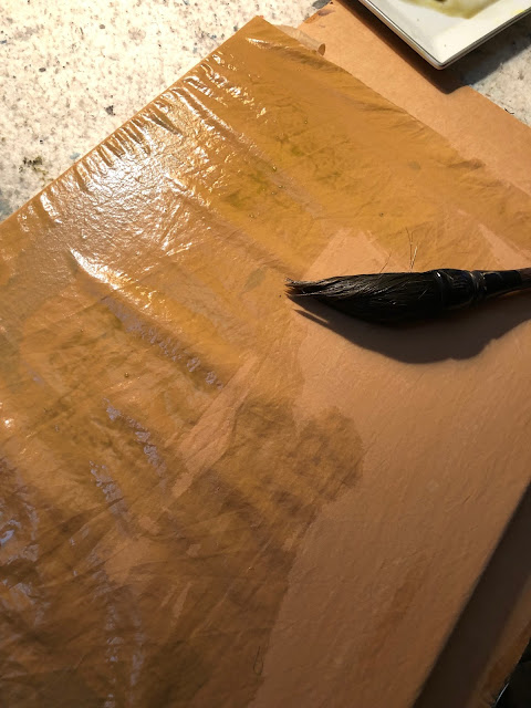

I didn't know whether it was the alum or was it my perseverance, the silk fabric was taking on the wash nicely now.  Unfortunately the fabric didn't present nicely at all after the wash dried up.  Somehow the surface was very blotchy.  Perhaps my alum solution was not mixed in evenly with my light green wash so there was uneven distribution of the pigments.  Now I was faced with painting something that could side-step or blend in with the discolorations.  The painting I recalled seeing in a museum had a very simple composition.  A spit in the middle of the river, with the mainland as the background, dotted with trees.  I remember vividly that it was the dotted trees that helped to define the topography of the land.  Sort of like the traditional moss dots, but transforming them into trees.  I could borrow the discolored blotches as the typical clouds and mists one sees in traditional Chinese landscape paintings.  How clever!
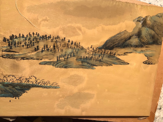

The soiled spots in the front center were too ostentatious.  I needed to tone them done.  I tried to hide them with a darker shade of green, suggesting a  body of water, with uneven surfaces caressed by the wind.


Distant mountains occupy the background, as I recalled.


The cloud/mist feature was perfectly represented by the swath of void.


Simple hemp fiber chuen depicted the landmass in the background,  nothing complicated.


After I had all the features down on the painting, I painted in a few punts.  The ones in the channel would get a white sail, adding an exclamation mark.


I wouldn't say this was an exercise in futility, but it was certainly frustrating; especially in the beginning.  I was constantly needing to find ways to amend my boo-boos but in the end I felt satisfied and enjoyed the journey.  I suppose that's the reason I paint. 

Monday, March 25, 2013

Beaverton Creek (yellow)

The last Beaverton Creek painting done in green was very impressionistic.  I liked it enough to build a canvas frame for it so that I could mount it a la Xuan-Boo style.

In the mean time I want to try my hands on something a little less wild, but still Xieyi.  The image I conjured up was a landscape bathed in a golden light.  Beaverton Creek, yellow !

 back of  Xuan


Again I mapped the landscape on the back of my Xuan.  This  process allowed me more freedom to flick my brush.  I could then concentrate on building up the painting  on the front side of the paper.

front of Xuan


My first step was to add visible branches and tree trunks to the scene.  I punctuated the highlighted areas with tips of branches.  I was trying to achieve the effect which I discussed at my "Visual Acuity" blog.  It is important to extend the exposed tips and branches down, at least in appearance, if not in physicality.  There is a saying in Chinese brush   "bi duan yi lian", meaning the  brush trek is broken up, but the meaning (spirit) still connects.  Sort of like driving down the freeway and using the dotted line to inform you of the virtual divide.  The extraneous branches and stems could be blended in very nicely with the split hair technique.


A few contour lines and hemp chuen  took care of the foreground, transforming a patch of grey into a bank with rocks and texture.


Looking at the rough draft, I noticed a white right triangle sticking out at the lower right quadrant of the painting.  Somehow there was a white line forming a vivid hypotenuse with the white branches.  This is most awful; especially when you are now aware of this flaw.


My remedy was to fill in the hypotenuse and turn it into a contour line.  I now have a more defined shore lobe extending into the water.


Right now this lobe seemed a little awkward, but I better stop now before I commit some knee-jerk changes.