Friday, June 28, 2024

Is this a cop-out

The water in my astrological water sign is having a herculean tidal pull on me.  I just can't get the thoughts of water out of my mind.  Something compels me to keep using water as a subject matter for my paintings.

When I started out to paint my algae in the pond work last November I was just toying with alum solution.  I tried to depict the messy blobs of algae with a certain fanfare.  Then I graduated to painting Rusalka, using water as my stage.  For my "tedious project" I was experimenting with my interpretation of the Gongbi style painting.

I am running the risk of being disrespectful to all the Gongbi artists out there.  Here I absolutely need to make a nota bene point, that I know little about the Gongbi discipline.  How dare I pass my work as a Gongbi painting.

By definition, Gongbi style painting demands finesse and patience; qualities that are sorely missing from moi.  Perhaps I can substantiate that statement by showing part of a painting from my friend, who happens to be a skilled Gongbi painter.


I implore you to examine the quality of the lines, the brushstrokes and how smoothly the colors are blended together.  That's Gongbi painting!

Mine is Gongbi-esque at best.  I do not have the patience to study Gongbi style painting properly.  It is always too "tedious" for me.

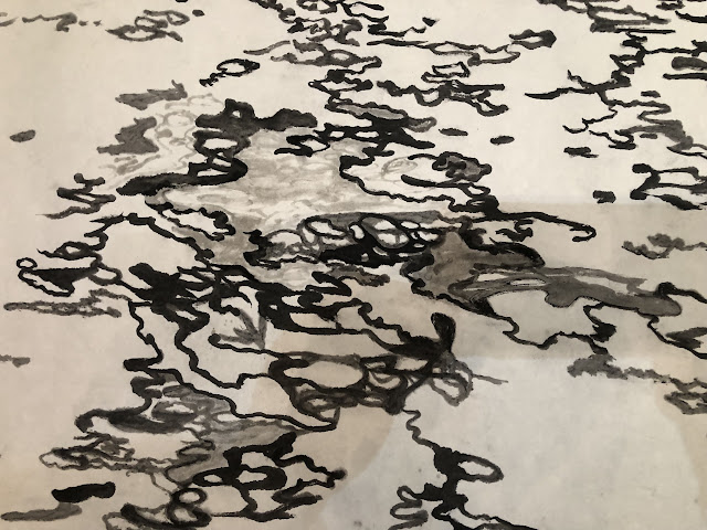
So what is percolating in my head now is another Gongbi-esque attempt in painting water.  I am starting with the multitude of forms and reflective patches and I am outlining these areas with my brush.  Instead of writing in the fine and disciplined lines like my friend did, I shall attempt to hide my incompetency by pretending those forms and shapes are complex Chinese characters.  Thus I am practicing my calligraphy if you will.


Actually these brushstrokes remind me of Sanskrit or Hebrew alphabets.  Actually they resemble Arabic writings.  I am definitely not trying to be disrespectful to the cultures that I've mentioned above.  I know nothing about their writings or alphabets so perhaps I should not be using them as examples.  But instinctively that's what comes to mind.  I am sorry if I am offending someone.  

Employing the same rhythm and mindset I am writing more lines and forms on the other side of my paper. 


I am thinking about composition already.  I need to create a contrast of density.  The haves and have nots. Lets call the left side the "rich" and the right side the "poor".


I am using very light ink for my brushstrokes to write swirls to fill some of the voids.  Light ink is also used to create a contrast with some of the thick black ink-lines.  


The swirls are actually my way of doodling.  Frankly I am at an impasse in deciding what to do with the rest of my water feature.  Thus writing swirls is relaxing and non-committal.  It gives me a respite.  

When I look at the painting now I feel a certain sudden emotion, as if something had struck me.

The painting looks interesting the way it is, without all the other embellishments!  It has a simple, impressionistic, naïve feel to it.  It is in black and white, with so few, and yet so much information.  Our minds are (at least mine is) doing the work of completing this painting.

I am writing in a few more phrases towards the lower right hand corner.  I feel that the sentence from the left needs to be a bit more structured.  That little tail forms a connection with the lines in the upper right hand corner. 

The red smearing is my way of digitally trying to decide where to place my seal.


Like a proverbial optimist, I do live in the moment.  I am placing a 24 in x 48 in frame over it just to see what the finished product might look like.


So I started out with the intention of doing another pretend Gongbi painting of water, to writing pretend calligraphy to emulate the wavy undulations on the water surface, to stopping the painting process with the bare minimums of information.  I have escaped all the tedious work of writing in the rest of the water.  All because something feels right for me.  At this particular moment. 

Is this restraint, or a cop-out?


Sunday, June 9, 2024

Water continued


Time to finish my water mosaic painting which was started back in January.  Perhaps due to the fact that I had committed so much on the painting already, and frankly I got sidetracked with other paintings, I find it difficult to change course or alter significantly what I have done so far.


I am holding tight to my boat's wheel and sail on.  I want to identify a body of glistening water by assigning a bluish color to it


Now I pick out the areas of occasional shimmers by mentally labelling them with my red lines and painting them in blue.  As one can see I am not confining the color within the boundaries of the lines as I should have.  Again I blame this on my "not wanting to lose my train of thought" or "sense of place".  Seems like a valid excuse!


Dark ink is used to fill in the "non-shimmering" areas of the water.  The stark contrast of black ink and color helps to bring the features of the water to life.


The right side of the painting gets a lighter ink treatment.  Again I am not being a good student.  My coloring goes outside of the outlined areas.  In a way this is like a hybrid of Xieyi and Gongi style paintings.  Hmmm.


I am adding a thin white line as an additional border to some of the black in pieces of my mosaic.  It is a subtle effect but somehow I am convinced that it adds to the nuance of the water mosaic.  Perhaps these lines reinforce the interpretation of shimmers on water?


In the end, my hybrid style of Xieyi and Gongbi Water Mosaic.  What a mouthful!


The above painting does not have the added white lines around dark ink.

The one below does have the added white lines.  If nothing else, it seems to have more definition and information.  I think the white lines add to that je ne sais quoi feeling of the painting.  I am just experimenting.  I do believe that some photo-editing software "sharpens" an image by imparting an artificial border of white to fool the eye of perceiving more contrast around the edges.  Perhaps this is the reason behind my saying that there's more definition and information as a result of painting in these white lines.  Serendipity!


Thursday, May 30, 2024

Ripples and waves

I think I have a pathological fear of water.  Some people call that a phobia.  Chinese astrologer has cautioned me about not messing with water, yet according to western astrology I belong to the water sign. Go figure! 

Water to me is the fluid that runs over my head in a shower, the shimmering substance in a river, and the infinite mass of motion and energy out in the ocean.  I still don't understand how water changes its shape to fit into anything, and how it heals itself even when something pokes through it.  I am afraid of it, yet I wish I could live in it, like a fish.  It gives life, and it also takes life; for us terrestrials anyways.  Perhaps I've listened to Rusalka's Song to the Moon too many times.

So I am going to attempt to paint my fascination, water, again.

I will try my luck with alum solution.  Alum is used as a sizing agent to treat Xuan paper, rendering it less absorbent.  It is this particular quality that I am trying to exploit. So I am using un-sized Xuan and paint lines with alum solution.  I mixed in a tiny bit of ink with the alum solution to help me see the stripes better.  I am visualizing the ripples, or little wave fronts as I paint.  I do this on the back of the Xuan paper.  When the paper is turned over, one can see a clear margin forming around the lines painted with alum.  This is the effect I am after.


I then fill in the space between the alum solution drawn lines with ink.  Taking liberty to cover up more or less as desire, and adding new shapes as I go.  After all, water is always changing its form and the ripples are always marching on.  Who is to say that a certain shape or line is correct or incorrect.  


I now have juxtaposed lines of black ink and clear alum, suggesting ripples on a body of water.  I am also painting in some form of a shore or land mass for this body of water.  All these are done on the back of the paper at this point. 


Now I flip over the paper to the right side up, and continue to correct and fill in the ink lines, based on what the paper reveals from the other side.  I am using the backside of the paper as a road map and the top side of the paper for the actual painting.  Notice how the blob of ink on the right is now on the left.  That's because I have flipped the paper over.  I am also giving the shore some structure and texture by amending it with some wild brushstrokes.  They are meant to be ambiguous.  They could be highlights, mist, water, or any combination thereof.  I am rendering the background with slanted brushstrokes, to make the composition more interesting.


Somehow I think the painting needs something to shore up the right side.  I am dabbing in some rough brushstrokes, reminding myself that these are flowers branches from a crabapple tree from my backyard.  I like the interplay of the dabs of petals with the black and white stripes of the water.   That little bit of color is like a garnishing.  


Tuesday, May 14, 2024

Mountain ridges, the background

Having completed the foreground and middle ground of my classical landscape, I am set for putting in the last player, namely, the background of the landscape.  I am also keenly aware that I still need to fulfill the "height perspective" of a classical landscape.  I need to have something soaring into the heavens.


For this exercise, I am sticking with a safe and seasoned player; mountain ridges.

Mountain ridges, or tops are common and standard features in a classical landscape painting.  In Chinese painting we will typically see a succession of hilltops, forming a mountain range.  I have alluded to this style of interpretation before, equating that to slicing up a potato into many pieces; each piece represents one vertical slice of the mountain.  When we arrange these slices of varying shape and height like pieces of domino tiles, we get to reconstruct the shape and volume of the mountain.

The picture below shows cardboard slices of a "mountain" that I used to help my students visualize a mountain when I was teaching landscape painting.


For my particular painting, I am using these slices from my inventory of shapes for my mountain,


This helps a person to visualize my mountain; my mannequin so to speak.


Typically I would lay down the contour lines of each "slice" of the mountain first.  For this painting however, I just pencil in the approximate position of the mountain and just splash down my individual slices, believing that this would result in a less rigid form.


After the paper dries to touch, I write in the contour lines of the individual slices.


And garnish my slopes with hemp fiber chuen, a technique used to add texture and further describe the topographic details of the landscape.


Shading helps to define the three dimensional structure of the mountain.


The top of these ridges are garnished with hints of shrubs and trees to add interest.


These decorative brushstrokes also serve the function of diverting the viewer's attention from the top dead center of the ridges.  In my haste of laying down the individual slices of the mountain, I committed the sin of lining up the apexes of the tops, forming a straight line towards the top.  By planting my shrubs and trees on some of the flanks of the mountain helps to create an illusion that the ridge tops form a curved and crooked line, which is more interesting and natural.  

Keeping in mind the requirement for depth perspective, which is to narrate a story or association of front and back, I am building a few simple shacks in this background.  


Thus it is plausible now, that people from these humble dwellings could perhaps visit the Ci En Pagoda, the waterfall, and walk alongside the path that sits at the bottom of a straight cliff with a platform on top, trek through the mixed woods and finally arriving at the temple in the foreground.  I trust this should satisfy the depth perspective.

To jazz up my "classical" landscape, I am going to emulate Zhang Daqian by brushing in some bold phthalocyanine blue.  Legend has it that Zhang would use a bowl to splash this bold and vivid color onto a huge painting painted on a enormous sheet of silk brocade, and his apprentices would help him lift the brocade to direct the liquid to flow to the strategic parts of the painting on that piece of silk cloth. 


I might be rushing things a little but I am eager to see what the final dimensions would be after cropping and mounting my painting.  I still have no idea whether I shall frame this painting the conventional way or mount it on canvas or board and then build a frame to house it. 


Sunday, April 28, 2024

Ci En Pagoda, the middle ground

Picking up from where I left off from the last session, I am filling in the empty spaces of the foreground, framing the temple structure in the process.


I am assigning different kinds of leaves to the shrubs and trees.  This is a rather typical way of depicting mixed woods as illustrated in the Mustard Seed Garden manual.  

This being the foreground, the brushstrokes are more delicate and mired in details.  The space is now filled with an assortment of vegetation.  It looks busy but not stuffy.  There is still a leisurely feel to it.  I am keeping the trunks as void spaces, to add contrast and style to the composition.  

Before I get myself into too much trouble, I have decided to move onto describing the middle ground, with the Ci En Pagoda as the focal point.  I am including the customary boulders along the shoreline, and I am adding steps path next to the pagoda, as a means of hinting at someplace beyond the paper, hidden in the depths of the hills.  Again, this is done with the intention of satisfying the depth perception of a "classical" landscape painting, trying to account for a story that goes from the front of the painting to the rear of the painting.  


The pagoda is colored in using the photo as a reference.  A reflection of the pagoda is painted in the water.  I just couldn't resist that.


A waterfall is added as an afterthought.  The location of the waterfall is not ideal, since I had not planned for it.  I am having difficulty visualizing the source of the fall.


I shall leave some voids above the waterfall.  One can interpret that as misty cloud, or a snow patch, or whatever.  Perhaps there is a gulley up there where a hidden stream that feeds the waterfall flows.  It helps to conceal some of the details of the mountain.  I am letting the viewers to engage their own imagination.


Trees are planted in all the low areas of the landscape, where water would gravitate.  This being farther away from the viewer, I can get away with not panting individual leaves or branches.  I shall use the silhouettes of trees o narrate the scene.  


I could stop right here and call that a finished painting.  The color and hue is not quite as bold and awkward now that the paper has dried.  It certainly has matured into a painting.  But, that is not what I set out to do.  I still need to deal with the background.  For now, I shall take a break.  

Thursday, April 11, 2024

Attempting a classical landscape painting

I kind of missed my yellow mountain piece after I toyed with it by adding a rising sun.  Perhaps I should settle down and work on another landscape painting; one that is more "classical".

Of course that is just me mumbling to myself.  I am not sure I fully understand the word "classical".  Can I reduce it to the simplest term, something that reminds me of the past?

I am reminded of the days when I was a student of Chinese brush painting and the hours spent in repeating and emulating everything that was in Mustard Seed Garden, hoping to my my work look "authentic" by being "classical".  Aside from the different brush techniques, I also learned the doctrines in classical landscape paintings, and one of those deals with perspective.  Scattered focal point is one thing, but more interestingly is the 3 perspective in the composition.  I am not referring to anything remotely related to say the vanishing point perspective.  Specifically the perspectives that govern landscape painting are the height perspective, the depth perspective and the level perspective.

Height perspective is as it suggests, the perspective of dealing with height, how the viewer is to perceive altitude.  Hence the peaks have to be soaring, and cliffs precipitous. The so called "level" perspective is actually what we would construe as the depth perspective; how to distinguish near objects from objects that are farther away.  Our depth perspective actually describes what goes on from near to far.  In other words, the painting needs to show not only the relative distance between objects, but how these objects are linked.  By placing person pushing a cart on a trail around a bend going behind a hill is a good example of our "depth perspective".  The artist fabricates an event or story line that directs the viewer's attention from foreground to background.   I personally deem this the most unique thing about "classical" landscape painting. 

Certain requisite features are often present in a "classical" landscape.  One will almost always find boulders, hills, mountains, streams, water, mist, waterfall, outcrops dotting the scenery.  From there one sometimes can see incidentals like shacks, vessels, foot bridges, animals etc.  A flat platform is sometimes included to add interest.  I was taught dots form lines, and lines form planes. So the ability to describe a plane, often sitting on top of a precipitous is one way to showcase the artist's proficiency.  This is no different from a pianist or violinist demonstrating their virtuosity when playing the cadenza during a concerto.   

Yes, there are indeed a lot of things to look for when enjoying a classical landscape painting.  And yes, it can be quite pedantic.  

I often grabble with the notion of a contemporary painting "classical" landscape because somehow I identify that as the product of rote learning and one is just regurgitating what someone did years ago.  I certainly understand that some of the "classical" landscape is impressionistic and full of symbolism, that the peak is the emperor and  he is adorned by his subjects. Nonetheless I would prefer us contemporary practitioners painting something real and that people can relate to, or moved by, as well as being beautiful.

Having said that, my assignment for myself, my so called "classical" landscape, shall adhere to the things I've learned as a student ( most of it anyways) and still harbor a bit of truth, as in real landmarks?
More aptly, I am borrowing a "classical" setting to house modern day landmarks.

I hark back to my trips to Taiwan, a couple of places in particular, that could fit into my landscape painting.  One of those places is Jiufen ( Jiufen Old Street) and the other is the Sun Moon Lake, where Ci En Pagoda is located.

This is a photo I took of a temple by the bus stop up by Jiufen.


and this is a photo of the Ci En Pagoda at Sun Moon Lake,


A common format of Xuan paper has the 2:1 ratio, the height being twice the width.  So I am loosely following this particular format.  I am painting on the Cicada skin Xuan.  It is more forgiving with my less than stellar techniques.  

I am putting the temple from Jiufen in the foreground, and the Pagoda in the middle ground, and the background shall be a continuation of the mountain range.


I am using the classical ways to paint trees and shrubs, as depicted by the venerable Mustard Seed Garden.  I am leaving a lot of spaces between my different objects.  My intention is to fill in with leaves and dots.  Something impressionistic and spontaneous, to break up the solemnness of a "classic".


I am placing tall trunks on the paper for my trees.  They could be lodge pole pines or firs, but for now they appear more birch-like.  Oh well, that's not important.  I've done such tall trees in my Multnomah Falls paintings, and trees are abundant in the Pacific Northwest, so that's something I can relate to.  For heaven's sake, I was once employed by a plywood mill. 


I have included a flat platform with a trail at the bottom.  I am a good student.  But seriously, that footpath is my adherence to the depth perspective.  The viewer's attention shall, hopefully,  follow that path to somewhere behind the foreground, and attempt to imagine "what's behind that."


Making it real now, coloring the temple, using my photo as reference.