Saturday, July 27, 2024

Poetry by Wang Zhihuan (王之渙)

I'm not a scholar, literary or otherwise.

My Caucasian friends are bantering with me, each insisting our form of poetry is better and reaches deeper depths in our emotional abyss.  Neither my friends nor I are what one would consider scholars, so the argument is just a way to bond, strangely enough.  One thing that often rubs me the wrong way is however that they always use the term Haiku generically.  They call any Asian poetry Haiku and they think Chinese poetry is the same as Haiku. Thus their perspective is to compare western poetry to Haiku, which I know nothing about.  Sure lemurs and humans are all primates, but they really are not the same animal, right?  

Enough said. 

That leads me to thumb through my Tang Poetry 300, which is the only text book from my primary school days that is still relevant.  Granted I was too young to be pulled in by meanings of these poetries, but with age and life experiences I am able to distill more from the verses.  

I revisited a poem by Wang Zhihuan, a Tang Dynasty poet.

白日依山盡  黃诃入海流  欲窮千里目  更上一層樓   

"The sun disappears behind the hills, the yellow river flows to the sea.  If the wish is to see for a thousand miles, one needs to climb another floor."

The first two line describes the setting.  One creates the imagery of a a river, hills, disappearing sun and distance.  The next two verses however addresses a wish, a yearning, a philosophy.  This is when the poet urges us to use our own imagination, based on the framework that he has provided.  In fact the last two verses were extremely popular when I was a kid signing graduation year-books.  They are meant to inspire and encourage a person to reach for loftier heights, set bigger goals.  

I have this painting that's been pinned on my wall and I deem it incomplete.  It's missing something.  This poem somehow fits the narrative of my painting, with a few modifications of the painting, that is.

I altered the sky around where the sun would set to denote an impending evening, without revealing the actual sun.  As in poetry, the conjured emotion is more persuasive than the terse words.  


I increased the dark tone on the rock formations, especially around the bottom, to add perspective and to say that this is positioned directly against the light.  Thus this area should assume the darkest value.


Conversely I let the exposed rock formation from across the river assume a more orange-reddish hue, bathing in the setting sunlight.  The golden hour!


The problem with me is I often get carried away.  "Quit when you're ahead" was never my mantra.  The pedantic and pretentious me decided that I should write Wang's poem onto the newly modified painting, just so that I can satisfy the 3 absolutes; painting, poetry and calligraphy.

Chinese brush calligraphy is the bane of my existence, and to make matter worse, I opted for an easy way out.  Instead of using a proper Chinese round brush, I used a fountain-brush, one that has nylon bristles and an ink cartridge.


I can tell you now that this is not meant for calligraphy.  Put it that way, I'm not good enough to control this contraption to make it a calligraphic instrument.  It seems like this modern invention would only respond to my pressing but not lifting.   Not much modulations in the brushstrokes that I can see.  I seem to be nudging all the way.  Perhaps I had subconsciously planned to use this as an excuse all along.  


Fortunately this was all fun and game for me.  My ego wouldn't be hurt if someone disapproves my irreverence.  I thought I was being smart to use a gadget like a fountain brush and I didn't know better to not try it.  

At least I know now.  

Live and learn. 


When I wet mounted this piece, I used a single weight Xuan as my backing.  Apparently it was too thin and no match for the forces generated by the drying and shrinking paper and tears showed up.  Stress fractures!


I don't know if this has to do with the fact that we are having a hot day today.  92 degrees F outside and the room thermometer here registers 80 degrees.  Perhaps the evaporation was too much, too fast?  I've been told to not do any wet mounting in a hot room.  Could this be the reason?  This is something I need to keep an eye on in the future.


Thursday, July 11, 2024

The Chinese round brush, more than a mark making instrument

I grew up in the era when composition class required the use of writing with a Chinese brush and ink.  The brush might as well be a piece of twig for me.  Something that I could leave a legible mark on my exercise book so that my teacher could read and grade my work.  In those formative days, I was not fortunate enough to receive the mentorship of how to properly use a brush.  Sure the teachers showed the different roots of the Chinese character and there were Fa Tie ( books of model letter, model character) for us to copy during penmanship classes, but we did not receive individual guidance.  Perhaps the class size was too big.

A brand new Chinese brush has its hair glued together to form a point and is rather stiff.  The new brush is meant to be soaked in water to dissolve the glue such that the hair is separated to its individual strands.  The scattered and spread out hairs would come back to a point after wetting with water or ink; when surface tension works its wonders.


The new brush is on the left and a used brush is in the middle.  The brush on the right shows how the hairs would come back to a point when wet.

Imagine having a wet wad of hair at the end of a thin stick and I was suppose to wield that and write thin lines with that floppy mess?  No way!

My answer to that was to not soak the new brush in water.  I would just jam the tip of the new brush onto the desk, such that the first few millimeters of hair separates, and I would write with that very limited "point".  Obviously that negated all the virtues bestowed by a Chinese round brush.  My lines were all thin and even.  Neat!

As the act of writing continued, the bristles of the brush became more scattered.  Ink and water had crept up to the belly part of the brush and was dissolving the glue.  The writing process became more labored. I became more frustrated.  My lines were getting fatter and irregular.  Fortunately I never washed my brush after each writing.  The ink would dry on the brush and it became stiff again.  

I wonder how many of us have the same story to tell.

I might as well be using a ballpoint pen, but this was before ballpoint pens were invented.  Yes, I'm that old!

It wasn't until I was in secondary school when Chinese Brush painting was part of the curriculum that I realized the wonders of the Chinese brush.  I basically had to re-learn everything about the brush.  All that became more succinct when I started to learn brush calligraphy in earnest.  It became clear to me why people say that calligraphy is the foundation of brush painting.  It's all about the brush, and the brush is more than a mark making instrument.

In calligraphy class, we were told to pay attention to the tip of the brush.  As the brush traverses the paper to write a line, the tip could be placed at the center of the line, hence the center-tip brushstroke. The brush tip is in line with the direction of travel of the brush.  If the tip however is pointing at any angle other than the direction of the travel, then the nab of the brush is basically dragging along and not in the orientation of the travel and that describes the side-tip brushstroke.

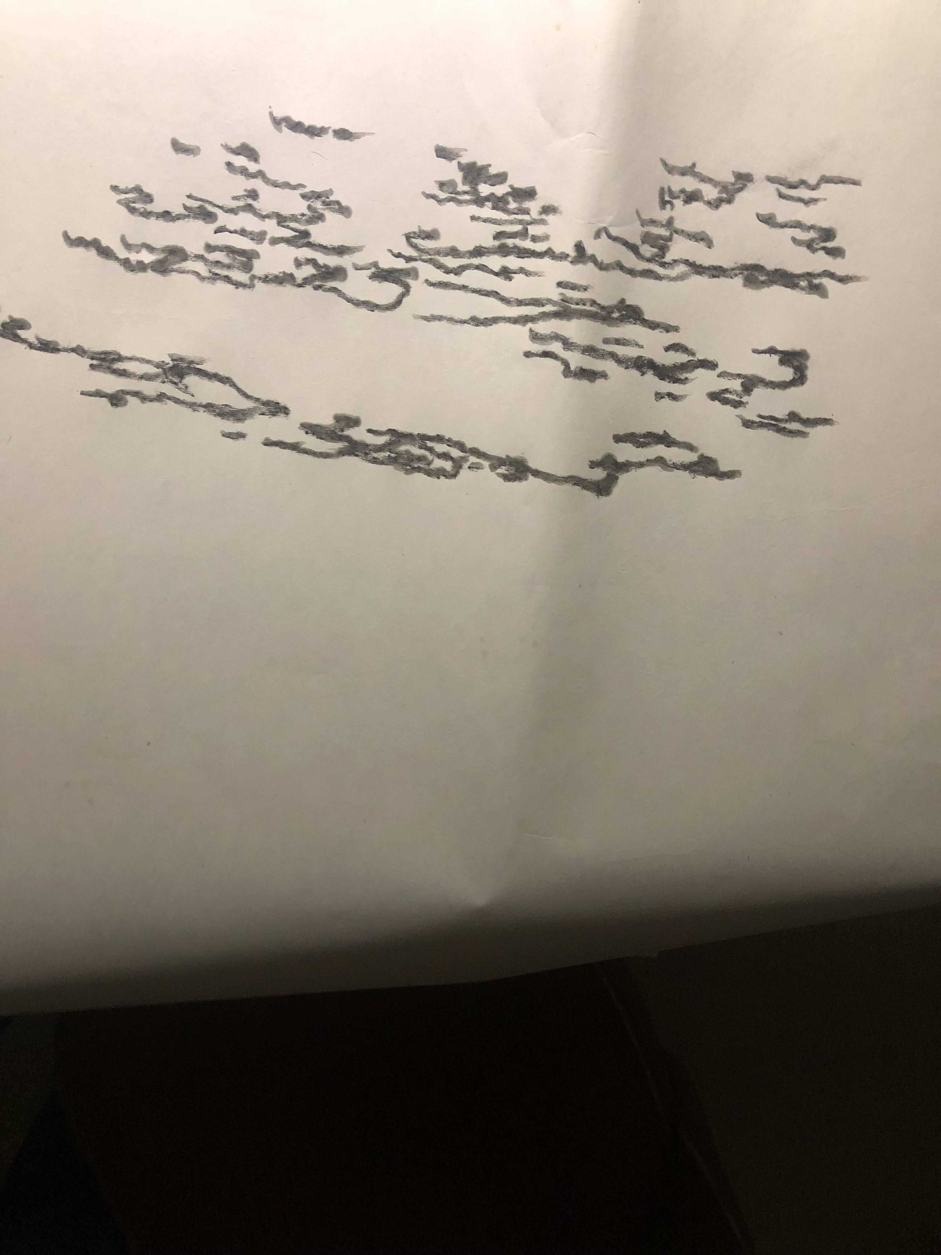
To illustrate the cumbersome statements above, I am write two lines with a brush that has the dark ink on the tip of the brush only.  Obviously the ink is going to migrate to the sides and belly of the brush, but the brush tip should leave the darkest mark on paper.


Hence the top line is done with the center-tip brushstroke.  Dark ink is at the center at the start of the brushstroke and gets fainter as the brush travels.  The center white line is actually the mark left by the tip of the brush as the ink on the tip depletes and only water remains.  This brings up the special quality of the Xuan paper we use for our paintings.  It registers everything from our brushstroke.

The line on the bottom shows ink at the start, but loaded to the top and continues to load up on the top margin of the line.  This is due to the position of the brush tip, which is pointed towards the top of the paper as the brush is dragged to the right.  In essence the brush tip is at a 90 degree angle to the line of travel.  Again the void space in the brushstroke represents the part of the brush where ink is depleted.

Certain fonts in Chinese calligraphy mandates the use of strict center-tip brushstrokes, whereas others require both center-tip and side-tip brushstrokes.  The accomplishment and hubris  ( or lack of ) a calligrapher depends on the correct application of the brushstrokes.  When one looks at a piece of Chinese calligraphy, each brushstroke encompasses different widths, shapes, bends and corners. and yet they are all discrete brushstrokes.  A stick or twig certainly can't do that. They would have to go back and fill in to modify the shape of the markings. 

When we say "we write a painting", we mean exactly that.  We use center-tip and side-tip brushstrokes to achieve the shapes and lines of objects.  A prime example would be paintings of bamboo.
Bamboo leaves are nothing but lines.  The entire shape of the bamboo leave, or stem, is done by discrete brushstrokes and not by filling in the space as one would normally associate with painting.  Again, using my "tip-loaded-only" brush, I have "written" the following "painting",


The 3 bamboo leaves on the left are center-tip brushstrokes and the one on the right is side-tip.  An easy way to tell is by look for the points at the start of the brushstroke.  If the point is in the middle, it is likely center-tip.  If the point in at a corner, then the brushstroke is side-tip.


In the example above, C denotes center-tip brushstroke, and S is for side-tip brushstrokes.  The arrows point to the line (edge) left by the tip of the ink-loaded brush tip.  One can see the point at the start of the brushstroke is at the corner, and the brushstroke has ink loaded on one side only.

A painting often requires both kinds of brushstrokes to make it interesting and harmonious.  

The following is a pointing of bamboo leaves done mostly with center-tip brushstrokes


Here is an example of one done mostly with side-tip brushstrokes (you can see the start of the brushstroke is a flat end, feels like putty knife)


Hopefully you can feel the different nuances presented by the two examples above.  Generally speaking, in paintings anyways, center-tip brushstrokes can be so "proper" that they become dry and monotonous.  Side-tip brushstrokes are more rambunctious and spirited, but can get away from you really easily.  

Speaking of being rambunctious, here is an example of just one bamboo leaf, done in the side-tip brushstroke:

The painting is the work of the famous Ling-nan style Master Chao Shao-An.


Which one do you prefer?  Do you paint (write) with those distinctions in mind?

Using the side-tip brushstroke, I "wrote" two half-circles.  I loaded the brush tip only with ink to better show the track of the tip.


I then garnished my half circles with some lines and now we have an insect.


These are all discrete brushstrokes but I am making a case of the character of the brushstrokes.  The legs on the left side of the insect were done center-tip.  The ones on the right were done in side-tip brushstroke, where I could modulate the shape of the line with greater ease.  Perhaps this is not too evident due to the small size of the brushstroke, but hopefully one can at least surmise that the legs on the right are more interesting and life-like.

Here's another example of how simple written lines and appropriate brushstrokes can represent an insect in this case.  This is what  "writing" a painting means.


When we mix center-tip and side-tip brushstrokes, we can transform simple lines in a fish.  I am hoping that one could easily tell that the pectoral fins are definitely side-tip brushstrokes.


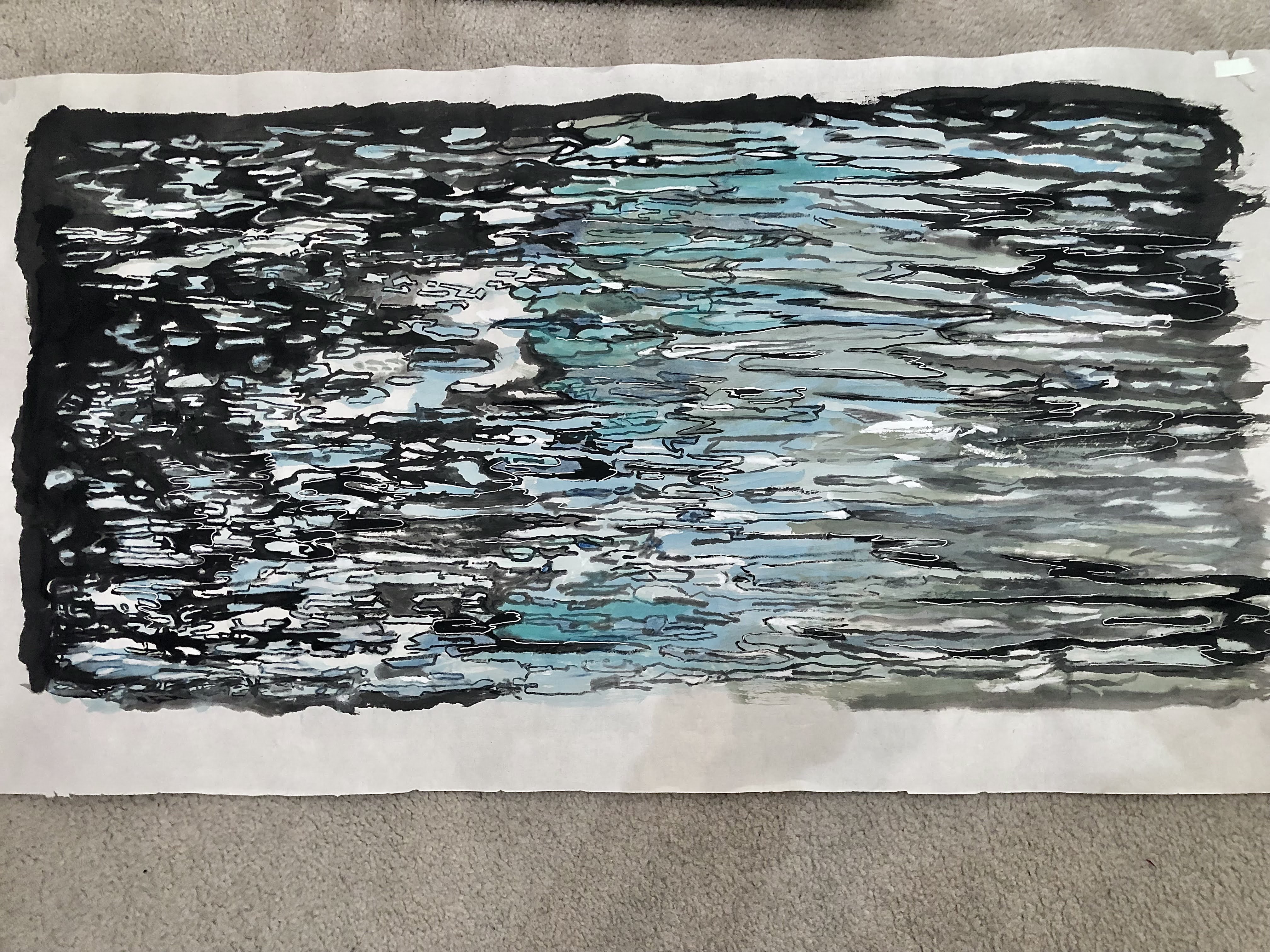
Just for fun, I am including the following photo is see if one can distinguish the two different brushstrokes


In painting, we would use the entire nap of the brush.  We use the tip, the side and the belly.  We hold the brush vertical, leaning, or even rolling flat.  I suppose the side-tip brushstroke is more exaggerated and expansive in brush painting.

Again using a tip-loaded brush with ink, side-tip brushstrokes describe the petals of a flower.


When the brush is totally flat on the paper, the with judicious positioning of the ink-loaded tip, we can see how a variegated petal or leaf can be described.


I hope to plead my case that the Chinese round brush is not just a tool for mark making, or dabbing.  The proper use of the brush demands knowledge, and most of all, practice.  If we fail to see it as a calligraphy instrument first, then we have minimized its importance in the realm of Chinese paintings.


Friday, June 28, 2024

Is this a cop-out

The water in my astrological water sign is having a herculean tidal pull on me.  I just can't get the thoughts of water out of my mind.  Something compels me to keep using water as a subject matter for my paintings.

When I started out to paint my algae in the pond work last November I was just toying with alum solution.  I tried to depict the messy blobs of algae with a certain fanfare.  Then I graduated to painting Rusalka, using water as my stage.  For my "tedious project" I was experimenting with my interpretation of the Gongbi style painting.

I am running the risk of being disrespectful to all the Gongbi artists out there.  Here I absolutely need to make a nota bene point, that I know little about the Gongbi discipline.  How dare I pass my work as a Gongbi painting.

By definition, Gongbi style painting demands finesse and patience; qualities that are sorely missing from moi.  Perhaps I can substantiate that statement by showing part of a painting from my friend, who happens to be a skilled Gongbi painter.


I implore you to examine the quality of the lines, the brushstrokes and how smoothly the colors are blended together.  That's Gongbi painting!

Mine is Gongbi-esque at best.  I do not have the patience to study Gongbi style painting properly.  It is always too "tedious" for me.

So what is percolating in my head now is another Gongbi-esque attempt in painting water.  I am starting with the multitude of forms and reflective patches and I am outlining these areas with my brush.  Instead of writing in the fine and disciplined lines like my friend did, I shall attempt to hide my incompetency by pretending those forms and shapes are complex Chinese characters.  Thus I am practicing my calligraphy if you will.


Actually these brushstrokes remind me of Sanskrit or Hebrew alphabets.  Actually they resemble Arabic writings.  I am definitely not trying to be disrespectful to the cultures that I've mentioned above.  I know nothing about their writings or alphabets so perhaps I should not be using them as examples.  But instinctively that's what comes to mind.  I am sorry if I am offending someone.  

Employing the same rhythm and mindset I am writing more lines and forms on the other side of my paper. 


I am thinking about composition already.  I need to create a contrast of density.  The haves and have nots. Lets call the left side the "rich" and the right side the "poor".


I am using very light ink for my brushstrokes to write swirls to fill some of the voids.  Light ink is also used to create a contrast with some of the thick black ink-lines.  


The swirls are actually my way of doodling.  Frankly I am at an impasse in deciding what to do with the rest of my water feature.  Thus writing swirls is relaxing and non-committal.  It gives me a respite.  

When I look at the painting now I feel a certain sudden emotion, as if something had struck me.

The painting looks interesting the way it is, without all the other embellishments!  It has a simple, impressionistic, naïve feel to it.  It is in black and white, with so few, and yet so much information.  Our minds are (at least mine is) doing the work of completing this painting.

I am writing in a few more phrases towards the lower right hand corner.  I feel that the sentence from the left needs to be a bit more structured.  That little tail forms a connection with the lines in the upper right hand corner. 

The red smearing is my way of digitally trying to decide where to place my seal.


Like a proverbial optimist, I do live in the moment.  I am placing a 24 in x 48 in frame over it just to see what the finished product might look like.


So I started out with the intention of doing another pretend Gongbi painting of water, to writing pretend calligraphy to emulate the wavy undulations on the water surface, to stopping the painting process with the bare minimums of information.  I have escaped all the tedious work of writing in the rest of the water.  All because something feels right for me.  At this particular moment. 

Is this restraint, or a cop-out?


Sunday, June 9, 2024

Water continued


Time to finish my water mosaic painting which was started back in January.  Perhaps due to the fact that I had committed so much on the painting already, and frankly I got sidetracked with other paintings, I find it difficult to change course or alter significantly what I have done so far.


I am holding tight to my boat's wheel and sail on.  I want to identify a body of glistening water by assigning a bluish color to it


Now I pick out the areas of occasional shimmers by mentally labelling them with my red lines and painting them in blue.  As one can see I am not confining the color within the boundaries of the lines as I should have.  Again I blame this on my "not wanting to lose my train of thought" or "sense of place".  Seems like a valid excuse!


Dark ink is used to fill in the "non-shimmering" areas of the water.  The stark contrast of black ink and color helps to bring the features of the water to life.


The right side of the painting gets a lighter ink treatment.  Again I am not being a good student.  My coloring goes outside of the outlined areas.  In a way this is like a hybrid of Xieyi and Gongi style paintings.  Hmmm.


I am adding a thin white line as an additional border to some of the black in pieces of my mosaic.  It is a subtle effect but somehow I am convinced that it adds to the nuance of the water mosaic.  Perhaps these lines reinforce the interpretation of shimmers on water?


In the end, my hybrid style of Xieyi and Gongbi Water Mosaic.  What a mouthful!


The above painting does not have the added white lines around dark ink.

The one below does have the added white lines.  If nothing else, it seems to have more definition and information.  I think the white lines add to that je ne sais quoi feeling of the painting.  I am just experimenting.  I do believe that some photo-editing software "sharpens" an image by imparting an artificial border of white to fool the eye of perceiving more contrast around the edges.  Perhaps this is the reason behind my saying that there's more definition and information as a result of painting in these white lines.  Serendipity!


Thursday, May 30, 2024

Ripples and waves

I think I have a pathological fear of water.  Some people call that a phobia.  Chinese astrologer has cautioned me about not messing with water, yet according to western astrology I belong to the water sign. Go figure! 

Water to me is the fluid that runs over my head in a shower, the shimmering substance in a river, and the infinite mass of motion and energy out in the ocean.  I still don't understand how water changes its shape to fit into anything, and how it heals itself even when something pokes through it.  I am afraid of it, yet I wish I could live in it, like a fish.  It gives life, and it also takes life; for us terrestrials anyways.  Perhaps I've listened to Rusalka's Song to the Moon too many times.

So I am going to attempt to paint my fascination, water, again.

I will try my luck with alum solution.  Alum is used as a sizing agent to treat Xuan paper, rendering it less absorbent.  It is this particular quality that I am trying to exploit. So I am using un-sized Xuan and paint lines with alum solution.  I mixed in a tiny bit of ink with the alum solution to help me see the stripes better.  I am visualizing the ripples, or little wave fronts as I paint.  I do this on the back of the Xuan paper.  When the paper is turned over, one can see a clear margin forming around the lines painted with alum.  This is the effect I am after.


I then fill in the space between the alum solution drawn lines with ink.  Taking liberty to cover up more or less as desire, and adding new shapes as I go.  After all, water is always changing its form and the ripples are always marching on.  Who is to say that a certain shape or line is correct or incorrect.  


I now have juxtaposed lines of black ink and clear alum, suggesting ripples on a body of water.  I am also painting in some form of a shore or land mass for this body of water.  All these are done on the back of the paper at this point. 


Now I flip over the paper to the right side up, and continue to correct and fill in the ink lines, based on what the paper reveals from the other side.  I am using the backside of the paper as a road map and the top side of the paper for the actual painting.  Notice how the blob of ink on the right is now on the left.  That's because I have flipped the paper over.  I am also giving the shore some structure and texture by amending it with some wild brushstrokes.  They are meant to be ambiguous.  They could be highlights, mist, water, or any combination thereof.  I am rendering the background with slanted brushstrokes, to make the composition more interesting.


Somehow I think the painting needs something to shore up the right side.  I am dabbing in some rough brushstrokes, reminding myself that these are flowers branches from a crabapple tree from my backyard.  I like the interplay of the dabs of petals with the black and white stripes of the water.   That little bit of color is like a garnishing.  


Tuesday, May 14, 2024

Mountain ridges, the background

Having completed the foreground and middle ground of my classical landscape, I am set for putting in the last player, namely, the background of the landscape.  I am also keenly aware that I still need to fulfill the "height perspective" of a classical landscape.  I need to have something soaring into the heavens.


For this exercise, I am sticking with a safe and seasoned player; mountain ridges.

Mountain ridges, or tops are common and standard features in a classical landscape painting.  In Chinese painting we will typically see a succession of hilltops, forming a mountain range.  I have alluded to this style of interpretation before, equating that to slicing up a potato into many pieces; each piece represents one vertical slice of the mountain.  When we arrange these slices of varying shape and height like pieces of domino tiles, we get to reconstruct the shape and volume of the mountain.

The picture below shows cardboard slices of a "mountain" that I used to help my students visualize a mountain when I was teaching landscape painting.


For my particular painting, I am using these slices from my inventory of shapes for my mountain,


This helps a person to visualize my mountain; my mannequin so to speak.


Typically I would lay down the contour lines of each "slice" of the mountain first.  For this painting however, I just pencil in the approximate position of the mountain and just splash down my individual slices, believing that this would result in a less rigid form.


After the paper dries to touch, I write in the contour lines of the individual slices.


And garnish my slopes with hemp fiber chuen, a technique used to add texture and further describe the topographic details of the landscape.


Shading helps to define the three dimensional structure of the mountain.


The top of these ridges are garnished with hints of shrubs and trees to add interest.


These decorative brushstrokes also serve the function of diverting the viewer's attention from the top dead center of the ridges.  In my haste of laying down the individual slices of the mountain, I committed the sin of lining up the apexes of the tops, forming a straight line towards the top.  By planting my shrubs and trees on some of the flanks of the mountain helps to create an illusion that the ridge tops form a curved and crooked line, which is more interesting and natural.  

Keeping in mind the requirement for depth perspective, which is to narrate a story or association of front and back, I am building a few simple shacks in this background.  


Thus it is plausible now, that people from these humble dwellings could perhaps visit the Ci En Pagoda, the waterfall, and walk alongside the path that sits at the bottom of a straight cliff with a platform on top, trek through the mixed woods and finally arriving at the temple in the foreground.  I trust this should satisfy the depth perspective.

To jazz up my "classical" landscape, I am going to emulate Zhang Daqian by brushing in some bold phthalocyanine blue.  Legend has it that Zhang would use a bowl to splash this bold and vivid color onto a huge painting painted on a enormous sheet of silk brocade, and his apprentices would help him lift the brocade to direct the liquid to flow to the strategic parts of the painting on that piece of silk cloth. 


I might be rushing things a little but I am eager to see what the final dimensions would be after cropping and mounting my painting.  I still have no idea whether I shall frame this painting the conventional way or mount it on canvas or board and then build a frame to house it.