Saturday, August 31, 2013

To gel or not to gel

I have been continually amending my Beaverton Creek classic style painting for a while now and I am really afraid that one of these days I might go overboard and make it ostentatious.  I suppose I could not gauge for myself whether the painting is 80% complete or 99% complete.  One way to cure this urge and OCD nonsense is to sign off the painting and mount it.

I did just that, in my usual Xuan-Boo fashion.

 Xuan mounted on canvas


I mentioned that I would coat it with a gel medium as a final step, not only to protect the surface of the delicate Xuan, but also to restore the brilliance and depth of the ink and pigment after they have dried.  I remember when I was first starting out, I was so absorbed by the appearance of the painting when wet, only to be disappointed after it is dried, as everything dulls.  What if I find something that will retain that wet look?

My prayer seemed to have been answered by employing the gel coat.  It definitely brings back and depth and brilliance of the original attempts.

 left 1/3 coated with gel

 right 1/3 not yet coated


I've been criticized by people in the circle for doing this.  Perhaps of the glossy finish the gel imparts, or perhaps the look and feel is too non-Chinese?

I suppose some of us use hair dressing in our hair while others don't.   I am at peace with my choice.

Wednesday, August 28, 2013

Chiseled in clay

Tea was served while visiting my friend.

I was nervously fidgeting with objects on the coffee table as my mind was racing, trying to find a polite and meaningful conversation.  I am just not adapt at social gathering with people that I barely know.  More often than not, I was afraid to be too opinionated, once engaged in an exchange.  Surprise!

Then my sight latched onto this teapot.


I've always maintained that Bi-fa is the quintessential element in defining Chinese painting.  Here is a simple drawing of a dwelling on water.  None of the associations in this scene made any sense.  In fact it bordered on being absurd.  Nonetheless we know immediately this is a Chinese painting.

Was it because it has Chinese thematic objects?  Probably.  It was the Bi-fa, however, that I consider to be the calling card in this instance; albeit the work was not done with a brush but with a carving utensil.

The scratch marks detail clearly the starting points, progressing to lines with various pressure and width.  This is really no different from drawings made with pencils or charcoal sticks.  The pressure and speed and decisiveness of the strokes are clearly documented.  Thus the tracks made were not wet noodles, but lines with Li (strength, energy).  Bi-fa is used generically in this instance.

The layout itself follows the traditional landscape doctrine, subscribing to the Three Perspective practice, height, level and depth.

 hemp chuen           

Trees were depicted in the traditional abstract fashion.  Hemp chuen was applied to boulders in the fore front and hills in the right background, whereas the rock pillars on the left received the Axe chuen.  These are all classical methods used to describe texture and topography.

 axe chuen on pillars


So even with  clay, and without using a brush, the artisan still followed the tradition and demonstrated the traits of a Chinese painting.


Wednesday, August 14, 2013

Semi-sized vs Unsized Xuan

I was continuing my efforts to emulate Gong Xian's paintings;  I find his Jimo ( accumulating, layering with ink )  technique fascinating.

I started out using a regular Xuan, actually an excellent quality Xuan.  Right away I found myself ill at ease.   

One of my Achilles heels is the fact that I tend to doodle.  Perhaps this is an exaggeration,  but I tend to go over my my brushstrokes over and over again, must be my OCD.   I was hoping by honing my Jimo skill I will learn to be more decisive and discrete with my doodling, but the unsized Xuan caused a lot of bleeding.  It is true that I can still see distinct tracks if I hold up the Xuan against the light, but when viewed under ambient illumination, the  painting looked muddled, or dirty as we say.  I stopped before finishing the painting.


I dug out my semi-sized Xuan stock and tried to paint again.  The semi-sized Xuan is less absorbent.  The ink floats on top of the paper for a while before getting absorbed into the fibers.  Once the ink is dried to touch, I can pile on more ink/color and I can push the original track somewhat, while keeping the original brushstroke more or less intact.

Here is a side by side comparison of the 2 versions.  The one on the left is semi-sized.  The brush marks are better delineated.


I like the semi-sized Xuan much better for this particular exercise, and I took the painting to completion.


Sepia color achieved by using left over from my cup of coffee !!

Thursday, August 1, 2013

Simple is as simple does

As part of the exercises of building my painting skills, I am always looking for interesting pieces to emulate; especially pieces that exemplifies brush strokes and composition.  I suppose this is learning by rote, but I look at it more from a standpoint of exploring and expanding my envelope.  It is no different from studying Paganini and Heifetz if I was a violinist.

The works I choose are  usually simple, not elaborate.  I can only take in a few things at a time.

I came upon 2 ink wash paintings.  My first impression was the paintings had interesting composition.  As I examined further into these works, I was intrigued by the  ink tones and the soft yet discrete brushstrokes.  The lines seemed to be blurry and distinct at the same time.

The first scene included a boat, waters, a hut and hills.  A dominant horizontal aspect described by prominent undulating contour lines and light value lines. The circumventing path punctuated with such subdued flair.  Neither the boat, nor the hut assumed a main character role, but they answer to each other across the hill, with the hut half hidden by bushes. The riveting bushes showed delicate tips by the ink layering technique.  (A different technique and feel was explored in my  Playing with Visual Acuity blog )


The second piece showcased a forest hiding a house, with a winding path/stream breaking the vertical lines.  The lessons to be learned here was how to handle the different ink tones and building up the branches/leaves to a pleasing form with perspective and attitude.  The painting made a deliberate statement about the relative positions of the trees in the foreground.  This was however, a more interesting example than the ones shown in the Mustard Seed Garden.


As I completed my emulation exercise, I liked the pieces so much that I researched deeper into them, and I was even more astonished.  The works that I emulated were by Gong Xian (1619-1689).  Imagine someone in the 17th century China emoting over the natural beauties and was able to depict them  in what seemed to be simple paintings. The simplicity was actually cloaked in interesting composition and brush strokes.  As it turned out, Gong Xian was credited with being the fore bearer of the Jimo (  accumulating layers of ink ) technique.  I am glad that I've at least identified the correct technique to practise on.  In fact, do these paintings not look like some of the contemporary works by western artists?

People have honored Simplicity as one of the merits/attributes of Chinese Brush painting, but just as Qi Baishi said with his catfish painting, to emote with a few simple strokes is difficult indeed.  Too many professed Chinese brush artists promise to show how to paint a fish or a bird in a few strokes.  Whereas the technique might be true, but the path to get there is not.

Monday, July 22, 2013

Beaverton Creek (classical) amended

I've received a lot of criticism regarding this attempt in a more traditional depiction of Beaverton Creek via Chinese brush.  Interestingly a lot of them had to do with composition and whether everything made sense.  The ones I found to be most valid had to do with my rendition of the fir trees at the upper corners.

The trees at the upper left corner looks like 3 incense punks, quipped one observer.  Fir trees do not grow in a single file row, quipped another viewer, pointing to the trees on the right.

I agreed with both of these assessments.  My excuse was that I was too intent on adhering to the Three Perspectives theory in creating this birds-eye view of the plot that I had fragmented the scenery into distinct cue cards;  not to mention the fact that the 3 punks did exist, albeit amongst much shorter woods.  In short, I failed to integrate and transition the different frames into one continuous strip.

I took the advice and added in trees behind the existing ones, and filled in some undergrowth bushes at the bottom of the fir trees.


This is how the amended painting looked:


Just for the heck of it, I took a black and white photo of the painting:


That was interesting!  I might try to paint this again in black and white, hoping that my brushstrokes will emote differently.


Monday, July 15, 2013

Vine Maple Trail amended

I felt something is amiss after look at the finished painting for a few days.  I found it to be a little bland.  Lacking oomph!  My eyes were wandering all over the image, finding no place to indulge.

I decided to ham it up a little. I wanted to accentuate the shadows on the trail.  I needed to restore the difference between light and dark.  I know light values assume a somewhat different presentation in Chinese brush, but I don't profess that this is a traditional Chinese brush either, :p

Trying to lay down water based color on top of a surface finished with gel medium is next to impossible.  The color just sits on top, beading up, as if water on glass.  So I took some gesso and mixed in the color I wanted and made my own color paste.  This worked exceedingly well.  Good enough to show brush marks!

Thursday, July 11, 2013

Beaverton Creek Vine Maple Trail ,continued

Not knowing exactly how the bottom layer will come out after it has been superimposed, I decided to err on the cautious side and painted in most of the scenery, except for the obvious foreground.  I also did this bottom layer with a more exaggerated tone.  My theory was that this way the bottom layer would reveal itself better.


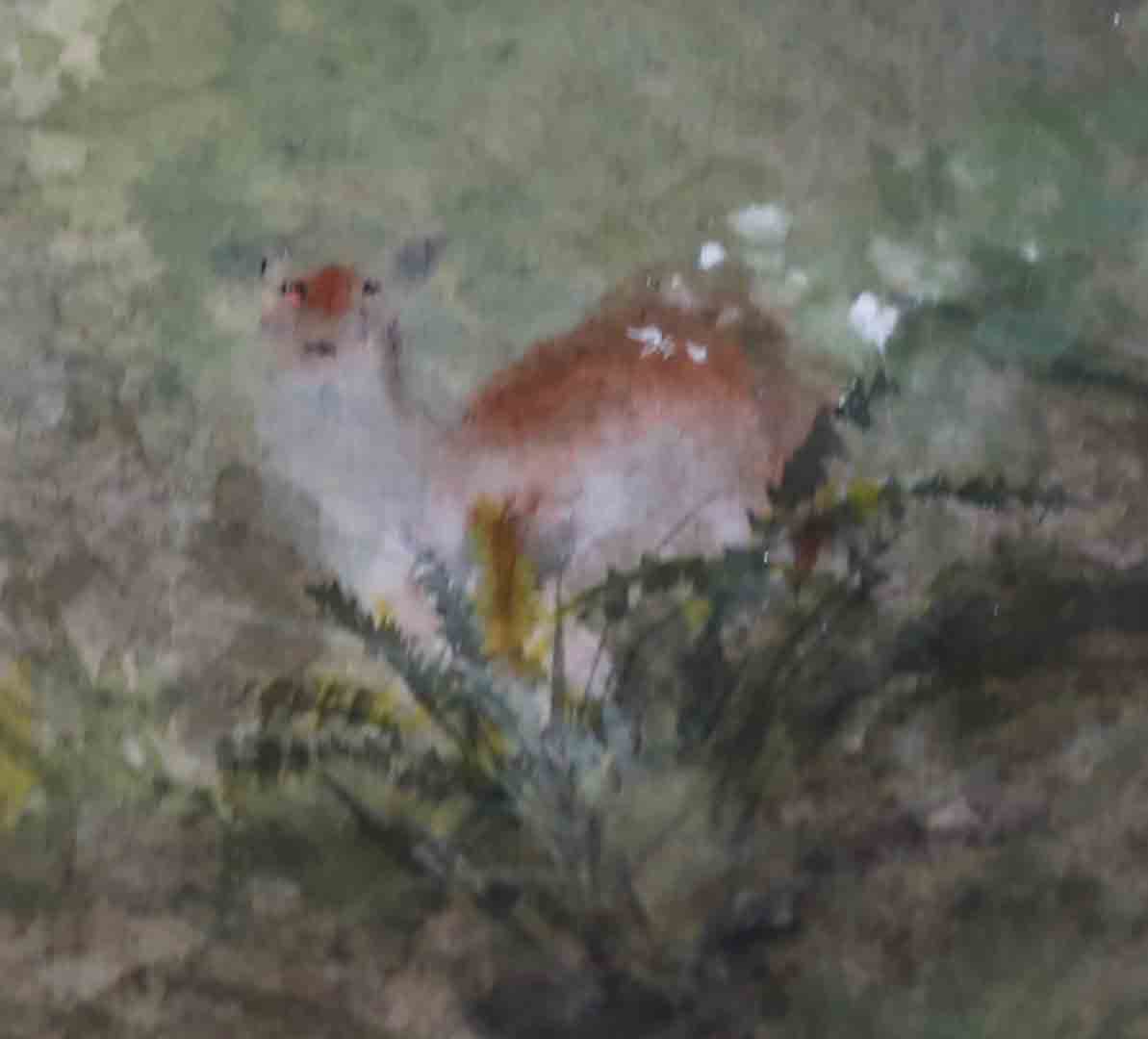
Then I decided to add a little interest to the work by painting in something dear, a Deer (bad pun).


Now it is time to do the top layer.  I put my translucent Xuan on top of the bottom painting, and begin adding in foreground information.

It didn't  take me long to discover a new problem.  What I was viewing through the top layer is not what it would look after the 2 pieces are glued together.  Gluing the two would have eliminated the air gap between them and illustrate the bottom layer much better.  In the mean time, I could only guess.

So I stopped and wet down the top Xuan, just to get a more educated view of the bottom.

 
I hoped to integrate the top layer better with the bottom layer.  I was hoping for a gradual transition from foreground to background.

Wanting to make sure that my deer is not so hidden, I re-painted it on the top layer for insurance.

 
This was how it looked when the 2 layers were mounted together.  While still wet, thus the color was more vibrant, and the paper seemed more transparent.


Then I found out what it is like when the 2 layers were misaligned by just a millimeter.  The eyes on the deer have migrated to the top of the head, instead of being lined up with the bottom edge of the ears!

Frantic reworking on the top layer solved that problem.

The painting lost some of its lustre after it was dried.


An application of gel medium brings back some of that color depth.


I was not too unhappy with the end result.  I wish I could have done a much better job on these trees.  Those are awful awful brushstrokes.  I forgot about "writing" them in and I am not proud of them.


I also realized that no matter how saturated the background colors were, they just don't show through enough to make a difference.  So for background information, it is better to be either succinct dark lines or large patches of color without intricate details.  I also discovered the color on the top Xuan really obscures whatever is on the bottom layer.  In order for the bottom layer to show through, I'll just have to have faith and do not embellish the top layer over the same spots.