Showing posts with label Beaverton Creek. Show all posts

Thursday, July 11, 2013

Beaverton Creek Vine Maple Trail ,continued

Not knowing exactly how the bottom layer will come out after it has been superimposed, I decided to err on the cautious side and painted in most of the scenery, except for the obvious foreground.  I also did this bottom layer with a more exaggerated tone.  My theory was that this way the bottom layer would reveal itself better.


Then I decided to add a little interest to the work by painting in something dear, a Deer (bad pun).


Now it is time to do the top layer.  I put my translucent Xuan on top of the bottom painting, and begin adding in foreground information.

It didn't  take me long to discover a new problem.  What I was viewing through the top layer is not what it would look after the 2 pieces are glued together.  Gluing the two would have eliminated the air gap between them and illustrate the bottom layer much better.  In the mean time, I could only guess.

So I stopped and wet down the top Xuan, just to get a more educated view of the bottom.

 
I hoped to integrate the top layer better with the bottom layer.  I was hoping for a gradual transition from foreground to background.

Wanting to make sure that my deer is not so hidden, I re-painted it on the top layer for insurance.

 
This was how it looked when the 2 layers were mounted together.  While still wet, thus the color was more vibrant, and the paper seemed more transparent.


Then I found out what it is like when the 2 layers were misaligned by just a millimeter.  The eyes on the deer have migrated to the top of the head, instead of being lined up with the bottom edge of the ears!

Frantic reworking on the top layer solved that problem.

The painting lost some of its lustre after it was dried.


An application of gel medium brings back some of that color depth.


I was not too unhappy with the end result.  I wish I could have done a much better job on these trees.  Those are awful awful brushstrokes.  I forgot about "writing" them in and I am not proud of them.


I also realized that no matter how saturated the background colors were, they just don't show through enough to make a difference.  So for background information, it is better to be either succinct dark lines or large patches of color without intricate details.  I also discovered the color on the top Xuan really obscures whatever is on the bottom layer.  In order for the bottom layer to show through, I'll just have to have faith and do not embellish the top layer over the same spots.

Saturday, June 22, 2013

Beaverton Creek Napolean

I can fondly remember the Napoleon ice cream in my days as a kid growing up in Hong Kong.  Strawberry, vanilla and chocolate flavors in pink, white and brown stripes.  The challenge was how to savor the treat for the longest duration before it melted away in the non-air-conditioned room.

I did the 3 styles of Beaverton Creek ( Beaverton Creek, Beaverton Creek Yellow, Beaverton Creek Classical ) to hopefully answer my own question; What is Chinese Brush painting.

I know I had discussed this topic in my last few blogs, I thought I would use these 3 pieces to illustrate my assertion.  The givens were, all three were done using Chinese brush and pigments on Xuan.


The most impressionistic of the 3 belongs to this one done in green.  The painting exudes a strong "feeling" that is abstract and yet tactile at the same time.  One can almost paddle the kayak through the water and be mesmerized.  Aside from the split hair and splash ink technique, it does not look very Chinese.  I'll submit this work looks more western than Chinese, despite Chinese brushes being employed.


There is definitely a lot more traditional Bi-Fa in the Beaverton Creek Yellow although the composition is not very Chinese.   It should be evident that the artist had  training in Chinese Brush landscape and uses "chuen" and contour lines to describe shape and topography.  Some of the lines depicting stalks and trunks showed center tip calligraphic characteristics.  So can we consider this one under Chinese Brush painting, even when its composition is identical to the top one?  Must a Chinese Brush painting look traditional?  When is this a "watercolor" as some might call it and not a Chinese Brush painting?


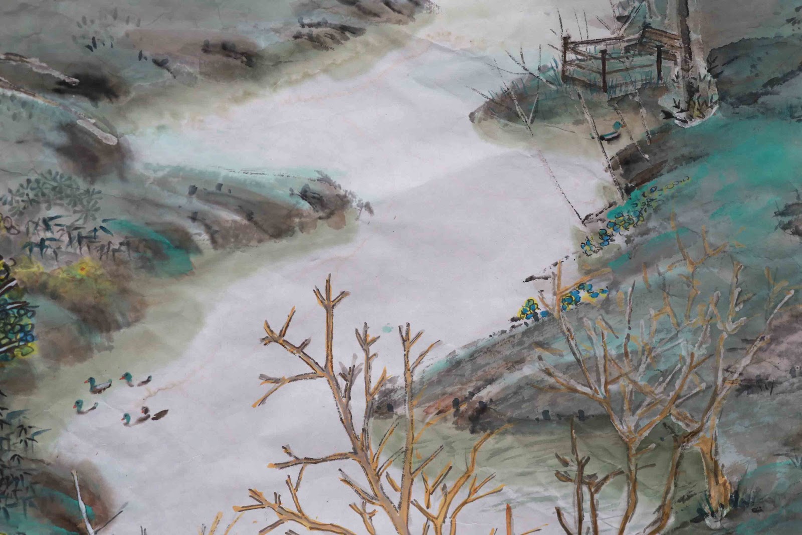
I am sure not a lot of people would have problem classifying this as a Chinese Brush painting.  So what is different about this one?

Granted the bridge was absent from the other two, but that does not make this more Chinese than the others.

We can't get very far from this discussion without addressing Bi-Fa again.  I still think this is the quintessential element in defining Chinese Brush painting.  One must show not only the presence, but the craftsmanship of the brushstrokes.  The traditional brush rendition of shrubs and shores helped to cement this in the Chinese Brush painting category.

We mentioned the Three Perspective concept in traditional Chinese Brush landscape paintings.  This work here employed all three.  The void space at the bottom of the woods in the distance added to the Level perspective.  The meandering shorelines and all the little details along the banks defined the Depth perspective.  Along with height described by the few stands of fir, one gets the birds eye view of Beaverton Creek; thus gently gliding over it, enjoying the little tidbits of information that each section gives off.

The composition falls within a classical doctrine..  a literal translation would be One River Two Shores.  The painting is dissected  somewhat diagonally by the creek, with contrast on both banks. Left bank is more densely vegetated, thus the Yang, The right side would be the Ying.   However the Ying side actually created conflict by harboring the attention grabbing pink trees. Leaves are present only on some of the trees, again creating contrast.   Complementing contrast is harmony;  opposite banks are linked not only by the bridge, but by tree trunks leaning towards each other, by the pink answering the blue, by sharing the ducks.

Although the painting employs many color, the overall feel is not "Su", or ostentatious.

I would not be so crass as to claim that I have thought of all these attributes before I laid my first brushstroke on this painting;  a lot of these points are anecdotal.  The fact remains that much thought has gone into these 3 paintings to raise a point, What Is Chinese Brush Painting.

Wednesday, June 5, 2013

Beaverton Creek (classic) completion

I know I have done a "what if" scenario by painting in pink leaves/flowers on the trees in the foreground using Photoshop; but that was before most of the incidentals were painted in and colored.
Now that I could see the finish line, I'm having second thoughts.

I am leery that pink might be too flashy.

There's only one way to find out.  I painted a couple of test swatches, one in pink and the other Blue Hue Three.


The blue looked nice and seemed to blend in well with the rest of the scenery.  Hence the problem.  It blended in too well and the painting looked ....uninviting.

The pink was uplifting and definitely grabbed my attention.  It worked well as a punctuation mark!  Now the fat lady sings!

 pink it is
 
The objects in the near ground were done mostly "boned"; with outline to give them a more defined, crisp footprint.  I tried to create the sense of a diverse and mixed shrubbery by punching up the color palette and painting in leaves of various species; avoiding the sense of total chaos at the same time.  Fortunately I've been to this place a hundred times and I had a pretty good idea in my head.  As one travels further back into the painting, the images became "boneless", edges were not well defined, and the color became more monochromatic.  I actually employed alum solution to help create the white margins around tree trunks.  This worked particularly well for objects in the distance, where a dark outline would be too crisp for the purpose and should be avoided.   I suppose I would call this alum technique as a "soft bone" technique.  Obviously this required planning;  the tree trunks were among the first items to be painted with alum.

The bamboo areas in the left midriff portion seemed a little flat.  I tried to paint in a few more leaves but that looked really cluttered and was concealing my brushstrokes, so I backed off.  I settled on selectively darkening certain areas to give it a lumpy look, to get  more depth in that cluster.


 bamboo treatment

The creek still looked too open ended for me.  I would like the bottom part to close off some more.  I also wanted to warm up the foreground somewhat, to subtly draw it out further from the background.  Harking back to Photoshop tricks, I decided to add a warming filter by painting a very diluted  and light yellow color over the lower half of the landscape, and the bottom end of the creek.  I was hoping the slight yellow tint on the water might work as a gradient tool to help narrow the creek somewhat.


 warming filter
 
I wish there is a way to retain this wet look.  There is so much more depth to everything.  Images just want to jump off the Xuan.

I decided to add a few ducks to this painting, or rather, to move them to different coves as compared with the original draft.   It seems like I couldn't do a painting anymore without adding a bird or heron or something.  In this case, that's what Beaverton Creek is all about.  A nature park in a city.

 ducks added
 
One of the things I like about this painting is that there are so many points of interest in it.
It invites you to explore each little snippet, to "read" the painting, as Chinese would say.
Some of these sections could stand in as a complete painting in its own right.


I need to hang this up now and  glance at it occasionally.  I'm sure something will come up for me to make corrections.


Monday, March 25, 2013

Beaverton Creek (yellow)

The last Beaverton Creek painting done in green was very impressionistic.  I liked it enough to build a canvas frame for it so that I could mount it a la Xuan-Boo style.

In the mean time I want to try my hands on something a little less wild, but still Xieyi.  The image I conjured up was a landscape bathed in a golden light.  Beaverton Creek, yellow !

 back of  Xuan


Again I mapped the landscape on the back of my Xuan.  This  process allowed me more freedom to flick my brush.  I could then concentrate on building up the painting  on the front side of the paper.

front of Xuan


My first step was to add visible branches and tree trunks to the scene.  I punctuated the highlighted areas with tips of branches.  I was trying to achieve the effect which I discussed at my "Visual Acuity" blog.  It is important to extend the exposed tips and branches down, at least in appearance, if not in physicality.  There is a saying in Chinese brush   "bi duan yi lian", meaning the  brush trek is broken up, but the meaning (spirit) still connects.  Sort of like driving down the freeway and using the dotted line to inform you of the virtual divide.  The extraneous branches and stems could be blended in very nicely with the split hair technique.


A few contour lines and hemp chuen  took care of the foreground, transforming a patch of grey into a bank with rocks and texture.


Looking at the rough draft, I noticed a white right triangle sticking out at the lower right quadrant of the painting.  Somehow there was a white line forming a vivid hypotenuse with the white branches.  This is most awful; especially when you are now aware of this flaw.


My remedy was to fill in the hypotenuse and turn it into a contour line.  I now have a more defined shore lobe extending into the water.


Right now this lobe seemed a little awkward, but I better stop now before I commit some knee-jerk changes.