Monday, February 16, 2015

Rehearsal

It's almost Chinese New Year.  February 19 is just around the corner.

I painted a horse last year to welcome the year of the horse.  The guest of honor this year is the ram.

I've been entertaining the thought of doing a painting for a ram.  This is not a subject that I've painted before so it would be fresh.  Luck would have it that I've been invited to do a couple of painting demos for school children, to honor Chinese New Year.  I'll have added incentive now to research my subject and embark on  the painting, except the stakes are  higher now.   I have to actually show that I could paint.

I seemed to have developed an affinity for phthalocyanine Blue.  That was the first color I reached for.  I sketched out a couple of rams in my scrapbook.


My emphasis will be on the posture.  The way the ram holds the head defines the painting.  However, I don't want to skim over the details of the facial features.  Perhaps I could paint a ram with attitude, if somehow I can grasp the expressions.


This is where I was having tons of problems.  Was I painting dogs.


How did the saying go; if you never made a mistake, then you've never tried.  After my incessant
giggling stopped, I began to analyse my mistakes.

The snout was too pointed.  I needed to make it thicker.

Time to get down to basics.  Stop being a cowboy.  I actually started to identify the components of a ram's snout.  I was sketching with a mission now.  The way I work around the problem was by creating a cylinder for the snout.  I could therefore control the diameter of the cylinder and made sure it didn't turn into a cone!


I also reached back to my high school days, when I was sketching animal skulls.  I do remember the strong  mandibles of  herbivores so their molars could grind up the grass they eat.


Feeling a little more reassured, I tried my sketching again.


I decided to break down the painting process into discrete steps.  Normally I am dead set against it.
I've met too many students and colleagues who would shy away from painting something just because they've never "learned" how to paint it.  I believe the fault lies in the system of rote learning.
We were taught to paint by memory, and not by observation.  It is my assertion that all these "How to Paint" books actually do more harm than good.  We become limited to, and by, these so called steps and this explains why most Chinese brush paintings look alike.

I suppose this is not the time to stay on my high horse.  I need to show high school kids how to paint a ram with a Chinese brush, within an allotted time frame.  Breaking the ram painting into discrete steps is the only way to get through it.


I would start out by painting the nose and the lips (steps 1 and 2).  This is followed by the 2 circles forming the two ends of the cylinder, or snout (steps 3 and 4).  Then we paint in the eyes, ears and the horns, and they all contribute to the spirit of the animal.  Finally how the ram carries itself, i.e. the neck and the limbs, speaks to the body language of the animal. 


It's time to make it bold.  I (the ram) mean business.

Wednesday, February 11, 2015

Banal Fail

I looked at my bastardized piece for a few days and I really didn't like that son of gun too much.
Since I couldn't possibly do anything more to hurt it, I whipped out my brush and started to paint in a flock of geese.  Migrating Canada Geese.


I was wrong.  I could make the painting worse. 

The painting now looked even more constrained, and trite !  It actually looked more like a snapshot than a painting.  Although I did not paint this from a picture, I still think it is a valid illustration of why one should never paint from a photograph.

I had to loosen up the painting somewhat.  Again I resorted to the titanium white.  I selectively blocked out some of the birds and a few valleys to take away some of the uniformity.   All these white-out moves unfortunately went against the grain of Chinese Brush methods.   I might as well be doing oil or watercolor.  The only thing Chinese about this piece was the calligraphic brush strokes of the geese; at least I tried.


I think I was able to loosen up the painting a little, but the caveat is it is still cliche.

Friday, February 6, 2015

Bastardization

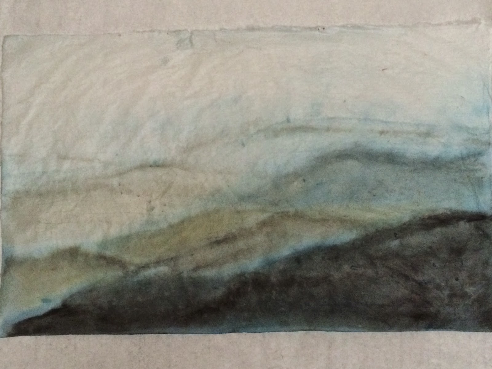
While still locked in the mode of describing those distant hills I saw while driving on the freeway, and having crusted wells of Prussian Blue along with Phthalocyanine Blue left over from the punting painting to consume, I decided to paint more hills.

The reminder I jotted for myself was simple; a dramatic fore/aft gradient and a  transition from warm to cold as the distance mounts.

Again I used the sized Xuan, keying on its tolerance to color moving and building.


After the color had dried, the painting looked very soupy. I must confess the thought of painting a dreamy landscape did cross my mind.  Perhaps not as featureless as my Glimpse painting, but nonetheless fluid.   But the rolling hills were too representational; I could not escape the realism.  The painting was begging for better definition.


Ahh, the foreground is better defined.  I also rearranged the contour lines a little.  They look less haphazard now.


I liked the way my color was bleeding from the brushstroke and I wanted to preserve those little tendrils before they are absorbed into the background. They resemble tree trunks poking out in the haze.

My hair blow-dryer came to the rescue.

The sized Xuan had a pinkish tint to it, especially against this blue theme.  My hills in the background could use a little toning down also.  I debated hard about using titanium white for this purpose.
I was taught by my first teachers to never use titanium white in landscape paintings.  Streams and rivers and clouds and mist are just virgin real estate on the paper.  I should never consider titanium white as a color.  The only exceptions were when mixing with other color to paint flower petals for example; especially the two-toned ones.  How dare I entertain such evil thoughts; first by using a hair blow-dryer, and now using white to mask colors? 

I am bastardizing the painting.


Time to say my Rosary and beg for forgiveness.  I had only good intentions.  I just wanted to experiment.

Now I shall be at peace with myself and see if I should commit the next cardinal sin of painting a flock of geese over this landscape.

Wednesday, January 28, 2015

A Glimpse

Every time I drove on the freeway I couldn't help but be fixated at the distant hills.

With the fog, the rain, and the decreasing daylight, the details on the hills were trying their best to be revealed.  It was just a silhouette a moment ago, but serendipitously pupils dilated and my rods and cones sprang into action, and my visual cortex interpolated the shadow into features and details.  I suppose this is how I would define soul.

I could see the branches and leaves floating in the swirl of  darkness, shrouded in haze, against a clearing in this otherwise featureless veil.  I was having tunnel vision.

I began by recalling the tree branches and the hilltop.  I used dots instead of discrete lines to denote the pixels.  I was trying to make them discreet.


I attempted many layers of different colors, hoping for a well blended body with hints and punctuations of amorphous features.


For my color, I used dabs of gamboge, phthalacyanine blue and ink and I sat them on different edges on my plate.  I did this so that I could freely mix those 3 in any combinations and obtained a continuum of colors.  This is almost like a living color chart, continually evolving and changing depending on my mood.   The technique could be used most effectively on a small scale; to be used extemporaneously.   I wouldn't do it if I needed a large quantity of a given color.


I then began to paint in the veil of darkness. 


I was trying to achieve the effect of extreme vignetting, with most of the 4 corners darkened.  This is where I lost my resiliency.  Perhaps I've spent all my patience building up all the pixels for the hilltop!  I felt the urge to hurry.


I did not take steps to build up my haze.  I miscalculated the wet Xuan.  I over compensated for the eventual saturation of the ink.  I was getting streaks instead of a haze.  These must be the wrinkles in the veil that I failed to see.


After copious dousing with my brush wash, I was able to hide the flaws and render them less obtrusive.


I started out by painting a well defined scene that I recalled but as the process went on I found my focal point changing.  As I became more involved with the painting, my desire to reveal concrete objects became a backstage  to portray a certain feeling.  I was drawn in more and more by that yearning for a bright spot in this desolate landscape.  For all I care it could be ET parting the dark sky and motioning for me to come home.  I felt a strong urge to hide the physicality of the painting and just go for the guts, literally.  I showed my painting to my acquaintances and almost all were trying to find the representational aspects.  Were you painting a sea?  You were painting reflections in water!

I suppose I succeeded in confusing my audience, yet I failed to deliver the basic sentiments. Would it help after make it wear the label " A Glimpse"?

Tuesday, January 13, 2015

Continuing to act out

Fueled by the recent attempts to romanticize  lotus root harvesters, I re-examined the martial art figure paintings that are pinned on my walls.  I now wanted to create a series of figures.  Not in the vein of the hazy silhouettes of the long-polers, but more like a staged presentation, a group exercise.

Strike the iron while it's hot.

I was trying to avoid the flat line arrangement  by grouping my figures in a semi-circle. Using various clothing combination and shades of  black to break up a otherwise monotonous composition.  I even threw in a female figure in the center for good measure!  She looked almost like a man suffering from gynecomastia, with a horse tail hairdo pinned on.


I don't dislike the painting.  I thought I was able to parlez a sense of movement.  A sense of energy.
Then I realized that my proportions were out of whack.  The figure on the left had too big of a torso, the man next to him looked weird.

My figures didn't carry any hidden symbolism, as the right hand of David purported to. I've seen sketches by fashion designers that really accentuated the waist, the bust, or the limbs.  Was I subconsciously exaggerating particular scales to emphasize certain gestures?   Perhaps.

So I decided to rein in my imagination a little by trying another set of martial art forms.    These new figures were a lot smaller.   By working on a smaller sample, I felt the inevitable urge to be a little more precise, even at the expense of being too logical. 


The arms on the third man from the left was still too long.   But I really liked those long flowing lines.  Such grace.

So what should it be.  How should it be.  Am I allowed certain latitude when painting human forms  or do I have to demonstrate my knowledge in anatomy in order to paint human figures?  In traditional Chinese figure painting, the images were all flat, devoid of any semblance of a three dimensional projection, devoid of any shading.  Does the fact that I am using a Chinese brush on Xuan mean that I have to paint in the traditional style to merit the resulting work? 

Food for thought.

At the end of the day, I am painting for my own amusement.  Yet painting involves exposing myself a little; taking emotional stock,  and I can't do that in a vacuum.  I do react to people's feedback, I'm not immune to that.   I do believe, however, that if a painting moves me, it has to move someone, somewhere.

Friday, January 9, 2015

Push Pole Brigade ( Brushed Line version)

While still digesting the last painting, I decided to do another version, with more emphasis on lines.

For this I used a paper that is normally reserved for calligraphy. I had not used this particular brand before but I was game.  This paper has a slight yellowish tint to it although one can't tell from the picture.


I had intended to go on, but somehow the void on the right stopped me.  I thought it was interesting.  I just wasn't sure where the focal point should be. 

Let me ruminate on that.

I decided to jazz up the dark values such that the audience is drawn deeper into the painting.  I also filled in the background with more shadows; semblance of more figures.  Nothing too drastic, but now I can sense where the punch is coming from.

Thursday, January 1, 2015

Push Pole Brigade (Punting for Lotus Root)

Happy New Year !

I was lounging around and caught a documentary on lotus root harvesters.  That is a job I could never do.  There were times that I had to put on my waders to repair the banks along the creek behind my house and I was totally exhausted in 5 minutes trying to free my feet from the mud.

I was impressed with how poetic it seemed; heading out in the waking morning, traversing the waterways to the lotus pond, pushing off the long poles to propel the sampans, gliding.


I suppose it would be poetic only if one ignores the imminent hard labor.  Still I pretend to be in the company of fellow harvesters, forming a queue, pushing off, anticipating the bounty, day dreaming a little in the early dawn mist.


I chose to use a rather dark Prussian Blue/Ink combination.  I thought ink alone would be too subdued.  I would use different tones to expand the spatial relationship's.  I wanted to present the objects against the light, for a silhouette effect, and using the different orientations of the long poles to add interest and direct attention.

I brushed on some darker color onto the closest subject, for a better contrast.  Using a clean brush and clean water I moistened a thin margin around the outline so the color/ink would migrate out a little.  This was done to avoid a harsh outline presented by the overwhelming dark patch.


The alteration added drama to the first edition.


Lets all forge ahead and make this a successful new year!