Friday, February 2, 2024

Water and dragon

I am running out of time to carry out my tradition of doing a painting for the Chinese New Year.  I do that for self amusement and I also render the painting into a digital greeting card so I can send it out to my friends and family.  Eventually I hope to have a collection of all the 12 Zodiac animals.  

Dragon is the protagonist for the upcoming New Year.  I am reminded of an old saying that proclaims "the water doesn't need to be deep; it will have spiritual energy if a dragon resides in it"  "水不在深, 有龍則靈".  Thus I am ruminating my thoughts around that theme.

Obviously the first thing is to try and paint water.  My hypothesis is that the dragon would be fierce, and it is not going to be doing a free style swim, but more like a butterfly stroke.

So the water should be splashing and churning. 

I am trying to augment the void spaces by drawing in white lines using a white gel pen.


I am not liking it.  Too contrived.

So I am using a little more restraint and patience and also using a rather dry brush to try to work the void spaces now.  I am trying to learn from the last attempt.


So a dry brush is definitely the way to go.  I can control the bleed much better to control the shape of the voids.  I do get the sense of waves crashing.

How about a little color and attitude?  Just go for broke?


Thursday, February 1, 2024

Family Zodiac completed

Finally I wrapped up on the Family Zodiac project.

Whether the finished product has artistic value or not is beside the point.  I'm sure it appears to be utilitarian or commercial, but the appeal of the painting is in its meaning.  Obviously I am prejudiced since I understand the nuances.

So the painting follows the doctrines of I Ching, where Tai Chi produces 2 Instruments, represented by the Dragon and the Snake.  The 2 Instruments produces 4 Images, comprised of a Rat, a Rooster, a Hen and a Baby Ox.  These 6 animals happen to be the constituents of the family I am doing the painting for. 

The Snake is fashioned in the shape of the word Loh, our family name, in cursive.

The cosmic swirls emanate from the two complementary/opposing energies, modeled with the proverbial Tai Chi or Ying Yang insignia.  In the swirls one finds a purple haze.  The significance of the purple haze is that it represents imminent auspicious events.  


The recipient of the Zodiac painting is a Rat, thus I was going to print my New Year Rat painting on a piece of white silk as an added memento.  Unfortunately I didn't know what print setting to use so the color came out awful.  I grabbed my brush and color and painted over the printed areas.  That was fun and was easier since all I had to do was to cover up the dreadful colors.  I decided to use gold acrylic for the writing instead of ink.  This actually reminded me of the practice of photo saloons coloring black and white portrait photo prints in the old days.  Perhaps I could find a job doing that.  


Just as I was going to close the books on this project, I remembered that I had made a seal for myself in the past; a toy chop if you will.  I had a friend whose hobby was into clay and ceramics and she had her own electric kiln.  I used some of her clay remnants and fashioned a seal for myself.  It showed the Big Dipper housed in a hulu gourd.  The gourd is omnipresent in our culture, not only as a vessel for storage, but also as a symbol of medicine and an extractor of negative energy.  In short, it is an auspicious object.

For the astute Chinese readers, the seal that I use for a lot of my paintings says 大熊 (great bear).  My dad named his children after the stars in the Big Dipper, the Ursa Major; so we all borne the name of a star in the Ursa Major.  Fortunately my dad did not have more than 7 children.  My siblings and I were all addressed as bears ( as in Great Bear constellation) as a way of endearment.  Our legal name was strictly for the school and government use.  Hence the significance of my using the Big Dipper as a seal.  I am paying homage to my dad and my family.


With the inclusion of this seal, the painting takes on a new meaning and significance, for me anyways.  In the grand scheme of things, I trust it is fitting for using this seal, since we are dealing zodiac topics.  In a backhanded way however, you can accuse me of manufacturing some bravado to an otherwise vapid piece of work;  perhaps.  


Wednesday, January 10, 2024

Rooster and Hen

Happy New Year!

My family zodiac painting still needs two more inhabitants to complete, two chickens.  In Chinese zodiac, the translated word should have been the gender non-specific "chicken", and not "rooster" as what is popularly referred to.  I suppose the "Year of the Rooster" sounds better than "Year of the Chicken" in the western society.  In this particular case, there happens to be a male and female chicken in my family zodiac.  

As in the case of the Rat, I've done a painting of the rooster for the Lunar Year of the Rooster, so I proceeded with not much planning or plotting.  Perhaps it was more like uninspired; I had done this before. This was not my first rodeo, right?


I kept looking at this and I really didn't like it.  There was something wrong with my painting but I couldn't put a finger on it.  It was just a feeling. 

Perplexing!

Today the fog finally lifts.  My rooster looks frazzled.  

The tail feathers just don't look right.  The brushstrokes of the black feathers are nowhere near the quality of the lighter brown ones.  They look thin, dry and malnourished, like the hair of someone afflicted with terminal illness.  Definitely not befitting a proud rooster.

I'm trying to recall the way I painted those black feathers.  I recall that I was really concerned about the silk that I was painting on; it didn't disperse nor allow bleeding like a normal piece of unsized Xuan paper would.  I was also concerned about the backing paper might separate from the silk itself, since I had absolutely no prior experience with this craft "silk" and I didn't know how much abuse by wetness it could take.  Thus I was using a brush that was perhaps too small and too dry for the required brushstrokes.  The result was a bunch of overlapping black streaks, each brushstrokes attempting to hide and modify the previous one.  They were very different from the blades as described by the brown ones.  I was no longer "writing", but sketching! Compare the black brushstrokes with the brown ones, and my analysis should be quite evident.  

I am hoping this can be ameliorated by using a bigger brush, and better ink.  This requires some bold moves on my part.  I am using the "blackest" ink in my inventory for this attempt.  This is an ink that I normally shun, due to the "shine" it imparts.  It gives the brushstroke a glossy finish.  Maybe I can exploit this, as heathy feathers are shiny?

I am also pre-wetting the destined brushstroke with a clean wet brush first.  I am hoping that the wet track would make the subsequent dark ink flow a bit, perhaps bleed a little, so that it is more in line with the Xieyi style of Chinese Brush. 


Much better!  That's more like a rooster.  More forceful and calligraphic brushstrokes, and there are actually natural areas of voids or lighter ink within the brushstroke, thanks to the pre-wetting by the clean wet brush.  The brushstrokes are now alive with nuances, and no longer just dead markings. 

Onward with the Rooster's partner, the Hen.  Having enjoyed some success with correcting the Rooster, my brushstrokes enjoy a moment of unrestrained zeal.  They appear and feel much freer, with more aplomb.


I am so happy that the straight-on perspective turns out to be sufficiently convincing.  


Here comes the Hen.


Tuesday, January 9, 2024

Water


I did something quite different with my "tedious project", and that was trying to paint with a Gongbi style workflow.  That involved drafting a copy of outlined objects and then filling in the blanks with color.  That tedious project had to do with reflections and ripples in a duck pond.  What made that particular project tedious and perhaps unique ( different from your typical everyday Gongbi style paintings of birds and flowers ) was that my painting had a mosaic appearance to it.  Quite impressionistic to say the least.

So I am going to visit that format again and try my luck.  With nothing but ripples this time as my subject matter.  I am hoping to digitize if you will, the analog experience of constantly shimmering ripples.  Forever morphing and yet appearing so orderly as to be cavalries swarming across the surface.


I am starting out by defining the bright areas of the water first.  Typically these are the fronts of the ripples.  Thus these areas might seem random but they actually remind me of U-shaped staples arranged in rows.

There are going to be tons of these bright spots and I really don't want to confuse myself by all these wriggly lines.  After 5 minutes of this I could no longer distinguish which areas are bright and which are dark.  To help my ailing cognitive brain I am cheating by filling in the dark areas as I go.


In a typical Chinese Gongbi style painting, the quality of the brushstroke for lines is of utmost importance.  They need to be evenly applied, like the gold rims around a fine china plate or cup.  My brushstrokes here really do not pass muster.  My excuses are that I am preoccupied with the expressiveness of the shimmering water, and I am eager and anxious to lay down the next piece of the mosaic before I lose my train of thought.


So there is order in my madness.  The red lines in the following photo show my perception and identification of the ripples as they dance on the water. 


This is more tedious than I have anticipated.  Time to pin this up on the wall, allow myself some distance from this mess of untidy lines and reassess this project.

Saturday, December 2, 2023

It sank; "Necessity is the mother of invention"

This blog doesn't have much to do with my paintings per se, but rather to document of how to mitigate a problem that shouldn't have happened in the first place. 

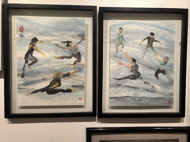
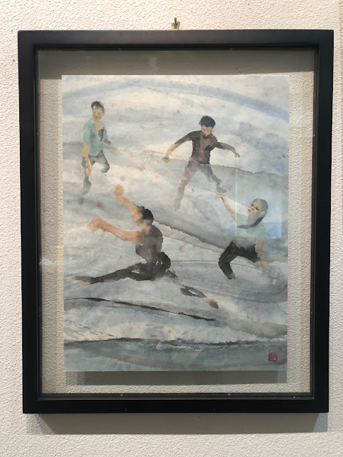
The 2 pieces of paintings of dancing movements, which I had mounted in a float presentation are ready to be on public display.


I had alluded to my various attempts to try to circumvent the visibility issue of the hanging wires and finally settled on using clear fishing lines, hoping that nobody would notice them, or at least not mind.

Well, I was wrong, and I am wrong.

The curator takes one scan, just a glancing look, and says "Those lines got to go."

"So I have 2 D-rings on the back of the frame, perhaps you can use 2 wires to suspend the frame?"

"No!"

"Sawtooth?"

"No!"

"Why not?"

Perhaps the curator is thinking of the hammered in sawtooth clips to have such reservations about sawtooth hooks.  Whatever the reason, this is almost universal now for art venues to demand that accepted pieces must be ready to hang, and no sawtooth hangers are allowed.  Along with no Styrofoam peanuts as packing material.  

I can sympathize with the nuisance of dealing with styrofoam peanuts, I've chased a few errant peanuts myself, but there are sawtooth hangers that are screwed-in, and they should be as sturdy as D-rings, especially if the correct weight rating is adhered to.  But, what do I know.  I'm only guessing.  

So I try to enlighten myself on the internet and see if I can find pertinent information regarding what ready to hang means.

"Ready to hang means that artworks must arrive with a suitable hanging system attached. This includes fixings such as “D” rings with cord or picture wire strung between."

My mission, should I accept it, is to fashion a device that is sturdy enough to hang my float and is hidden from the front view.

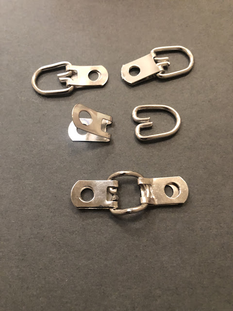
I am trying to make my hanging "hook" out of the existing D-rings.  Perhaps this is one way to associate my homemade hook with the well accepted D-ring, so there is no second-guessing. 


I am using two tabs to latch onto the "D" ring itself, such that it is kept secured and locked in at the center position.  I am bending the "D" ring at the vertical midline to make room for the hanging hook.
For all this to line up in a geometrically correct position, I am crimping one of the attachment tabs to accommodate the round side of the "D".


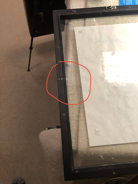
I am making a note of the center of the frame.  This is where I am going to locate my homemade "hook".


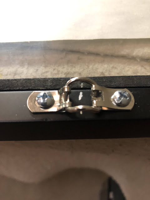
After careful positioning of the tabs, screws from the original D-rings are used to secure the homemade attachment contraption. 


No more visible hanging wires!


I am now using a smaller hanging hook on the wall, such that the hook itself is hidden from view.


I must admit, this is a cleaner and more professional look!

The takeaway from this experience is that I should have known better.  Despite my efforts of trying to make the float paintings "float", I was still cutting corners by using fishing wires as hanging wires.  Obviously the only person fooled was myself!

It takes a third party, someone who can decide on the fate of these two floats, to object to the fishing lines to nudge me to not accept anything that is less than "acceptable".  I've come to appreciate the saying "necessity is the mother of invention" even more.

Thank you, curator!


Friday, December 1, 2023

Will it float?

It is time to frame my two pieces of gesture paintings.  These are paintings done on thin, delicate, translucent Xuan paper so I really to to present them in a float format.  And I have just the frames for them.  Perfect.

But then I become concerned about the steel hanging wires being visible through the clear border of the float piece.  The wires would be very distracting, taking away the ambience I am trying to attain.

Perhaps I can compromise by attaching the painting to a similarly thin piece of translucent Xuan paper, such that the paper would obscure the hanging wires, and the translucent paper will still give off the air of a float piece?  Semi-float piece?

Without thinking it through, I trim off a piece of the translucent Xuan paper the size of the glass and attach the painting to it.  I am using a hobby heating iron used to attach skins to model airplanes to smooth out the wrinkles and creases on the paper.


 I meticulously cleaned my glass with denatured alcohol and microfiber wipes.  


Only to see this when the painting is sandwiched between the two panes of glass.


There are visible wrinkles forming on the translucent Xuan paper!  The paper is too thin and delicate to withstand the clamping of the cover glass.  A heavier piece of paper or cardboard would have definitely solved this problem, but I won't be getting my float or semi-float presentation.

I should have known better.  Years ago I committed the same mistake, but the excuse then was I was short on time, and not at a place where I would have resources to mitigate the problem.


I've seen the same snafu at the office lobby of our local Chinese/Asian attraction.  They displayed a piece of un-mounted Chinese painting sandwiched between 2 pieces of glass and it was awful.  My grandma had smoother skin than that piece of paper.  This is not an acceptable way to present Chinese works of art or culture.  

Obviously I cannot bear to see wrinkles on my own piece of work.  I should have thought it through more thoroughly.  

Back to square one, a real float it shall be.  I shall use clear fishing line for hanging wire and hope that it is not too visible, especially if the lighting is done right.


Now that I have the two pieces displayed side by side, I think they might work as a diptych?


Saturday, November 11, 2023

Rat and Baby Ox

I have done a rat painting before for the Year of the Rat.  I had a rat climbing over a red square Fai Chun with the Chinese word "Blessings" written on it.  Obviously the tone was to show the coming year as an auspicious one because the person in charge, the Rat, has found blessings.  My emphasis was also on the posing of the rat, being cute and all that, finding a ledge to clamber onto the piece of paper with writing on it.  

For this family zodiac project, I am hoping to pose my Rat in an appealing light; smart and inquisitive.  My rat is not going to be timid or secretive.  My rat is poised to explore, to sniff out the surroundings; showing confidence and ready to accept a caressing on the head.  Definitely not something you want to vilify.  Perhaps I am reminiscing about the white mice that my son kept when he was little.  

Painting this rat is pretty straight forward.  I am roughing in a general shape of the animal, paying attention to where I want the eye to be at.  They say the eyes are the windows to a person's soul, the same applies to the rat.  If I can paint the eyes successfully, then nothing else matters.


Using pink to denote the ears and the digits and the nose helps to give reference to the different body parts.  Small dabs of Chinese White bring out the highlighted areas.  Once the mouth is defined, I have the posture of my rat nailed.


Filling in the eye and adjusting for dark values make my rat more "real"?


Putting on whiskers and starting to grow hair on the body of my rodent.


A tiny dab of white becomes the catchlight on the eyeball, and makes all the difference to the spirit of the animal.  It really feels alive now.

Moving on to the next featured character in this project, the baby ox.  I am going to model my ox with the head turned back, to give it movement.


I am lightly sketching out the animal with a pencil, delineating darker values with an ink brush along the way.  This helps me to form a better three dimensional picture of my subject.


I am going to color with my Tea color from a tube this time,  and not from my tea cup as I inadvertently did before. 


I am using Chinese White to help with the highlights again.  Just as I was abscessed with the sternocleidomastoid muscle of Rusalka when I painted her, I am intrigued by Achilles tendons of the ox and I am trying to document them.


My baby ox has a little attitude.  My ox has a tongue sticking out of the mouth.  Could be a playful gesture, could be a satisfying suckling.  Either way it adds interest to a otherwise stoic, academic interpretation of the zodiac animals. 


I am half-way there!