Friday, March 30, 2012

Should My Paintings Be Explained ?

I went to an exhibition of  a relief print artist. 

The images were all haunting.  They told stories of  roaches and leeches coming out of  body orifices.
Behemoth rising from the cracks of the earth.  Mythological  beings in acrobatic convolutions.  They struck me as schizophrenic.

My artist friend who is well versed in print making was appreciative of the techniques, the composition and color choices, and was intensely curious as to the meaning of these works.  Inevitably our conversion evolved to whether our works need any explanation?

Painting for me is a form of self expression.  I am using my brush and paper as my tools of communication.    As I utter my words this way,  I am shielded, in most cases, from face to face contact.  I get to verbalize in my privacy, and the viewers do their viewing in theirs.  This added insulation allows me the opportunity to disclose what I would otherwise be reluctant to.  Therefore artists perhaps feel protected, or at least are more willing, to portray troubling, perhaps even socially unacceptable thoughts????

I can't help but be reminded of a movie that I saw, "NEVER LET ME GO".  In this movie a lover couple thought that their love for each other could be substantiated by the guy's art work.  If they can prove there existed true love between them, then they could find a way out of their predicament.  So they went to the gallery curator and asked for affirmation, only to be told that they couldn't be extracted from their fate.   However, what the curator said was even beyond what they were seeking.  What was said was (paraphrasing) " we don't want to reveal your souls, we want to see if you have souls"

For my very limited exhibition experiences, I've always attached  a description to each piece of work.  Sometimes documenting my techniques, but more often, my thoughts.  Some of the  artists that I've encountered really frowned on this idea.  To them, any explanation is a desecration of their work, or that such explanation limits the viewer's imagination and therefore sets unnecessary boundaries and preconceptions.  So what happens when we assign a title to a piece?  Aren't we guilty of suggesting?  If one is true to this belief, then all works should be labelled as "Untitled".

For my piece "Lonely", people would recognize that as a dark painting.  Perhaps the silhouetted images  elicited an accord with viewers.  Need I tell you what my thoughts were?


I had the following write up on my description.  Hints of blue adds to bleakness of a cold, moon lit night.  Birds have settled in for the night, silhouetted against the emptiness as a lone wolf  howls to the moon, begging for company.  Did that help to paint a more succinct picture?  Did I barge in on your elucidation?


For my blog on "PAIN" I alluded to the circumstances of creating this painting.  Certainly the title of "PAIN" helps to channel the viewer to that particular frequency.  But now read the captions that I had placed on the label of this painting and feel the painting again.


PAIN
Is drinking by yourself
Is to be alone in a crowd
Is voices
Is faces
Is inexplicable
Is not able
To find me.

Was my explanation adding to or taking away from your impression ?   From my perspective, as the person who created these pieces, I do relish the idea that my viewers and I are on the same page sharing the same emotions.  I, for one, would not scoff at the idea of explaining my works.

Of course this becomes a moot point if we practice the 3 Perfections  of  Chinese Brush Painting, i.e. the painting, an accompanying poem  and the calligraphy of the poem.

Thursday, March 29, 2012

More Than Just Broken Lines

I touched upon the topic of continuous lines (contour) in my last blog.  I wanted to discuss the curse of a continuous line in Chinese Brush painting, especially when spatial accounting is necessary or preferred.

We often hear brush artists mention that continuous lines suffocate;  that the painting  "can't breathe".  In my "Don't Cross Me" blog I talked about how to remedy lines that intersect.  Intersecting lines take away the spatial arrangement of our painted subjects.  Continuous lines tend to foul in the same manner, burying the presence of any third dimension.    Demand for such reveal is critical, for example in landscape paintings.

In the following illustration, the letter E written with continuous lines look flat.  Two dimensional.
The adjacent E was written with broken lines, strategically placed, and now assumes a three dimensional feel.


In the next illustration, the far left image shows 2 overlapping circles with no spatial definition.
The middle image clearly shows which circle is on top, whereas the image on the right adds a dimension of depth to our visual clues.  The gap between the 2 circles creates a thickness.  We are more apt to perceive these 2 circles as the top and bottom of a cylinder.  The "gap" technique is evidenced by the separation of ridge contour lines by space disguised as cloud or mist, thus pushing back the ridge tops in succession, creating perspective.


Finally I have an illustration of 4 circles, analogous to the 4 geese I was trying to paint in my last blog.


The right image on top row does clearly denote which circle is covering which, but the image on the second row has a strong suggestion of depth;  all because of the broken lines.  This image can "breathe"!

When I was painting the geese, I was so hung up on the blank bodies and fuzzy outlines that I had totally forgotten about the basic premise of rendering lines in Chinese Brushwork, and more specifically, how to render depth and relationship between subject matters by just paying attention to writing lines.

To break or not to break, that is the question.

Wednesday, March 28, 2012

Have I Cooked My Geese ?

Having tried my hands at modeling my geese as animate objects, I wanted to present them in a more impressionistic light.

My initial impression was obviously to play up the black and white content of my subject matters, but I wanted to treat the bodies of the geese as my void spaces.  Therefore the background needed to be dark to reveal the bodies.


As I looked at the first draft, I immediately felt that the painting was TMI, too much information.  It is true that the strokes were haphazardly written, as I was formulating the construction as it was evolving,  nonetheless the only "impression" I perceived was "garbage".

My vision had gotten a little clearer.  I would like to frame my subjects in

a. A dark background
b. A white body
c. A distinct black and white neck
d. A fuzzy, ink bled lines of the body contour to suggest down feathers

These geese would be sleeping with their heads tucked back.  My premise was that I would have a contrast of a few teardrop bodies vs one such body, the Su (sparse) and Mi(crowded) contrast, and that the necks would be tucked in opposing directions for balance.


Notice that I added blue tint to the contour line to add a little flavor.

Working off this basic blueprint, I tried on a less heavy costume.  My background became a much smaller patch of gray, but I used pencil marks to accentuate the geometric forms of geese with their heads tucked back.  A more minimalistic view.


And I also tried different arrangements, with the bodies painted in.


I was not too thrilled with the results up to this point.  I blamed it on my brush techniques, and a lack of control of my ink bleed.  Being a resourceful person, I tried the unthinkable.

A quick trip to the local art supply, I armed myself with a charcoal pencil and a bunch of charcoal sticks.  For the next couple of weeks, I fretted about how I was going to proceed.  Finally it came.


I did everything ( save the neck  ) with charcoal.  The necks were done with brush and ink and the contour lines was gone over with a moist ink brush to fill in the gray and was allowed to bleed a little. 


The painting was interesting.  That was a polite way of saying  " ah, not that good ".  I would have like the lines to be quite a bit  fuzzier to animate down feathers.  Unfortunately that wasn't the only problem that ailed this painting.  This piece assumed too much of a "graphic" look.  The worst part was that all the contour lines were continuous and unchanging, a big no no in Chinese brush painting, where Bi-Fa is all important. ( I'll delve more into "continuous lines" in my next blog).  I tried to break up these chained lines by darkening the necks and the lower bodies such that a break was more noticeable in the continuum of patches. 


Well that didn't work so well.  Back to the drawing board.


That was my last attempt at my impressionistic geese.   I need to sleep on this for a while and see what happens.  I can't feel anymore.  I just hope that I haven't cooked my geese.


Monday, February 20, 2012

Beyond The Horizon

Having laid down a few of the flight postures of the Canada Geese, it is time to mate them to different backgrounds.

The first concept I wanted to explore was the natural habitat of these migrants; the wetlands. 

I did not want to paint blades of reed grass, nor did I want to do reflections on water.  Especially the water, I thought it was passe and run of the mill.  Besides, it did not fit well with the soaring birds.

I decided on doing a bunch of nondescript vertical strokes as the vegetations in the wetlands.   I tried to avoid packing the strokes too tightly together.  I made sure that I had voids amongst my strokes for "breathing".   Alum solution was used to paint the initial few strokes.  This worked as a resist and altered the absorbency of the Xuan.  Subsequent overlays of colored strokes would reveal voids occupied by the initial alum brush strokes.


I also used a rather stiff horse hair brush to facilitate the texture.  I kept the color light and not saturated to contrast with the dark birds.  I wanted to really separate the geese from the background to give the illusion that they really are airborne.

What ended up was a  painting with a horizon dividing the Xuan into 2 equal parts.   I suppose my replay of the wetland horizon was so overwhelming that I committed the cardinal sin of  halving my Xuan.


My color scheme for the ground reference was on the light side, so the halving was not real obvious.  Unfortunately once I noticed it I could not take my eyes off of that.  Reminded me of the time a lady sat across from me on the subway with a big boil on her exposed neckline.  I knew I shouldn't be staring.  Yet the harder I tried to not look at it, the more I ended up looking at it.

So how could I remedy this?

It was suggested maybe I could paint a tree to breakup the horizon.  I didn't like it because it took away the sense of free flight.  Somehow the geese seemed to be tethered to the tree.


Another suggestion would be to perhaps add other points of focus/interest to breakup the symmetry.  In this case, bright colored dots sprinkled strategically on the ground reference could divert ones attention to the dividing line in the middle.  This is the same theory behind the application of "moss" dots commonly employed in the floral or landscape genres.


I tried to accentuate certain parts of the grassy foreground to add layers to the composition, and to allow the sloped contour of these layers to dilute the effects of the bisecting horizon.


(The correction is still wet, thus effects are exaggerated)


(Same painting after correction, when dried)


Of course the simplest way to deal with this problem is to crop the painting such that the horizon no longer occupies  the mid-line.

Monday, January 30, 2012

Geese In Flight

Feeling a little more confident about the brush strokes involved in painting Canada geese, I ventured to do something on a larger scale.  Armed with a large and a medium size brush, and sheets of 4 ft. Xuan, I went to work.

Goofing around on scrap paper is one thing, but trying to paint something for "real" is another thing.
I've told myself a million times, it's only paper..........go for it.............the waste basket is only a few feet away........I could always practise my finger tip release and see if I could create a back spin as the wad of Xuan flying  towards the can.  Only to freeze up when I perceived that something might be at stake.  Fear of failure!  I can only blame my parents, my teachers and any one who dared to place expectations on me.

Anyways, here are the results.


My next challenge would be to incorporate these into a background.


Friday, January 13, 2012

Goose Me More, Canadian Style

Happy New Year!  2012 is here, let us all stay healthy, body and mind.

I want to start the year off with a flighty agenda.  No, nothing capricious, just trying to pick up  painting Canada Geese again, from where I left off last year.

First allow me to show you an image below:


Before I would comment further on this image, let me also show you a picture that I captured:


As part of my new resolve, I decided to get out more and observe more.  Around Oregon there are innumerable parks, preserves, wetland habitats to keep a person busy all year long.  I decided to take advantage of what the state offers.  This crisp winter morning at the Jackson Bottom Wetlands, I inadvertently came up on a Canada goose and the startled bird took off without uttering a single word.  I was pretty quick with my lens and captured the above picture.

I've been trying to document the neck and postures of the Canada geese, but so far my renderings had been of the static variety.  As I said before, it was the black and white contrast of the bird, and the feasibility of depicting the bird as a calligraphy character that intrigued me.  This is the first time that I am attempting to study the bird in flight.


What struck me was the simplicity of the form.  A V-shaped pair of wings anchored on a bowling pin with black neck and a white band.

We start out with the body,

The neck is a combination of strake A and stroke B.
The letter V describes the wings:


With that interpretation of the bird in flight, and the picture as a reference, I attempted to create my
Chinese Brush painting of the Canada goose.


This one looks like a sea plane;  I had placed the V-assembly too high on the body.


Here is a rendition of the bird with wings in the down stroke.


So what is the deal with the first image I posted on this blog?

If you look closely, you could see pencil tracings on the Xuan paper.  I did that deliberately to illustrate a point.  That painting had a perfect image, a perfect likeliness because I traced it from my photograph.   A few dabs of the brush to delineate feathers and walla.....a Chinese Brush painting of a Canada goose.  This is something that
a person who has gone to the Dark Side would have done.  A stenciled drawing filled with a few half hearted brush strokes passes off as an attempt at Chinese Brush works.  Instant gratification.

It is my sincere hope that by posting the 2 versions of painting, that you will agree with me that there is no quick shortcut to this art form.  There is something tangible in Xieyi brush painting, however subtle that might be.  The energy is just not quite the same when we trace.

Speaking of birds from the North, I had the pleasure of a Tundra Swan (Whistling Swan) visiting my place.  I had mistaken it for a snow goose but thanks to the United States Geological Survey, I learned otherwise.  I am posting the video here for all to see.

Thursday, December 29, 2011

Silent Protest

This pond would have a dwarf weeping cherry tree and the Heron would come and stand next to it.  Perhaps the bull frog season has ended, the Heron did not find much to stuff through its long neck.  The creature just turned away from the water and chose to face the Dwarf;  motionless, whilst the wind whipped up its chest feathers, betraying its presence.


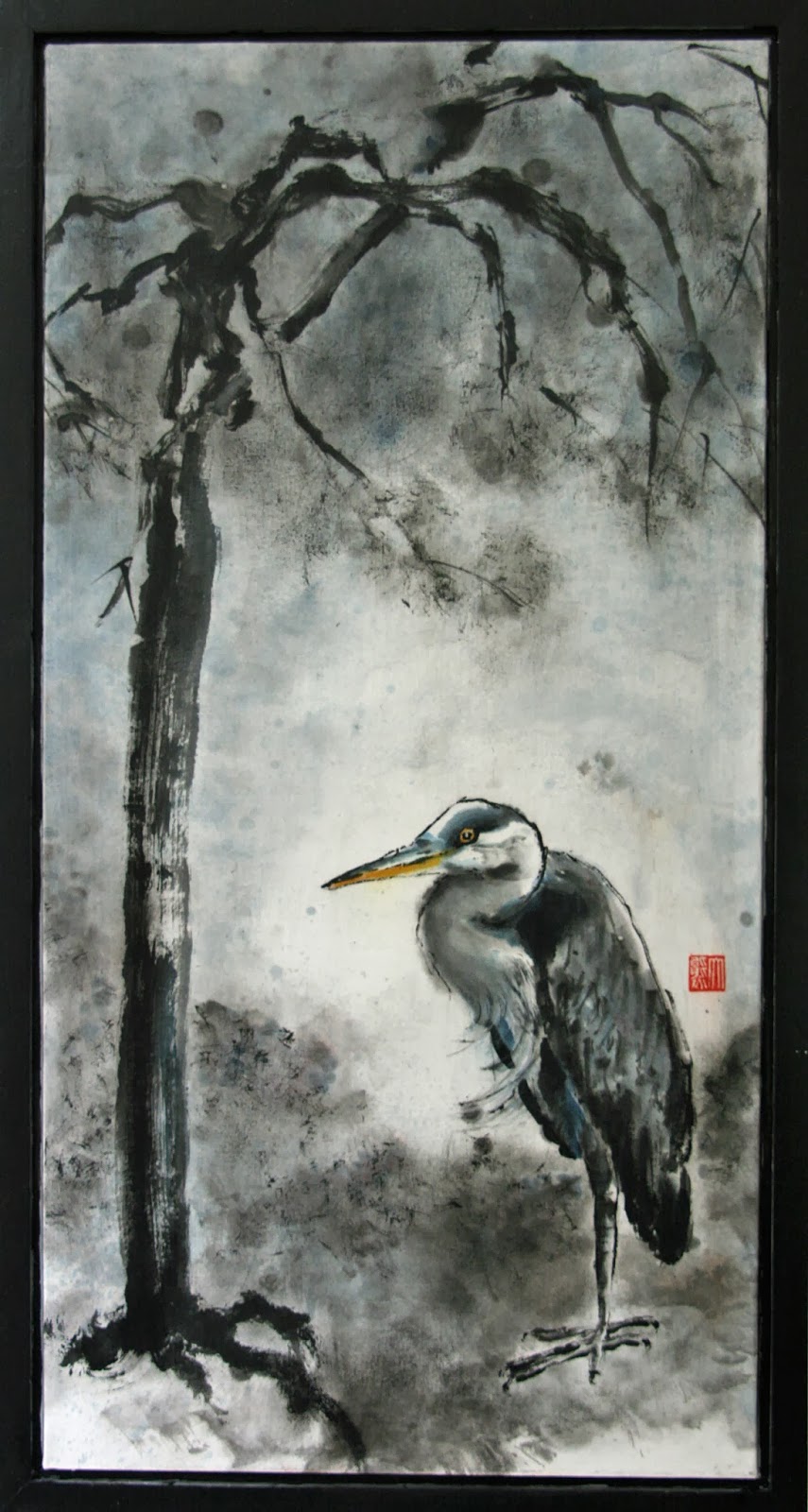
 I gave the title "ODD COUPLE" to this painting.

The painting was done in a cold tone.  I tried to do the neck as a single brush stroke but I failed.   It took several passes to get the shape down.  I was hoping to write the neck as a reverse "S".  The feathers were side tipped brush strokes.  I used a rather dry brush to begin with, intended on bringing  out the texture of the feathers but the resulting bird was too harsh.  A moistened brush dabbing over the original strokes took care of that.  The outline of the bird was done broken style.  A continuous smooth line would resemble too much of the Gonbi style and would render this "motionless" heron "dead".

The dwarf weeping cherry on the other hand, was made to look menacing.   The clawing branches and the exposed arthritic roots seem to mock the heron.  There is a tension between the 2 subjects.  The tension is not of an overt hostility, but a muted resolve of c'est la vie, que sera sera, whatever !!  The heron has sought solace from an unlikely source.  The tree can't just get up and walk away.  It is what it is.  How often do we find ourselves in this predicament, an uneasy acceptance of our fate?

I was a participant at a bazaar for arts and crafts, hawking my paintings at a ridiculously low price ( so I was told ).   It was a juried event and I applied as an artist doing Chinese Brush Painting.  This venue labeled me as a Sumi-e artist on the program.   Granted my works do use ink and wash, but I am not a sumi-e artist, especially when I did not label myself  as such.  What is the big deal, you might ask.  Let me put it in this perspective:  A Chinese is an Asian, but not all Asians are Chinese.  What's scary about this ordeal is that the event was sponsored by an art school as a fund raiser.  Imagine how that  school would teach Asian art?

So how did the art form that originated from China ended up being labelled here as sumi-e?   When I was looking for teachers for my Chinese Brush Painting, I came across our local cultural center, whose putative mission was to bridge the cultures, and it offered classes in Spontaneous Chinese Brush and Elaborate Chinese Brush.  Obviously I was confused.  Fortunately I could read Chinese.  What the center meant to advertise was that it offered classes in Xieyi and Gonbi styles of Chinese Brush.  I objected vehemently to this advertising and was told that the non Chinese would not understand Xieyi or Gonbi.   So how do we bridge the east and the west?  How do we bridge any culture if we can't even be honest with ourselves, by calling a spade a spade, instead of saying an implement shaped like a flat scoop with a long handle used for digging.  My suggestion was to stay with the proper nomenclature Gonbi and Xieyi, and put(  Elaborate Chinese Brush ) and (Spontaneous Chinese Brush ) in brackets.  Exposure is everything; we must allow people the opportunity to be familiar with and start using the proper terminology.

Do we translate proper nouns?  Would anyone attempt to translate President Bush other than phonetically?  Likewise we would not allow Chairman Mao to be translated as Chairman Hair! (Mao means hair in Chinese)

When China changed the nomenclature of Peking to Beijing, she asserted to the world that she wants the world to address her as she would address herself.  Peking was probably the  result of some foreigner trying to emulate Chinese pronunciation of Beijing.   At first I was led to believe that this was pidgin English but later I understood pidgin English was something else totally.  Yet during the last Olympics many of the news anchors from  the U.S. ( some of them well known national personalities ) while doing the broadcast in situ , would insist on pronouncing the simple "J" sound in Beijing as a "J" sound in  French "bon jour".  These anchors must have known in their daily contact with the locals and yet they insisted on their assumption.  The word Beijing meant "North" "Capitol".  I am glad that it was not translated literally and only phonetically.   When we insisted on calling Chow Mein by its proper name, people learned to accept it for what it is, just as they accepted crepe and baklava.   Unfortunately us overseas Chinese, especially those of us in the States did not have the spine to insist on calling our fried rice as Chow Farn, thus allowing us to be the butt of the joke for saying  "fly lice".  I, for one, refuse to believe that Chinese could not distinguish "B" and "P" sounds, or that we are deaf to "R" and "L" sounds.  My belief is that we are afraid to "stir up" trouble.  We don't want to make a mountain out of a mole hill.  We were taught to not offend others.  After all people do get the gist of it, so why insist? 

At the bazaar I overheard some Asians telling their western friends to ignore my booth because my "stuff" was "not Chinese" and they were really "not good".  Obviously mine were not museum nor gallery pieces, but neither were any of the other artisans.  Perhaps my pieces did not fit the stereotype?  Did tramping on a fellow Asian elevate us to be more sophisticated and savvy or did it expose our own insecurity?   Would I have felt the same betrayal had the people saying that were not Asians?  For the price I was asking for, my works were real bargains, but that really wasn't the issue.

For my town of half a million souls, the population is innocently naive when it comes to Chinese Brush painting, or at least most of the fellow artists that I had dealt with are.    Words like sumi-e and kanji are used generically sans ill will, just as Google had enjoyed the transformation from a noun to a verb.   People are eager to show that they know something of the eastern culture but stumbled in their quest because they were never told the truth.

So there is this feeling of injustice, insecurity and ambiguity in me.   Should I continue to voice what I perceive as inaccurate or just tolerate with a patronizing smile.  Should I allow myself to be casted as a sumi-e artist doing spontaneous painting on rice paper?   Need I worry that if I insist too strongly then there might not be a role for me to play at all, because the public would have perceived me of having a "bad attitude"; to coin a favorite corporate  Management verbiage.   The fact that local Chinese restaurants that serve Chinese food have few Caucasian clients and the Chop Suey joints here have no Chinese customers speak volume for my concern.   Perhaps what I am serving up on my Xuan-boo is chop suey??

I blame this outburst  on the holidays.  I am told that people are a little moody around this time of the year.  .  I should know, I am a pharmacist.  I must be the Grinch of the X'mas.  Could it be I am just suffering from SAD?  Better up my Prozac dosage, and in the meantime I'll protest in silence.

 Let it be, just let it be, uttering under my breath.

HAPPY NEW YEAR