Tuesday, July 11, 2017

Adding Human Interest

It has been two years since I finished my Shadows painting (Chronicle Of Shadows) and it is still pinned on the drywall in my studio.  I normally would either mount my paintings or just throw them in a pile as my etudes.  In that particular blog I used the term epilogue, thinking that I had written the last chapter on this work and I would close the book.

Little did I know.

After two years of casting occasional glances, ruminating on the vibes of the painting, I am convinced that the painting needs dressing up.  My playing with light values and casting shadows was fun, a lot of fun.  Now it feels almost anti-climatic.


Isn't it time to smoke a cigarette?  Wink! Wink!  Ah but I've severed my friendship with tobacco!

I need to add some human interest to this painting.  I am thinking of adding a jogger, a couple, someone, on the path.

I must confess that I had entertained this thought from the very beginning.  I have this one artist who eschews cliche and would chide me for being "redundant" as I recall.  Having people on the pathway is so mundane.  Is it?  How does one decide what is vapid and what is "just right"?

It must have been a broadcast on public educational channels that showed neuroscientists employing transcranial magnetic stimulation (TMS) to study how our brain deals with art.  Aside from a neuroaesthetic response, there seems to be a neuromotor response also.  Thus an image of a runner elicits a response from the area of the brain that controls our legs, though no physical movements from our own legs ensued.   We literally immerse ourselves in the picture.  Being a pharmacist with some biomedical knowledge, this topic intrigues me.  It would be interesting to study the different kinds of responses when we are subjected to various genres of subject matters.  Does ethnicity, culture and social economics have a say to which areas of the cortex is activated?  Why do some of my friends find a visit to the Grand Teton boring and others jubilating.  How is our preference of one thing over something else arrived at?  Does it have anything to do with dopamine, the neurotransmitter that is associated with pleasure; or oxytocin, the chemical that causes uterine muscle to contract amongst other things, and bonding.  So if we avoid something, is it due to an inhibition in these pathways?  I'm way off the subject now.

I suppose I should not be taking a reductionist point of view.  There are things that cannot be defined by a formula;  how and what we paint is one of them.  Beauty is in the eye of the beholder.  Now this is definitely cliche!

I decided to include a girl walking her dog in my Shadows painting.  Putting a person in the painting is what I call adding human interest, literally.   I now need to find out where's the best location to insert them.  I summoned the help of my clear vinyl sheet.


With that I have freedom in moving the subjects around to find an optimum size and location.  I started out by painting the girl and her dog on this clear sheet and placed it over my painting.


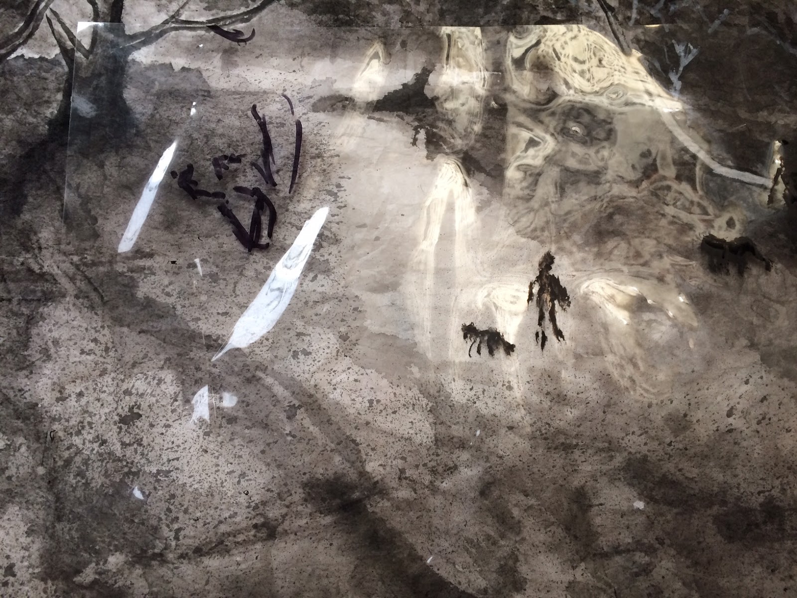
I added a different sized silhouette to gauge the fit.


Then I moved my clear sheet to a different location to decide


I finally decided to put them at the bend next to the edge of the path.  I particularly enjoyed how the dog's tail was serendipitously pointing towards the out swung hand of the girl.  A connection was made.  Whether the dog was leashed or not would remain an enigma.  To define that further would be trite.


In the end I assuaged my indecision whether to add the pedestrian by going off on a tangent with some logical excuses perhaps, but mostly by just painting it.  Perhaps the Shadows painting has lost its initial appeal and I can afford to take no prisoners the second time around?

Sunday, June 18, 2017

Han Shi

Using the light ink version of my home spun Te, while paying emphasis on the visual clues from a printed version, I started the do my calligraphy on the Han Shi poem, with a proper calligraphy brush this time.

As I had discussed in the last blog, I was hoping that by having the light ink to trace with, I could be devoting one hundred percent of my attention to the quality of my brush strokes.  I was trying to cheat a little bit by not having to internalize the piece as much.  Though I would not deny nor negate the merits of that pretense, I found myself fighting the tracing.  The emulation turned out to be a comprehensive process, and I was over-thinking and plotting it, hoping that I could do a better job by splitting the task into smaller components.  Even the mundane effort of emulating and copying was not able to escape the inevitable  deviation  and personal interpretation of the archetype.


The following is a photo of the original Han Shi poem


One might say that I did an ok job in the emulation, but the persona of the piece has changed from a taut, chiseled and rhythmic piece to something that is languid and impassive,   as if a steeplechase athlete had turned into a middle aged office worker.

Aside from the overall presentation of the piece, I was also critical of the quality of my brush strokes. I still did not have a good command of my edges and my brush tip.

Here is an example of employing side-tip instead of the center tip.  The uneven edges betrayed my incompetency.  The sharp edge on one side vs. the rough edge on opposite side of the stroke is a tell tale sign for a side-tip blunder.


Here is an example of tracing for tracing's sake

I seemed totally lost with this word.  I seemed more worried about following the track than putting the brushstroke down with my own will.  Wet noodles is how I would describe my brushstroke!

Here is an example of a nice center-tip execution.  There is uniformity on both edges of the brush stroke and the character looks stalwart.


There is an ongoing debate amongst my friends as to whether non-Chinese reading people are better students at Chinese brush calligraphy.  The notion is that if one cannot read Chinese, then the calligraphy is pure graphic to that person, allowing that individual to appreciate and examine the calligraphy in its purest and fundamental qualities.  As for someone who reads and writes Chinese, that person has been exposed to and perhaps developed a habit of writing in certain styles and nuances, therefore a lot of the finer details in the brushstrokes are overlooked.  This person already has a preconceived notion of what that word looks like, and is not always congruent with the Te that is at hand.

I submit that Chinese calligraphy requires an interpretive component.  When we refer to such calligraphy, especially the ones that are good enough to be passed down as Te, they are not trivial recipes or shopping lists.  Often times they have historical relevance and importance in literature.
This Han Shi Te is a prime example.  In this poem the writer Su Shi wrote of the riveting disposition that he was in and screamed out the injustice and abandonment that he had to endure.

When we look at the piece as a whole, we can see that the font size is irregular, as is the spacing.
The fonts got bigger and bigger as Su wrote from right to left, especially with respect to certain words.  The red circled area shows a distinct enlarging of the fonts, perhaps signifying the increasing drama in his thoughts as he proceeded to describe the dilapidated abode that he had to endure.  The font size became huge when he wrote about the  broken stove (blue circled area) that he had to cook in.  He was pissed.


The characters with a downward ending stroke all showed exaggerated elongation and terse extension of the brushstroke ( circled in blue).  This is the same as a sharp, long stroke on our "p's", "y's", "g's" etc.   These could likely be Su letting off steam with these straight, forceful downward strokes; since they are not followed by another stroke.  Su seized on this opportunity, consciously or subconsciously, to discharge his pent up emotions.  These long strokes were his lightening rods, discharging.


I am just pointing out the fact that if one does not read Chinese, then one is missing out on the emotional aspect of this work.  One would be missing the phrasing, the fortissimo, and the fermata of the composition.

Now lets take a look at the overall presentation.  The irregular spacing and font size added to the artistic quality and gave this piece its character, especially when one takes into account its content.
The energy, or chi,  of the piece derived not only from his expertise with the brushstrokes, but perhaps with the inadvertent display of irregularities, thus illuminating his state of mind.

I did an experiment with the help of digital manipulation and rendered all the fonts approximately the same size and the long downward strokes shortened to normal length.  Inexplicably the piece lost its spirit.  It is now a deflated balloon.


Such is the magic in beautiful calligraphy.  It emanates not only proper brushstrokes, but a composition, contrast and proportion, like a painting.   It radiates a scholastic mettle.  It helps if one could read it.

This has been a fun exercise.  I can always find useful means to exploit my practice pieces.  They sometimes end up as window cover for the skylights in my studio.


Saturday, June 10, 2017

Lost

I've been avoiding the brush; avoiding most everything for that matter.  I still can't accept the fact that she's gone; the person who gave me life.  Not when it was so sudden.   I am desperately trying to find a way to unclog my head.  There are too many cross talks.  I just don't know how to organize my thoughts.
'
I'm not trying to fill a void, it's just like there's less meaning to all the things I do now.  It's difficult to imagine a grown man was still motivated by the thought of the "NEED" to hand in "Home Works".   I suppose the simple act of turning in some piece of work suggested not some sort of  an accomplishment, but it was a way to show the I was doing fine, and nothing in my life had altered my routine.

To help me get back on the horse I decided to go back to calligraphy, to a piece that I had studied in the past.  The beauty of revisiting this study is that it is familiar and I just need to follow and emulate the Te, and the circumstance of this piece of work is meaningful.

I am referring to the work of Han Shi Te by Su Dongbo.

Han Shi ( Cold Food Festival ) is a festival that falls around the time of Qingming Festival ( Tomb Sweeping Day).  Qingming ( April 4th or 5th) is a day to show respect to ancestors, thus tidying up the tomb site  and offerings of food and drinks and incinerating paper money (currency of the underworld ) are traditional practice.

Legend has it that Han Shi (Cold Food Festival) was ordered by an ancient Emperor as a redemption for his horrific mistake.  The Emperor was seeking the service of his friend, who did not aspire to fame nor glory, and avoided the Emperor by vanishing into the woods with his aging mother and entertained a life of simplicity.   In his infinite wisdom the Emperor decided to force his friend to reveal himself by setting fire to the woods,  subsequently causing the death of his friend and his mother.  In his remorse, the Emperor decreed that no fire or burning was allowed for 3 days.  Thus there was no way to cook and food had to be consumed cold, hence the Han Shi Festival .

Su Dongbo (Su Shi)  (1037-1101)  was a famous calligrapher, poet, foodie and a statesman of the Song dynasty.   He somehow angered his Emperor and was banished to a remote place.  During his exile he held a post in name only but received no stipend, thus was living in poverty.  One could only imagine the smorgasbord of emotions that he had to endure.   Shrouded in the shadow of injustice he wrote the Han Shi poem, where he referenced the Han Shi Festival as a means of noting the seasons.  His calligraphy Han Shi Te  hence became one of the gold standard for studying the walking style of brush calligraphy.

He wrote about the incessant cold rain and the dilapidated hut he dwelt in was like a boat in a rising torrent .  He was trying to cook on a broken stove with wet hay and only sensed  it was time of the Han Shi Festival by noticing that birds were carrying incinerated paper in their beaks.  He was far removed from the central administration despite his continued desire to serve and he couldn't even fulfill his duties by observing the Qingming Festival.  He talked about how all the blooms had wilted  and fallen overnight, perhaps drawing a parallel of his own fate.

What made this poem famous was the picture it portrayed of the desolate bleakness of his emotional state.  What made this piece of calligraphy astounding was the air it exuded, of the author's anguish, frustration and longing, by means of the irregular font size and spacing and the different ink tones.  His was not your typical calligraphy piece.  It was a testament to his circumstances.

I reacquainted myself with this piece by performing the usual ritual of shadow writing; following the brushstroke in my head and analyzing how each stroke was shaped and delivered.  My first job was trying to emulate his brushstrokes.  I started to copy his writing.


My next goal was to emulate the whole piece as a complete organism.   I would try to gauge the spacing, the ink tone and the rhythm in the script.  I tried to find the punctuation, the phrasing of written passage.  I needed to sense where the fermata is, which words were pizzicato and which words should be treated like legato; to borrow a few musical terms.  Perhaps I was over-analyzing or was being pedantic, I found myself hesitating with my brush edge and pressure.  I found myself  already arriving at the end of the brushstroke and I still wasn't able to form the correct shape.    This was like a novice horn player having difficulty with finding the correct embouchure, causing  the notes to come in late or drag on for longer than intended.

I devised a method to combat that.  I thought I would write in light ink first and my emphasis would not be on the quality of my brushstrokes, but rather on the placement and the relative size of the words.  I could thus start the emulation with less pressure, by dealing with the more graphic aspect of the project.  My intention was to re-trace my light ink with the proper brushstrokes, done to the specifications of Su Dongpo.  I was eager to see if this plot would work.


To help ease my trepidation with this emulation, I chose an old brush that somehow survived 18 years of abuse and really was not fit for calligraphy.  I figured that would help me to not place too much emphasis on the quality of the brush edge and pressure etc. but to seek out the spacing and the form of the whole piece.  I was treating this work as a painting or sorts.  I spotted the position of the columns of  characters by creasing the paper along those lines.


Somehow I mis-calculated the numbers of columns I needed and the words did not fit into the original places.   I tried another piece, and still managed to omit the last column ( where Su titled his work).   Is there hope for me?!


To be frank, I wasn't disappointed with my efforts, so far.  The brush strokes actually were not that bad.  They were free and energetic.   I think the fact that I was using an old brush and all that gave me an excuse to fail, thus taking off a lot of pressure from me.  Such was my psyche.   I wished perfection right off the bat, and I had to will myself to be not so demanding.  I was my own worst enemy!   I was always so uptight about everything that I just couldn't relax.  I recall that I used to bowl a little bit and my scores were always hovering around 100.  After a couple of beers I could come near 150.  The score would fall back to 100 as alcohol left my system.  My bowling score was an uncanny indicator of how much beer I had to drink!

Anyways my next step would be to use a good brush and attempt to do "real" calligraphy by tracing my light ink.  Hopefully I could now be paying more attention to the brush edges and pressure, and not so much in the form and spacing.  That is my intention anyways.

Tuesday, March 28, 2017

Emulating, Copying

The rote learning tradition of Chinese brush painting required most of us going through the repetitive process of practicing the fundamentals, Ji Ben Gong.  We learned how to use the brush, manipulating the tip and the edge, techniques evolved from brush calligraphy.  The old reference book Mustard Seed Garden provides loads of information on how to arrange and paint different subject matters, and gives examples of the different styles, stemming from different dynasties and assorted artists. To hone our skills and to put these examples into practice, we are often required to emulate or copy works from famous masters.

We benefit from such excursions only if we pay critical attention to the various aspects of the masters' paintings, and how they relate to the examples in Mustard Seed Garden.  Otherwise it's an exercise in futility. Worse yet, we will be repeating our mistakes without knowing it.

Recently I encountered a student's emulation of an old landscape painting, probably of the Song circa.
I was very surprised when the instructor piled heaps of compliments on this exercise because as a student of Chinese brush painting, I felt that student totally missed the boat.

I didn't think the student understood what all those lines represented.  I had posted in my past blogs about the contour lines of the mountains as being thin vertical slices of the structure, as if we were looking at a series of a CT scan of the mountain.


Here are some typical examples of classical brush landscapes


There were too many scalloping on the contour lines ( circled red ) and the flat platform showed no reference to the edges ( circled blue ) and obviously the trees were haphazardly placed.  Jagged undulating lines were mistaken for little mounds.  I refuse to believe for one minute that the original looked anything like that.  I thought this was a searing example of illustrating our bad habits; blindly copying without understanding.  Either that or I was using a different yardstick.


I thought I would take a picture and compare that with the original for more research and the instructor blocked my capture with a hand, stating that I needed permission from the student for my picture taking.

I was at a loss; confused and startled.  The instructor would have no second thoughts about making photo copies of copy righted material and yet was being so adamant about my taking a picture of what I deemed as a bad case of copying? Taking a photo of a copy of a copy elicited ire!   God help me.

I rather enjoy the landscape works of Zhang Daqian ( 1899-1983 ).  His bold use of color and the splashing technique was refreshing for me.  Unfortunately he was also known as a supreme forger.  Anyways it is his craft that I wanted to study.

I decided to emulate a snippet of his LuShan Painting.  This painting is interesting in that Zhang had never set foot there.  He composed it purely from imagination and experience from other places.  I chose the semi-sized Xuan for the ease of  floating colors.

I started out by sketching with charcoal and painted in the tree trunks using alum mixed in with a base color.
I needed the alum to help define the body of the trees, even under the cloaking of the leaves.  It works sort of like a resist does in watercolor.


Using light ink, I wrote in the tree that was not colored in the original painting.  The fact that Master Zhang left this tree untouched was interesting, as if he wanted us to see his creative process; this along with the faint sketch lines he made of trees and contours towards the upper middle part of the painting.  I also utilized the light ink to loosely dab in the shaded areas of the precipitous, making it easier to identify the tucked in areas.


I then began the arduous task of writing in the leaves on these trees, paying attention that there were different styles of leaves, as pertained to the mixed woods canon.


A base coat of color was applied to form the hills, and the various ledges and flat tops, also delineating the folds along the flat top edges and the little trail that led to the bottom flat top.


Accumulating layers of color and Chuen strokes to render texture to the landscape.


Applying Lotus Leaf Chuen to the hill on the left, adding reference to where the trees were sprouted.  This simple technique helped the viewer to perceive that the trees grew not out of a  straight line, but rather, a mass that had a top surface.  It added to the dome shaped top of the structure.


To summarize, I paid attention to the following attributes when I decided to emulate this piece of work:

1. mixed woods presentation of the trees
2. naked, exposed, tenacious roots, and suggestion of a broad root system even on distant trees
3. how to preserve the tree trunks as discrete voids
4. relationship of the roots to the land, how the trees are anchored
5. the edge and folds of the flat tops, and their relationship to the precipitous
6. the roof tops behind the tree line for Depth Perspective
7. the addition of Lotus Leaf Chuen to help modulate the otherwise two dimensional hill ridge
8. the continuation of the land mass as represented by the sketch lines to the right of the trees,    dissolving into the ambiguous background, lending so much more virtual space to the ambiance

It was a fun exercise, and hopefully I retained some of the knowledge gained.

Wednesday, March 22, 2017

One thing leads to another

For my Chinese brush painting demonstration I also showed how to paint traditional roof tops.  Again it was the repetitive pattern of the roof tiles that intrigued me in the first place.  I deem that a fun way to practice writing lines.  Through my research, I found these single camel hump like roof line, which interestingly enough, is considered to be in the Wood Element.


What I required of myself was that the lines be discrete, yet loose.  I needed the lines, especially the tiles, to be expressive.  I didn't want them to appear to be pre-fabricated.  I wanted the hand-laid appearance.


Thus I decided to get serious and attempted to paint for real


I also tried a more impressionistic look, one that is comprised of broad dabs arranged in a geometric fashion, suggesting roof tops in a village.


Saturday, March 4, 2017

Lines

I'm interested in creating something with lines primarily.  I just can't get away from the lasso of representational forms, even as I am contemplating an image that is strong in graphic nuances.
What comes to mind is a setting of reeds shooting straight up from the water.


I start with the backstage, laying a row of lines as the spine, hoping to develop from that skeleton.


The straight lines look a little too austere for my taste, so blobs of ink are also applied, to break up the
pattern.

In the end I can't resist the urge to put in some shading, to suggest the water surface.  Like I said, I have difficulty in producing something that resembles a simple graphic design.


In a way this exercise is not unlike my attempt on "Finding my roots".  They all started with a premise of lines, and the relationship amongst them; although this one wears a much lighter cloak, in thought and in appearance.