Sunday, August 28, 2011

Multnomah Falls Again?????

It is one of those days, hot and muggy.

As I picked up my feet and placed one in front of the other, dodging the red dragonflies that had wandered into my path, I kept counting, almost audibly to myself, the numbers of switchbacks I had taken.   It was a steep and steady climb, perhaps the grades were too much for my silvery brows, they were soaked.    Breathe easy, I told myself.  Stick your chest out, can't let other people see me panting like a dog.  The sign said 11 switchbacks to the top, and I made only 4 so far. 

The familiar lapping sound nudged me onwards.


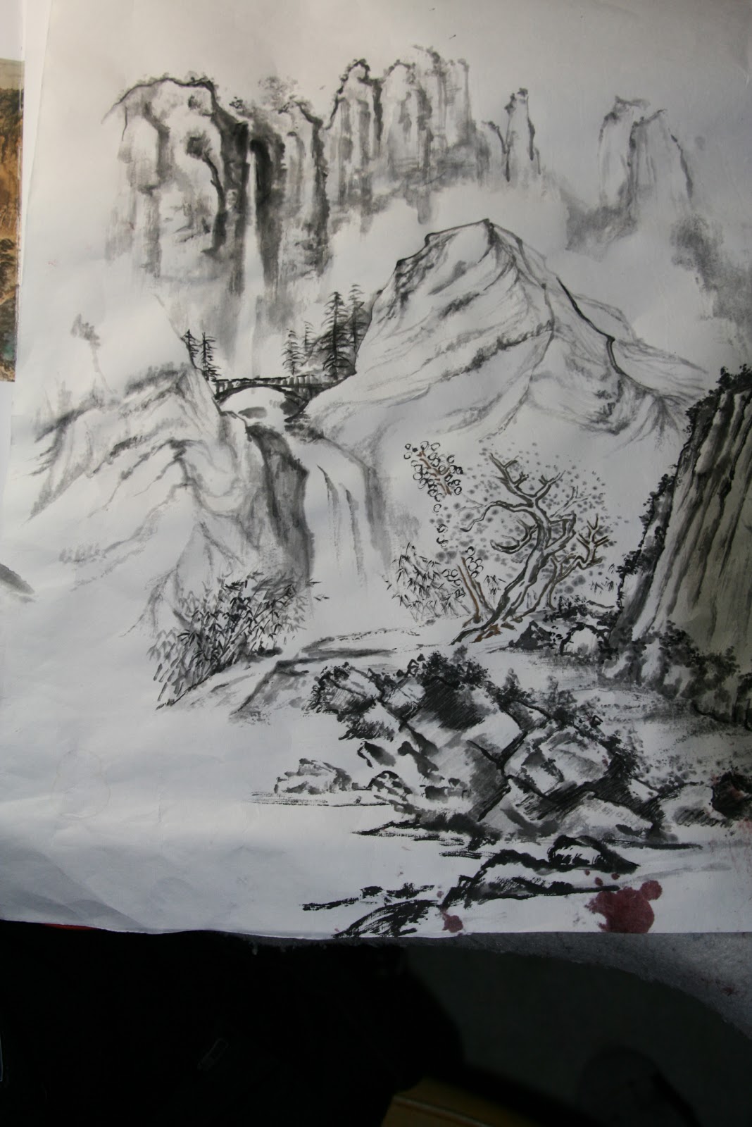
As I closed the distance to the next turnaround, I felt the air charged exclusively with  negative ions;  there was this freshness that automatically invited my lungs to expand.  Out of the corner of my eyes, just beyond my eyelashes, framed by the sentries of trees, a silver ribbon was fluttering downwards; flaunting a few pirouettes before it disappears behind he trees.  As I looked upwards towards the sky, the flanking basalt walls were featureless against the sun, decorated with a golden hue around my vision field, exacerbated by my cholesterol deposits around my pupil. 

So here I am, back to painting the Multnomah Falls again.


In this attempt, I shied away from using the Falls as my main character.  Rather, I am using supporting characters to frame the subject.  Thus I did not want to burden the Falls with exacting accounts, but to give it a mere "presence".  A presence that is sonorous and delightful.  I wanted to hear the choir through the pillars of the hall;   I was not interested as much in the faces of the ensemble.


Obviously I stayed away from my past mistake of placing the Falls front and center.  To "write" the trees, I decided to use the tried and true techniques of the more classical eras.  The near ground trees/shrubs were done using the "outlined" method.  I tried to impart different types of leaves to the woods to suggest a diverse vegetation.  The shapes of the leaves need not bear resemblance to the real plants; these were products of rote learning.  The emphasis was to have an assortment of trees and to be able to establish a spatial relationship of the bodies.


The "outlined" trunks and leaves transitioned to a "boneless" method of portraying for the more distant objects.   This technique is used quite frequently in Chinese landscape paintings.


My design was to have a very dark outer ring of details to contrast the empty spaces ( the falls).  In order that the darks are not too heavy and covered  up details, I layered in my dark values on the back of the Xuan paper.   I also wanted to leaves and trunks in the foreground to retain that translucent quality, so the colors were mixed with alum to give them more of a resist property.  The tree trunks were meant to be empty spaces, to contrast them sharply with the dark background.  Unfortunately the "dark side" was too intense and the "force" was not with me,so now they look tinted, which is still acceptable, albeit  not what I had planned.


I had to go over the "outlines" a few times to revive the lines lest they get buried under all the stains.  This "going over" is actually kind of a boo boo in Chinese brush painting.  This is akin to "touching up" and it takes away the spontaneity and the expressiveness of the brush strokes.  I really need to practice on my patience............ do a light outline, just enough to start the painting, and then finish with the dark brush strokes just once, as the final act.


Wednesday, August 3, 2011

Multnomah Falls Impression

After my last attempt, which was a more Xieyi (expressive) interpretation of Multnomah Falls, I decided to carry that momentum a bit further.  I wanted to express motion and spatial relationship with more of a "presence" than descriptions of details.  The following picture was my attempt in this endeavor.


Not everybody has been to the Falls or seen pictures of it.  So I decided to play it up a little.  I used blue streaks to create the upper cliffs.  The streaks were done so that they themselves resemble moving water.

The blue wash was mixed with alum applied side tip fashion onto Xuan.  Alum functions as a sizing
agent, helps to delineate the brush strokes;  makes the brush strokes more vivid in the sea of blue wash.  Thus we have a laminar flow of blue ribbons, rounding the corner to flow into the hour-glass void below.   A grayish overlay is then applied over the blue streaks.  The grey wash was again created by using alum solution as diluent.   This was done to prevent the wash from totally blending into one big flat surface.  I wanted stroke marks to show up a little better, simulating the horizontal crevasses in the cliff wall.    These marks also helped to suggest interruptions in the stream ( even though the grey area is not the stream ) and gave an illusion of  motion.
The actual narrow ribbon of upper fall was again painted with alum first to establish a base layer of resist, to ward off  as much unintended seepage of wash as possible.  At the head of the upper fall, I just held my brush and waited for the color to slowly bleed out to the desired spaces before moving on.   This controlled osmosis when executed alongside of alum sizing will create some artifacts that will indulge your ocular senses.

The hour-glass void represented the lower fall.  Its shape was inspired by the exaggerated proportion of a woman's body.  Imagine Marilyn Monroe coming at you with open arms, donning a black cape.  Get the picture now?

The lower fall is flanked by bold side tip brushstrokes.  This was my interpretation of the near scape of the land.  The hour glass shaped lower fall was again defined by the use of alum.  I was careful to not make the entire structure black.  I took time to make sure I leave some white slivers in them, so they can breathe. 

I wish I had done the bridge in a more Xieyi fashion.  More nonchalant, more expressive.  Right now it looked too stiff.    I was pushing it too much.
There  you have it.  Multnomah Falls, Impression!

Tuesday, July 26, 2011

Oregon Coast

Well this piece is not exactly what one would call Chinese brush painting.  The only role the Chinese brush had was to lay the foundation of the jetty, the beach and the sky.    I particularly like the effect on the jetty by the way.  This was done on water color paper; and I really like the texture.  I also helps by laying down the different tones on paper so I can concentrate on building the details.


The brush work was done mainly with ink with indigo for the water and the sky; and ink with burnt sienna for the foreground.

I then work out the details with charcoal.  My skill level did not allow me to do the rolling crests on Xuan paper.  I had difficulty creating just the right empty spaces for the waves, so I resorted to charcoal on watercolor paper.

I found the eraser to be my Best Friend for this painting!!

Sunday, July 24, 2011

"Multnomah Fall" Chinese Style

It is no secret that I am not happy with my Multnomah Fall painting and have attempted some remodeling to the painting.  Yet I am still bitten by the bug.


I've decided to try to depict the fall more as a presence than as a specimen.  I employed simple lines.
I created 3 stages, the near, the middle and the far.  The learn by rote training came into play.  It wasn't too difficult to snatch different scenes from repeated practices.


  The near scene enjoys the darkest lines and is shacked with the most details.  Trees are done in the outlined style, sort of.  The middle stage cradles the bridge and the lower fall, which then empties into the creek.  The far scene is staged by the upper fall, flanked by sentinels of straight cliffs.  The fog and  mists at the bottom of these cliffs are used to push them way back, further away from the rest of the masses.  I should note that in the original draft, I felt the width of the lower fall was too wide.  I cleverly turned the right edge of the lower fall into a steep embankment, effectively narrowing the spillway.


I kept the color scheme simple.  The indigo blue was used mainly for effect.  The cold color helped to foster distance, yet adding punch to the painting.


I did the frame a little different from the traditional way.  Instead of an assembly of 4 sides, I skillsawed an opening into a plank of pine to accommodate the canvas.  The pine is finished in gold to render an "antique" look.


This piece was submitted to a Calligraphy and Painting competition hosted by the Confucius Institute.
Whereas I have not received any notices from the Institute,  I am very happy to see my work poted as the promotional piece  on their main page under the C and P category.
http://promotion2011.chinese.cn/index.php


Wednesday, June 29, 2011

Pear Flower

I must have stared at my Chinese Pear trees for the last 10 years, each year contemplating whether to thin the pear blossoms or not.  I was told thinning the blossoms will give me bigger pears.  As it is my pears are tiny, but abundant.  In fact so many of them fell to the ground each year that it seemed such a waste.
Fortunately the Canadian geese have developed a taste for them now and they are helping  themselves to juicy (fermented?) pears on the ground in the Fall.

This year I decided to paint my Pear blossom, ala  En Plein Air.  As I am also studying Chinese calligraphy, I thought it would opportune myself to "write" each petal.  I would attempt to write each blossom with my Chinese brush, with infinite patience, and observation, and different brush strokes.

I am also doing this painting on my calligraphy paper.  I was told this paper is made of bamboo fibers and is colored yellow.  Not unlike the toilet papers that I remembered growing up.  The paper is very absorbent and "honest", in that it captures faithfully your brush stroke.  Unlike ordinary Xuan, it is not good in recording shades of grey, but it excels in reporting the sharp edges and streaks rendered by your brush.

I picked this subject matter because each petal is akin to writing a "dot" in Chinese calligraphy.  Not necessary round, but some requires you to hide the tip, while others demands a parade of tips and hooks and twists.  Intriguing indeed.  Thus I spent quite a few days, sitting in the backyard, painting on my picnic table.  A tedious process,  for I am not a patient individual.  A rewarding process, for the finished work is one that I could be proud of.


Finished painting is 16 in x 16 in, mounted on Canvas, ala Xuan-Boo style.

Saturday, June 25, 2011

Etude


Examples of  Landscape practice pieces.  I intend to use some of these as instructional materail.  Why not?  Write a blog and be able to use it for teaching...... I guess this is what you would call killing two birds with one stone.

Friday, June 24, 2011

Gou, Chuen, Ts'a, R'an


Gou, Chuen, Ts'a, R'an are the 4 required elements to execute a Chinese brush landscape painting.
This is a continuation of my last 2 blogs; "Stone Paper Scissors" where we tried to make sense of all the lines that are associated with rocks and mountains, and " What Chuen" where we delved into the application of  texture to the object.

The loose translation for these 4 elements are as follows:

Gou  means to outline, to scribe.  This is the process when we lay down the initial outline of the landscape.  The requirement for this element is that the line must not be "drawn", and must be "written."   The line must possess the quality of change, from start to finish.  The viewer has to be able to feel the variations in brush speed, pressure, center or side tip.  Hence "GOU" carries the connotation of not tracing but etching and carving.


After we have the outline done, it is time to garnish it with "Chuen" and this is the process when we can provide a qualitative description of the texture of the landscape.  In this particular example, I've used mainly the "AXE" chuen and a little bit of the "HEMP" chuen.


After texture is provided, we provide the the painting with "Ts'a"
Ts'a means scrub or rub.  This is when we used a very dry brush to rub the landscape to give it a general sense of texture.  This texture is quite generic, unlike the more specific axe or hemp chuen.
The Ts'a process is often  mingled with the Chuen process.  As one is laying down the more specific texture, one can also add the non specific texture.  In a way the Ts'a process can be deemed a prelude to shading.  The important thing to remember is the Ts'a still requires the artist to follow brush strokes, paying attention to using either the tip or the belly of the brush, or both.  This is definitely not a random, omnidirectional wild circles of shading.


The last element of landscape painting is R'an, which means to dye (wash), to shade.  This is the time when we use a very diluted ink wash to accentuate the shaded areas of the landscape, to effect a more 3-dimensional presentation of the work.  It is important to note that the R'an process must be done with patience.  It is only after repeated attempts to selectively augment the strategic areas of the landscape, each time with different dilutions of the ink solution, does one succeed in a painting that is pleasing to the eye.

This patience has to be tethered with experience for the effort not to be futile.  Xuan paper gives off a false and exaggerated saturation profile when wet.  For beginners ( and impatient journeymen alike), the wet Xuan seems to function like an abyss, where it will take up a large amount of ink and showed little difference in the apparent "blackness" until it is irreversibly too late.
This is an example of a wet Xuan,  The R'an seems more saturated than it really is, giving one a false sense of security.


The above picture is the same as  the wet Xuan picture, except that now it has dried.  As one can see, the really dark  areas are no longer pitch black.  Thus for those of us who are not patient, we will try to attain this with one step, one layer of R'an and that often ends up in overkill, and renders the painting rather unnatural.
 (example of color added)

At this point, some artist like to give the painting an overall wash, often times with the brush wash, to give the painting a more coordinated look.  Many artists dislike this process, for it tends to take away the "punch" of the painting.

If one chooses to add color to the painting, now is the time.   Color often is considered a distraction, and is typically not applied until the painting is deemed satisfactory and coud be presented as a black and white on its own merits.